Punctuation is not a mere ornament or a curiosity — it is essential, and we need to know about it. Keith Houston’s history is entertaining and readable.
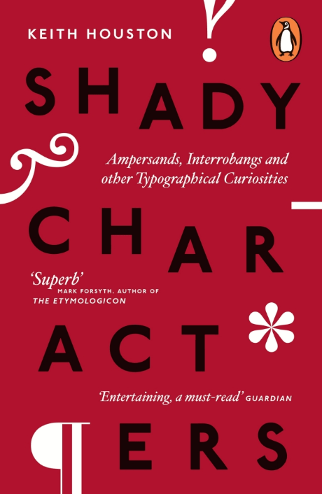
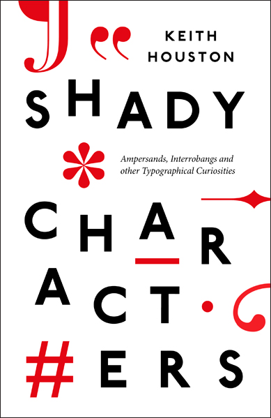
Shady Characters: The Secret Life of Punctuation, Symbols, & Other Typographical Marks, illustrated with over seventy images, is published in North America by W. W. Norton. It is published in the UK by Penguin Books as Shady Characters: Ampersands, Interrobangs and Other Typographical Curiosities.
- In paperback
- Get the paperback in the USA from Amazon.com, Barnes & Noble, IndieBound or Powell’s. In the rest of the world, order from Amazon.co.uk, The Book Depository or Waterstones.
- In hardcover
- Order the hardcover in the USA from Amazon.com, IndieBound or Powell’s. In the rest of the world, order from Amazon.co.uk, The Book Depository or Waterstones.
- E-book
- Get Shady Characters for your Nook at Barnes & Noble; for your iPhone or iPad at Apple Books; for your Android device at Google Play Books; for your Kindle at Amazon (USA) or Amazon (UK); and in ePub format at Waterstones (UK).
- Non-English editions
- Shady Characters is also available in Polish (as Ciemne typki), published by Karakter, and in Chinese complex characters (as 英語符號趣味學), published by Rye Field Publications.

Praise for Shady Characters:
If Eats, Shoots & Leaves whetted your appetite on the subject of punctuation, then you have a treat in store. Shady Characters is an authoritative, witty, and fascinating tour of the history and rationale behind such lesser known marks as the ampersand, manicule, the pilcrow, and the interrobang. Keith Houston also explains the octothorpe — otherwise known as the hashtag — and my final comment on his book is #awesome.
Make no mistake: this is a book of secrets. With zeal and rigor, Keith Houston cracks open the &, the #, the † and more — all the little matryoshka dolls of meaning that make writing work. Inside, we meet novelists, publishers, scholars and scribes; we range from ancient Greeks to hashtagged tweets; and we see the weird and wonderful foundations of the most successful technology of all time. By which I mean, of course: this. These marks and scribbles. Honestly, it gets almost theological: how many stories can you fit on the head of a †? The answer — and the stories — will surprise you.

I’m a sucker for this stuff. The @ is called chiocciola (snail) in Italian! The & was once taught as a letter of the alphabet! The manicule has been with us for a millennium! Thank you, Keith Houston, for bringing these little mysteries out of the shadows of typographic history.
For fans of Lynn Truss’s Eats, Shoots & Leaves, this bestiary of lesser-known punctuation marks is a wonder.
More than a mere catalog of curious trivia, it’s an absolutely fascinating blend of history, design, sociology, and cultural poetics — highly recommended.
This book has more in common with Malcolm Gladwell than with standard history writing.
Houston explores the roles a variety of punctuation marks have played in the popular imagination. The forgotten manicule, the modest dash and the ampersand all make appearances, as do intriguing characters from millennia past. The book is often engrossing… An unusual triumph of the human ability to find exaltation in the mundane.

Engaging typographical journeys […] Houston brings to life a history of ingenuity and imagination.
[S]cholarly, highly readable and, on some deeper level, slightly deranged.
[W]ritten in a jaunty tone, laced with geeky relish. ★ ★ ★ ★
Questions about the book? Leave a comment below, or get in touch via the Contact page. As with any book, some errors slip through the cracks before publication; read about errata here.
Comment posted by Ype Kingma on
Today (the last day of 2013) I got my copy of “Shady Characters, The Book” & what a book it is! The way this book is designed & produced is the ultimate antidote to the e-book. I got mine with the red dustjacket, which has embossed lettering. How chic. What a pleasure to hold this book & flip the pages. So far I have read Chapter 6 (Asteriks & Dagger). I enjoy the Hoeffler Text lettering & the layout of the whole book.
I read a number of entries online, but the book is even better!
Comment posted by Keith Houston on
Hi Ype — thank you for taking the time to leave a comment. I’m very glad you enjoyed the book! The excellent interior design was by Judith Abbate.
Comment posted by Jamsheed on
Hi! Wanted to tell you that I just got your book and started reading it. And I love it! Am mentally cheering on the interrobang to conquer the realms of typography. Cheers!
JS
Comment posted by Keith Houston on
Hi Jamsheed — I’m very glad you’re enjoying the book! Thank you for the comment. Do let me know if you come across the interrobang in the wild!
Comment posted by Robyn on
I just picked up a copy of this book yesterday and I am so excited about it! It looks amazing and I cannot wait to start reading it.
Comment posted by Keith Houston on
Great! I hope you enjoy it. And if you do, The Book will be published next month if you’d like more in the same vein.
Comment posted by Kaye Cossar Stokes on
Just heard your illuminating interview on Radio National NZ. I am rushing out to get this book and your other one too! Love books as I was so deprived of them growing up during WW2. I have one big gripe about books! Most of them are printed with a very narrow gutter strip in the middle and then a wide white margin on the outside. Causing one often to press the book open, especially paperbacks, then over time the book breaks the spine. Why cannot printers do it the other way? I know they can as I have a lovely book ( packed up at present) about Chinese Gardens and it is printed with the wide margins in the gutter strip. Sadly I am having a senior moment and I cannot recall the name of the author. . Katherine?…She died of cancer and her husband ( ? Charles…)has set up places in the UK for sufferers and also a large garden in her memory. Any comment about gutter strips?
Kaye Cossar Stokes. Auckland. NZ
Comment posted by Keith Houston on
Hi Kaye — thanks for the comment! I’m glad you enjoyed the interview — I did too.
I’m not exactly sure why book designers would have the horizontal margins the wrong way round, so to speak, but I’d guess at a couple of reasons: to achieve a visually pleasing layout, and to leave some space for marginal notes. It may be that the inner margins suffer so that the outer margins can breathe a bit.
Comment posted by Kaye Cossar Stokes on
Re the book and author mentioned above.
The Chinese Garden by Maggie Keswick and her husband is Charles Jencks.
Hope you may have a look at her book as it is beautiful….
Kaye Cossar Stokes. NZ
Comment posted by Keith Houston on
Thanks! I will do.
Comment posted by Kaye Cossar Stokes on
Oh, I forgot to mention that I had my attention drawn to the narrow gutterstrip by my cousin who is a book binder. She laments, that with those narrow strips a well loved book is very difficult to repair..she has restored many very old beuatiful books and won international awards for her work….
Comment posted by //**\\ Sara on
I cannot wait for your book on ligatures.
//**\\ Sara