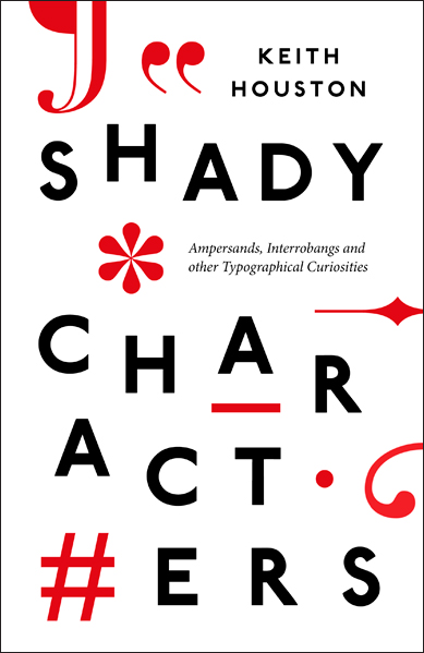
Ladies and gentlemen: having revealed the US cover last month, it’s now the turn of the UK edition. Published by Particular Books, a Penguin imprint, the UK edition of the Shady Characters book is now available for pre-order at Amazon.co.uk,
The Book Depository and Waterstones.
The main typeface this time round is (I think) Johnston, the original, iconic London Underground typeface on which Eric Gill’s Gill Sans is based. I’m awaiting definitive confirmation from my editor at Particular, but if any Shady Character readers know better, please let me know!
Comment posted by Dylan on
Not gonna lie, I like this cover way more than the US cover. Though I think Hoelfer is a bit more elegant of a typeface.
Comment posted by Keith Houston on
Hi Dylan — glad you like the cover. Hoefler Text is used for the text itself in both UK and US editions, so you get the best of both worlds!
Comment posted by James on
Certainly looks like Johnston/London Underground. That R is highly distinctive. Also, I much prefer this cover to the US version. It’s worth it for that plump asterisk alone.
Comment posted by Keith Houston on
Hi James — the R gave it away for me too. It’s nice that Particular Books have used Johnston for the cover; I’ve tried to work it into a website design or two, but it always ends up looking like a knock-off London Underground poster. Happily, I think the Shady Characters cover pulls it off rather better than I could have done!
Comment posted by Graham Moss on
Yes, looks like a digital Johnston. Not sure it’s right to say that’s the base for Gill Sans though, after all, huge time gap between the originals, and Gill worked with Johnston – as did Harold Curwen, and the three faces (+Curwen Sans) have a nice affinity without being copies of each other.
Raggedy design by the way – would have preferred something neater and with better references to the contents. But then I don’t work for Penguin! Should be a seller though, being so in with the gestalt of today.
Comment posted by Keith Houston on
Hi Graham — thanks for the comment!
Perhaps “based on” is too strong, but there’s certainly some commonality between Johnston and Gill Sans. I had a look for Curwen Sans after you mentioned it here, and came across a nice Curwen Sans specimen over on Flickr. I do love that W.
It’s funny that you should mention the “raggedy” nature of the design — I was also a bit leery of it initially , but the more I look at it the more I like it. And there’s always the US edition if you can’t be swayed!
Comment posted by Quick transcription service on
Hello i want to purchase this book and want to translate into Japanese language for Japanese people because this book is looking nice and readable. Can i translate it?
Comment posted by Keith Houston on
Hi – I’m glad you like the look of the book! For translation rights, please contact my agent, Laurie Abkemeier.