I exaggerate for effect. Although thanks to Martin von Wyss, an Australian geographer, cartographer and punctuation enthusiast, we’re on the cusp of interrobangs visible from space even if they aren’t technically in space. I came across a tweet of Martin’s a few weeks ago, and if you take a second to click on that link you’ll see exactly why I was keen to get in touch.
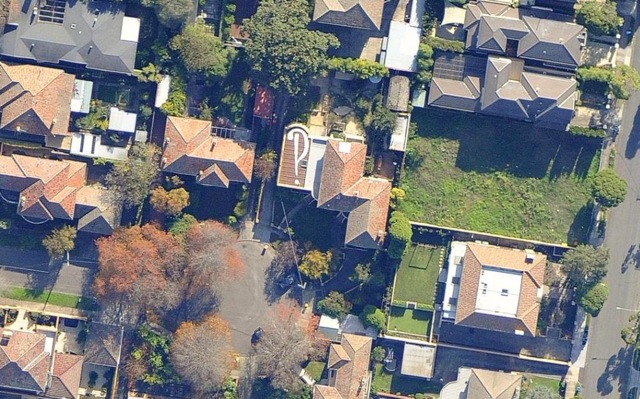
Martin has painted an interrobang on the roof of his house.
I sent Martin a message to ask him why he had undertaken this noble task and his answer, to paraphrase George Mallory’s famous justification for tackling Mount Everest, was joyously simple: because he could. Martin writes:
Ever since Google Maps (or was it Mapquest?) came along with their free images in 2003(?), I’ve been conniving about orthophoto art.* But it wasn’t until recently that I had roof access! And in the meantime I learned to love the interrobang.
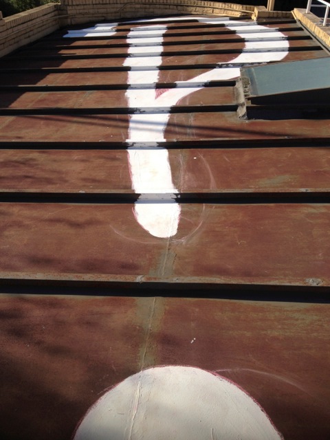
As a cartographer, typography and fonts matter a great deal to me. In my work I usually end up using sans serif fonts that are legible at very small sizes and lend the map an air of impartiality. But I knew that no one would get a headache from reading one character in all of greater Melbourne’s roofs, so I went for an expressive serifed interrobang. Since I’m on Twitter and since they’ve chosen such a fine specimen for their logo, I used the logo of the State Library of NSW as my model when sketching out my character on the roof.
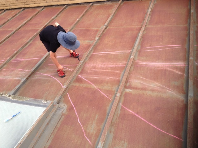
We used a pink chalk for the outlines on the metal deck and whatever paint it is we found in the garage for painting our character. An added benefit to the project is increasing our albedo!
Amazing. Martin’s house is both literally and metaphorically cooler as a result of his endeavour.
Readers of the Shady Characters book will find that Martin’s interrobang is familiar; it does indeed mirror the one used by State Library of New South Wales, although that august institution took the conventional route of placing its emblem on its walls rather than its roof. (The NSW interrobang, coincidentally, was the product of Vince Frost of Frost Design, who explained the reasoning behind the logo to me back in 2011.)
The image at the top of the page comes courtesy of nearmap, an Australian company that transforms aerial photographs into images suitable for use in mapping. Martin tells me that he awaits the next overflight of a Google Maps satellite so that his rooftop interrobang will finally be imaged from space and available for all to see. Perhaps it’s time for a Google Earth Alphabet of unusual marks of punctuation.
I can’t thank Martin enough for posting his picture to Twitter and for all his help in preparing this post. Check out his website for Australian Wine Maps and more!
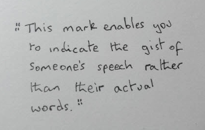
Reader Angus got in touch after my recent post about the “quasiquote” to explain that he has been using a mark of his own invention with a similar meaning. He sent in an image to illustrate his symbol, a “broken” quotation mark in contrast to the underlined quotation mark we saw last time, that he uses in written correspondence:
I must thank Angus for getting in touch and for sending in a custom-made demonstration of his mark. Have you come up with any alternatively renderings for marks discussed here? An alternate-universe interrobang, perhaps, or an improved ampersand? Let us know in the comments, or drop me a line via the Contact form!
- *
- An “orthophoto” is an aerial photograph that has been manipulated to appear as though it has been taken from directly over the subject. ↢
Comment posted by Katie on
Totally cool! That would definitely be the work of my elementary school classmate, Martin.
Comment posted by Jim on
This is way cool. If I owned (instead of rented), I’d go paint my roof right now.
Comment posted by Bonnie on
That’s a very elegant interrobang.
Comment posted by Vikki McDonough on
Aren’t GMaps’s closer-in images from aerial rather than satellite photography?
Comment posted by Keith Houston on
Very possibly! Never let it be said that I am unwilling to exaggerate for dramatic effect.