Always nice to ease oneself back into the swing of things with a new mark of punctuation, don’t you think? I was pleased to come across the following announcement a little while ago:
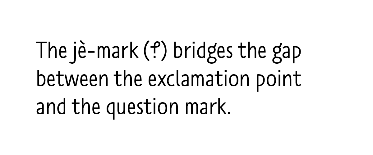
On May 27, at the international design conference TYPO Berlin two new typefaces will be launched that are designed as part of the TilburgsAns project. Both typefaces – TilburgsAnsText and TilburgsAnsIcons – contain a new punctuation mark. This mark is based on the Tilburg dialect word ‘jè’ (which sounds more or less as ‘yeah’) that is used as a confirmation but often expresses some doubt or mild irony. The jè-mark bridges the gap between the exclamation point and the question mark.
And what does this new mark look like? It looks like this:
Let’s backtrack a bit. The TilburgsAns project is the brainchild of Sander Neijnens, a typographer, and Ivo van Leeuwen, a graphic designer, both of whom live in the Dutch town of Tilburg. In 2016 the pair released a typeface called TilburgsAns* inspired by and intended to promote their home town. Their typeface was joined by a set of icons depicting Tilburg landmarks and also by an intriguing new mark of punctuation: the “jè” symbol described above. As Sander explains, it is intended to convey a sort of typographical shrug: somewhere between “oh yeah?” and “really?”.
Of course, there have been many attempts to create and promote new irony and sarcasm marks, as documented here over the years. There was the reversed question mark (⸮) of the sixteenth century and the inverted exclamation mark (¡) of the seventeenth; Martin K Speckter’s interrobang (‽), invented in the 1960s; the tilde (~), proposed in the early 2000s; and the asterisk (*), a more recent entrant. And then there is my personal favourite, the ironieteken as designed by Bas Jacobs (), and which is now available in the Satyr typeface in which this site is set.
It’s too early to say how well the jè-mark will fare in comparison to its predecessors, but I was interested to learn more nevertheless. Last week I spoke to Sander Neijnens via email about his new mark of punctuation and about TilburgsAns in general and so, without further ado, here is the genesis of the jè-mark in the words of its creator.
- KH: How did the TilburgsAns project get started?
-
SN: The project started in 2013 when I discovered that I could put pictures into a typeface as ligatures. In typography ligatures are used to replace two separate characters (for instance f and i) by a specially designed, combined character (the fi ligature). It appeared to be possible to construct ligatures of many more than two characters, so complete words can be turned into a ligature (or picture). In fact, ligatures make it possible to bridge the gap between words and images, while images can be linked to the words they represent.
In 2014 I started in cooperation with illustrator Ivo van Leeuwen to design a typeface inspired by our hometown Tilburg in the south of the Netherlands. The typeface is called TilburgsAns, a sans serif that in the meantime also contains ninety icons of specific Tilburg locations, events, persons and dialect words. The first version was released in April 2016 and a new version was recently launched at the TYPO Berlin conference.
- Why did you choose to create a “jè” mark? Did you consider any other words from the Tilburg dialect?
- Some dialect words that were turned into an icon are dèùf (pigeon), kaajbaand (curbstone), bèngske (bench), knòrrie (canary), lozzie (wristwatch) and kenaol (canal). I also asked Ivo to draw an icon for the word jè, which is an affirmation (like: “yes”) but also expresses doubt (like: “so what”). When he replied that it was not possible to make an icon for this word, I got the idea to turn it into a punctuation mark. I used the letters j and e. The j was rotated 180 degrees and the curl was elongated, so the eye of the e became visible. In fact, it’s also a kind of ligature; this refers to the genesis of the exclamation point, that originated from the Latin word io, a shout of joy.
- KH: Have you seen the “jè” mark being used in Tilburg? Have you had any feedback on it?
- SN: The jè mark is incorporated in the latest version of the typeface, so it has just been launched on May 27. We think it can be used as an irony mark. There have been several predecessors like the reversed question mark, the interrobang, the sarcmark and the ironieteken. Neither of them was a real success, but we want to give it another try, because in the past many writers have suggested that they need such a mark. Besides that, the ironic phrase is often used in digital messages. There the jè mark can replace an emoticon or the wink ;-) The mark might also be a help in digital tools for translating text to speech.
- What’s the future for the “jè” mark? Do you think it will appear in other typefaces?
-
As the logic for the design (based on the j and e) is very obvious, the mark can be constructed in any other typeface in a simple way. Furthermore it can easily be written by hand. And the design looks like an intermediate form between the exclamation point and question mark. So, all ingredients for a bright future are present ;-)
Of course, the mark still has a long way to go. First it has to be available in a typeface. That step is already taken, as you can access it by using TilburgsAnsText and typing “jè.” which turns into the ligature, the jè mark.
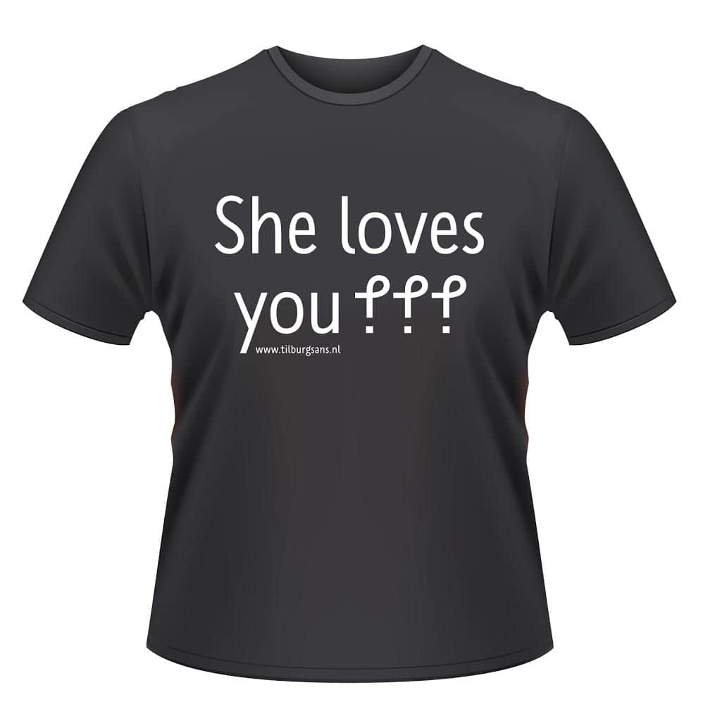
The next step is the application of the mark in texts. Therefor we inform writers, designers and the general public about the birth of this mark; we’ll have to wait if they are actually going to use it. Part of the ‘campaign’ is a T-shirt with the text ‘She loves you jè jè jè’, referring to the Beatles song and expressing that in the realm of love nothing is 100% for sure. [T-shirts are now available to order. See Sander’s comment below for details — ed.]
Step three is the acquisition of a Unicode [code point – ed.].
And step four is a key on the standard keyboard.
- KH: Do you plan to add more new marks?
-
After I designed the jè mark, I discovered that an Austrian designer has made thirty so called typojis, as an alternative for emoticons. In my opinion this is a bit overdone. The relation between certain forms and their function is ambiguous and some typojis can’t be easily written by hand.
We don’t have plans for designing other new marks. If we can add just one punctuation mark to the toolbox of writers that would be an enormous outcome.
So there you have it: Sander Neijnens’ jè mark, a typographic shrug — “so what?” — or irony mark, made with uncommon care and attention, and just waiting for you to take it up. If you have access to a word processor or other platform that supports ligatures, you can get your own jè by downloading TilburgsAns and typing “jè.”, taking care to include the e-grave and the full stop, to see it magically replaced by Sander’s new mark.
What’s your take? Does the jè-mark stand a chance of making it into the mainstream, or is will it face the same uncertain fate as the other irony marks?
Many thanks to Sander Neijnens for answering my questions — and for designing such a thoughtful take on the irony mark! I’ll be keeping an eye out to see how it gets on.
Also, this is a quick note to say that tickets for my July 3rd talk at the British Library are now on general release. Get them here!
- *
- That is, “Tilburg Sans” with a whitespace-ectomy and some creative capitalisation. The “Ans” of the name is the project’s fictional avatar or mascot. ↢
Comment posted by Trevor Peach on
‽
Comment posted by Lois Fundis on
I like it. Still, a lot of fonts still don’t support the interrobang, which is fifty-some years old, so the je (this font doesn’t even seem to want to do e with the / accent mark) may take awhile to catch on. The two could become interchangeable, too. Their meanings aren’t all that different.
Comment posted by Keith Houston on
It’s all in the wrist! Here’s one: è. (But yes, depending on what device you’re writing on, accented characters aren’t always convenient to enter.)
Unicode, the standards body that deals with such things, can be convinced to give a character a permanent identifier if it becomes widespread enough. The problem that all these novel irony and sarcasm marks face is that there are a surprising number of them. One mark that everyone could get behind might stand a chance; any one of two, or five, or ten marks vying for attention will doubtless find it much more difficult to make themselves known. (That said, I wish the jè-mark luck!)
Comment posted by Sander Neijnens on
The shortcoming of the interrobang is – in my opinion – that it is very hard to write it by hand. And, even in this digital age, handwriting remains the cornerstone of typography.
Comment posted by Robert Higginbotham on
Rather reminds me of the Canadian, eh?
Comment posted by Keith Houston on
It does! That’s a good analogy.
Comment posted by Sander Neijnens on
Indeed, we get comments from people who tell about likewise words in other languages or dialects. Makes me curious. I’ll make a list, so examples from other languages are welcome.
Comment posted by Bhikkhu Pesala on
Just use the existing code-points for Interrobang or Irony mark (reversed question mark).
The reason for the limited use of these marks is that they are not understood by many readers.
Old style emoticons like :) or :( are not as easy to understand as (~_~), but they have been better adopted due to being easier to type.
I use Standard ligatures of ?! for Interrobang, and ?? for Irony ⸮
Comment posted by Keith Houston on
Hi Bhikkhu,
I go back and forward on whether irony marks should be assigned to the interrobang code point. Unicode generally assigns code points to graphical marks, rather than to the meaning of those marks, but in the case of the interrobang/irony mark/ironieteken/jè-mark, I do wonder if we’d be better served by a single code point for “irony mark” (and perhaps a second one for “sarcasm mark”). It’d certainly solve the problem of where to put new ones.
I’ve been reading about horizontal emoticons recently — (^_^) et al — and yes, they aren’t easy to enter, especially those that rely on non-Latin characters. Presumably that explains the East/West divide between the two.
Thanks for the comment!
Comment posted by Sander Neijnens on
I don’t think that a code point for the meaning “irony mark” will work out well, as some marks may get another meaning by the way in which they are used. Confusion arises when in the long run one mark gets a different meaning (e.g. “sarcasm” instead of “irony”) and the other mark – at the same code point – not. In that case, changing typeface would result in changing meaning.
Comment posted by Sander Neijnens on
The jè T-shirts are ready. And wow, there already came an order from Wellington, New Zealand! The total costs for the shirt and international shipping are 24,15 euro.
Comment posted by Keith Houston on
That’s great! Is it possible to buy them online?
Comment posted by Sander Neijnens on
The jè T-shirt can be ordered by writing a mail to info@tilburgsans.nl. Don’t forget to add your address and if you want a men’s or women’s model and the size (M, L or XL). Payment can be done by PayPal or an international bank transfer.
Comment posted by Keith Houston on
Excellent! Thanks for the details.
Comment posted by Sander Neijnens on
Today Tilburg citizen Hetty van de Vorstenbosch had the jè-mark tattooed on her ankle. See: http://www.tilburgsans.nl/nl/nieuws/een-enkeltje-ans-je/
Comment posted by Keith Houston on
That is one dedicated TilburgsAns fan! Thanks for the link.
Comment posted by Sander Neijnens on
A short video about the first jè-mark tattoo can be watched on: https://www.youtube.com/watch?v=Pe8-0C7Q1hk