As we head towards the holiday season, 2022 edition, good news for next year’s gift-giving conundrums: my esteemed editor, Mr Brendan Curry, has rubber-stamped the Empire of the Sum manuscript, which has now started its journey through the W. W. Norton publication pipeline. Between now and the summer of 2023 it will be copyedited, proofread, indexed, designed, typeset and many other things beside, and it will be much better for it.
Still, though, next summer is a long way off. For now, then, here are a few recent (and not so recent) stories you might find interesting.
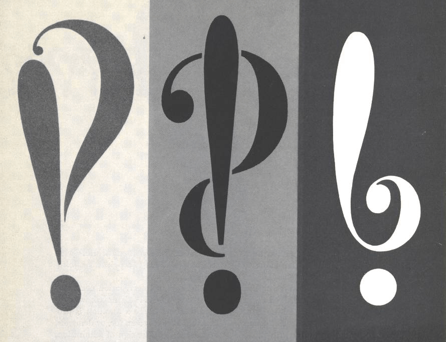
I somehow missed the video below when it aired on Netflix back in 2018. It’s a collaboration with Vox, the news web site, and it addresses the origins, history and usage of the exclamation mark. At only fifteen minutes long, no-one would mistake it for an exhaustive treatment of a mark that has been around for five centuries or more, but it does find time to introduce our old friend, the interrobang (‽). Here’s the video:
There’s a poignant star turn at around 7:50, when the late Penny Speckter appears on screen to explain the circumstances of her husband’s creation of the interrobang. It was a jolt to see her apartment much as it had been when I visited in 2013 for a lengthy, entertaining and cocktail-fuelled audience. Now, as then, the walls were covered in bookcases that were populated in turn by both books and miniature printing presses. (For a time, she and her husband Martin had rented the apartment across the hall to hold their collection of full-size presses.)
In the video, Penny adds some colour to the story of the interrobang’s birth. Out to dinner one night, she says, Martin was fretting over the four pages left to fill in the latest issue of Type Talks, the pair’s magazine on typography in advertising. Apropos of nothing at all, he announced his idea for a new mark of punctuation and dashed off to call their agency’s favored art studio. “Is there anybody there who can draw?” The Speckters made their way to the studio and stayed for hours, hashing out* what would become the interrobang’s earliest visual forms. Here’s how they appeared in Type Talks:
My original series of posts on the interrobang (and, of course, the Shady Characters book) picks up the story from that point onwards, opening with the publication in Type Talks of Martin’s fateful article on his new mark, but I’m glad to have learned a little more of the story!
Elsewhere, I was taken with a Guardian article on the discovery of an ivory comb inscribed with what is said to be the oldest known sentence in the oldest known alphabet: “May this tusk root out the lice of the hair and the beard.” Not just a comb, then, but a comb for getting rid of head lice. Leave it to Mark Liberman at Language Log to get to what really matters: the letters on this comb, ytš ḥṭ ḏ lqml śʿ[r w]zqt, do not come from a conventional alphabet but rather an abjad, or an alphabet that makes do without vowels, modern examples of which include Hebrew and Arabic. Head over to the Guardian and Language Log to learn more.
Staying with Language Log, I learned from a recent post there by Victor Mair that there is renewed interest in shorthand writing as practised in ancient Greece and Rome. Mair links to an article in the Daily Beast in which Candida Moss delves into the origin, uses and users of shorthand in the ancient world. Moss invokes Cicero’s favourite amanuensis, Tiro, whom Shady Characters readers will remember as the inventor of the “Tironian et” (⁊), but there’s much more to learn and to ponder in her article.
Lastly, you may have noticed that Twitter is having a bit of a wobble in the wake of its sale to cut-rate Bond villain Elon Musk. Many Twitter users, myself included, have since created accounts on Mastodon, a decentralised social network that feels much like Twitter but which remains in independent hands. If you’ve already made the move or are thinking about doing so, you can follow Shady Characters at @shadychars@mastodon.social and my personal account at @orkneydullard@mstdn.social. I’ll still be active on Twitter, but perhaps that will change in the coming days and weeks. See you at the new place!
Comment posted by Brian on
Without vowels, surely?
Comment posted by Keith Houston on
Hi Brian – thanks for catching that! Fixed now.
Comment posted by ktschwarz on
Since this is a blog about typography, I can’t help noticing that in the quote ytš ḥṭ ḏ lqml śʿ[r w]zqt, the ḏ is out of line with the surrounding characters: too big, different slant from the other italics. This is probably because the Satyr font that you’re using doesn’t have that character (U+1E0F Latin Small Letter D With Line Below), so the browser has to pull it from another font. This is a common problem; the headline of the Language Log post is even worse, with not only the ḏ but also the ḥ and the ṭ visibly mismatched. I don’t know if there’s anything you could have done about it, other than putting the whole quote in a different font, which would also look odd.
The underscore, or macron below, is a Semiticist convention for fricatives; the d with macron below represents IPA [ð].
Comment posted by Keith Houston on
Hi there — which quote are you referring to?
Comment posted by ktschwarz on
The sentence inscribed on the lice comb, in your third section.
Comment posted by Keith Houston on
Ah, of course. Thanks!
It turns out that although Unicode contains separate “Latin Small Letter D” and “Combining Macron Below” characters, if I use them together then the browser interprets them as the single “Latin Small Letter D with Line Below” character (https://www.compart.com/en/unicode/U+1E0F). And that, in turn, kicks the system out of Satyr and into some default fallback font.
I tried using the native HTML underline tag instead, but the resulting underline is too long and too heavy. Neither option is perfect, really, which is a shame.