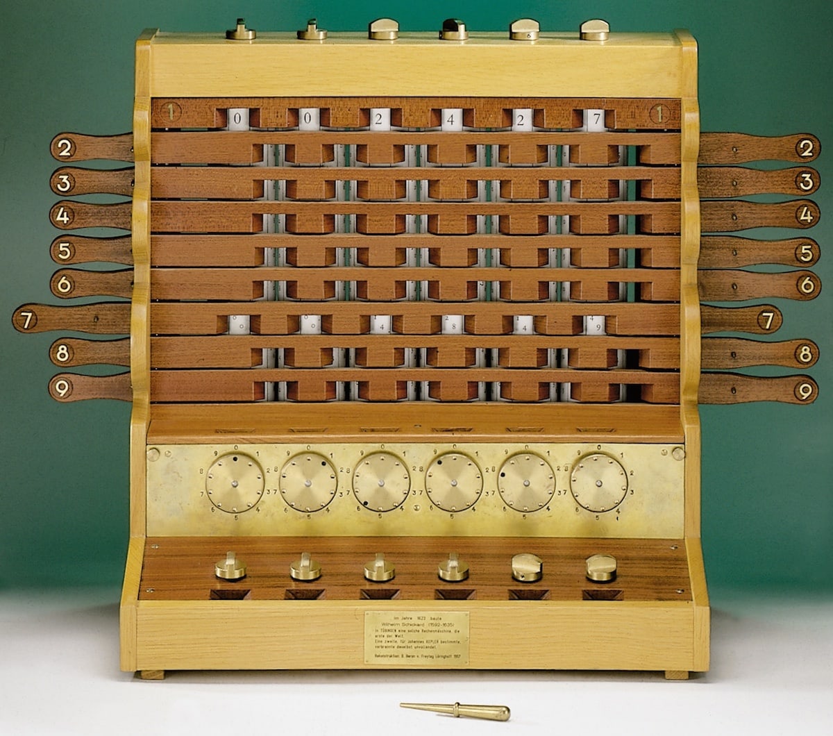
Miscellany № 95: invention, illumination, and evasion

Links! It is high time for a few links. Let’s start out with some scholarly appetisers before a good old-fashioned moral panic as dessert.


First up, anthropologist Piers Kelly, writing in the pages of Sapiens magazine, has penned a simple but compelling tale of how the Vai script of Liberia was invented and brought to its modern-day state in less than two centuries. Piers digs into how the accelerated evolution of the Vai script might be used to understand the development of ancient writing systems such as hieroglyphs, cuneiform, and Chinese script. His article is called “What the Vai Script Reveals About the Evolution of Writing”, and it is well worth a read.


Over at Language Log, Victor Mair links to news of a huge discovery of ancient Chinese manuscripts in the form of bamboo slips. The original article is in Chinese, but Google provides the following translation, lightly edited for readability:

More than 3,200 bamboo slips have been rediscovered in the Warring States Chu Tomb at No. 798, Wangjiazui, Jingzhou, Hubei. Some of them are the first archaeological excavation of the Chu State manuscript “Confucius”, some are “Book of Songs”, and some are suspected to be unprecedented pre-Qin music scores. […] The Wangjiazui Warring States Chu Tomb dates back about 2,300 years ago and is located in Hongsheng Village, Jinan Town, Jingzhou District, Jingzhou City, Hubei Province. According to Xiao Yujun, the head of the archaeological project and director of the Archaeological Department of the Jingzhou Museum, in order to cooperate with the infrastructure project, the Jingzhou Museum conducted archaeological excavations at the cemetery from 2019 to 2021[.] A batch of bronze ware, lacquered wood ware and more than 3,200 bamboo slips (not counting small fragments) were collected.

If you’ve read The Book, you’ll know that the ancient Chinese often wrote on vertical slips of bamboo — a practice which, in turn, led to China’s characteristic top-to-bottom and right-to-left style of writing. I found it very difficult to locate images of bamboo slips for publication in The Book (ironically, the language barrier being the main stumbling block), so it’s gratifying to note that the original article has some decent photographs of the manuscripts found in the tomb.


Finally, the US Drug Enforcement Agency has recently taken an interest in emoji. As I discovered via Emoji Information on Twitter, the DEA has released a fact sheet aimed at parents, teachers, and other caregivers that purports to decipher “common emoji codes” for illicit drugs and related slang. Here they are:

Percocet and Oxycodone
💊 🔵 🅿 🍌
Xanax
💊 🍫 🚌
Adderall
💊 A-🚆
Meth
🔮 💙 💎 🧪
Heroin
🤎 🐉
Cocaine
❄ 🌨 ⛄ 💎 🎱 🔑 😛 🐡
MDMA & Mollies
❤ ⚡ ❌ 💊 🍬
Mushrooms
🍄
Cough syrup
🍇 💜 🍼
Marijuana
💨 🔥 🌴 🌲 😮💨 🍀
Dealer advertising
🤑 👑 💰 💵 🔌
High potency
🚀 💣 💥
Universal for drugs
🍁
Large batch
🍪

But wait! The DEA is behind the times on this. The phenomenon of emoji-as-drugs-slang seems to have been uncovered by BBC reporter Stacey Dooley in a 2017 programme entitled Stacey Dooley Investigates: Kids Selling Drugs Online. (Dooley’s findings were parroted by outlets such as the UK’s premier freesheet, the Metro, and salted with implied outrage into the bargain.) Many of the DEA’s terms were already in use at the time of Dooley’s investigation.

It’s worth noting, I think, that the DEA’s “emoji drug codes” are no more sinister or nefarious than slang words such as “snow” or “weed”. Once you know that ‘❄’ means “cocaine” and ‘🌴’ means “marijuana”, you have cracked the code. This isn’t to minimise the impact of illegal drug use, but I do think it’s a little unfair to single out emoji; one might equally well blame English for permitting individual words to have more than one meaning.

This has been your periodic emoji public service announcement. Please use drug emoji responsibly.

Miscellany #️⃣9️⃣4️⃣: flagging emoji?

If I learned anything as I wrote about emoji, it is that emoji is as dynamic as any “real” language. Here’s a recent development that demonstrates exactly that.

From the latest edition of Jennifer Daniel’s always-entertaining newsletter, “Did Someone Say Emoji?”,* comes the news that Unicode is shutting down the pipeline of new flag emoji. Jennifer is the chair of the Unicode Emoji Subcommittee, so this comes straight from the 🐴’s mouth.

This is not a small change. Flags are the largest homogenous subspecies of emoji, and a special one at that, with the Unicode Consortium careful to ensure that there is always an official flag emoji for each of the countries defined by the ISO 3166 standard. (There are also some non-country flags, but more about them later.) But despite this special status, there is a long list of reasons for the cauterisation of one of emoji’s major limbs.

First, and probably most obvious, is that international boundaries, politics, and identities are constantly in flux. Flags change, countries change; even whether a particular geographic entity is a country or not is sometimes a matter of perspective. Taiwan, of course, is the flag-bearer (sorry) for this particular type of disagreement: in order to prevent offence to one party or another, Taiwanese flag emoji do not appear on some devices.

In the same vein, flags for “subdivisions” of countries — the UK’s home nations, the USA’s constituent states, and so on — can be equally problematic. Thus, although the Unicode standard technically supports subdivision flags, only a handful are officially blessed to appear as emoji: the flags of Scotland, England and Wales are uncontroversial enough to be supported on most platforms, but for Unicode to sanction a flag for Northern Ireland would be to wade into a political quagmire that has endured for more than a century. For another difficult case, consider Spain’s independence-minded region of Catalonia.

And then there are those flags that represent something other than countries and regions, and they can be just as troublesome. Should historical flags be supported, for example? Or organisational flags such as those of NATO or the UN? What about indigenous peoples, such as Australia’s Indigenous Peoples and New Zealand’s Maori, who have flags different to those of their colonisers? And what about the flags of such slippery things as movements, like the rainbow LGBT flag or the skull-and-crossbones of the pirate flag? Some of these have emoji flags, others do not, and it is not at all clear whether the correct choices have been made.

Beyond all this, Jennifer notes that flag emoji are just not very popular; the vertigo-inducing emojitracker, for instance, shows that not a single flag regularly cracks the top 100 emoji on Twitter. Such is the dearth of interest that, as Keith Broni points out over on Emojipedia, Microsoft Windows has never supported flag emoji. Every flag emoji sent to a Windows machine ends up as either a pair of “regional indicator symbol letters”, such as “🇺‌🇸” or “🇬‌🇧” or simply a featureless black flag (🏴).

In future, then, Unicode’s Emoji Subcommittee will not accept any new proposals for flags. There will still be new national flags from time to time, as the ISO 3166 Maintenance Agency adds new entries to its more-or-less-canonical list of countries, but anything else is likely to be rejected out of hand. Fly your 🏴s at half mast: the book is closed on new emoji flags.

*
Crying out for an interrobang right there. 
Capitalise the ‘p’ in “party” and this sentence still makes sense. 

Miscellany № 93: a fistful of manicules

Underware, the Dutch/Finnish type foundry comprising Akiem Helmling, Bas Jacobs and Sami Kortemäki, is one that gets special characters. Bas’s ironieteken (), or irony mark, was one of the first characters I wrote about here.* They’ve also done some interesting work towards a “Latin plus” character set — a collection of the more than 450 accented and non-accented characters needed to typeset the hundreds of languages, common and otherwise, that use the roman alphabet. Now, they’ve added what they call a “manicule specimen” to this body of work. This warrants some explanation.

First, the manicule (☞), or pointing hand, is a written or printed mark traditionally placed in the margin to call out some point of interest in a text. Being a creation of some unknown medieval scribe, the manicule is considerably older than the ironieteken but has survived intact into the Unicode era. More than survived, in fact; like the pilcrow (¶), the manicule is one of those archaic marks that type designers just can’t seem to give up, despite its assuredly marginal utility.

Specimen of chromatic wood type
A page reproduced from Specimens of chromatic wood type, borders, etc. manufactured by Wm. H. Page & Co. (1874). This version is hosted at the Internet Archive and is taken from the copy held by Columbia University Libraries.

Separately, a type specimen is typically a sheet or two of printed text that show off a typeface in something approaching its expected habitat. The collection of the Science Museum in London, for example, contains an appropriately sober specimen of Monotype’s Times New Roman, an archetypal newspaper typeface. William. H. Page’s 1874 Specimens of chromatic wood type, borders, etc., on the other hand, is a riotous collection of multi-coloured wood types intended for advertisements and other attention-grabbing purposes. The page reproduced here shows that Page knew his audience.

Type specimens are usually arranged around typefaces and letters. Where a specimen contains special characters, they are often corralled into a section of their own and kept apart from the more serious business of letters, by God. The Underware guys have turned this on its head by creating a type specimen that revolves around a single special character — the manicule — and which uses that character as a literal index to their catalogue of typefaces. As they put it,

The Manicule specimen is an illustrated essay on the manicule, which briefly tells its transition from the margins of 12th century books up to the vaults of contemporary typefaces, and brings our love for carefully designed manicules in the open. This publication is therefore not a type specimen, but rather a manicule specimen, in which each pointing hand is presented in combination with the typeface to which it belongs.

I was lucky enough to receive a copy bound in a bold, brassy gold cover. You’ll have to take my word on that, since my photography skills are not equal to the task of properly documenting my copy. Happily, however, Underware have uploaded to Flickr some shots of a different version (there are seven different versions, each printed on a different set of leftover stock), and have kindly allowed me to reproduce my pick of the bunch here.

Cover of Underware's manicule specimen
Cover of Underware’s manicule specimen. (Image courtesy of Underware.)
Interior pages from Underware's manicule specimen
Interior pages from Underware’s manicule specimen. (Image courtesy of Underware.)
Interior pages from Underware's manicule specimen
Interior pages from Underware’s manicule specimen. (Image courtesy of Underware.)
Interior pages from Underware's manicule specimen
Interior pages from Underware’s manicule specimen. (Image courtesy of Underware.)

It’s excellent stuff, and a reminder that even as emoji continue to make the headlines, good old-fashioned shady characters are still worthy of our time. Many thanks to Bas Jacobs and the others at Underware for sending over a copy!


In other manicule news (not often I get to type that), Henning Hansen of the Swedish National Heritage Board calls attention to a particularly metal manicule of the fifteenth century, perhaps best represented in type using the “SIGN OF THE HORNS” emoji (🤘). Head over to Henning’s Twitter account for an image and more details.

And elsewhere, I learned that the manicule has given its name to Manicule 2.0, a software tool created by Whitney Trettien for building tours of old books. That in turn led me to Whitney’s new book, Cut/Copy/Paste, which examines how seventeenth and eighteenth century printers in London “remixed” material from other works. Intriguing stuff, and something to go on my to-read list once my own new book is finished.

*
Sindre Bremnes and Frode Helland’s Monokrom is another type foundry that gets special characters. It’s thanks to them that I can enter an ironieteken here and see the character itself () rather than a sad Unicode “missing character” symbol (□). 
Ho ho! 
William Page did exactly this, as you can see here

Miscellany № 92: a lightly festive miscellany

Work continues apace on the new book, but here are a few links I couldn’t let go before the holidays are upon us.


First is this amusing and well-crafted video exploration of where the comma should go in the first line of the song God Rest Ye Merry, Gentlemen. Very clever, and very well executed. Kudos to its maker, Ramses the Pigeon.


Next up is my one and only Christmas gift recommendation this year (barring my own books, of course!). This fetching asterisk-as-snow T-shirt is available from Type Tasting, as are hoodies and greetings cards bearing the same pattern.

Red T-shirt printed with snow in the form of asterisks
Asterisk snow T-shirt available from Type Tasting.

Type Tasting, I should say, is the website of Sarah Hyndman, a prolific writer and public speaker on typography. Very much worth a follow on the social network of your choice.


Elsewhere, my blog-friend Glenn Fleishman, who hosts the Tiny Typecast podcast, last month released an episode on electrotyping in the nineteenth century. What is electrotyping, you ask? Well, now you can find out. (Full disclosure: I appeared on Glenn’s podcast last year, talking about books, book history, and and more. Extra full disclosure: I’ve met Glenn in real life, and he is a thoroughly decent chap. Do yourself a favour and subscribe to the Tiny Typecast!)


I was intrigued to see a tweet announcing the publication of an open access book entitled Manual of Roman Everyday Writing, Volume 1: Scripts and Texts. (Volume 2, Writing Equipment, was published earlier this year.) I haven’t had a chance to dig into them yet, but both volumes give every impression of being invaluable resources on how the Romans wrote and what they wrote with — exactly the sort of thing I could have used back in 2016 as I wrote The Book!

Volume 1 was written by Alex Mullen at the University of Nottingham and Alan Bowman of the Centre for the Study of Ancient Documents. Volume 2 was written by Anna Willi, also at Nottingham. Both books were sponsored by the LatinNow project, which has a blog post announcing volume 1. Both are now on my reading list, and if you’re at all interested in ancient writing, I suspect you might want to add them to yours, too.


Enjoy the holiday season, and see you in the new year!

Ciemne typki competition: we have a winner!

Congratulations to Mykola Leonovych on winning a copy of the new edition of Ciemne typki, the Polish translation of Shady Characters! I asked entrants about their favourite marks of punctuation and why they liked them. Here’s Mykola’s winning entry:

My favourite punctuation mark is probably the fleuron. I use ❧ to mark a personal section of my email newsletter, and sometimes a beginning of a poem (for that I also like the asterism, ⁂). I think that any font with a fleuron is more lively than without.

Indeed! I’m grateful to Mykola for reminding me about the fleuron and asterism, a pair of marks that have somehow not featured prominently here on the blog. And he makes a good point about fonts and shady characters: in the same way that Van Halen demanded a bowl of M&Ms with all the brown ones removed to figure out which concert promoters had read their contract and which hadn’t, for me the absence of a fleuron or other unusual marks is a sign of a typeface lacking a bit of verve. Conversely, a good asterism or pilcrow is a sign of a designer with a sense of history.

If you’d to see Mykola deploy a fleuron in person, his newsletter Повільна людина (The Slow Person), where he writes in Ukrainian “about books, culture, and typography”, lives here.

Mykola’s copy of Ciemne typki will be in the post soon, and thank you all for entering!