is in print at last! Well, in a sense. David Březina of Rosetta Type, who specialize in multi-script typography, approached me a little while ago to ask about including some snippets of text from Shady Characters in their first type specimen, and I was happy to agree. The specimen arrived in the post a few days ago, and so here we are:
Rosetta type specimen no. 1, complete with text from Shady Characters. (Dreadful photography is mine; elegant type layout is Rosetta’s.)
It’s no Catiline Oration, but I’m still pleased to have been able to help. Thanks to David for providing me with a copy; I think it looks great, and you can buy your own copy here for the very reasonable price of €4.
With respect to the real Shady Characters manuscript, I’m currently in the process of responding to Brendan Curry’s first round of edits. I must apologise if this leads to posts here becoming a little erratic for a while — bear with me, and hopefully the end result will be worth your patience.
In other news, Eye Magazinereports on the opening of the “Pencil to Pixel” exhibition in London, open from today, the 19th of November, until Friday 23rd. It examines the history of the Monotype Corporation over the past century, and frankly, it looks amazing. Last week I was lucky enough to get a quick tour of the Type Archive (the charity which inherited much of Monotype’s machinery and responsibilities when the company went bankrupt in 1992) at the invitation of Nick Gill of Hand & Eye Letterpress, though I’m now kicking myself that I wasn’t able to postpone my visit until this week. If you’re in or near London, you really should get along to this exhibition!
Also this month, the octothorpe’s starring role as the Twitter ‘hashtag’ gets some scrutiny from Julia Turner of the New York Times. Her article “#InPraiseOfTheHashtag” delves into the semantics and fashions surrounding the use of the device, and concludes with the welcome observation that “the pound sign [is] flexing its muscles”.
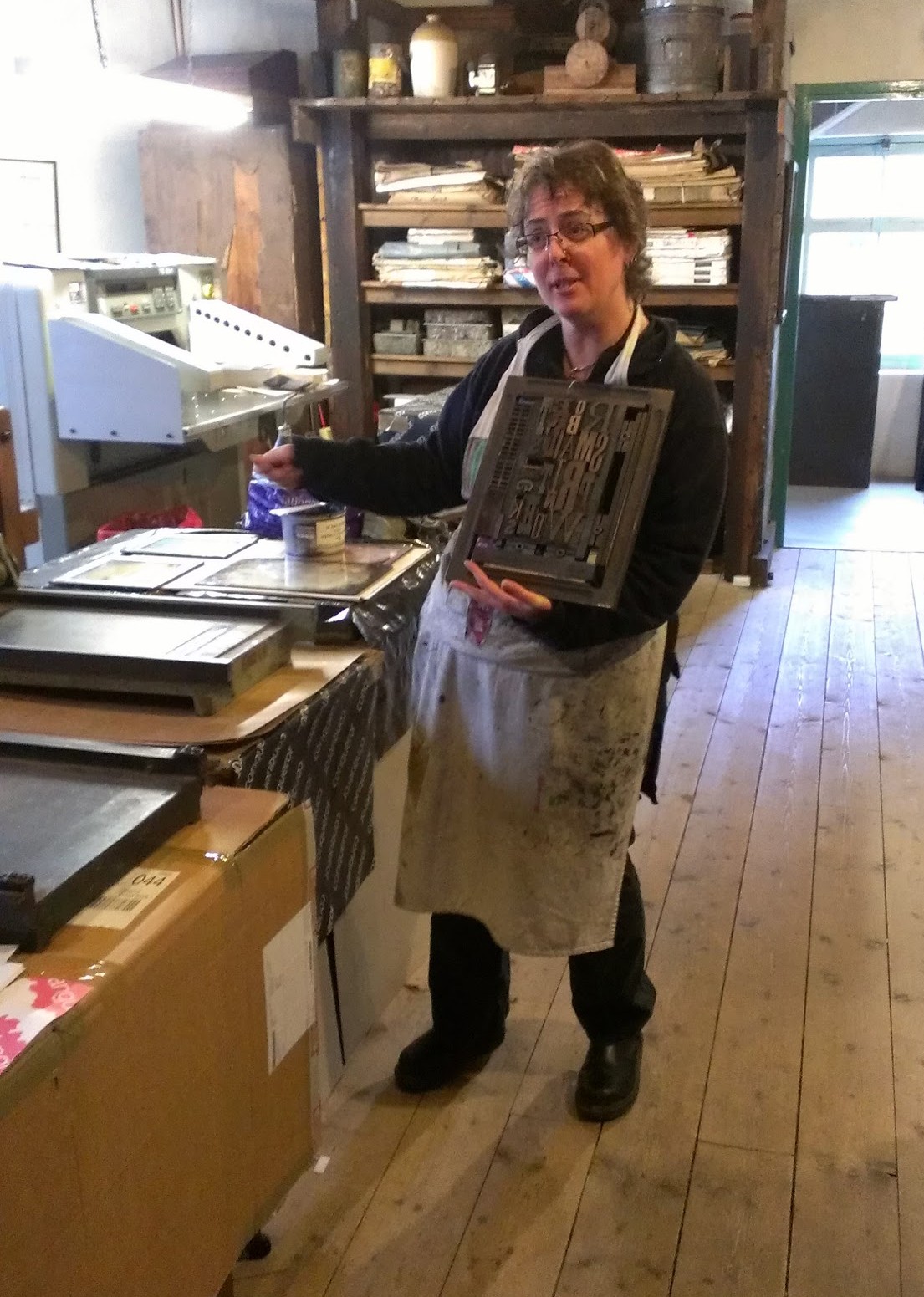
So, just before 10am on a damp but clear Saturday morning, I stepped off the bus on Innerleithen’s high street and walked the few hundred metres to the Victorian shop front of R. Smail & Sons Printing Works. Gen Harrison, property manager, and Rachel Mays, senior assistant, greeted the handful of us who had managed to snag places on the second of the two workshops run each year. We were shepherded from the neat, quaint shop to the separate, two-storey workshop building behind, given aprons and warned to keep our hands out of whirring machinery.
Gen Harrison, property manager at Smail’s, holds up a forme of wooden type.
The workshop is a warmly inviting, thoroughly lived-in piece of Victorian architecture. It is poised over a manmade canal, with the small water wheel that powered the works’ presses in their heyday visible through the windows at one gable end. The ground floor was taken up with a variety of hand and powered presses, with cabinets of type and shelves laden with reams of paper crowding the walls. To get us over the inevitable what-do-I-print-and-how-do-I-print-it hump, Gen led us through the basics of printing with the large, wooden type once used to set posters and other display items, and encouraged us to start by printing our own names.
The process is as easy to describe as it is difficult to get right. First, the wooden blocks of type are placed face up on the bed of the press, then the viscous, sticky ink is rolled out and applied to the faces of the letters with a small hand roller. Next, the paper is laid flat over the letters and the press’s cylindrical platen is rolled over and back across the paper. Carefully peel off the paper et voilà: you have a squint, patchy reproduction of your name in a style beloved of the makers of distressed denim clothing. Gen and Rachel helped us through the various tricks to getting things right: even application of ink, the use of magnets and wooden guides (or “furniture”) to keep the type square on the bed of the press, and judicious use of scrap paper placed under the type to level out the uneven surfaces of the letters.
My first attempt at letterpress printing: underwhelming in a fashionable way, I think.
Rather than perfect my wooden type technique, though, I had a different goal in mind. I explained to Gen what I wanted to do and was shown upstairs to the second storey of the workshop. The second floor was again packed with presses and cabinets of type; this time, though, the angled cases set out at eye and waist height held the minuscule lead type used to set books.
The process of setting lead type is a little more involved than for wooden type. First, a ‘composing stick’, or ‘setting stick’, resembling a brass ruler or caliper, is set to the desired line width. Individual sorts — lead blocks carrying embossed letters — are placed upside down and left to right along the composing stick’s ledge until the line is full, or nearly full; any play is eliminated by distributing progressively thinner spaces between the words. Next, if the printed lines are to be separated by some white space, a thin lead strip is placed along the top (or bottom, depending on your point of view) of the finished line, and a new line begun. Once the stick is full, the letters are carefully slid off into a metal ‘chase’, or frame; empty space around the text is filled with furniture and everything is held in place by means of expandable spacers called ‘quoins’. The finished article — furniture, quoins and type bound into a chase — is called the ‘forme’. (Inevitably, your first completed forme will shed letters and spaces willy-nilly onto the workbench as soon as you lift it up. There is an art to spacing lines so that they do not do this.)
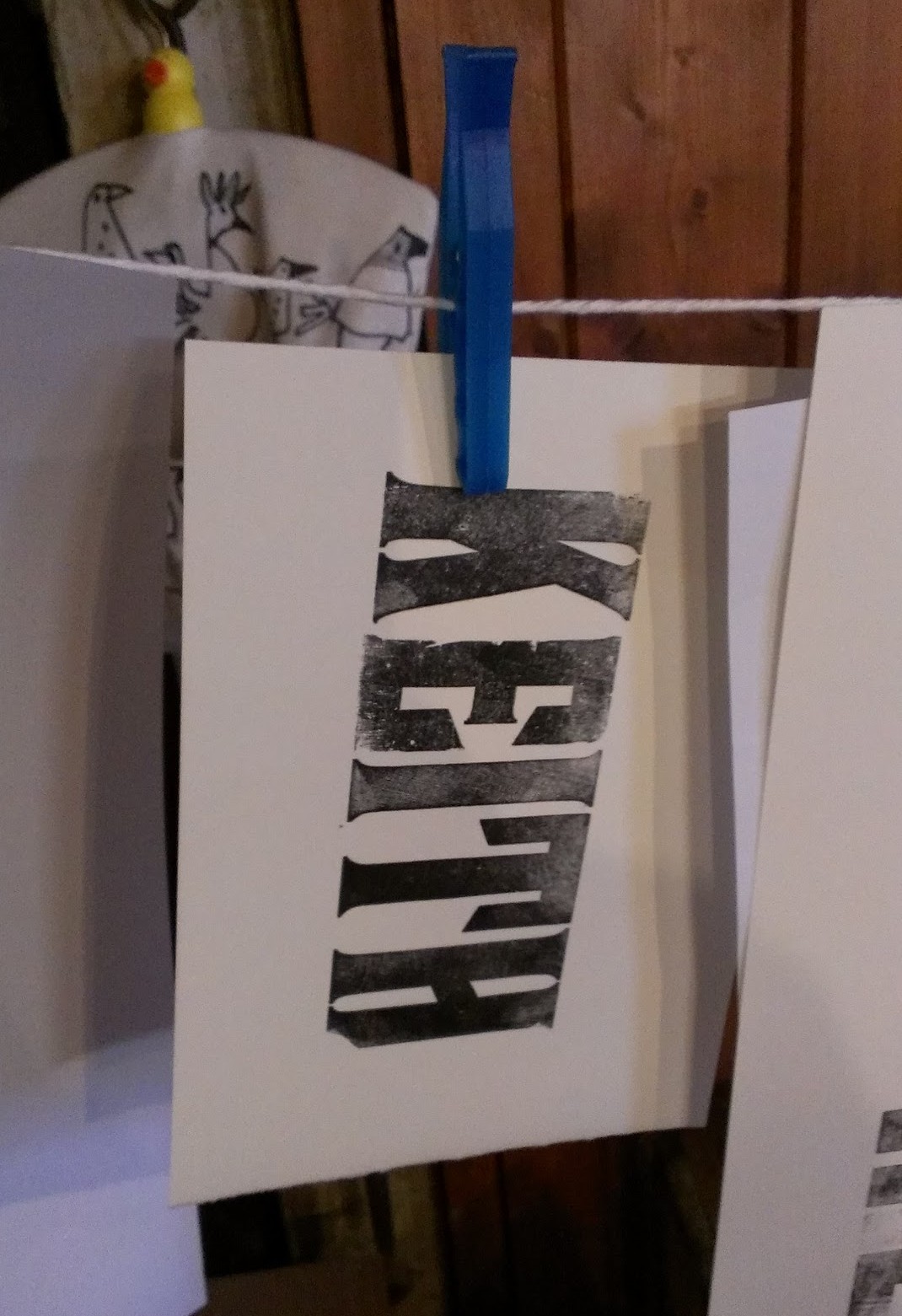
A composing stick filled with the first two lines of my printing project. Can you tell what it is yet?
Unlike the large roller presses downstairs, this time round I would be using a dainty “Adana”, the quintessential hobbyist printing press, and a British institution from its introduction in the 1920s until the last new example was sold in the ’90s. The Adana is an ingenious device: a single lever drives a pair of rollers across the surface of the type and up over the circular inking plate to receive a fresh coat of ink; after the rollers have passed, the platen bearing the paper is pressed against the type. As the lever is released, the platen is withdrawn from the type and the rollers return to rest at the bottom of the machine. (It’s difficult to describe; this video shows a similar Kelsey press in action.)
My plan called for four or five formes in total, and two separate impressions for each printed piece, each with a different colour of ink. With Gen having demonstrated the subtleties involved in aligning, or ‘registering’, the successive formes required to print each piece, I set to work. The printing itself went remarkably smoothly — so smoothly, in fact, that I almost immediately felt the siren call to purchase a used Adana — though cleaning the stubbornly adhesive ink off the rollers and inking plate was enough to bring me back down to earth. Distributing type back into the correct boxes at the end of the day was another shock to the system, and I suddenly understood at an instinctive level why Ottmar Mergenthaler and Tolbert Lanston had sunk so much of their time and money into their respective automated typesetting devices. A lifetime of distributing used type must have driven even the most patient of hand compositors a little mad.
The finished article. I also printed examples bearing @-symbols, pilcrows and manicules.
In the end, my 6-hour day resulted in a stack of perhaps fifty two-colour business cards. It seems paltry to type that, but I can’t express how satisfying the process was; Eric Gill may have been a monstrous character in his private life, but his public endorsement of skilled manual work was spot on. Gen and Rachel’s enthusiasm for their job was infectious, and by the end of the day I was thoroughly pleased with my small achievement. If you’ve ever been the slightest bit curious about printing or typopgraphy, you owe it to yourself to give it a try, and Smail’s is the perfect place to start.
Responsibility for all photographs (however inexpert) is mine. See more at my Google+ profile. Neither the NTS nor Smail’s induced me to write this in any way; I enjoyed myself so much that I thought it worth spreading the word. Do get in touch with them if you fancy trying letterpress printing!
The interrobang is in the ascendant this week. Richard Polt, a professor of philosophy at Xavier University, Ohio, is also a vintage typewriter buff who has helped me a number of times with regard to keyboards, typewriter models and such like. Back in 2011, Richard contributed this great image of a piano-like, 1889 Hammond to my article on The @-symbol, part 2 of 2; now, though, he has outdone himself handsomely with an amazing find. Witness the interrobang in print on the cover of Agent, Action, and Reason (1971) edited by Robert William Binkley et al.1
The cover of Agent, Action, and Reason, (1971) edited by Binkley et al.
According to Roger Trigg’s contemporary review in The Philosophical Quarterly2 the book is “a well-produced volume [providing] a worthy addition to the work published in the field”, though Trigg inexplicably fails to mentions the elephant in the room — that is to say, the interrobang on the cover. This piece of punctuational history can be yours at AbeBooks for the very reasonable sum of £0.62 plus postage and packing; my copy is already en route, and perhaps the colophon will help identify its avant-garde cover designer.
Many thanks to Richard for alerting me to this!
Still on the subject of the interrobang, recently I came across some references to an event called “Interrobang” — seemingly a literary festival of some sort — taking place in London next month. Alexander Mee of Ithaka, the London theatre company staging the event, told me more via email:
Interrobang was initially conceived as a simple fundraising event, for a production of the Odyssey that we’re developing at the moment. The money raised from ticket sales will go towards funding that production. It grew into [a] mini arts festival as we began booking events and acts and is now a celebration of words.
We’ll be hosting a workshop by we make books, a zine (smallpress magazines) fair, storytelling, poetry, some speech audio listening stations and some talks. There will also be live music throughout the day.
On the subject of their striking choice of name, Alexander explained that:
We were talking about grammar and [co-producer] Nick lamented that the interrobang had fallen out of use. I liked the word, it’s such good fun to say, and we spent a good 5 minutes repeating it. Then it stuck. Hopefully Interrobang is such a success that the interrobang will have the renaissance it deserves.
So there you have it. The Interrobang festival will be taking place at the Betsey Trotwood in Clerkenwell, London, on November 17th. Who knows; If I can find the money and the time I may well try to make it along there myself.
In other news, Ben Yagoda strikes again in the New York Times’Opinionator blog, writing about that horizontal indicator of pause and elision, the “Mad Dash”. His article is a nice primer on this most Euclidean of marks of punctuation, and, dare I say it, touches upon some of the same topics as will the forthcoming Shady Characters book.
Over at The New Yorker,Hannah Goldfield writes about ‘emoji’, the pictographic descendants of the primitive emoticon. This is a world of riches no longer constrained by the typewriter keyboard, and as Goldfield explains,
The Emoji vocabulary includes but is not limited to: a cluster of musical notes; a fire; a thumbs up; a thumbs down; a hand giving the peace sign; a pair of blonde chorus-line dancers in matching hairbows and leotards; a woman getting a haircut; a baby; an old lady with a gray bun; a blonde princess; a skull; a lipstick kiss; an ear; a nose; a mouth; a wild boar; a koala bear; a snowman; a race horse; a ram; a bouquet of tulips; a dolphin; a cactus; an octopus [and many more.]
Confronted with an SMS ridden with emoji, I can’t help but think that some of the emoticon’s staunchest critics would suddenly be very happy to compromise on the simple pairing of a colon and closing parenthesis :)
1.
, Robert W Binkley, Richard N Bronaugh, and Ausonio Marras. “Agent, Action, and Reason”. In. University of Toronto Press, 1971.
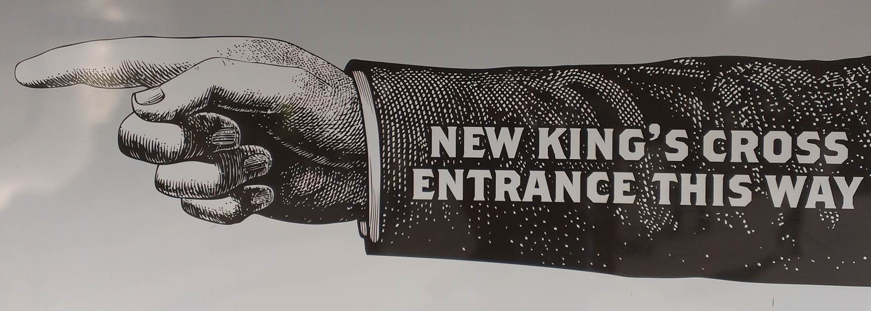
A retro-appearing manicule points the way to the new entrance to Kings Cross station. (Photo by author.)
I visited London this weekend, continuing my niche campaign to explore the world of computer-to-Monotype interfaces. (If none of this makes any sense, take a look at my earlier post about the last working Monotype caster in Scotland.) Having seen Harry McIntosh’s system first-hand in Edinburgh, this time round I prevailed upon Phil Abel and Nick Gill of London’s Hand & Eye Letterpress to show me the system installed at their own workshop, of which much more in a future post.
On the way to catch the train home, I came across the billboard-sized manicule shown above, pointing the way to the new entrance at King’s Cross; this centuries-old mark is clearly in rude health. Not only that, but this larger than-life example takes a very clear (and quite correct) stand with regards to the King(’)s Cross apostrophe controversy: for now at least, the possessive apostrophe is in the ascendant.
Now, though, on with the show ☞
Unusual marks of punctuation got some much-needed PR a couple of weeks ago, courtesy of Adrienne Crezo of Mental Floss magazine. The contents of Adrienne’s list of “13 Little-Known Punctuation Marks We Should Be Using” will be not unfamiliar to readers of Shady Characters — the interrobang, SarcMark, irony mark all get mentions — but nonetheless, a number of other sites have picked it up and run with it, including The Week and Neatorama. Is a renaissance in the offing for unusual punctuation?
Having looked into the life and times of the humble ‘@’ key in fairly comprehensive detail, I enjoyed the New York Times’ short history of the ESC, or ‘escape’, key. It may not have the epic sweep of the @-symbol’s journey from Renaissance Spain to the birth of the Internet, but the ESC is surely as prevalent, if not used quite so regularly, as ‘@’. No sooner did I wonder if anyone has attempted a history of vestigial and endangered computer keys than I found a 2003 article at the Straight Dope taking a game stab at such a thing.
As eagle-eyed readers of the @shadychars Twitter feed will have noticed, September 24th was National Punctuation Day. Billed as the “holiday that reminds America that a semicolon is not a surgical procedure”, this year’s event was accompanied by a competition, run by the New Yorker’s Questioningly blog, to design a new mark of punctuation by combining two existing marks. The competition is now closed, and though I won’t spoil the winner for you, I will say that I particularly appreciated @Majo_P’s “commarisk” (,*), used to connect a logically unsound conclusion to a premise, and Andrew Nahem’s “meh” mark (¥<), used to indicate a lack of enthusiasm for something. See more entries and the eventual winner here!
Oddly enough, of all the marks that have featured on Shady Characters, the only one that I can remember which fits the New Yorker’s bill is Choz Cunningham’s bipartite irony mark, or “snark” (.~). Do you double up any marks in this way?
I was intrigued (though admittedly not surprised) to read that Ernest Hemingway’s The Old Man and the Sea has been quantitatively determined to contain only a single exclamation mark:
‘Now!’ he said aloud and struck hard with both hands, gained a yard of line and then struck again and again, swinging with each arm alternately on the cord with all the strength of his arms and the pivoted weight of his body.1
This insight comes from Jeff Umbro of Quartz where, in another article penned in honour of National Punctuation Day, he investigates the relative frequency of exclamation points as employed in a number of major works. Hemingway’s Old Man is least exclamatory, fanfic-sensation-made-good Fifty Shades of Grey manages 299, while Zadie Smith’s 2006 novel On Beauty surely approaches a 1:1 ratio of exclamation marks to page count with no fewer than 439.
Having just turned to Microsoft Word to check, I can now reveal that the Shady Characters manuscript contains exactly 41 exclamation marks. It should be arriving back from its initial edit any day now — I will report back with updated statistics as soon as it does so. I’m sure you’ll be on tenterhooks!
And, last but not least, the interrobang still continues to make waves at the grand old age of 50, selected as Merriam-Webster’s Word of the Day for September 26th.
1.
Hemingway, Ernest, and Herman Finkelstein Collection Library of Congress. The Old Man and the Sea. Scribner, 1952.


