Miscellany № 15

A short entry today, but, I hope, a good one.

In the run-up to handing in the Shady Characters manuscript, I went through my notes one last time to check that I hadn’t missed anything. In doing so I came across a cryptic note about some of Richard Isbell’s original drawings for his font Americana, commissioned and sold by American Type Founders in honour of the USA’s impending bicentennial. I duly clicked on the accompanying link and was rewarded by an amazing set of Isbell’s drawings for the extra bold weight of this first interrobang-bearing font.

The ship has sailed on including the image in the book, unfortunately, but its loss is our gain: from the collection of Fritz Klinke of NA Graphics, Silverton, Colorado,1 here is the last of the interrobangs drawn by the man who first shepherded them into print:

Designed for Richard Isbell's Americana
Designs for the extra bold weight of Richard Isbell’s Americana. (Image courtesy of Fritz Klinke on Flickr.)

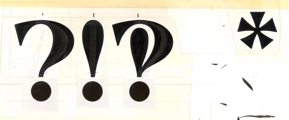
Fritz acquired the image (and others like it, which you can see at his Flickr set of Isbell’s work) through his company, which in turn had purchased them at ATF’s 1993 bankruptcy auction.2 The fabric of the drawings themselves afford a glimpse into the pre-PC world of graphic design; as Fritz describes alongside the image:

Isbell used [photo]stats of the Bold version and cut them apart, expanding each character to the extra bold size and infilled the space with black India ink. Each character was then touched up with white and India Black where needed.3

And, via email:

All the marks on the scan are where Isbell was working the ink in his pen and similar marks occur on most of his other work. This artwork was shot on a camera and then an engraving pattern was made from the negative for use on the [pantographic] Benton engraving machine to produce a matrix for casting metal type.2

Americana Extra Bold was not only the final variant of that particular typeface, but also the the last hot metal typeface released by the once-mighty ATF. Given the rush from hot metal to the “cold type” of optical typesetting devices, the interrobang you see above may well have been the last ever to have been cut and cast in metal. You can read more about Isbell, Americana and the ATF’s slow demise elsewhere on Shady Characters.

My thanks go to Fritz Klinke for his permission to reproduce this fantastic image!


Coinciding neatly with the reappearance of the sci-fi drama Doctor Who on UK television screens, one-time Who script editor and novelist Andrew Cartmel recently wrote a short blog post bidding “Farewell My Lovely… Pilcrow”. Having used the pilcrow extensively in the past, Andrew confronts the difficulties in using the mark in its traditional role as a paragraph divider, concluding that “since I did a big publicity push for my new novel […] the last thing I wanted was a less-readable blog”.4 Do you agree? Is the pilcrow beyond saving as a common-or-garden mark of punctuation?

1.
Klinke, Fritz. “Fritz Klinke”. Briar Press, November 2004.


2.
Klinke, Fritz. “Personal Correspondence”. Keith Houston, 2012.


3.


4.


Miscellany № 14

The manuscript is delivered, ladies and gentlemen. Barring any drama when the W.W. Norton staff return from Labor Day weekend, another milestone in the production of Shady Characters has been reached. To the many people I’ve hounded in the past month about images, quotes or other details, please accept my apologies and my thanks. Also, thanks must go to you, the Shady Characters readership, for your patience. Sorry for the radio silence!


Ben Yagoda, English teacher at the University of Delaware and instigator of the recent “logical punctuation” brouhaha, seems to be making a career as a punctuational agent provocateur. Turning his attention to the “Weimar-level exclamation inflation” particular to online communication, his latest missive for the New York Times makes passing reference to the interrobang and concludes that “QECs”, or “question-exclamation combos” (?! and !?), are now making their presence felt in print. Have any Shady Characters readers come across these devolved interrobangs in print?


Jen Doll of the Atlantic Wire has documented the “Imagined Lives of Punctuation Marks”* in a series of hilarious biographical sketches. Though the octothorpe and @-symbol do not warrant individual treatment, Doll does grant their street gang to a brief bio:

The Symbol for an Obscenity. !@#$!@$#!@ will tell you off just as soon as to look at you, but he’s fun to have around at parties and when truckers are giving you the finger on the highway, as well as on the off-chance you get your pinky caught in a door. Never met a bar brawl he didn’t like. Borderline sociopath, this @!*%$?-er owns a chihuahua.

The octothorpe does get a mention over at c|net, where Eric Mack laments the apparent fashion for prefixing a spoken exclamation with the word “hashtag” — for instance, “hashtag are you kidding me?”. I have never encountered this in person (I’m fairly sure my eyes will start out of their sockets if I ever have that privilege), but Mack evidently has done and implores his readers to use “pound” instead. Commenter md611, however, hits upon the correct solution to the problem, suggesting that:

[W]e could start saying “octothorpe”. That would be much easier to say and gesture.

I couldn’t agree more.

*
While reading Doll’s piece I came across a link to an article in Smithsonian magazine discussing the “The Accidental History of the @ Symbol”. Am I the only one to feel a little déjà vu when reading the latter article? 

Miscellany № 13

After the New York Times’ article “Semicolons: a love story” mentioned here last time, Mary Norris of the New Yorker has weighed in with a rather more measured piece entitled “Semicolons; So Tricky”. Where do Shady Characters’ readers sit on this mark, I wonder? Is use of the semicolon a matter of taste or an essential part of writing?


Also mentioned here recently was Conrad Altmann’s site Glyphaday. Conrad has recently moved his focus from individual characters to the glyph-by-glyph creation of the entire alphabet. It’s a great opportunity to see a new typeface being crafted piece by piece, and there are still some tidbits (such as this assertive asterisk) to be had for punctuation-philes.


The long s, or ‘ſ’, isn’t exactly a mark of punctuation, though I think it still more than qualifies as a Shady Character. It will be making a guest appearance in the book, but until then Andrew West’s exhaustive article “The Long and the Short of the Letter S” is well worth a look. That’s all for now; the 1st September deadline for handing in the Shady Characters manuscript is looming ever larger, so I have to cut things a little short. Wish me luck!

Miscellany № 12

Emoticons are, it turns out, rather older than I had thought. Last month the photo blog Retronaut posted images of an 1881 issue of Puck magazine depicting proto-smileys constructed from parentheses, stops and other typographic marks, just like their modern counterparts.

Emoticons in Puck magazine, 1881
Emoticons in Puck magazine, 1881, as mentioned by Retronaut. (Public domain image courtesy of Wikimedia Commons.)

I find “Melancholy” to be almost ineffably sad, though the perky can-do attitude of “Joy” acts as a fortunate counterweight. Perhaps the Victorians were not quite as dour as we imagine them to be.


Kurt Vonnegut may have famously derided semicolons as “transvestite hermaphrodites, standing for absolutely nothing”, but the much-maligned mark recently received a veritable love letter from Ben Dolnick, writing in the New York Times. Rather than attempt to summarise Ben’s article, I prefer to quote a single line from it that to me explains precisely why the semicolon is an absolute necessity:

No other piece of punctuation so compactly captures the way in which our thoughts are both liquid and solid, wave and particle.

For a lapsed physicist like myself, and in the wake of the likely discovery of the Higgs boson at CERN, this seems most appropriate. The semicolon is a fundamental particle of punctuation: its origins lie in Aristophanes’ ancient points just as surely as do those of the colon, full stop or exclamation mark, and, like Ben, I can only hope that the semicolon will continue to soldier on beside them.


Lastly, I’ve only just discovered an excellent, ongoing series of posters created by Joe Stone at Glyph, a UK-based design studio. Joe has tackled the octothorpe, interrobang, infinity symbol (∞) and more, and I hope that he keeps up the good work.

Miscellany № 11

Conrad Altmann, proprietor of Altmannhaus Creative, has been reinterpreting the visual forms of some familiar shady characters. My interest was piqued by his recently-posted @-symbol (shown below); where the usual typographic approach is to start with the “single storey” ‘a’ commonly found in italic typefaces, Conrad has instead used the “double storey” ‘a’ more usually associated with roman script. I like it!

Conrad Altmann's double-storey @-symbol
Conrad Altmann’s double-storey @-symbol. (Image courtesy of Conrad Altmann at Altmann Creative.)

Conrad has also produced a swirling, knot-like octothorpe that echoes the heraldic St. John’s Arms (⌘), and an elegant, minimal pilcrow. More characters are on the way at Conrad’s Glyphaday blog, and I’ll be watching it with interest.


If the opinion of the US justice system has anything to do with it, the interrobang may have received its most convincing stamp of approval so far. A couple of weeks ago, Eugene Volokh of the law blog The Volokh Conspiracy broke the unusual news that an interrobang had been sighted in a document issued by the Court of Appeals for the Seventh Circuit. The first paragraph on page eight of the court’s opinion on Robert F. Booth Trust v. Crowley apparently contains an interrobang, but as luck would have it the court’s website is currently down for maintenance. I remain on tenterhooks., and reader porges has dug up a copy of the offending document. Here, then, for your consideration, is the 7th Circuit court’s interrobang in context:

Plaintiffs say that investors still can gain from this suit, because removing interlocking directors from the board will eliminate any chance that the United States will file a §8 suit to remove them. We don’t get it. In order to avoid a risk of antitrust litigation, the company should be put through the litigation wringer (this suit) with certainty‽

Well, it’s a start. Thanks to porges for his detective work!


And lastly, because I enjoyed researching and writing it so much, I can’t resist a little self-promotion by linking to my article on the oldest working Monotype caster in Scotland.