It’s December, and that means it’s time for the second annual Shady Characters gift guide! In no particular order, here are a few gifts to consider for the punctation-phile or language buff in your life.

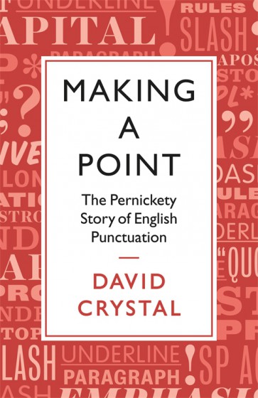
Last year I focused on mainly non-literary gifts; this year, happily, has seen the publication of a number of new books on punctuation. Here’s the first: David Crystal’s Making a Point: The Pernickety Story of English Punctuation is a combined history and usage guide that explores punctuation in English from medieval monasteries to the internet. I reviewed it for the Wall Street Journal and had a great time in doing so — the first part in particular, in which Crystal takes the reader on a breakneck journey through the history of English punctuation, is a joy to read. More serious than Shady Characters and less judgmental than Eats, Shoots, and Leaves, it’d make a great gift for writers, readers, and teachers.
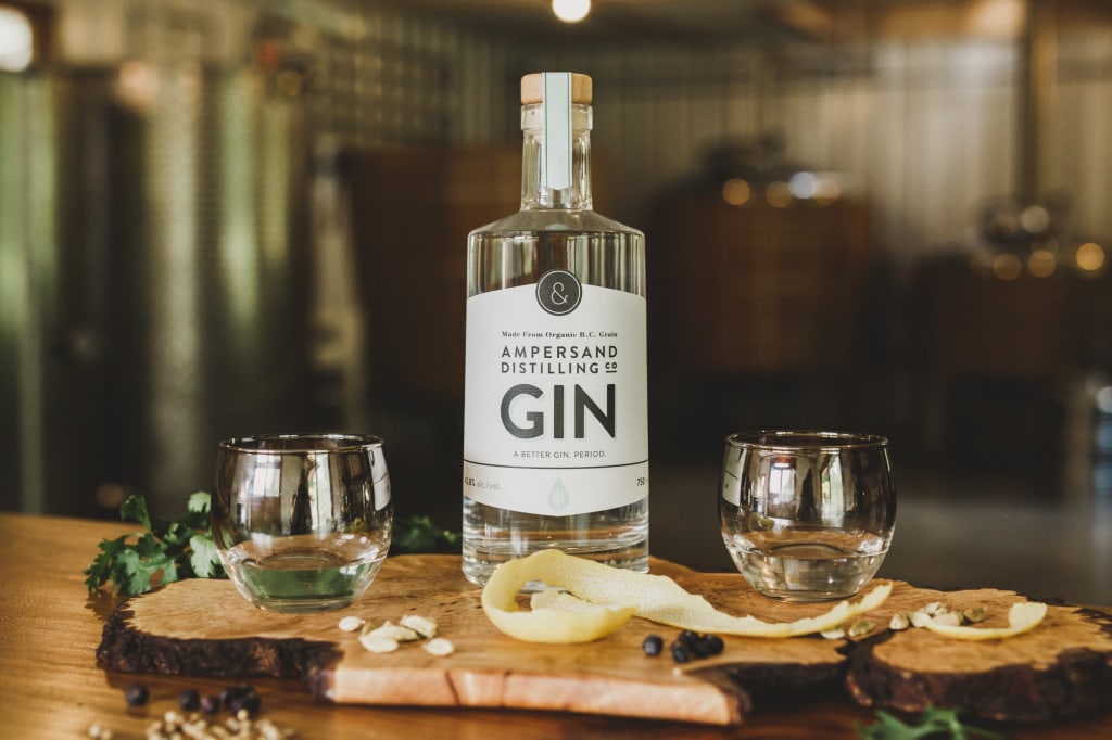
Recently, I came across an article at CBC.ca about an “Ampersand Distilling Company” on Vancouver Island, British Columbia. Punctuation and booze, and in the Pacific Northwest, no less? I was intrigued.

Ampersand, it turns out, is a family business run by Stephen and Jeremy Schacht, along with Jessica McLeod, which makes gin and vodka from organic ingredients harvested on the Schacht’s five-acre farm. Jessica told me more about their choice of name and emblem:
We chose the ampersand as our name and symbol because I have read that names joined with an ampersand signify a closer collaboration.* As a family business that seemed very appropriate. It’s also about bringing things together – science & art, innovation & tradition, ingredients & techniques. Also, gin being our flagship offering, we thought it worked since gin is very much and ‘&’ spirit. Gin & tonic, gin & vermouth — even just the idea of botanicals & the spirit.
The company’s latest product is called Per Se Vodka — named, of course, for the origins of the ampersand’s name in the expression “and, per se, and”. A distiller after my own heart. Ampersand’s spirits are currently available only in British Columbia, but if you’d like to learn more you can stop by the Ampersand Distilling website. A great gift for drinkers and thinkers — if you’re lucky enough to live in BC, that is.
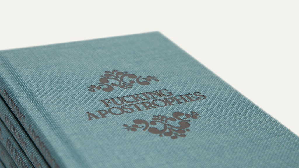
On to the next book, and it is one that comes with a Not Safe for Work warning: Fucking Apostrophes – A Guide To Show You Where To Stick Them, written by Simon Griffin, was published recently to some acclaim from The Guardian.

As Simon explains, “I’m a freelance copywriter and based on the insight (slash massive generalisation) that Creative Directors are generally good at swearing and bad at apostrophe usage, this was the result.” And what a lovely result it is!
Here are Simon’s guides to using the apostrophe in plural names:
The same rule [as for possessive apostrophes] applies for family names, which is where many mistakes are made. Where you put the fucking apostrophe depends on how many family members you’re talking about.
Examples:
The Biebers’ behaviour was upsetting = The behaviour of the whole Bieber family was upsetting. (Plural)
Mr Bieber’s behaviour was particularly distressing = The behaviour of Mr Bieber was particularly distressing. (Singular.)
The first print run has already sold out, but Simon tells me that a second run of 400 copies is now available. Get your copy — I mean, a copy for the object of your gifting affections — here while you can.
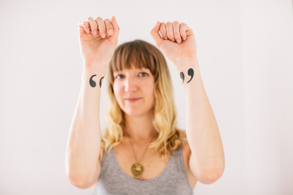
Books, though — all that text is too small, am I right? And not fleshy enough, either. If you feel the same, then temporary tattoo store Tattly.com has you covered with their “Air Quotes” design, as created by Jonny Gotham.

Lastly, after that brief excursion beyond the printed page, it’s back to books. Glyph, written by Adriana Caneva and Shiro Nishimoto of London design studio Off-White, is an easy-to-digest stroll through a whole host of non-alphabetic characters. It’s a slim little thing — each character gets a single page of text accompanied by a page or two of images, and much of the material will be familiar to Shady Characters readers — but it would be perfect as a stocking filler for a budding typophile or lover of punctuation.
Of course, if you aren’t already familiar with the interrobang, ampersand, irony mark et al, I have the perfect solution for you: Shady Characters, the book, is still available in hardback and paperback, or for the e-reader of your choice, from a host of bookshops. Why not buy a copy as a companion to one of the other gifts here?
That’s all from me for 2015 — as ever, thank you all for your comments, emails, tweets and Facebook messages; enjoy the rest of the year, and see you all in 2016!
Comment posted by Bonnie on
I’ve ordered two copies of the Fucking Apostrophes book and signed up for further news from Ampersand. (I already have your book.) I recently signed up with some vintage typewriter blogs. They’re a fun accompaniment to your punctuation blog.
Comment posted by Keith Houston on
Typewriters are quite seductive objects, aren’t they? I’d love to get my hands on an IBM Selectric.
Comment posted by Simon Griffin on
Many thanks Bonnie. Sorry they won’t make it to the US before Christmas, but hopefully worth the wait.
Comment posted by Ralph on
Nice list, Keith. I’m really enjoying Shady Characters. A small typo in your post, though: the Off-White URL should be
http://offwhite.co.uk/rather thanhttp://www.offwhite.co.uk/(the latter throwing an error).Comment posted by Keith Houston on
Hi Ralph — thanks for the comment! It looks like Off-White have some sort of redirection problem with their site.
Comment posted by Ralph on
Huh, that’s strange. It worked when I tried the
wwwversion the first time, but not now. Anyhow, I’ve finished your book, and loved it all the way through. Apart from being a fascinating history, your writing style is delightful, too—full of lovely phrases and wit. Great job. :-)Comment posted by Keith Houston on
That is great to hear — I’m very glad you enjoyed it! Thanks again for the comments.
Comment posted by Korhomme on
David Crystal’s book Making a Point is by far the best book on punctuation (and ‘style’) I have ever read. Crystal starts off with ‘rhetoric’ and ‘grammar’, the two classical features of punctuation, but goes much further. He shows the importance of ‘semantics’ and ‘pragmatism’, features not usually thought of as punctuation. By semantics, he means that meaning is the most important part of punctuation, and that meaning should not be unclear or ambiguous. By pragmatics, he means things such as ‘paragraphs’, ‘sections’, and ‘white space’ whose importance is to clarify exactly what is meant, and to make it easier for the reader to assimilate the message. He shows how punctuation has changed over the centuries so that the style today is ‘light’ rather than ‘heavy’: thus today we prefer an en – dash with a space before and after [sic] rather than an em—dash [sic]. The differing house styles of various publishers are noted; whether, for example, they use the ‘Oxford comma’ – he reckons is almost always better to use one.
Comment posted by Keith Houston on
Hi Korhomme — the idea of punctuating the page (rather than only the text) with paragraphs, section markers, whitespace and so on is a valuable one. At Punctuation in Practice, John Lennard talked about a “scale” of punctuation, starting with punctuation in the conventional sense and moving up to page layout, pages within books, and even books in their entirety “punctuating space”. I’d quibble with that last one, but it’s eye-opening to have to place textual punctuation in the context of a page, chapter, or a book.
Comment posted by Randolph on
Happy New Year to you, Keith! From waaay across the pond near Seattle, Washington. That’s right, the REAL Washington.
Here’s hoping you and yours are blessed this new year with mirth and good health, and may you find many new nuggets in our mutual mine with which you might enlighten us. Slainte!
Comment posted by Keith Houston on
Hi Randolph — happy new year to you too! I’m in Wisconsin this year (rather closer to the other Washington), so it has been a snowy and picturesque Hogmanay for me. Thanks for the note, and see you around at Shady Characters in the coming year!