The first stage of this year’s Tour de France
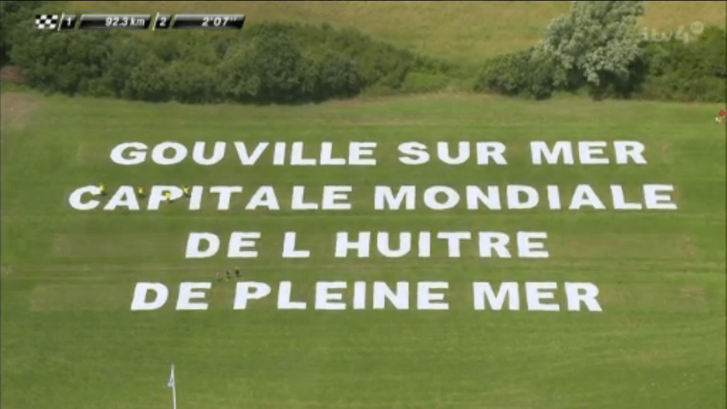
ran from Mont-Saint-Michel to Utah Beach/Sainte-Marie-du-Mont, along the north-west coast of the Manche region, on the second of July. As the riders followed the 188km route, they passed through the little town of Gouville-sur-Mer, which, in the time-honoured tradition of provincial villages that the Tour visits but once every few decades or so, laid out its slogan for the TV helicopter to see: Gouville-sur-Mer, capitale mondiale de l’huître de pleine mer (Gouville-on-sea, world capital of the open sea oyster).
So now you know.
World oyster capital though it may be, Gouville-sur-Mer is not, evidently, the world capital of diacritics: the noble circumflex, which should have reigned proudly over the word huître, was nowhere to be seen. Nor were any other non-alphabetic marks — not the hyphens that should have appeared in Gouville-sur-Mer or the comma that should have come after it, and not the apostrophe that should have punctuated l’huître. And yes, tweets and instant messages may be increasingly doing without their full stops, but I could have handled one appearing here. For shame, Gouville-sur-Mer! I salute your oyster credentials but I deplore your aerial typography.
In other news, reader Hillel Smith dropped me a line to follow up on the discussion here, a couple of months back, on Winston Churchill’s unusual approach to punctuating the notes for his speeches. Hillel wrote to tell me about a similar approach taken by President Lyndon Johnson on the occasion of the signing ceremony of the Civil Rights Act on the 2nd of July, 1964 — or at least a similar approach taken by whoever had prepared Johnson’s teleprompter notes. The image below is the first part of the text that appeared to Johnson that day on the teleprompter:

You can click through to see more of the speech at the Library of Congress’s exhibit on the Civil Rights Act — and you most definitely should, because what this image doesn’t show is the nuanced approach to ellipses that prevails throughout. In Johnson’s speech, one dot is used to mean a full stop, two dots a short pause, three a longer pause, and so on. Where Churchill used indentation, Lyndon B. Johnson used ellipses of varying lengths; clearly, politicians are not averse to bending punctuation to their own purposes, and I wonder what other novel uses of punctuation might be lurking out there in the great speeches of the world.
Back in January this year, Michał Żadkowski pointed me in the direction of a Daily Mirror article on what the paper called the “Semicolon Project”. As Nicola Oakley writes:
You might have seen people on social media posting pictures of semicolons drawn or tattooed on their wrists or elsewhere on their bodies. […] Non-profit mental health organisation, The Semicolon Project, is encouraging anyone who has been through depression, anxiety, or had suicidal thoughts, to draw a semicolon on their wrist. While some have settled for a temporary ‘tat’ drawn on in biro, others have committed by getting inked.
I’m ashamed to say it took me some time to investigate further and even longer to post the results here today, but I’m glad that I did. I got in touch with Amy Bluel, the founder of what is more properly called Project Semicolon, to ask her about the semicolon and what it symbolized. She told me:
I chose the semicolon for our symbol because a semicolon is used when an author could’ve ended a sentence but chose not to. A semicolon symbolizes a pause or continuance. We are saying you are the author and the sentence is your life. You are choosing to continue.
It’s a noble aim. I’m glad that Michał brought it to my attention and that Amy was able to answer my questions, so thank you both! You can learn more at the Project Semicolon website or, if you need help with or would like more information about a mental health issue, please see the NHS’s list of mental health helplines.
Lastly, if punctuation is one of the typographic tools we use to clarify the meaning of the written word, then capital letters are another. Reader Glenn Fleischman wrote to let me know about a pair of articles he published recently on the use of uppercase letters as a signifier of shouting — not, as you might think, a phenomenon specific to the internet, but one with a much longer history. His articles, “CAPITAL CRIMES, PART 1: SHOUT, SHOUT, LET IT ALL OUT” and “CAPITAL CRIMES, Part 2: Usenet has no CHILL”, are well worth a read.
That’s all for now! Thanks for reading, and I hope you enjoy this week’s links.
Comment posted by Bill M on
I guess one could say the British speak English, the Americans speak American, and the French forgot how to punctuate French.
Comment posted by Keith Houston on
Hi Bill — you could indeed! Nicolas has a good explanation of why that might be in his comment below.
Comment posted by John Cowan on
While I’m sure you’re right in general, the word huitre is now written sans circonflexe in the newly proclaimed French orthography. In general, i and u have now lost their circumflexes, since they don’t (except in the most conservative varieties spoken by old people) represent any phonetic distinctions, and rarely if ever any semantic disambiguation either. Of course it will be some time before the reform is fully effective.
Comment posted by Keith Houston on
Hi John — you’re quite right that the circumflex has been officially deposed from ‘î’ and ‘û’. I don’t much like the change, however!
Comment posted by nicolas on
It’s unfortunately very common, even if not correct at all, not to accentuate capital letters in French.
There are various reasons, one being typewriters not having enough keys for that and typists consequently learning to not put diacritics on capitals, another being the traditional cursive writing learned at school not having as I remember it any accentuated capitals (I think they changed it now), and a third being French-set Windows computers with AZERTY keyboards not offering any proper way to input capital letters with accents (in fact, it only allows you to type the symbols screen-printed on your keyboard, like a typewriter).
All of this leads most people not to accentuate capitals, and even to hear, often, that it is a ‘spelling mistake to add accents to them’. As a result, you can’t walk one minute in the street in France without seeing hundreds of missing accents.
Anyway, since the 1990 reform, « huitre » is a perfectly okay spelling :)
Comment posted by Keith Houston on
Hi Nicolas — that’s interesting to hear. I’ve read recently about a push to reform the AZERTY keyboard (here at PRI, for example), so perhaps we’re on the cusp of a change in attitude.
And yes, “huitre” is fine – I just prefer it with its little hat.
Thanks for the comment!
Comment posted by nicolas on
Actually, the AZERTY keyboard is fine — there are better improved layouts to write French of course, like BÉPO, but they are even more different from QWERTY than AZERTY is.
The only real issue is Windows’ implementation. On Linux and Mac OS, the user just have to press
Shift+éto input É, orShift+çto insert a Ç. It’s also easy to write « and » for instance. The only way Windows provides to access them is to remember ‘Alt-codes’, likeAlt+1+2+8to get the Ç. It’s possible to find user-made alternate configurations adapted from the Linux AZERTY layouts, but they aren’t by default and not very commonly installed.Comment posted by Keith Houston on
Yup — the PRI article makes the same point:
It’ll be interesting to see what comes out of all this.
As an aside, I remember being driven to distraction some years ago by a keyboard in a Turkish internet café. Since then, I’ve been careful never to underestimate how aggravating a non-native keyboard layout can be!
Comment posted by Kári Emil Helgason on
Italian, similarly, tends to drop the grave accent in all-caps, but sometimes replaces it with a trailing apostrophe so instead of CAFFÈ they write CAFFE’.
Comment posted by Keith Houston on
Ah! So that’s what the trailing apostrophe is for. I was in Sicily a few months back and I did wonder. Thanks for the comment!
Comment posted by Korhomme on
The teleprompter printout looks a bit like IBM’s Orator typeface, at one time very popular for people giving speeches from a lectern. A large typeface, supposedly, made it easier to read; but being all in capitals it’s legibility was made much more difficult.
Comment posted by Keith Houston on
It is a little similar. Interestingly, and appropriately to Glenn Fleischman’s articles, Orator apparently came with CAPS and small caps only.
Comment posted by Vítor Santos Lindegaard on
ca-
pitale
or
capi-
tale
not
cap-
itale
(you don’t need to publish this)
Comment posted by Keith Houston on
Hi Vítor — thanks for the comment! I’m afraid I’m at the mercy of hypher.js for hyphenation. It does a pretty good job, but I can perhaps look into adding a special case for this.
Comment posted by Korhomme on
If you really want to do your head in with the ‘rules’ of hyphenation, look at German grammar books!
Comment posted by Keith Houston on
I don’t know much German, unfortunately — are hyphenation rules very much more complicated?