Underware, the Dutch/Finnish type foundry comprising Akiem Helmling, Bas Jacobs and Sami Kortemäki, is one that gets special characters. Bas’s ironieteken (), or irony mark, was one of the first characters I wrote about here.* They’ve also done some interesting work towards a “Latin plus” character set — a collection of the more than 450 accented and non-accented characters needed to typeset the hundreds of languages, common and otherwise, that use the roman alphabet. Now, they’ve added what they call a “manicule specimen” to this body of work. This warrants some explanation.
First, the manicule (☞), or pointing hand, is a written or printed mark traditionally placed in the margin to call out some point of interest in a text. Being a creation of some unknown medieval scribe, the manicule is considerably older than the ironieteken but has survived intact into the Unicode era. More than survived, in fact; like the pilcrow (¶), the manicule is one of those archaic marks that type designers just can’t seem to give up, despite its assuredly marginal† utility.

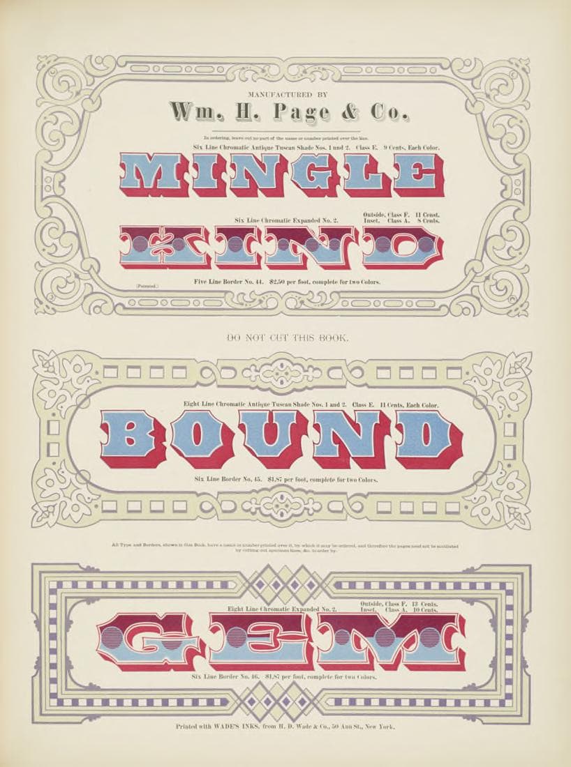
Separately, a type specimen is typically a sheet or two of printed text that show off a typeface in something approaching its expected habitat. The collection of the Science Museum in London, for example, contains an appropriately sober specimen of Monotype’s Times New Roman, an archetypal newspaper typeface. William. H. Page’s 1874 Specimens of chromatic wood type, borders, etc., on the other hand, is a riotous collection of multi-coloured wood types intended for advertisements and other attention-grabbing purposes. The page reproduced here shows that Page knew his audience.
Type specimens are usually arranged around typefaces and letters. Where a specimen contains special characters, they are often corralled into a section of their own‡ and kept apart from the more serious business of letters, by God. The Underware guys have turned this on its head by creating a type specimen that revolves around a single special character — the manicule — and which uses that character as a literal index to their catalogue of typefaces. As they put it,
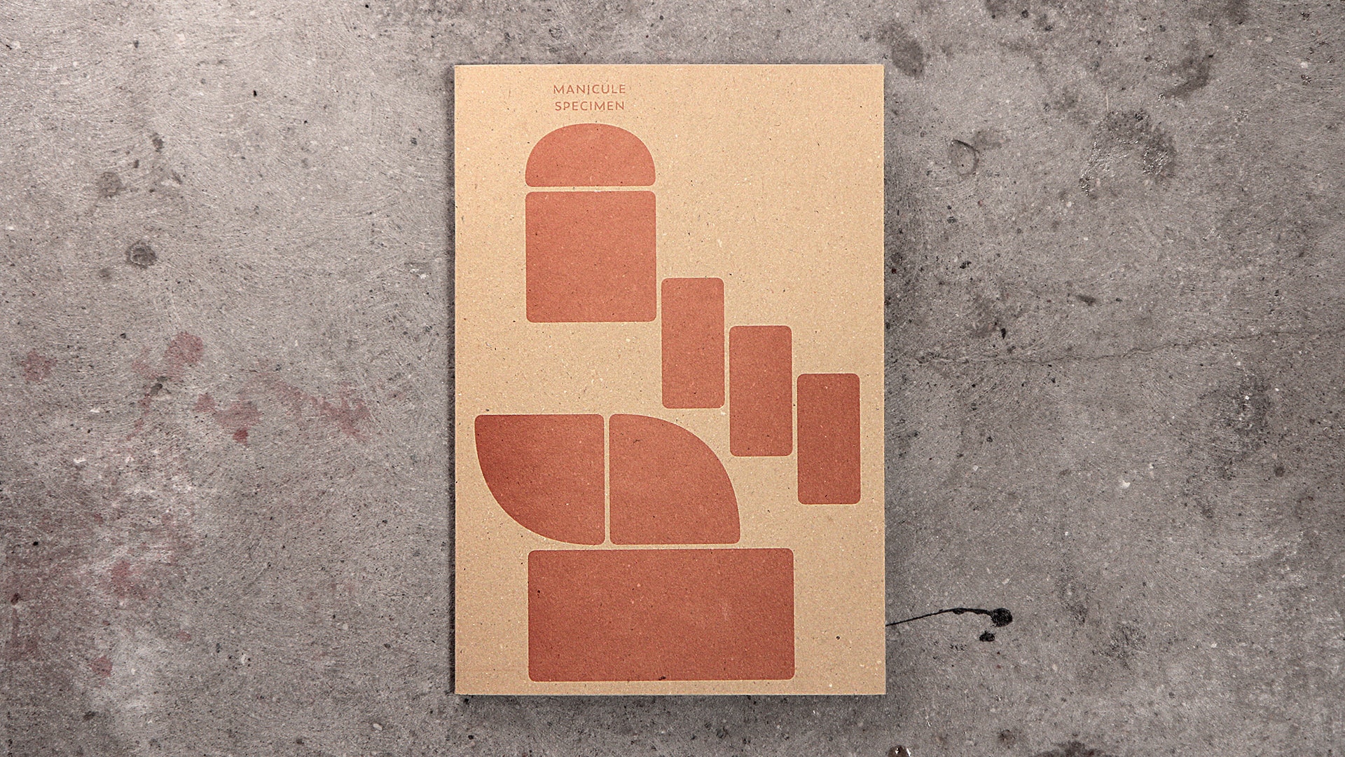
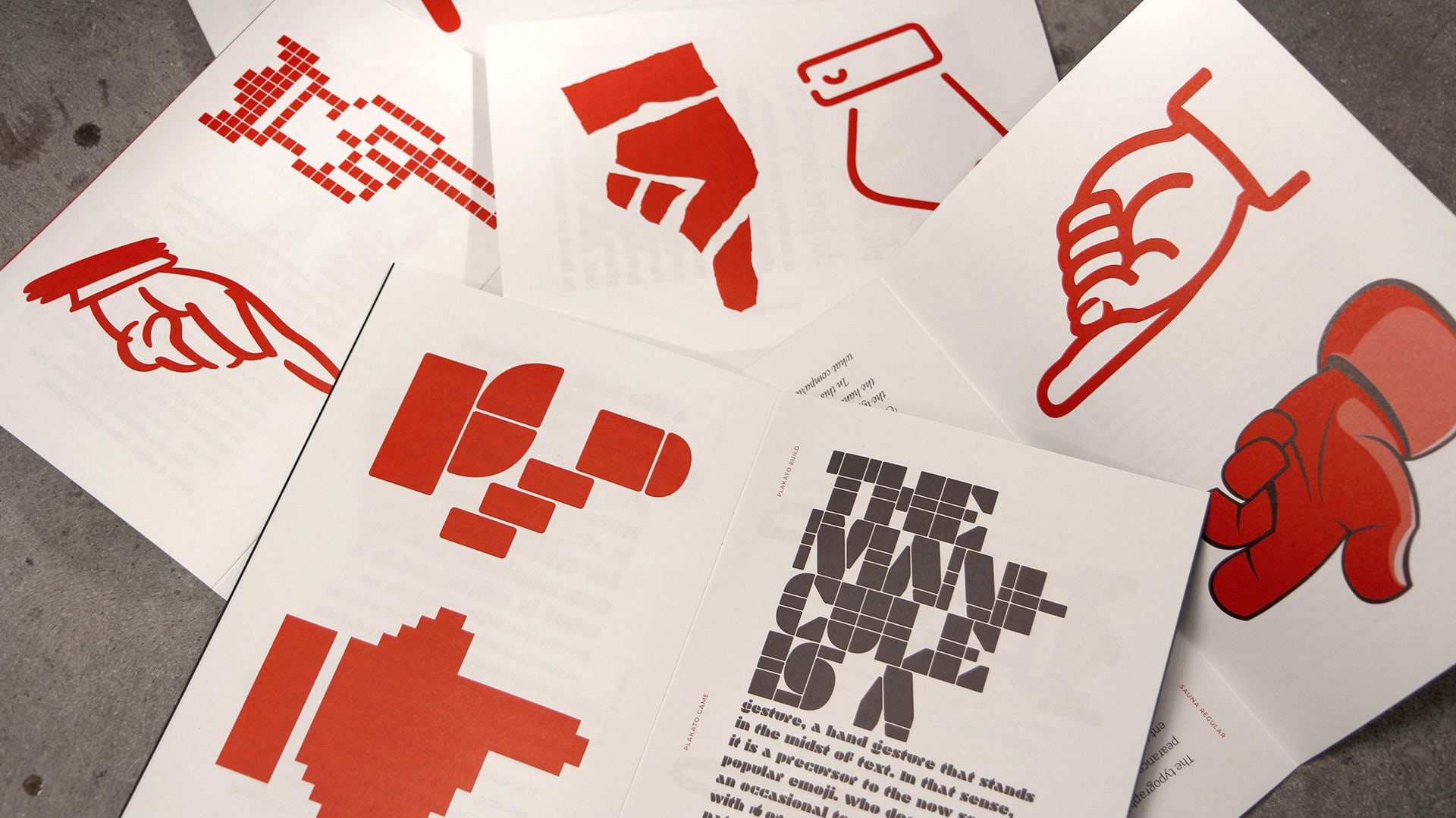
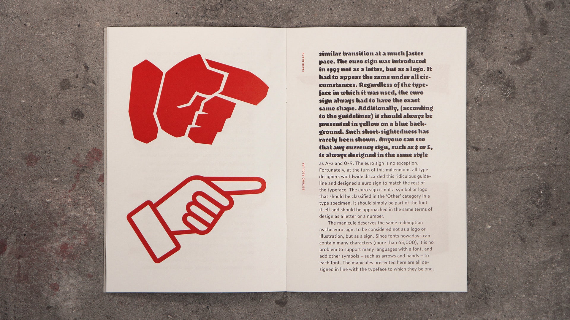
The Manicule specimen is an illustrated essay on the manicule, which briefly tells its transition from the margins of 12th century books up to the vaults of contemporary typefaces, and brings our love for carefully designed manicules in the open. This publication is therefore not a type specimen, but rather a manicule specimen, in which each pointing hand is presented in combination with the typeface to which it belongs.
I was lucky enough to receive a copy bound in a bold, brassy gold cover. You’ll have to take my word on that, since my photography skills are not equal to the task of properly documenting my copy. Happily, however, Underware have uploaded to Flickr some shots of a different version (there are seven different versions, each printed on a different set of leftover stock), and have kindly allowed me to reproduce my pick of the bunch here.


It’s excellent stuff, and a reminder that even as emoji continue to make the headlines, good old-fashioned shady characters are still worthy of our time. Many thanks to Bas Jacobs and the others at Underware for sending over a copy!
In other manicule news (not often I get to type that), Henning Hansen of the Swedish National Heritage Board calls attention to a particularly metal manicule of the fifteenth century, perhaps best represented in type using the “SIGN OF THE HORNS” emoji (🤘). Head over to Henning’s Twitter account for an image and more details.
And elsewhere, I learned that the manicule has given its name to Manicule 2.0, a software tool created by Whitney Trettien for building tours of old books. That in turn led me to Whitney’s new book, Cut/Copy/Paste, which examines how seventeenth and eighteenth century printers in London “remixed” material from other works. Intriguing stuff, and something to go on my to-read list once my own new book is finished.
- *
- Sindre Bremnes and Frode Helland’s Monokrom is another type foundry that gets special characters. It’s thanks to them that I can enter an ironieteken here and see the character itself () rather than a sad Unicode “missing character” symbol (□). ↢
- †
- Ho ho! ↢
- ‡
- William Page did exactly this, as you can see here. ↢
Comment posted by Nancy Gilmartin on
Fascinating as ever and as always! Thank you.
Comment posted by Keith Houston on
Thanks! I’m glad you enjoyed the post.