Remember the interrobang‽ Of course you do! That’s the kind of rhetorical question for which the interrobang is perfectly suited. I’ve been thinking about Martin K. Speckter’s punctuation mark of late for a couple of reasons: first, a Google alert turned up an obituary of a Minnesotan poet named J. Otis Powell‽. I hadn’t known of Powell‽ previously — I’d have loved to have been able to ask him about his surname! — but Minnpost explains his unusual name as follows:
Powell‽ once signed his own name with an exclamation point. Sometime in the 2010s, he changed that to an interrobang, a nonstandard punctuation mark that combines a question mark with an exclamation point. [When] asked about the change, Powell‽ said, “The exclamation point was too didactic. I’m at a point in my life now where even if I’m passionate and committed to something, there’s still that question, because I learn how much I don’t know every time I learn anything.”
Getting an ampersand tattoo is one thing; changing one’s name to include an interrobang is quite another.
Separately, I recently came across the website for a London-based architecture and engineering firm named Interrobang, and, although their name isn’t especially unusual, the way they present their logo very much is — it is an interrobang unlike any other I’ve seen so far.
This prompted me look at the interrobang itself in more detail. Of all the recently invented marks of punctuation, it is arguably the most successful and the most difficult to design. I count at least four separate approaches to its visual design, and, as such, I thought it was time to lay them out and perhaps even to start closing in on a canonical form. And so here we are: please read on for my tentative taxonomy of interrobangs.
Closed interrobang
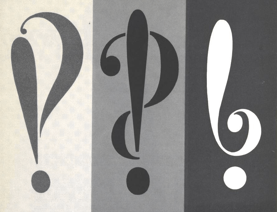
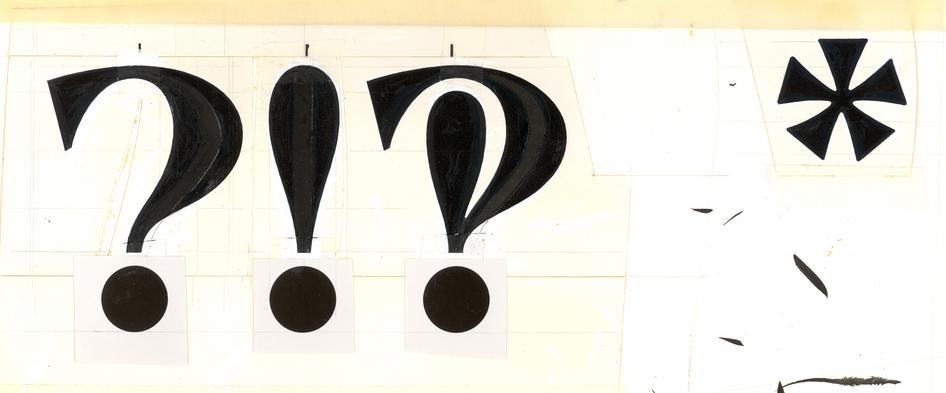
Though Martin K. Speckter invented the interrobang, he did not design it. That was left to Jack Lipton, his agency’s design director. Lipton (and, in fact, a number of other interested parties) furnished Speckter with a series of potential interrobang designs, of which a few were published in Speckter’s type-in-advertising magazine, Type Talks. Here are some of Lipton’s proposals:

The design shown here in the middle was the one that stuck, if in the less sinuous form seen below. Its distinguishing feature is that the ascenders* of its constituent question and exclamation marks overlap to form a closed counter (or, in Lipton’s design, counters plural) and, as such, I’m calling this the “closed” interrobang.

Open interrobang

Next comes the converse: the “open” interrobang. This style also arrived early in the form of the interrobang that accompanied Richard Isbell’s 1966–1967 typeface Americana. The distinguishing characteristic here is that the ascenders of the question and exclamation mark are joined at the bottom but do not form a closed counter, hence the name.
Isbell’s interrobang was echoed in 1968 by Kenneth Wright’s rather more lo-fi design for Remington Rand’s Model 25 electric typewriter and, of course, the interrobang used here at Shady Characters (‽), that of Sindre Bremnes’ Satyr typeface, even if its dual ascenders splay outwards rather than fitting neatly within one another.
Disjoint interrobang

If the closed and open interrobangs have in common a single conjoined stroke, the “disjoint” interrobang diverges by possessing two separate ascenders — as if its constituent question and exclamation marks share a terminal dot but can’t otherwise bear to touch.
I haven’t seen many disjoint interrobangs, but the most distinctive and well-executed are those in Christian Schwartz’s Amplitude and Fritz.
Hybrid interrobang

Lastly, on to the reason for this post! As I mentioned above, I was intrigued by the interrobang used in the logo of Interrobang London. I asked Maria Smith of Interrobang to tell me more, and this is what she said:
We’re architects and engineers working together so we wanted a name that spoke to this cross fertilisation. The interrobang seemed perfect as it combines the expression of architects and exclamation marks, with the interrogating nature of engineers and question marks.
The design was a collaboration between myself and graphic designers Polimekanos.
We wanted to create a new one because while we loved the meaning, we couldn’t find an existing one that really satisfied us in terms of its composition. I suppose we also wanted our very own! The starting point was Didot because that was the heading font for the engineering company we’re a part of: Webb Yates Engineers.
You can see the result here, featuring a single “hybrid” stroke that combines aspects of both the question and exclamation marks. I like it! It’s less dense than the closed variant and, dare I say, less fussy than the disjoint and open varieties.
So: there you have it. What do you think? Is it reasonable to categorise extant typographic interrobangs as open, closed, disjoint or hybrid? Have I missed a category, or are my names in need of some finessing? And, most importantly, which is your favourite? Let me know in the comments!
- *
- Ascender or stem? I’m not sure how to refer to the main stroke in the exclamation and question marks respectively. Answers in the comments, please! ↢
Comment posted by Jason Black on
While I immediately understood your use of “ascender” in this context, I do think “stem” would be slightly more appropriate.
As for which is my favorite, that’s a question of many factors, including: looking like both a ! and a ?; not looking like a P, and the ever-ambiguous quality of being visually pleasing.
On the closed designs, the Arial Unicode does the best at the first two factors. Alas, of the four closed designs shown above, none of them are very visually pleasing. They bear a staid, businesslike quality, which shouldn’t surprise me coming from Microsoft, but which leaves me yearning for the emotional playfulness of the mark itself.
I find the disjoint designs, well, uninspired. Like, “That’s the best you can do? C’mon.”
The hybrid interrobang is an interesting invention, but to me looks too much like a modified ? and doesn’t retain enough of the ! to satisfy.
This leaves the open designs. And there, I find happiness. The interplay of the two marks, with the ? suggestively encircling the !, and the !’s stem just as suggestively invading the ?’s open counter, well! That’s just lovely. Though I don’t care for the extra bold weight, there’s a luscious curviness to Richard Isbell’s Americana design that has the emotional appeal I want in a good interrobang. And even after all these years, I do quite like Kenneth Wright’s original Remington Rand interrobang, which is very well suited for business yet still carries some sass in the flare of its ! stem.
So, it’s the open interrobang for me. Though I have to say that the Satyr interrobang favored by Shady Characters doesn’t do it for me, for exactly the same reason as the hybrids don’t. I would re-classify that one as a hybrid, as the stems are too separate from one another. Indeed, they feel almost at war, undecided about what emotion they’re trying to convey, while the open interrobangs nicely blend the two emotions the original interrobang was meant to convey.
Comment posted by Keith Houston on
Hi Jason — thanks for weighing in! And thanks for correcting me on stem vs. ascender — I may update the post in future to rectify that.
You make some good points. I very much like the “open” Americana and Remington Rand interrobangs too, but it’s the awkwardly small “!” that throws me off if I look at them for too long.
I’d love to see what Sindre Bremnes could do with a hybrid interrobang. Is it greedy to want one of each kind for use here at Shady Characters?
Comment posted by Sander Neijnens on
Although the interrobang is a printed mark, I think it should have a form that can easily be reproduced in handwriting. From that point of view the closed interrobangs of Calibri and Consolas are the best. You can write them as a capital P with a swash and a dot.
Comment posted by Keith Houston on
Hi Sander — that’s a good point. After a few goes, it does seem easiest to produce a convincing closed interrobang, although I still use separate strokes for the “exclamation” and “question” portions of the design.
Comment posted by Kj Davis on
How I adore your FB posts! The interrobang is my favorite mark of all time. It’s daring and illustrative and doesn’t seem as rigid or domineering as a question mark or exclamation point would as a lone mark. My preference is the Consolas version because it’s simple and seems to share the same space equally, where in other version the question mark seems to assert more presence.
As to whether it’s an ascender or a stem, I was always taught to start at the top and descend when printing letters or marks of punctuation. Not to begin from the bottom and ascend. In that regard, descender seems to illustrate that motion perfectly. What are your thoughts?
Comment posted by Keith Houston on
Hi KJ — the Consolas interrobang is certainly a no-nonsense kind of mark, isn’t it?
I take your point about ascender vs. descender, especially when talking about handwriting. I was using it in the typographic sense, where “ascender” is used to refer to strokes that reach up towards the top of the line. There’s a good definition here, at Type Deconstructed. Maybe using “stroke” is a sensible way to split the difference.
Thanks for the comment, and I’m glad you enjoy the blog!
Comment posted by Kj Davis on
You see? I learn so much from your posts! Thank you for the reference to Type Deconstructed. I never knew the actual terms of letter parts but I’m ecstatic about knowing now!
Comment posted by Keith Houston on
Not at all! Glad to be of help.