A visual treat this week!
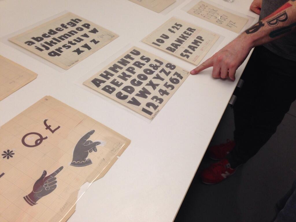
Our header image (above) depicts a pair of manicules as drawn by celebrity pilcrow-user, type designer, and all-round reprehensible human being Mr. Eric Gill. The picture here was taken by Molly Woodward (aka @VernacularType) at a lecture given by Dan Rhatigan of Monotype. There’s little more to say, except look at those manicules! Gill Sans has its idiosyncracies, certainly, but to the casual observer it remains an exercise in geometric forms and yet these expressive manicules are cut from a quite different cloth.
Sadly, Monotype’s digital version of Gill Sans lacks manicules entirely, much as Linotype’s digital incarnation of Americana lacks its signature interrobang. Plus ça change! Perhaps one day some type designer with an affinity for shady characters will reunite Gill’s manicules and Richard Isbell’s interrobang with their estranged digital families.
Thanks to Molly and Dan for providing the image!

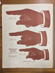
Eric Gill’s 1920s-era manicules reminded me of the Flickr ☞ Manicule Pool, a collaborative collection of manicules snapped in myriad settings and across different times. There are digital manicules; analogue manicules; relief manicules; intaglio manicules; sculptural manicules; type specimens; signposts; advertising hoardings; and much more. The pool is a great place to browse, and it drives home just how indispensible this simple sign was to signwriters, advertisers, and businesses — and how sharply it fell from favour. The arrows that have replaced it (← →) just lack the same degree of panache, do they not?
This was to be a longer entry, but unfortunately my tardiness has got in the way. Twitter user @dheadshot pointed me in the direction of a BBC radio programme presented by Simon Armitage, a poet and writer, entitled Marginalia, which purported to look at the history of writing in the margins in books — including the not inconsiderable role of the manicule. It was, by all accounts, a fascinating examination of these hinterlands of books, where readers intrude on writers’ territory, and I was very much looking forward to listening to it. And to passing it on to Shady Characters’ readers, of course.
Unfortunately, I am too late. The programme has expired on the BBC’s iPlayer platform, so we’ll have to wait for it to be rebroadcast another time. I’ll be sure to post it here when it reappears.
And with that anticlimax, thanks for reading!
Comment posted by Lan on
I see what you did there with the heading.
Comment posted by Keith Houston on
I couldn’t resist.
Comment posted by Jeremy W on
Is there any resource on the development of manicules (only found out today that is what they are called – thanks!)? I have ondered for some time why they have both thumb and forefinger pointing – something I don’t think I’ve ever seen in real life.
Comment posted by Keith Houston on
Hi Jeremy — that’s a good question. The Shady Characters book contains a chapter on the manicule, but I’m afraid I don’t know much about its development from a graphical point of view.
Comment posted by Gunther on
Hi Jeremy, have a look at William H. Sherman’s “Toward a History of the Manicule” – maybe this will help you.
Comment posted by Jeremy W on
Thanks, Keith – I have “Shady Characters” on my list to buy, but not until after the upcoming house move – I’ve [more than] enough books to pack as it is!
Gunther – thanks for pointing me at that fascinating article! It didn’t shed much light on my question, but it did raise many others!
Comment posted by Keith Houston on
I know exactly what you mean — our house is full to bursting with books and papers, and that’s after we donated a pile to charity. I hope you enjoy the book once you do get to read it!
Keep an eye on the site (the RSS feed is probably the easiest way to do that) and I’ll be sure to post any new information about the manicule I come across.
Comment posted by Jeremy W on
Thanks again, Keith – I’m sure I will.
I came across the Shady Characters site a few weeks ago (I cannot remember where the link was – sorry – though it was Miscellany 51: The Irony Mark that was the topic), and I’ve been subscribed since then. I get the emails when new posts go up. It is a new world opening up – I hadn’t realised that there is an entire branch of study into punctuation and marginalia marks.
Comment posted by Keith Houston on
It was news to me too, back in 2010! I’m glad you’ve joined in the fun, and thanks for the comments.
Comment posted by Larry Hosken on
And then, a mobile made of manicules: http://www.jeffcanham.com/index.php?/projects/at-home-with/
Comment posted by Keith Houston on
That’s great! Thanks for sharing that.
Comment posted by Randolph Watkins on
I was pleased to see that for today, Saturday 02 August, the word of the day at Dictionary.com is INTERROBANG. Keith, you may be pleased to know the first quote they used is from you, and your terrific book. Congratulations!
Comment posted by Keith Houston on
Hi Randolph — what a pleasant surprise. Thank you very much for the notice! It’s nice to see the interrobang getting some love. The article is here, for reference.
Comment posted by Ed on
Why must manicules always be male? I’ve looked and looked but have only found two un-ambiguously female example, one based on a pun “womanicule”.
http://52illustrations.tumblr.com/post/98019128236/womanicule
Trying to do a search for “female manicule”, search engines un-helpfully look for female manicure instead.