Miscellany № 97: interrobang archaeology, part 2

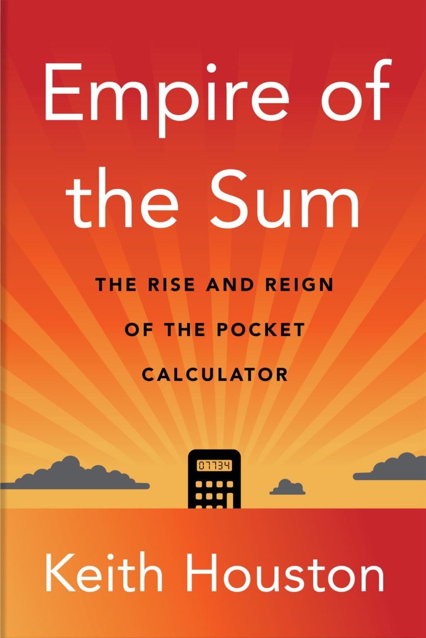
As we head towards the holiday season, 2022 edition, good news for next year’s gift-giving conundrums: my esteemed editor, Mr Brendan Curry, has rubber-stamped the Empire of the Sum manuscript, which has now started its journey through the W. W. Norton publication pipeline. Between now and the summer of 2023 it will be copyedited, proofread, indexed, designed, typeset and many other things beside, and it will be much better for it.

Still, though, next summer is a long way off. For now, then, here are a few recent (and not so recent) stories you might find interesting.


I somehow missed the video below when it aired on Netflix back in 2018. It’s a collaboration with Vox, the news web site, and it addresses the origins, history and usage of the exclamation mark. At only fifteen minutes long, no-one would mistake it for an exhaustive treatment of a mark that has been around for five centuries or more, but it does find time to introduce our old friend, the interrobang (‽). Here’s the video:

There’s a poignant star turn at around 7:50, when the late Penny Speckter appears on screen to explain the circumstances of her husband’s creation of the interrobang. It was a jolt to see her apartment much as it had been when I visited in 2013 for a lengthy, entertaining and cocktail-fuelled audience. Now, as then, the walls were covered in bookcases that were populated in turn by both books and miniature printing presses. (For a time, she and her husband Martin had rented the apartment across the hall to hold their collection of full-size presses.)

In the video, Penny adds some colour to the story of the interrobang’s birth. Out to dinner one night, she says, Martin was fretting over the four pages left to fill in the latest issue of Type Talks, the pair’s magazine on typography in advertising. Apropos of nothing at all, he announced his idea for a new mark of punctuation and dashed off to call their agency’s favored art studio. “Is there anybody there who can draw?” The Speckters made their way to the studio and stayed for hours, hashing out* what would become the interrobang’s earliest visual forms. Here’s how they appeared in Type Talks:

Proposed interrobangs from Type Talks, March-April 1962
Proposed interrobangs from Type Talks, March-April 1962, drawn by Jack Lipton of Martin K. Speckter Associates, Inc. (Image courtesy of Penny Speckter.)

My original series of posts on the interrobang (and, of course, the Shady Characters book) picks up the story from that point onwards, opening with the publication in Type Talks of Martin’s fateful article on his new mark, but I’m glad to have learned a little more of the story!


Elsewhere, I was taken with a Guardian article on the discovery of an ivory comb inscribed with what is said to be the oldest known sentence in the oldest known alphabet: “May this tusk root out the lice of the hair and the beard.” Not just a comb, then, but a comb for getting rid of head lice. Leave it to Mark Liberman at Language Log to get to what really matters: the letters on this comb, ytš ḥṭ ḏ lqml śʿ[r w]zqt, do not come from a conventional alphabet but rather an abjad, or an alphabet that makes do without vowels, modern examples of which include Hebrew and Arabic. Head over to the Guardian and Language Log to learn more.

Staying with Language Log, I learned from a recent post there by Victor Mair that there is renewed interest in shorthand writing as practised in ancient Greece and Rome. Mair links to an article in the Daily Beast in which Candida Moss delves into the origin, uses and users of shorthand in the ancient world. Moss invokes Cicero’s favourite amanuensis, Tiro, whom Shady Characters readers will remember as the inventor of the “Tironian et” (⁊), but there’s much more to learn and to ponder in her article.


Lastly, you may have noticed that Twitter is having a bit of a wobble in the wake of its sale to cut-rate Bond villain Elon Musk. Many Twitter users, myself included, have since created accounts on Mastodon, a decentralised social network that feels much like Twitter but which remains in independent hands. If you’ve already made the move or are thinking about doing so, you can follow Shady Characters at @shadychars@mastodon.social and my personal account at @orkneydullard@mstdn.social. I’ll still be active on Twitter, but perhaps that will change in the coming days and weeks. See you at the new place!

*
Ha! 

Miscellany № 96: EPA

Esteemed Norwegian typefoundry Mono­krom (who, of course, designed the fonts used here at Shady Characters), tweeted a while back about a Unicode character called the “Wiggly Exclamation Mark”. Here’s the relevant snippet of text:

Text describing the proposed Unicode "wiggle exclamation mark"
Text describing the proposed Unicode “wiggly exclamation mark”, tweeted by Monokrom and taken from Karl Pentzlin’s 2011 proposal.

I’d never come across this mark before, and some digging revealed that it came not from the Unicode standard itself but rather a proposal to add characters relating to the so-called “English Phonotypic Alphabet”, or EPA.1 The EPA, in turn, is an English spelling reform that was promoted during the 1840s by Isaac Pitman and Alexander John Ellis. Needless to say, Ellis and Pitman failed to make much of a dent in English’s famously obtuse orthography.2 One need only compare the proposed spellings of words like “hwen” (when), “acsent” (accent) and “menʃun” (mention) with their current forms to see how well it all panned out.

Except that isn’t quite the full story. The EPA was not Pitman’s first venture into alternative English spelling models, and another of his endeavours had been considerably more successful. His name may be more familiar to you as the creator of Pitman’s “Stenographic Sound-Hand”, or, more simply, Pitman shorthand, one of the most widely-used English shorthand writing systems.3 Nor was the English Phonotypic Alphabet as abject a failure as it at first appeared. We may not use Pitman and Ellis’s reformed spellings today but the EPA’s descendant, the International Phonetic Alphabet (IPA), is still used to lay out pronunciations in dictionaries and similar publications.4 Here are those same words rendered in the IPA: “wen” (when), “æk.sənt” (accent) and “men.ʃən” (mention). See the resemblance?


So, what of the “wiggly exclamation mark”? Back to the “Second Revised Proposal to encode characters for the English Phonotypic Alphabet (EPA) in the UCS”, the document from which the snippet above was taken. Its author, Karl Pentzlin, had discovered a number of novel punctuation marks associated with the EPA and described how they, along with the modified letterforms that formed the basis of Pitman and Ellis’s new alphabet, could be added to Unicode.

At first, Pitman and Ellis had not seemed to care much about punctuation. Their foundational texts, the Completion of the Phonotypic Alphabet and the Extension of the Phonotypic Alphabet, published respectively in the June and July of 1845, did not mention punctuation at all.5,6 But in January of 1848, in the pages of Pitman’s in-house Fonetic Jurnal,* an unattributed article described the system of punctuation that was to go with the new alphabet.7

Table of characters in the English Phonotypic Alphabet
Table of characters in the English Phonotypic Alphabet, taken from the January 1848 issue of Isaac Pitman’s Phonetic Journal. New punctuation marks, including the “smile”, are at bottom.

Helpfully, many punctuation marks retained their meaning in the EPA: the full stop, colon, semicolon, comma and hyphen all kept their existing appearances and functions. A new mark, the “elision”, was rendered as a high dot (˙) and took the place of the apostrophe, which was repurposed to indicate stressed syllables. Added to these, however, were a battery of more radical marks. To quote that 1848 article,

(⸮) The Query
This is placed before any words or clauses by which a question is asked.
(?) The Doubt
This is placed after any word or statement, concerning which the writer feels some doubt, or which he wishes to call in question. Observe the difference between the doubtful inquiry, “You came last night?” and the usual interrogation “⸮Did you come last night.”
(!) The Call
A mark of exclamation, or simple surprise. Doubled (!!), it indicates great astonishment.
(¡) The Sigh
A Mark of grief or sorrow: placed after a statement which gives the writer pain. Doubled (¡¡), it indicates great affliction.
([wiggly exclamation mark]) The Smile
A mark of mirth or pleasure: placed after a statement which gives the writer pleasure, or produces in him a feeling of amusement; and hence used in place of that expression in the speaker which in common intercourse is meant to indicate, “I was only in joke.” The doubled smile is a downright laugh.

(Some later publications inverted the “smile” mark to give a sarcastic or ironic inflection.1)

These new marks were quite a departure from the otherwise simple spelling reform of the EPA, and I wonder what drove Pitman and Ellis to add them to their new orthography. A rush of blood to the head, perhaps? A desire to remove even more of the ambiguity from printed English, where a ‘!’ can be happy, sad, excited, anxious, or portentous? In the end, their motivations may be less important than the fate of their marks — which was, if you haven’t already guessed, to be consigned to history along with the rest of the EPA. A sad and perhaps undeserved end, but hardly an unexpected one.

1.


2.
Tarantelli, Valentina. “Voice Into Text: Case Studies in the History of Linguistic Transcription”. University of Sheffield, 2015.


3.


4.


5.
Pitman, Isaac. “Completion of the Phonotypic Alphabet”. The Phonotypic Journal 4, no. 42 (June 1845): 105-119.


6.
Pitman, Isaac. “Extension of the Phonotypic Alphabet”. The Phonotypic Journal 4, no. 43 (July 1845): 121-126.


7.
“Symbols of the English Phonetic Printing Alphabet”. The Phonetic Journal, no. 1 (January 1848): 17-20.


*
Sadly, this is not a faithful representation of the title of Pitman’s periodical. Pentzlin’s proposal to add EPA characters to Unicode was rejected, so it is not possible to render the title of the Fonetic Jurnal exactly as it was printed — the lower-case ‘o’ should have a small indentation at the bottom. 

Museum of London: a Shady Characters field trip

Apologies for the relaxed pace of posts here; I’ve been hard at work on the manuscript for Empire of the Sum, which is currently ping-ponging between New York and Birmingham as my editor helps knock it into shape. There isn’t much time left for writing anything else!

That said, I did manage a trip to London with my family this last weekend, which was a pleasant little diversion. We visited the Museum of London, which lives on a roundabout (or traffic circle, or island, depending on your local vernacular) at the southern edge of the Barbican Estate. This alone is noteworthy. The Barbican is an astonishing place, a Brutalist, 1960s vision of a future in which residents and visitors perambulate serenely from one tower block to the next via elevated walkways and manicured gardens. It is, as far as I can tell, impossible to hurry through the Barbican: if the arresting views don’t get slow you down, the mazelike layout will finish the job.

Built in 1976, the Museum of London is of a similar vintage and manages to cram a lot of material into its two floors. It’s an old-fashioned museum in a lot of ways, with few interactive exhibits and a liking for display cabinets and dense textual labels. But don’t let that put you off: the history of London is fascinating, the building itself is a pleasure to stroll through, and its out-of-the-way location means that it’s often quieter than heavy hitters such as the Natural History Museum and Science Museum. (For what it’s worth, the Museum of London also looks to be less dependent on problematic sponsors such as BP, Shell and Rio Tinto.)

Down on the museum’s lower floor was a cluster of exhibits that caught my eye: a Sumlock Anita calculator, an Apple II home computer, and the control console for a Lyons Electronic Office. I spent a lot of time with these three devices as I worked on Empire of the Sum, but the pandemic put paid to a lot of in-person research and it was a treat to finally see these machines in the metal. Each one of them played a pivotal role in the rise and fall of the pocket calculator.

Controls for the Lyons Electronic Office
Controls for the Lyons Electronic Office. (Image by the author, taken at the Museum of London.)

The Sumlock Anita and the Lyons Electronic Office, or LEO, were competitors at one remove during a critical period in the calculator’s history. Vacuum tube computers, such as the LEO (developed by a chain of tea shops, no less), threatened the livelihood of the mechanical adding and calculating machines that occupied many an office desk. As the largest British manufacturer of such things, London-based Sumlock was especially worried. Their response was the Anita of 1961, a desktop calculator about the size of a cash register whose keyboard mimicked those of Sumlock’s older mechanical models. It was the world’s first mass-produced electronic calculator, and it shook the complacent calculator industry out of its torpor. Within a few years, transistorised desktop calculators were the norm; a few years after that, and pocket calculators driven by integrated chips had arrived. The clunky, chunky Anita started it all.

Sumlock Anita calculator
Sumlock Anita calculator. (Image by the author, taken at the Museum of London.)

If the Anita was the starting gun for the electronic calculator race, the Apple II, released in 1977, was the bell for its last lap. Home computers, as with mainframe-style machines such as the LEO before them, were not direct competitors for the calculator, but the programs that ran on them were another matter. The Apple II’s killer app — the first-ever killer app, by most accounts — was a program called VisiCalc that simulated a paper accounting tool called a spreadsheet. VisiCalc was a runaway success, to the extent that many customers bought Apple IIs purely to be able to run it. For decades, the calculator industry had been building better mousetraps; VisiCalc was a mousetrap, bear trap, and hunting lodge rolled into one. The calculator’s days were numbered.

Apple II computer and disk drive
Apple II computer and disk drive. (Image by the author, taken at the Museum of London.)

There’s much more to the history of the calculator, of course, and to the Museum of London! I hope to tell the calculator’s story as well as I can in Empire of the Sum (I guess we’ll find out how well I did in summer 2023 or thereabouts) but in the meantime, if you can make it, the museum is an excellent place to visit. Highly recommended.

Miscellany № 95: invention, illumination, and evasion

Links! It is high time for a few links. Let’s start out with some scholarly appetisers before a good old-fashioned moral panic as dessert.


First up, anthropologist Piers Kelly, writing in the pages of Sapiens magazine, has penned a simple but compelling tale of how the Vai script of Liberia was invented and brought to its modern-day state in less than two centuries. Piers digs into how the accelerated evolution of the Vai script might be used to understand the development of ancient writing systems such as hieroglyphs, cuneiform, and Chinese script. His article is called “What the Vai Script Reveals About the Evolution of Writing”, and it is well worth a read.


Over at Language Log, Victor Mair links to news of a huge discovery of ancient Chinese manuscripts in the form of bamboo slips. The original article is in Chinese, but Google provides the following translation, lightly edited for readability:

More than 3,200 bamboo slips have been rediscovered in the Warring States Chu Tomb at No. 798, Wangjiazui, Jingzhou, Hubei. Some of them are the first archaeological excavation of the Chu State manuscript “Confucius”, some are “Book of Songs”, and some are suspected to be unprecedented pre-Qin music scores. […] The Wangjiazui Warring States Chu Tomb dates back about 2,300 years ago and is located in Hongsheng Village, Jinan Town, Jingzhou District, Jingzhou City, Hubei Province. According to Xiao Yujun, the head of the archaeological project and director of the Archaeological Department of the Jingzhou Museum, in order to cooperate with the infrastructure project, the Jingzhou Museum conducted archaeological excavations at the cemetery from 2019 to 2021[.] A batch of bronze ware, lacquered wood ware and more than 3,200 bamboo slips (not counting small fragments) were collected.

If you’ve read The Book, you’ll know that the ancient Chinese often wrote on vertical slips of bamboo — a practice which, in turn, led to China’s characteristic top-to-bottom and right-to-left style of writing. I found it very difficult to locate images of bamboo slips for publication in The Book (ironically, the language barrier being the main stumbling block), so it’s gratifying to note that the original article has some decent photographs of the manuscripts found in the tomb.


Finally, the US Drug Enforcement Agency has recently taken an interest in emoji. As I discovered via Emoji Information on Twitter, the DEA has released a fact sheet aimed at parents, teachers, and other caregivers that purports to decipher “common emoji codes” for illicit drugs and related slang. Here they are:

Percocet and Oxycodone
💊 🔵 🅿 🍌
Xanax
💊 🍫 🚌
Adderall
💊 A-🚆
Meth
🔮 💙 💎 🧪
Heroin
🤎 🐉
Cocaine
❄ 🌨 ⛄ 💎 🎱 🔑 😛 🐡
MDMA & Mollies
❤ ⚡ ❌ 💊 🍬
Mushrooms
🍄
Cough syrup
🍇 💜 🍼
Marijuana
💨 🔥 🌴 🌲 😮💨 🍀
Dealer advertising
🤑 👑 💰 💵 🔌
High potency
🚀 💣 💥
Universal for drugs
🍁
Large batch
🍪

But wait! The DEA is behind the times on this. The phenomenon of emoji-as-drugs-slang seems to have been uncovered by BBC reporter Stacey Dooley in a 2017 programme entitled Stacey Dooley Investigates: Kids Selling Drugs Online. (Dooley’s findings were parroted by outlets such as the UK’s premier freesheet, the Metro, and salted with implied outrage into the bargain.) Many of the DEA’s terms were already in use at the time of Dooley’s investigation.

It’s worth noting, I think, that the DEA’s “emoji drug codes” are no more sinister or nefarious than slang words such as “snow” or “weed”. Once you know that ‘❄’ means “cocaine” and ‘🌴’ means “marijuana”, you have cracked the code. This isn’t to minimise the impact of illegal drug use, but I do think it’s a little unfair to single out emoji; one might equally well blame English for permitting individual words to have more than one meaning.

This has been your periodic emoji public service announcement. Please use drug emoji responsibly.

Miscellany #️⃣9️⃣4️⃣: flagging emoji?

If I learned anything as I wrote about emoji, it is that emoji is as dynamic as any “real” language. Here’s a recent development that demonstrates exactly that.

From the latest edition of Jennifer Daniel’s always-entertaining newsletter, “Did Someone Say Emoji?”,* comes the news that Unicode is shutting down the pipeline of new flag emoji. Jennifer is the chair of the Unicode Emoji Subcommittee, so this comes straight from the 🐴’s mouth.

This is not a small change. Flags are the largest homogenous subspecies of emoji, and a special one at that, with the Unicode Consortium careful to ensure that there is always an official flag emoji for each of the countries defined by the ISO 3166 standard. (There are also some non-country flags, but more about them later.) But despite this special status, there is a long list of reasons for the cauterisation of one of emoji’s major limbs.

First, and probably most obvious, is that international boundaries, politics, and identities are constantly in flux. Flags change, countries change; even whether a particular geographic entity is a country or not is sometimes a matter of perspective. Taiwan, of course, is the flag-bearer (sorry) for this particular type of disagreement: in order to prevent offence to one party or another, Taiwanese flag emoji do not appear on some devices.

In the same vein, flags for “subdivisions” of countries — the UK’s home nations, the USA’s constituent states, and so on — can be equally problematic. Thus, although the Unicode standard technically supports subdivision flags, only a handful are officially blessed to appear as emoji: the flags of Scotland, England and Wales are uncontroversial enough to be supported on most platforms, but for Unicode to sanction a flag for Northern Ireland would be to wade into a political quagmire that has endured for more than a century. For another difficult case, consider Spain’s independence-minded region of Catalonia.

And then there are those flags that represent something other than countries and regions, and they can be just as troublesome. Should historical flags be supported, for example? Or organisational flags such as those of NATO or the UN? What about indigenous peoples, such as Australia’s Indigenous Peoples and New Zealand’s Maori, who have flags different to those of their colonisers? And what about the flags of such slippery things as movements, like the rainbow LGBT flag or the skull-and-crossbones of the pirate flag? Some of these have emoji flags, others do not, and it is not at all clear whether the correct choices have been made.

Beyond all this, Jennifer notes that flag emoji are just not very popular; the vertigo-inducing emojitracker, for instance, shows that not a single flag regularly cracks the top 100 emoji on Twitter. Such is the dearth of interest that, as Keith Broni points out over on Emojipedia, Microsoft Windows has never supported flag emoji. Every flag emoji sent to a Windows machine ends up as either a pair of “regional indicator symbol letters”, such as “🇺‌🇸” or “🇬‌🇧” or simply a featureless black flag (🏴).

In future, then, Unicode’s Emoji Subcommittee will not accept any new proposals for flags. There will still be new national flags from time to time, as the ISO 3166 Maintenance Agency adds new entries to its more-or-less-canonical list of countries, but anything else is likely to be rejected out of hand. Fly your 🏴s at half mast: the book is closed on new emoji flags.

*
Crying out for an interrobang right there. 
Capitalise the ‘p’ in “party” and this sentence still makes sense.