I had a lot of fun a few months back recording an interview with Dallas Campbell on the subject of book history for his podcast, Patented. At least someone else must have enjoyed it too, because Dallas invited me back for another episode, this time on digital calculators. Have a listen and let me know what you think!
Calculator of the day: the HP-35
It’s out! Empire of the Sum is now available in the US, and to mark the occasion I’m posting about a few of my favourite calculators. Today’s is the Hewlett-Packard HP-35, a scientific calculator that today looks quite unremarkable — and yet which, at the time, was revelatory.
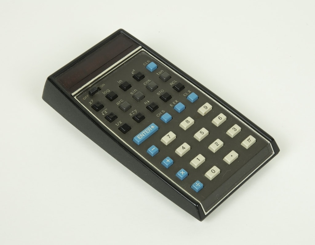
Depending on the reader’s age, the name “Hewlett-Packard” may evoke calculators, desktop computers or printers. (Or, maybe, nothing at all.) But for the first few decades of the company’s existence, it specialised in electronic “instruments” such as the oscilloscopes, signal generators and other tools that an engineer might use to design or test an electrical or electronic circuit. Conceived by HP’s co-founder, Bill Hewlett, the HP-35 was to be the company’s route out of that niche and into a wider world of consumer electronics.
The thing about the HP-35 is this: unlike many other calculators at the time, no part of it was truly without precedent. Scientific calculators were not new, although they were sized for desks rather than pockets (and nor had anyone thought to market them to consumers rather than engineers). Integrated chips were not new, although they were rarely as complex as those in the HP-35. LED displays were not new, but they were very expensive and not often seen in calculators. What the HP-35 did do that no other device had managed before was to bring all these things together into a package that was portable, powerful, and, crucially, aesthetically pleasing.
HP’s first pocket calculator turned out to be a smash hit. Sold at Macy’s and advertised in Esquire, the HP-35 had an appeal far beyond mathematicians and scientists, and the company could barely keep up with demand. Students sold their cars to buy them. NASA engineers had to lock theirs away to stop them from going walkabout. US army math instructors devised a new course as an excuse to buy HP-35s on expenses. And HP never looked back: the company that had once built engineering gadgets for engineers now aimed its products at the public at large. Some observers, in fact, credit the HP-35 with inaugurating the whole category of consumer electronics; your iPhone, tablet or laptop computer may never have come about without it.
A big thank you to Jim Hughes at Codex99, whose article was the catalyst for my chapter on the HP-35. His writing is excellent, and his site is well worth a moment of your time.
If you’d like to order a copy of Empire of the Sum, this post will point you in the right direction. And if you’d like to hear more about the history of the pocket calculator first, have a listen to my chat with Dallas Campbell on the history of digital calculators.
Empire of the Sum extracted in Lapham’s Quarterly

If you’d like to get a flavour of Empire of the Sum, check out this extract in Lapham’s Quarterly! It’s taken from the first chapter of the book, and, spoiler alert, it has nothing to do with the image (above) they’ve chosen to illustrate it — although Hollerith’s machines do make an appearance later in the book, and, coincidentally enough, I wrote about them a few years back in the context of the Monotype machine. Everything old is new again!
Calculator of the day: the Canon Pocketronic
It’s out! Empire of the Sum was published yesterday in the US, and to mark the occasion I’m posting about a few of my favourite calculators. Today we’re taking a look at the Canon Pocketronic, a machine with a decent claim to being the first ever pocket electronic calculator.
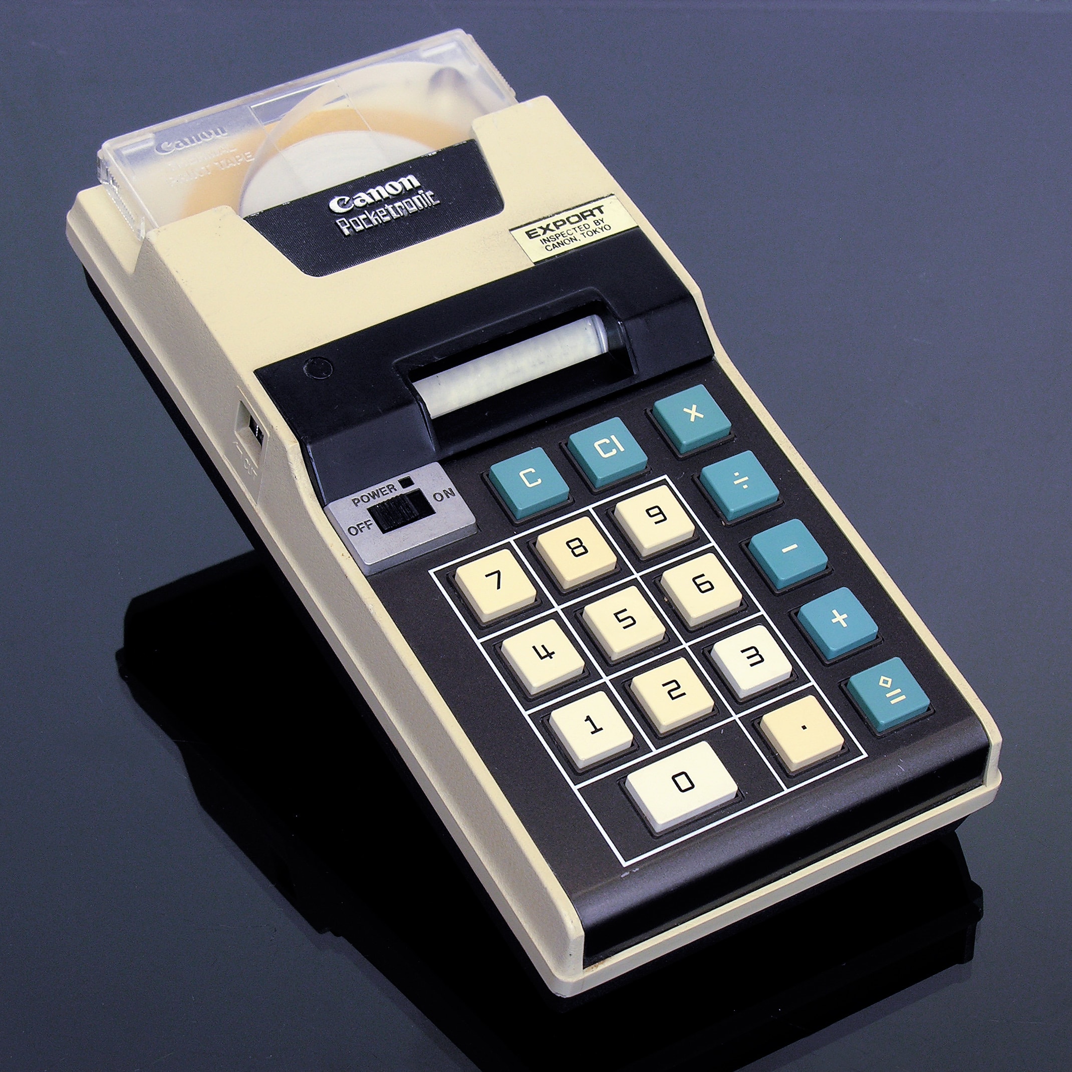
The Pocketronic was both an imposter and a failure. It started life as the “Cal Tech”, a prototype calculator designed by Texas Instruments as a means to sell microchips to the average person on the street. The problem was that TI was not, at first, very good at making those chips. Despite having pioneered the integrated circuit, the Cal Tech’s chips were so complex that the company could not reliably produce them en masse. Another problem was that the usual calculator display mechanisms were inimical to the Cal Tech’s hoped-for pocketable form factor: LEDs were too power hungry, and so-called Nixie tubes — lightbulbs, essentially, with filaments twisted into the shape of numerals — were too large. In their place, TI put a reliable but obsolescent printing mechanism. This was a calculator that could run out of batteries and paper.
TI had never meant to build the Cal Tech itself, and so, years later, when it had solved its production issues, it handed the design to Canon for refinement into a more consumer-friendly device. The Pocketronic was born, considerably later than intended and so bulky that the “pocket” part of its name was as much an aspiration as a statement of fact. It was never the success that TI had hoped, and yet it gave the company a taste of a calculator market that only promised to grow and grow.
By and by, TI worked the kinks out of its manufacturing processes and, eventually, started to make calculators in house. A decade or so later and it was one of the largest calculator manufacturers in the world. And as any US schoolchild will tell you, it still is today.
If you’d like to order a copy of Empire of the Sum, this post will point you in the right direction. And if you’d like to hear more about the history of the pocket calculator first, have a listen to my chat with Dallas Campbell on the history of digital calculators.
It’s US publication day for Empire of the Sum!

It’s publication day! Empire of the Sum: The Rise and Reign of the Pocket Calculator is published today in the USA.* You can order a copy from Norton, Amazon.com, Barnes & Noble, Books A Million, Bookshop.org, Hudson, IndieBound, Powell’s, Target or Walmart.
There are many people to thank for helping make this happen: my agent Laurie Abkemeier; Brendan Curry, Caroline Adams, and Anna Oler at W. W. Norton; Judith Abbate for design; and Rachelle Mandik for copyediting. And of course, my wife Leigh helped out at every stage — she has read Empire cover to cover many times over by now, and it’s all the better for it.
I hope you enjoy the book, and please let me know what you think!
- *
- For readers in the rest of the world, the book will be published in October. ↢