Happy New Year, everyone! To celebrate the coming of the new year, let’s, er, start by looking back to the old one. Back in December, in response to my post about the ampersand/plus-sign face-off currently underway on the signs of London’s hipster restaurants, commenter Jeremy wrote:
[H]aving taken what might well be hundreds of miles of handwritten notes over the years, I regard the ampersand as too fiddly for quick writing, and instead use a sort of “+” with the far-left and top ends joined. I don’t know if this is a real character (maybe from shorthand?) and I was taught it at some point, or whether it just morphed from a “+”and lazy writing. However, it stands out from the text and (at least with my handwriting), does not get confused with a “t”.
Well, you’re doing it all wrong! It’s supposed to be the far left and bottom ends that you join together. And I know I’m right, because that’s how I have been doing it all my life.
But seriously, I wholeheartedly agree.
Jeremy and Jamsheed are both correct, of course — there’s more than one way to write a legible ‘+’, ‘&’ or other ‘and’-sign, even when discussing what is ostensibly a single mark. Their description of an augmented or hurried ‘+’-like symbol brought to mind an email conversation I had a few years ago with a designer named Rebecca Kirch (née Alden) about almost exactly the same subject, and that, in turn, got me thinking about how we create, disseminate, and “standardise” new marks or forms of punctuation.
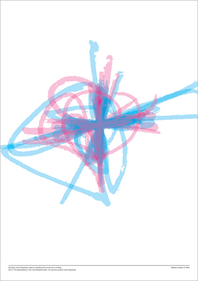
Back in 2004, Rebecca told me, she had decided to examine how the ampersand, plus sign and their kin fared when pen met paper. This would form part of a Masters thesis on the subject, and the result of her research was a fascinating series of images that illustrated just how much our personal ‘and’-signs vary when the time comes to write them down. (You can see one such image above, depicting a multitude of handwritten plus signs like the one described by Jeremy and Jamsheed.) As Rebecca explained in the introduction to her thesis:
Symbolic abbreviations for certain words are part of everyday handwriting, yet they are not part of the alphabet. For example, a writer may use & for ‘and’, w/ for ‘with’ or @ for ‘at’. There are many reasons to use these symbols: maybe because it is faster, or because it saves space, because it looks nice, or because it is more fun to write. Some people use such symbols so frequently and automatically that they have become ingrained in their handwriting.
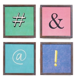
The way that a handwritten symbol varies from writer to writer “because it is faster, or because it saves space, because it looks nice, or because it is more fun to write” is a recurring theme here at Shady Characters. It is the little idiosyncrasies of our handwriting — the unconscious variations on existing glyphs and the shortcuts we take as write down familiar marks and letters — that have moulded the visual appearance of many marks of punctuation as much as any deliberate process of design. The ampersand, for instance, comes from the juxtaposition of the letters E and t; the ‘@’ may well come from an a surmounted by a bar, or tilde; and the ‘#’ is the formalized descendant of a hastily-written, barred ℔ for libra. It is the unpredictability of the human hand, not the aesthetic judgement of a type designer or stone-cutter, that has laid the foundations of our written letters and punctuation.
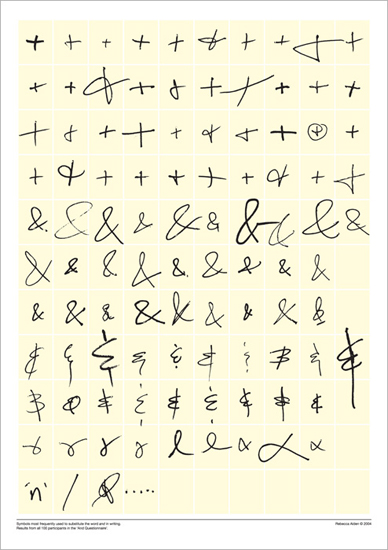
To explore this phenomenon in flight, so to speak, Rebecca catalogued a variety of handwritten ‘and’-signs, including the ampersand, Jeremy and Jamsheed’s looped plus sign, the familiar ‘reversed-3-with-vertical-bar’ (for want of a better term) seen at left, and many other similar marks. Having separated the marks into related groups she superimposed male and female interpretations of each symbol to produce dramatic images such as the one at the top of this post — entrancing visual surveys of various ‘and’-signs that reveal that the “average” ampersand or plus sign is anything but.
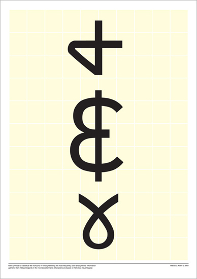
Out of this orderly chaos Rebecca created three new ‘and’-symbols, codifying the handwritten forms she had collected into glyphs designed to be compatible with the ubiquitous Helvetica typeface. (You can see them below.) As intriguing as Rebecca’s new marks are, however, I am duty bound to write the same thing I often have to write in these circumstances: these new marks of punctuation have so far failed to make themselves felt in mainstream writing. But while this is, sadly, par for the course in such cases, I think there’s a deeper point to be made. The thing that stuck with me after looking through the messy, very human symbols that Rebecca catalogued along the way to creating her trio of new ‘and’-signs is that we in danger of losing the calligraphic Brownian motion that helped form our alphabet in the first place. In place of the divergent handwritten scripts of an entire species’ worth of letter-writers and note-takers we are increasingly reliant on digital typefaces and emoticons designed and curated by a comparative handful of interested parties — type designers, software companies, and, not least, the Unicode Consortium, which acts as guardian of essentially all the characters that might appear on a computer screen. It is as though we’ve abandoned evolution in favour of intelligent design.
Still, though, given that the Unicode Consortium is still willing to consider new characters for inclusion in the all-important Unicode standard, things can’t be all that bad, can they? In their own words:
For new characters, [submitters should] provide images clearly showing the characters in use, with their glyph circled or clearly identified, along with a caption that describes the character and the source of the image.
Show us enough examples of a new mark in use, they say, and we’ll consider it. And there are, obviously, many people who still primarily write by hand who might yet invent a new mark, whether deliberately or accidentally, when an existing one is too time-consuming or awkward to write. But are there enough of them? For me at least it has been a long time since I put pen to paper to write anything longer that a to-do list, and I suspect I am not unusual in this respect. All my work ultimately ends up in electronic form, whether for a book or this blog (I daresay much of yours does too, whatever your profession or favoured hobby happens to be), and I find it easiest to stay within the digital realm from start to finish.
The problem with this is that we will, at some point, simply run out of new characters to be sent off to the Unicode Consortium for their stamp of approval. It feels like the critical mass of writers required for a new mark of punctuation to appear in any sort of organic way — the number of pens that must be put to paper on a daily basis to create a credible new ‘#’, ‘@’, or ‘&’ — is ebbing away, if it has not already been lost. Put simply, if we confine ourselves to writing only with our computers and smartphones, the spontaneity of creating new letters and symbols is lost to us. Has the Unicode Consortium approved its last truly novel handwritten character, I wonder?
So, um. This is all a little heavy, and it is certainly not where I expected to end up after pondering Jeremy, Jamsheed, and Rebecca’s handwritten plus signs. But here I am nevertheless. So I would ask of any type designers, calligraphers, or punctuational innovators who are reading this: what do you think? Is it still possible for a new mark of punctuation to come out of the hustle and bustle of everyday handwriting? Is there still hope for an accidental ampersand or a hurried octothorpe to come about and to spread organically, without a deliberate act of creation or promotion? Answers on a postcard, or, preferably, in the comments below!
You can see more of Rebecca’s work at tingedesign.com. Many thanks to her for supplying a copy of her thesis!
![<cite>The delights for ladys : to adorne there persons beautyes stillyris banquits perfumes [and] wators</cite>, a recipe book written in 1655.](http://shadycharacters.co.uk/wp/wp-content/uploads/2014/12/B47fD3sCUAAs4JX.jpg)
![Birds Eye “Mashtags”: “PREFRIED POTATO SHAPES MADE WITH FRESHLY MASHED POTATOES [sic]”.](http://shadycharacters.co.uk/wp/wp-content/uploads/2014/12/masgtag456.png)