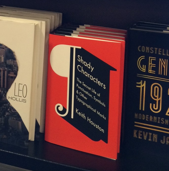
The Shady Characters book, revealed!

Image courtesy of Jason Booher.

Ladies and gentlemen: the Shady Characters book is now available for pre-order at W.W. Norton, Amazon.com, Amazon.co.uk, Barnes & Noble and The Book Depository.

Phew. Wow, even.

After months of writing, editing and proof-reading with the help of Brendan Curry, Laurie Abkemeier, Rachelle Mandik and many others, it feels like everything has happened in a rush. The loose, printed proofs arrived in the post a couple of weeks back, closely followed by the bound proofs, and now by the appearance of the book itself at Norton, Amazon and Barnes & Noble.

The bound proofs, incidentally, are a wondrous thing. The book has been set, with quite some flair, in Hoefler & Frere-Jones’ splendid Hoefler Text, and the typographic treatment is spectacular — there are certain things that don’t quite work in an electronic medium, and the physical book is just that little bit more cohesive. The pilcrow on the cover is also set in Hoefler Text, though the text is in Futura. I like it a lot, and my default sans-serif font choice of Gill Sans is under threat.

This is all still a little unreal. But not so unreal that I won’t encourage you to head over to the vendor of your choice and pre-order it as soon as you can!

Miscellany № 28: Save the Tironian et!

Readers will, of course, be familiar with the interrobang (‽), that most Madison Avenue of punctuation marks. Its name, like its shape, is equal parts question and exclamation: the Latin interrogatio, for a rhetorical question,1 combines with ‘bang’, a slang term for the exclamation mark. Until I started researching the history of the interrobang I had never come across this use of the word ‘bang’, but a quick check of the Typographic Desk Reference soon dispelled my ignorance: the TDR also lists ‘exclamation point’, ‘screamer’ and the rather risqué ‘dog’s cock’ as alternatives.2

These, it turns out, are mere drops in the ocean of exclamation point names, and a new post at Stan Carey’s Sentence First lifts the lid on the veritable cornucopia of alternative terms for this humble mark. “Bang, pling, boing, shriek, gasper, screamer, Christer! And other exclamation mark aliases” pulls in these terms and more, with some informed commentary to follow. Full disclosure: Stan kindly provided a great photograph of the Tironian et (⁊) for a prior post here, but that’s no reason not to check his his excellent blog. What’s your favoured name for the exclamation mark?


Speaking of the Tironian et, European type foundry Underware recently posted an image consisting entirely of ampersands on Flickr. I was struck by its similarity to the serried ranks of ampersands presented in Formenwandlungen der &-Zeichen,3 Jan Tschichold’s obsessive 1953 pamphlet that chronicles the character’s visual development. Tschichold also catalogued the many forms of the ampersand’s ill-fated competitor, and it seems a shame that this once-great mark is so little heard of today. Accordingly, I have begun the fightback: it is time to lobby for the reintroduction of the Tironian et. Surely Underware, as noted purveyors of quality irony marks,4 can be persuaded to help rehabilitate another endangered symbol?


In other news, today I received the first page proofs of the Shady Characters book, set in Hoefler & Frere-Jones’ luxurious Hoefler Text. It’s one of the default fonts for this blog, and it’s preinstalled on many Apple Macs: if you’re reading on such a machine then you’re likely already looking at it. If not, I encourage you to take a look at some of H&FJ’s specimens! It’s a feast for the eyes.

1.
Burton, Gideon O. “Interrogatio”. Brigham Young University, March 2011.


2.
Rosendorf, Theodore. “Exclamation Mark”. In The Typographic Desk Reference, 46+. New Castle, DE: Oak Knoll Books, 2009.


3.
Tschichold, Jan. Formenwandlungen Der &-Zeichen. D. Stempel AG, 1953.


4.


Miscellany № 27

The apostrophe, for some reason, is one of those marks that raises hackles no matter how it is approached. I write in the Shady Characters book about a news story that ran back in 2002, when the city council of Nottingham, England, instituted an “apostrophe swear box”. Infuriated by misuse of the apostrophe by council workers, Graham Chapman, the council’s leader,

[…] challenged his chief executive, John Jackson, to pay a forfeit to charity every time a council document prepared by officers contained a grammatical error. Now all 14,000 staff have been asked to cough up £1 every time they make a mistake with the proceeds going to charity.1

I now read that Mid Devon District Council, also in England, has decided to side-step the troublesome apostrophe entirely by simply removing it from all their road signs. Beset by predictable declarations of outrage, council leader Peter Hare-Scott retorted that it has long been common for apostrophes to be omitted from signs2 — and to be fair, he has a point. Birmingham City Council, for instance, issued a similar decree back in 2009, eliciting similar howls of protest.3

The apostrophe in general has long proved to be an unstable mark of punctuation, prone to decaying into non-existence. The US ruled against possessive apostrophes in place names as far back as 1890, with Australia doing the same in 2001.3 Nor does perceived wealth, social standing, or literacy prevent apostrophe catastrophe: Harrods, Selfridges, and, lately, Waterstones have all given up their possessive apostrophes, while McDonald’s proudly flies the flag for grammatical correctness.4

In the light of all this, should we care about Mid Devon’s decision to drop the apostrophe? Instinctively I would say yes, of course; but then I look at the minuscule impact that it will make: in the entire Mid Devon district, only three street names will be affected.2 Galling it may be, but I think I’ll cope.


On Twitter, Glen Turpin points out an interesting article on the origins of the “+” and “-” signs. In “Where and When Did the Symbols “+” and “–” Originate?”, Mario Livio talks about the surprisingly recent derivations of these two symbols. It’s well worth a look!

1.


2.


3.


4.


Miscellany № 26

A quiet week! Where has all the punctuation news gone? If you have any tips as to something you’d like to see featured here, please get in touch.


“Ice Cream & Cake” by Emily Blincoe. See more at THIS & THAT.

The first of today’s abbreviated items is a tasty punctuational treat: photographer Emily Blincoe’s juxtapositions of complimentary foodstuffs at THIS & THAT, her Tumblr blog, are a feast for the eyes. Each of her pairings — pork & beans, cookies & cream, burger & fries, and many more — is lovingly composed with an edible ampersand at its heart. I thought my love for bacon could ascend no higher, but after seeing Emily’s eggs & bacon, I may have to revise my opinion.

Prints of her compositions are available for purchase at Etsy for the very reasonable price of $11. Her combination of peas & carrots has an amusing Ishihara test quality about it, and I’m sorely tempted to order a copy.


In more conventional news, Reuters reports that a misplaced comma allowed a foreign airline into India’s closely regulated air transport market via the back door. A 2012 press release from the Department of Industrial Policy and Promotion stated that:

“The government of India has […] decided to permit foreign airlines also to invest, in the capital of Indian companies, operating scheduled and non-scheduled air transport services, up to the limit of 49% of their paid-up capital.

Reuters suggests that had the second, disputed comma been absent (yielding “Indian companies operating scheduled and non-scheduled air transport services”), foreign airlines could have invested only in existing companies, rather than new ones. The DIPP argued that the comma should stay and thus, it is alleged, AirAsia’s CEO Tony Fernandes was permitted to join Tata in creating a new budget carrier and so break into the jealously-guarded Indian market.

Personally, I’m rather more concerned that the original form of the sentence is so mangled. The free market economy’s gain is punctuation’s loss.

A Shady Characters Wedding

Captured in the middle of a middling speech. The text on the card is in the open source typeface Gentium, which doesn't have a native interrobang, so I cobbled one together from its exclamation and question marks. (Photography by Elizabeth Houston.)
Captured in the middle of a middling speech. The text on the card is in the open source typeface Gentium, which doesn’t have a native interrobang, so I cobbled one together from its exclamation and question marks. (Photography by Elizabeth Houston.)

No Miscellany this week, I’m afraid; the world of punctuation has been quiet of late. What I did want to do, though, was to share the photograph above, taken by Elizabeth Houston, my mum, at my wedding a couple of weeks ago to the beautiful Leigh Stork. The wedding took place in the Auditorium at Òran Mór in Glasgow, Scotland, under the shadow of Alasdair Gray’s fantastic mural, and we were lucky enough to celebrate it surrounded by a veritable army of our closest friends and family.

Most apposite to Shady Characters, however, were the names — and place cards — we gave each table. Unusual marks of punctuation! They were, in no particular order, the ampersand (&), the ellipsis (…), the manicule (☞), the asterisk (*), the dagger (†), the diesis (‡), the pilcrow (¶), the at-symbol (@), the asterism (⁂), the obelus (÷), and the octothorpe (#). I fervently hope that just a few guests went home pondering how best they might employ a pilcrow, manicule or asterism.

As you can see above, I couldn’t resist saving the interrobang (‽) for the top table — appropriate, perhaps, given the surprise expressed by many acquaintances when I told them that I was (finally) getting hitched!