Punctuation, as any dictionary will tell you, consists of the marks that dance around the letters of a text to mark clauses, sentences and inflection.1 What, though, is minimal punctuation? Is it in the range of marks that a writer uses? Ernest Hemingway wrote famously minimalist prose, for instance, where marks such as the semicolon (;), the ellipsis (…) and the dash (–) are notable mostly for their absence. The Old Man and the Sea contains but one colon and one exclamation mark, and is none the worse for it.2
What of punctuation marks themselves? There is a very definite scale of complexity when it comes to punctuation, ranging from ostentatious symbols such as the manicule (☞) and asterism (⁂) all the way down to the humble comma (,) and apostrophe (’). Sitting at the bottom of the scale, the full stop (.) is surely simplest of all, and yet it is possible to step beyond even its mathematical irreducibility. The most minimal mark of punctuation is not a mark at all: it is the space between words.
Writing in ancient Greece was broken by neither marks nor spaces. Lines of closely-packed letters ran left to right across the page and back again like a farmer ploughing a field.3 The sole aid to the reader was the paragraphos, a simple horizontal stroke in the margin that indicated something of interest on the corresponding line. It was up to the reader to work out what, exactly, had been highlighted in this fashion: a change of topic, perhaps; a new stanza in a poem; or a change in speaker in a drama.456
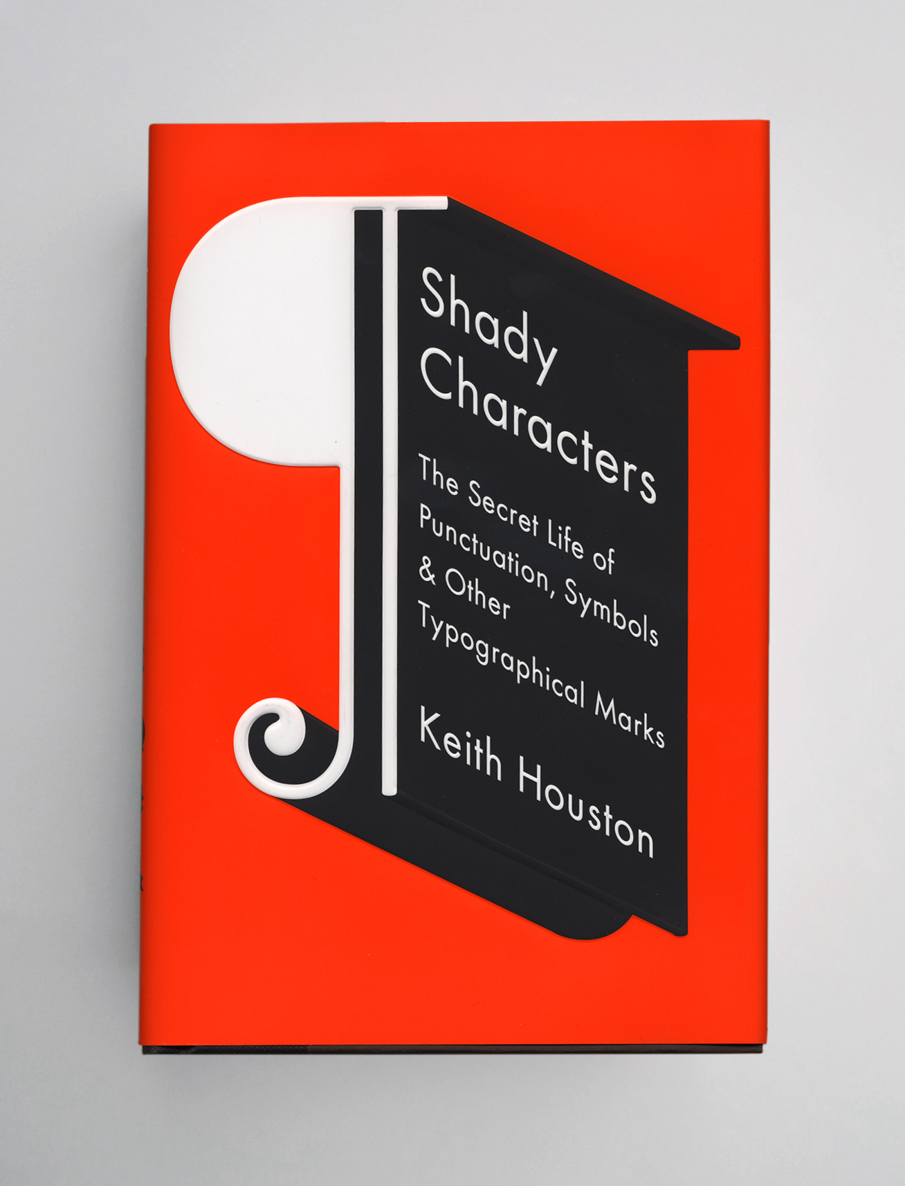
Punctuation itself – literally, the act of adding “points” to a text – did not arrive until the third century BC, when Aristophanes of the great Library at Alexandria described a series of middle (·), low (.) and high points (˙) denoting short, medium and long pauses.4 Over the centuries, this system gave rise to punctuation as we know it: from Aristophanes’ three dots came the colon, the full stop, and many other marks besides. At the same time the paragraphos evolved into the “pilcrow”, a C-shaped mark (¶) placed at the start of each new section in a text.7 The word space was a late arrival, appearing only when monks in medieval England and Ireland began splitting apart unfamiliar Latin texts to make them easier to read.
Then, in the mid-1450s, Gutenberg published his famed 42-line Bible,8 and everything changed overnight. Spaces, once as wide or as narrow as a scribe chose to make them, begat an extended family of fixed widths, from hair spaces ( ) up to em quads ( ), that printers required to justify lines. Once carefully painted in by hand, pilcrows became too time-consuming to add; left out, their ghostly absences gave rise to the indented paragraph.9
In the end, even a simple word space, paragraph or full stop carries the weight of centuries of tradition and evolution. Like Hemingway, we may prefer to leave out colons, semicolons and dashes, but as long as we do our readers the favour of spacing words, finishing sentences and breaking paragraphs, there can be no such thing as minimal punctuation.
- 1.
-
Oxford English Dictionary. “Punctuation”.
- 2.
-
Hemingway, Ernest, and Herman Finkelstein Collection Library of Congress. The Old Man and the Sea. Scribner, 1952.
- 3.
-
Encyclopaedia Britannica. “Boustrophedon (writing Style)”.
- 4.
-
Brown, T. Julian. “Punctuation”. Encyclopaedia Britannica.
- 5.
-
Pearse, Roger. “More on the Paragraphos Mark”. Roger Pearse, November 10, 2010.
- 6.
-
Johnson, William A. “The Function of the Paragraphus in Greek Literary Prose Texts”. Zeitschrift für Papyrologie Und Epigraphik 100 (1994): 65-68. https://doi.org/10.2307/20189008.
- 7.
-
Parkes, M. B. “The Development of the General Repertory of Punctuation”. In Pause and Effect: Punctuation in the West, 41-49. University of California Press, 1993.
- 8.
-
Davies, M., and . The Gutenberg Bible. Pomegranate Artbooks in association with The British Library, 1997.
- 9.
-
Tschichold, Jan, and Robert Bringhurst. “Why the Beginnings of Paragraphs Must Be Indented”. In The Form of the Book: Essays on the Morality of Good Design, 105-109. Lund Humphries, 1991.