1962 was a momentous year for the United States of America. John Glenn became the first American, and only the second human, to reach orbit;1 the Kennedy administration successfully negotiated the nuclear tightrope of the Cuban missile crisis, taking the world within a hair’s breadth of nuclear war in the process;2 and NASA launched AT&T’s Telstar, the world’s first telecommunications satellite, ushering in a new era of instantaneous global communications.3 Consumer society too was reaching new heights: advertising ruled, and the ad men were at the peak of their game.
In amongst this turmoil of Cold War and technological revolution, one particular Madison Avenue executive turned his attention to loftier matters. Martin K. Speckter was the head of his own New York advertising agency with no less than the Wall Street Journal account on his books;4 a keen hobbyist typographer, he also edited Type Talks, a bimonthly journal published by the Advertising Typographers Association of America which explored the use of type in advertising. Frustrated with the growing tendency of copywriters to combine the exclamation mark and question mark to yield a surprised or rhetorical question — “Who would punctuate a sentence like that?!” — Speckter penned an article for Type Talks to offer a solution. ‘Making a new point, or, how about that…’ appeared in the March-April 1962 issue and argued that there was a need for a single punctuation mark to replace this ugly, jury-rigged construction. As the article went on to explain, this putative symbol was intended to convey a particular mixture of surprise and doubt:
To this day, we don’t know exactly what Columbus had in mind when he shouted ‘Land, ho.’ Most historians insist that he cried, ‘Land, ho!’ but there are others who claim it was really ‘Land ho?’. Chances are the intrepid Discoverer was both excited and doubtful, but neither at that time did we, nor even yet, do we, have a point which clearly combines and melds interrogation with exclamation.5
Presenting a set of speculative designs for his creation, rendered by his agency’s art director Jack Lipton, Speckter tentatively named the new mark the ‘exclamaquest’ or ‘interrobang’. He ended the article with an invitation to “join the exalted ranks of Aldus, Bodoni et al” by calling for readers to supply their own interpretations of the symbol’s design, and solicited new names to compare with his own suggestions.
Response to the article was immediate and enthusiastic, and the new mark’s genesis was reported by various newspapers within weeks of its first appearance. The Wall Street Journal, for instance, published an editorial on the 6th of April which introduced the new symbol and displayed an immediate comic mastery of its intended usage with the example, “Who forgot to put gas in the car‽”.6 Despite Speckter’s work for the WSJ, the article’s publication still came as a pleasant surprise, as related by his wife Penny:
The Wall Street Journal editorial piece was a complete surprise. […] Back in 1962, journalism was much purer than it is today. Editorial people at WSJ barely spoke with the advertising side.7
Another mention came in the New York Herald Tribune (now defunct, but whose European edition lives on as the International Herald Tribune8), where advertising correspondent Joseph Kaselow devoted an entire column to the Speckter’s new symbol and hailed it as “true genius”. This welcome publicity was not entirely without its hiccups: Kaselow’s article was published on the 1st of April9 — whether this was an unfortunate coincidence or a deliberate act by a misinformed editor is not recorded — and this predictably raised questions as to the interrobang’s authenticity.
In addition to editorial enthusiasm for the new symbol, submissions of alternative names and sketches from other advertisers and graphic designers flowed in to Type Talks over the following months. Emboldened by the generally positive reception to his first article, Speckter published a follow-up in the May-June ’62 edition of Type Talks, taking the opportunity to firmly but genially rebuke suggestions that his newly minted symbol was anything other than serious:
Well, Type Talks favors just about everything that makes for more effective communication, so our proposal is more than half-way serious. […] more people read advertising than read books; is it too far-fetched to hope that advertising can successfully introduce a new character for our punctuation system?9
This second article publicised some of the alternative names for the new character submitted by readers. Portmanteaux denoting questions and exclamations were most common, giving rise to ‘emphaquest’, ‘interrapoint’ and the tongue-twisting ‘exclarogative’, while the mark’s application to rhetorical questions was addressed by ‘rhet’ and its intentional ambiguity by the slyly humourous ‘consternation mark’. However inventive these suggestions were, by virtue of its head start one of Speckter’s own terms had already gained traction in the newspaper stories which had reported his original article. ‘Interrobang’, formed from the Latin interrogatio, translating roughly as ‘a rhetorical question’,10 and the English ‘bang’, a slang word for exclamation mark,11 would prove to be the favourite from that point on.
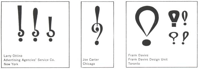
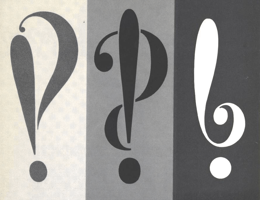
Also reproduced in the second article were some of the designs sent in by graphic designers and typographers. Like the suggested names, some were abstract, others direct; more than anything else, though, they were all fashionable. These were, after all, the creations of advertising men steeped in a culture of continual renewal. As shown here, Frank Davies’ stylised hot-air balloon and Larry Ottino’s angular, inverted question mark with its tiny aperture seem custom-made for movie posters or glossy magazine covers of the era. In the end, however, mirroring the popularity of Speckter’s own term ‘interrobang’ over the other suggestions for its name, his simple superposition of a question and exclamation mark (‘‽’) would prevail, becoming the model for most future interpretations of the symbol.
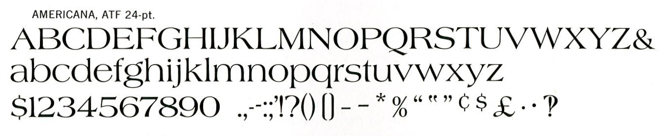
Popular as it was with writers and advertisers, the interrobang faced an uphill struggle for mainstream acceptance. Simulating one on a typewriter was possible, if clumsy — type a ‘?’, and then overstrike it with ‘!’ — but for typesetters creating a printed document, there was no such shortcut. Those advertisements and documents which actually honoured the writer’s use of the character had to be set using hand-crafted interrobangs, either drawn by an illustrator or created using rubber cement and sculpted with a razor blade.12 Four years after the character’s creation, though, came a breakthrough. Commissioned by American Type Founders to create a typeface to commemorate the upcoming U.S. Bicentennial, the graphic designer Richard Isbell included for the first time a so-called “interabang” (as ATF would have it13) in his new hand-set, hot metal font Americana.14
This apparently spontaneous* provision of the interrobang in a commercial typeface gave the mark a new legitimacy and ease of use overnight, and was significant enough for Time magazine to print an article in July 1967 which recapitulated the character’s creation and contained the optimistic declaration that “Delighted by its possibilities, the A.T.F. plans to include it in all new types that it cuts.”13 Unfortunately, this was a little premature; ATF was already in a slow but steady decline, and, following the roman face by a couple of years, Americana Extra Bold would be the last hot metal type to be released by the company.14
Stricken though ATF was, the interrobang still had wind left in its sails, and on the 5th of September 1968 the Wall Street Journal again reported on the character. Perhaps as a result of its increasing familiarity, it warranted only a brief mention in a round-up of miscellaneous business reports. Remington Rand, a prominent typewriter manufacturer, had an announcement to make:
Remington Rand offers the new punctuation mark, the Interrobang (a combination of ? and !), as a special type face for its Model 25 Electrics.16
The brevity of this report belied its significance. The interrobang’s path had been cleared all the way from the writer’s desk to the printing presses, and a new wave of enthusiasm for the interrobang was in the offing.
- 1.
- Unknown entry ↢
- 2.
-
Chang, Laurence., Peter. Kornbluh, and . The Cuban Missile Crisis, 1962 : A National Security Archive Documents Reader. The New Press, 1992.
- 3.
-
Gregersen, Erik, and . “Telstar (communications Satellite)”. Encyclopaedia Britannica.
- 4.
-
New York Times. “Martin K. Speckter, 73, Creator of Interrobang”.
- 5.
-
Speckter, Martin K. “Making a New Point, Or, How about that. ”. Edited by Martin K Speckter. Type Talks, no. March-April (1962).
- 6.
-
Wall Street Journal. “The Missing Symbol.”
- 7.
-
Speckter, Penny. “Personal Correspondence”. Keith Houston, February 10, 2009.
- 8.
-
“A Short History of the International Herald Tribune.”
- 9.
-
Speckter, Martin K. “Toward the 2-Way Punctuation Mark”. Edited by Martin K Speckter. Type Talks, no. May-June (1962).
- 10.
-
Burton, Gideon O. “Interrogatio”. Brigham Young University, March 2011.
- 11.
-
Rosendorf, Theodore. “Exclamation Mark”. In The Typographic Desk Reference, 46+. New Castle, DE: Oak Knoll Books, 2009.
- 12.
-
Haley, Allan. “The Interrobang Is Back”. x-height: FontHaus’ Online Magazine.
- 13.
-
Time. “New Punctuation Mark”.
- 14.
-
McGrew, Mac. “Americana”. In American Metal Typefaces of the Twentieth Century, 13+. New Castle, DE: Oak Knoll Books, 1993.
- 15.
-
Publishers’ Auxiliary. “Interrobang (!?) Expresses Modern Life’s Incredibility.”
- 16.
-
Wall Street Journal. “Business Bulletin.”
- *
- The September 7th 1968 edition of Publishers’ Auxiliary writes that “Speckter says it took him five years” to get ATF to include an interrobang in Americana. Speckter’s widow Penny explains that this is inaccurate, and that the addition of the so-called “interabang” to Americana was entirely unprompted.7 Perhaps tellingly, the Publishers’ Auxiliary article also makes a factual error; if Speckter had been lobbying for the inclusion of the interrobang for five years since its creation, the font would have had to appeared in 1967 while most other sources date it instead to 1966. But hey, who’s counting‽15 ↢
Comment posted by Jason Persampieri on
I am completely enthralled by these articles. Keep ’em coming!
Comment posted by Keith Houston on
Hi Jason – glad you like them!
Comment posted by mjb on
Being a relatively young person, I first found reference to the interrobang on a discarded box of books in the Fenway neighborhood of Boston in 1989. Never able to pass such a thing, I rifled through and pulled a book by Herbert Spencer RDI FSIA, “The Visible Word” (1969 – 2nd revised edition of a Royal College of Art report from 1968 – Visual Communications Books, Hastings House Publishers, NY).
A study of ledgibility of type as the industry began the transition from the tried & true hot metal technology, on page 35 there was very small reference to a “new punctuation mark, ‘un point d’ironie’ proposed by writer Alcanter de Brahm (1868-1942)”. A backward question mark, there was also reference to “A mark serving the same purpose and called an ‘interabang’…recently introduced by American Type Founders Company.” showing the Isbell design from ATF Americana.
I was some completely intrigued and enamored, and immediately dropped the idea of naming my only recently founded printing office “The Stinking Toe Press” (my fiancee and I ate a lot of garlic…) and adopted the name “interrobang letterpress” under which I have imprinted since 1990.
Well prior to the explosion of the internet, I’m fairly confident I was ahead f the curve on resurrection of the interrobang, and have been duly miffed at all the late-comers “diluting” my brand ever since.
Ahh well, the joke’s on them. If I had a dollar for ever time I heard “How do you spell that ‽ “…
Comment posted by Keith Houston on
Hi,
That’s a great story! If you’re amenable, I may link to Interrobang Letterpress in my next article. Please let me know if that’s okay!
Comment posted by mjb on
Hi Keith, yes certainly, and thank you.
Comment posted by Keith Houston on
Fantastic, thanks! The second (and final) interrobang article will be up not this weekend but next.
Comment posted by Tim May on
Is there evidence that “interrobang” was based directly on the Latin interrogatio? On the face if it, an English word like “interrogation” or “interrogative” would seem more likely. “Interrogation mark” (or “interrogation point”) is another name for the question mark, after all.
Comment posted by Keith Houston on
Hi Tim,
Martin Speckter gave the interrogatio explanation himself in the first Type Talks article. Hope this helps!
Comment posted by John Cowan on
Pero ⸘por qué no mencionan el signo de interrobang invertido‽
Comment posted by Leonardo Boiko on
Yes, the deliciously-named gnaborretni!
Comment posted by Keith Houston on
Hi John — there may yet be a mention of the gnaborretni in the second part of the article!
Comment posted by Ron on
I love these articles! And my choice of interrobang is Lipton and Speckter’s one on the left.
Comment posted by Blinde Schildpad on
Just leaving a comment to have my comment look pretty.
Comment posted by Geof Huth on
Another great job, and certainly the best writeup of the history of the interrobang I’ve ever seen. I assume you either inadvertently let slip in or intentionally made one error, since I think it extremely unlikely that an American writing in an American journal would spell the word “favors” as “favours.” But tell us if Spekter did, since that would be interesting. I, of course, call this an error not only because you are quoting text; otherwise, “favours” is clearly correct by anyone who wants to use it.
Geof
Comment posted by Keith Houston on
Hi Geof,
My mistake! I’ve just checked the original text, and Martin Speckter did in fact use the American spelling. I’ll update the post accordingly.
I’m glad you enjoyed the piece otherwise.
Comment posted by Melissa on
This was certainly a refreshing read. There aren’t many writeups about the interrobang that hold my attention from beginning to end. Excellent job, Keith.
Comment posted by Bart on
Another very interesting article. Love the alternate designs for the interrobang, particularly Joe Carter’s!
Comment posted by MadArchitect on
I wonder if the fixity of standards caused by the widespread adoption of typing makes popularizing new symbols like the interrobang all but impossible. As your articles on the pilcrow demonstrated, experimentation and assimilation tended to be more fluid when documents were, by and large, hand-written. I suspect that was the case even in the early days of the printing press, since printed documents were typically arranged to emulate the style of the written documents on which they were based. Now that we do most of our writing (not to mention formatting) with the standard keyboard, the bar for entry is likely higher than it was in previous centuries.
Comment posted by Keith Houston on
That’s entirely possible, and I’ll be talking a bit about the use of symbols from the standard typewriter keyboard when I write about the ‘@’ symbol in a few entries’ time. I’d imagine that anyone trying to introduce a new character these days would find it at least at difficult as Martin K. Speckter did with the interrobang — broadly speaking, the same obstacles to text entry and reproduction still exist, only in digital rather than mechanical form.
Comment posted by Francis Norton on
I think you could take the 1996 introduction of the Euro symbol as a case study from the age of the internet and standardised keyboards.
And yes – it face difficulties.
Comment posted by Keith Houston on
Hi Francis,
That’s a great suggestion. I still have a few marks of punctuation up my sleeve, but the introduction of the Euro symbol could make for a good story. Thanks!
Comment posted by Gunnlaugur Þór Briem on
Hi Keith,
Whatever happened to this entry’s footnotes‽
Comment posted by Keith Houston on
Hi — I’m not quite sure what you mean. Are the footnotes malformed in some way, or invisible?
Comment posted by Aaron Davies on
I have nothing to add, I just wanted to compliment you on your pluralizing “portmanteau” as “portmanteaux”.
Comment posted by helen mciver on
I just found a letter (only last pages of a letter handwritten during/around WW II by Sgt. Martin K. Speckter to my parents. Does he have any living relatives? Would it be of value to anyone? It is weird and talking about men and women, last sentence being “Greater praise has no Spec.”
Comment posted by Keith Houston on
Helen,
He does indeed — his wife Penny has been of great help to me in writing these articles on the interrobang. I’ll pass along your details.
Thanks for the comment!
Comment posted by Vanessa Vaile on
and there is the upside down Spanish interrobang, ⸘
(I have no idea what it’s called)
Comment posted by Keith Houston on
Hi Vanessa – it’s called the “gnaborretni”!