Happy New Year, everyone! To celebrate the coming of the new year, let’s, er, start by looking back to the old one. Back in December, in response to my post about the ampersand/plus-sign face-off currently underway on the signs of London’s hipster restaurants, commenter Jeremy wrote:
[H]aving taken what might well be hundreds of miles of handwritten notes over the years, I regard the ampersand as too fiddly for quick writing, and instead use a sort of “+” with the far-left and top ends joined. I don’t know if this is a real character (maybe from shorthand?) and I was taught it at some point, or whether it just morphed from a “+”and lazy writing. However, it stands out from the text and (at least with my handwriting), does not get confused with a “t”.
Well, you’re doing it all wrong! It’s supposed to be the far left and bottom ends that you join together. And I know I’m right, because that’s how I have been doing it all my life.
But seriously, I wholeheartedly agree.
Jeremy and Jamsheed are both correct, of course — there’s more than one way to write a legible ‘+’, ‘&’ or other ‘and’-sign, even when discussing what is ostensibly a single mark. Their description of an augmented or hurried ‘+’-like symbol brought to mind an email conversation I had a few years ago with a designer named Rebecca Kirch (née Alden) about almost exactly the same subject, and that, in turn, got me thinking about how we create, disseminate, and “standardise” new marks or forms of punctuation.
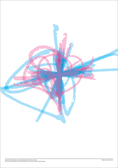
Back in 2004, Rebecca told me, she had decided to examine how the ampersand, plus sign and their kin fared when pen met paper. This would form part of a Masters thesis on the subject, and the result of her research was a fascinating series of images that illustrated just how much our personal ‘and’-signs vary when the time comes to write them down. (You can see one such image above, depicting a multitude of handwritten plus signs like the one described by Jeremy and Jamsheed.) As Rebecca explained in the introduction to her thesis:
Symbolic abbreviations for certain words are part of everyday handwriting, yet they are not part of the alphabet. For example, a writer may use & for ‘and’, w/ for ‘with’ or @ for ‘at’. There are many reasons to use these symbols: maybe because it is faster, or because it saves space, because it looks nice, or because it is more fun to write. Some people use such symbols so frequently and automatically that they have become ingrained in their handwriting.
The way that a handwritten symbol varies from writer to writer “because it is faster, or because it saves space, because it looks nice, or because it is more fun to write” is a recurring theme here at Shady Characters. It is the little idiosyncrasies of our handwriting — the unconscious variations on existing glyphs and the shortcuts we take as write down familiar marks and letters — that have moulded the visual appearance of many marks of punctuation as much as any deliberate process of design. The ampersand, for instance, comes from the juxtaposition of the letters E and t; the ‘@’ may well come from an a surmounted by a bar, or tilde; and the ‘#’ is the formalized descendant of a hastily-written, barred ℔ for libra. It is the unpredictability of the human hand, not the aesthetic judgement of a type designer or stone-cutter, that has laid the foundations of our written letters and punctuation.
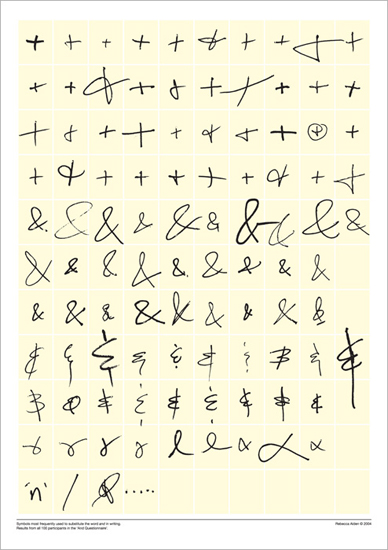
To explore this phenomenon in flight, so to speak, Rebecca catalogued a variety of handwritten ‘and’-signs, including the ampersand, Jeremy and Jamsheed’s looped plus sign, the familiar ‘reversed-3-with-vertical-bar’ (for want of a better term) seen at left, and many other similar marks. Having separated the marks into related groups she superimposed male and female interpretations of each symbol to produce dramatic images such as the one at the top of this post — entrancing visual surveys of various ‘and’-signs that reveal that the “average” ampersand or plus sign is anything but.
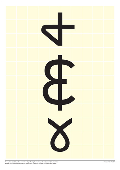
Out of this orderly chaos Rebecca created three new ‘and’-symbols, codifying the handwritten forms she had collected into glyphs designed to be compatible with the ubiquitous Helvetica typeface. (You can see them below.) As intriguing as Rebecca’s new marks are, however, I am duty bound to write the same thing I often have to write in these circumstances: these new marks of punctuation have so far failed to make themselves felt in mainstream writing. But while this is, sadly, par for the course in such cases, I think there’s a deeper point to be made. The thing that stuck with me after looking through the messy, very human symbols that Rebecca catalogued along the way to creating her trio of new ‘and’-signs is that we in danger of losing the calligraphic Brownian motion that helped form our alphabet in the first place. In place of the divergent handwritten scripts of an entire species’ worth of letter-writers and note-takers we are increasingly reliant on digital typefaces and emoticons designed and curated by a comparative handful of interested parties — type designers, software companies, and, not least, the Unicode Consortium, which acts as guardian of essentially all the characters that might appear on a computer screen. It is as though we’ve abandoned evolution in favour of intelligent design.
Still, though, given that the Unicode Consortium is still willing to consider new characters for inclusion in the all-important Unicode standard, things can’t be all that bad, can they? In their own words:
For new characters, [submitters should] provide images clearly showing the characters in use, with their glyph circled or clearly identified, along with a caption that describes the character and the source of the image.
Show us enough examples of a new mark in use, they say, and we’ll consider it. And there are, obviously, many people who still primarily write by hand who might yet invent a new mark, whether deliberately or accidentally, when an existing one is too time-consuming or awkward to write. But are there enough of them? For me at least it has been a long time since I put pen to paper to write anything longer that a to-do list, and I suspect I am not unusual in this respect. All my work ultimately ends up in electronic form, whether for a book or this blog (I daresay much of yours does too, whatever your profession or favoured hobby happens to be), and I find it easiest to stay within the digital realm from start to finish.
The problem with this is that we will, at some point, simply run out of new characters to be sent off to the Unicode Consortium for their stamp of approval. It feels like the critical mass of writers required for a new mark of punctuation to appear in any sort of organic way — the number of pens that must be put to paper on a daily basis to create a credible new ‘#’, ‘@’, or ‘&’ — is ebbing away, if it has not already been lost. Put simply, if we confine ourselves to writing only with our computers and smartphones, the spontaneity of creating new letters and symbols is lost to us. Has the Unicode Consortium approved its last truly novel handwritten character, I wonder?
So, um. This is all a little heavy, and it is certainly not where I expected to end up after pondering Jeremy, Jamsheed, and Rebecca’s handwritten plus signs. But here I am nevertheless. So I would ask of any type designers, calligraphers, or punctuational innovators who are reading this: what do you think? Is it still possible for a new mark of punctuation to come out of the hustle and bustle of everyday handwriting? Is there still hope for an accidental ampersand or a hurried octothorpe to come about and to spread organically, without a deliberate act of creation or promotion? Answers on a postcard, or, preferably, in the comments below!
You can see more of Rebecca’s work at tingedesign.com. Many thanks to her for supplying a copy of her thesis!
Comment posted by Przemysław on
Personally I actually write “et” – just for fun ;-)
Comment posted by Keith Houston on
A retro touch! Interestingly, the Unicode Consortium says that new characters that can be produced using two or more existing characters will not be considered for inclusion in the standard. If “et” ever was to take off, we’d still have to type it out…
Comment posted by Korhomme on
In Pitman’s Shorthand, ‘and’ is represented by a sign like an acute accent: ´ .
‘The’ is represented by what looks ordinarily like a full stop. And a ‘full stop’ is an x .
Comment posted by Keith Houston on
Interesting. I wonder — have any modern shorthand symbols made their way into common use among us longhand writers? The Tironian et lasted far longer than the rest of Tiro’s shorthand, but I can’t think of another example off the top of my head.
Thanks for the comment!
Comment posted by Gunther on
An interesting topic. I always enjoy writing the ampersand, starting from the lower right, mostly because a part of it is written in the opposite direction.
Regarding another plus sign for handwriting: What about the ∧, used for a logical conjunction, maybe written like an upside-down u to differentiate it further from the A?
Comment posted by Keith Houston on
I write it that way too. In the introduction to her thesis, Rebecca mentions that she was never taught how to write the ampersand, and that was true for me too; in the end, I just copied the printed ampersands I saw everywhere. The computer isn’t the only writing technology that has influenced how we write!
‘∨’ mean “or”, does it not? Having said that, maybe there’s a related symbol that would work. How about ‘∪’, or “the union of two sets”?
Comment posted by Jamsheed on
That’s how I write the ampersand as well. Oddly, I had to learn how to write it when I taught logic (I did my PhD in philosophy and stuck with academia for a couple of years after). Some textbooks use ‘∧’ but a lot of them use the ampersand. Sadly, now I almost never get to write the ampersand, or rather, I suppose I never do write it.
N.B.: Hi Keith (if I may), there seems to be a bit of an issue with the domain name for this site. If I type it out without ‘www.’ prefixed, it takes me to an outdated version where the first post is from August of last year. Possibly only an issue I’m having, but wanted to bring it to your attention.
Always a pleasure to read a new Shady Characters post.
Comment posted by Keith Houston on
Hi Jamsheed — you mean that some textbooks used ‘∧’ to mean “and” in lieu of an ampersand? Interesting! I had no idea that was the case.
Thank you for mentioning the “www” issue — I seem to be having the same problem. I’ll see what I can do to fix it.
Thanks for the comment!
Comment posted by Keith Houston on
The “www” issue should be fixed now. I’d be grateful if you could try again to see what happens!
Comment posted by Jamsheed on
Hi Keith,
The ‘www’ issue indeed seems to be fixed.
As for the logical connectives: yes, some textbooks use the ampersand for the logical ‘and’ and some use ‘∧’. But it’s only for the logical symbol: so another way of putting the point is that some textbooks reserve the ampersand for a logical symbol. (Similarly, for the logical ‘not’, some use the tilde and some use whatever this thing: ‘¬’ is called. Etc.)
Comment posted by Keith Houston on
Great! Thanks for testing it out.
The ampersand is used for logical operations in many programming languages, too. A single “&” usually performs a “bitwise” AND operation (the two operands are broken into individual bits and each pair of bits are ANDed together individually before reassembling the result) whereas “&&” converts the two operands to
trueorfalsebefore ANDing the results. Other than copyeditor, philosopher and programmer must surely be the professions with the most to lose from a misplaced mark of punctuation!Comment posted by Martin Eden on
Despite the advantages of typing in a word processor over handwriting – legibility, speed, undo history, collaboration, backup – there are many obvious disadvantages. When writing on paper we can, as you say, easily invent new characters, draw scribbled or neat diagrams – we can be playful and creative. All of these things currently are possible with computers but they take far more effort.
My hope is that our ways of interacting with computers will yet develop into richer and more flexible forms, where we can easily translate from what we picture in our minds into the finished document. A means of interaction that will combine the fluidity of paper and pen with the advantages of computers.
I don’t know what this would look like, but user interface design is still a developing field. I look forward to what the future brings.
Comment posted by Keith Houston on
“My hope is that our ways of interacting with computers will yet develop into richer and more flexible forms” — I couldn’t agree more! Now that we have these adjunct touchscreen devices in our pockets throughout the day, it feels like the time is ripe for a rethink (or rather, a freeing-up) of how we enter text by computer.
Comment posted by Deborah HH on
This Christmas I received hand-addressed Christmas card from a high school classmate—we are now in our 60s—that used a heart with a vertical strike through it for an ampersand mark between Mr. & Mrs. It’s was so sweet and juvenile—I suspect she has a pre-teen granddaughter.
Comment posted by Keith Houston on
A nice touch! This is precisely what I was getting at. Thanks for the comment!
Comment posted by Jamsheed on
Oh, hey! My comment was featured in a post! 2015 is off to a flying start.
Comment posted by Keith Houston on
Hi Jamsheed — I must thank you for having taken the time to comment in the first place! Your note, along with Jeremy’s original post, really did get me thinking about the whole computer vs. human input question.
Comment posted by Sebastian Villarreal on
“Put simply, if we confine ourselves to writing only with our computers and smartphones, the spontaneity of creating new letters and symbols is lost to us. ”
I think it’s the opposite. As more of our communication moves to written form (texting, email, facebook), the need for typed shorthand will evolve symbols of it’s own. That’s what emoticons are! In fact, emoticons have themselves gotten simplified. A smiley with a hyphen for a nose is positively retro at this point.
Comment posted by Keith Houston on
Hi Sebastian,
I take your point, but I’d like to clarify mine. It’s not that I think we’ll see fewer new symbols in future, it’s that we’ll see fewer of them created democratically. The key thing about Scott Fahlman’s original smileys is that they could have easily been created by any other computer user — and that they were equally easy for others to mimic when they found them to be useful. And of course, as you say, they’re still evolving. This one is a particular favourite of mine: ¯\_(ツ)_/¯
What I was getting at was that the creation of new individual characters — the SarcMark, for example, or Bas Jacob’s ironieteken, as opposed to emoticons composed from strings of other characters — is increasingly difficult. Bas could only create the ironieteken because he is a type designer and knows his way around a digital font (and even then, we still can’t type his mark without the appropriate font installed on our machines), and he is not exactly a representative sample of computer users. As another example, consider the bitmapped emoticons and emoji that have succeeded textual smileys: there was no way to transmit images as characters until it was coded up by some software engineer, and the vast library of emoticons and emoji to be transmitted over this new protocol had to be intentionally designed by someone. Again we’re out of the comfort zone (not to mention the economic clout) of the vast majority of computer users. Neither the ironieteken nor bitmapped emoticons/emoji are the product of any kind of democratic creation process.
Phew.
Thanks for the comment!
Comment posted by Clayton on
The shape of the ampersand in title of the previous post (http://imgur.com/ic0lyXb) intrigued me–I had never written an ampersand like that before. I tried my hand at scribbling it a few times.
It’s a little hard to get used to (it occasionally comes out like a G), but I do like the look of it. I’ve been a pretty devoted “backwards-3-with-line” user up to this point. The backwards-ness and difficulty in creating curves that look good when writing & always felt odd. I like to think the backwards-3-with-line also retains more of the look of an “Et” ligature.
An interesting thing to note about the “+” use: PBS has a kids’ show called “Peg + Cat”, which is usually pronounced as “plus”. The show is heavily mathematics-focused, though, so that maybe isn’t too surprising.
I have never seen anyone write the “upside-down-breast-cancer-awareness-ribbon”. Is that just a REALLY sloppy + (such that it’s connected and rotated)? Or is it a unique symbol, somehow? Are there people who use both?
Comment posted by Keith Houston on
Hi Clayton,
The ‘&’ in the title of the last post is typical of italic ampersands in that many of them retain more of their character as an “et” ligature than their roman counterparts.
It’s funny: I remember my granddad once asked me to “print” my name on some form or other, but I didn’t understand. Wasn’t “printing” something that you did with a computer? What he meant was “write in square, upright capitals”, in emulation of printed text. That was the first time it occurred to me that the way we write by hand might be influenced by printed letterforms, and your experiment brought it all flooding back!
I’ve seen the “upside-down-n-awareness-ribbon” ampersand quite a few times here in the UK. I wonder if it’s particular to a given country or group of writers?
Thanks for the comment!
Comment posted by Gunther on
A funny note: There are many examples of weird typography but one of the weirdest – at least to me – is the use of the ampersand as a fancy “E” by an estate agent in my home town (I have shown it in my blog at “Sonderzeichen”). I wonder if no one has noticed it or the if ones who have remained silent …
Comment posted by Keith Houston on
Wow. Google suggests that there at least some people out there with the surname “Etschner”, but presumably this isn’t the case with your estate agent…?
Comment posted by Gunther on
The name of this estate agent is really “Eschner” which makes the lettering look so odd. Maybe he should change his name to match his corporate design ;-)
Comment posted by Andy Behrens on
Wouldn’t “&schner” be read as “Undscher”?
Comment posted by Keith Houston on
Indeed, unless the reader happened to know the Latin etymology of the ampersand.
Comment posted by Dave on
Surely the new “and-symbols” that Rebecca’s created would be, in the eyes of the Unicode consortium, alternative forms of the ampersand, and therefore still covered by the 0026 codepoint? Font designers working in OpenType are long since used to designing multiple glyphs for a single character and having them available via “contextual alternates” or “stylistic sets” features. I think my copy of Zapfino’s got around seven different ampersands in it.
Comment posted by Keith Houston on
A good point! And, hopefully, a bit of encouragement for typographers creating new variants of existing symbols. Perhaps the interrobang should be mapped to a ‘!?’ ligature.
Comment posted by Jess Kautz on
I think it might not be time to completely despair at new symbols being created by hand. There’s at least one place where hand written notes are still a norm, and that seems to be in taking notes for science. It’s still just too much of a pain to write down almost any sort of equation using a computer, let alone all the special characters that you end up using. In working one my dissertation I’ve generated probably a few thousand pages of written notes. Some I could type up, others I could scan, but it’s just easier to create and sift through the handwritten pages than a 4000 page pdf. The handwritten lab book is also still very much a thing.
I’ve even ended up coming up with a few symbols of my own for things that come up frequently, usually when reading papers, like a notation that I should download paper that’s mentioned (a ‘D’ with a down arrow through it) or that I should should cite this section of a paper (‘C’ with a left arrow through it.)
As a side note, I also use the plus symbol as “and” sometimes, bottom and right corners connected. I stumbled on this page when I started to wonder if that had a name, like the ampersand.
Comment posted by Keith Houston on
Hi Jess — thank you for the considered comment! I’m currently doing some programming work, and, like you, I find a handwritten work book is invaluable. I like the idea of your augmented letters; an arrow is a nice way to add meaning to a letter without overwhelming its legibility.
Have you noticed any new punctuation or logographic symbols (that is, symbols that would be used in prose rather than written or mathematical notes) come into common use in the scientific community of late?
Comment posted by Ann Bradburd on
This essay discusses my deepest wish. I transcribe a lot of handwritten material, 19th century letters and my own notes from a long ago trip. The + sign looks wrong, too high and too stiff, but I haven’t found a suitable substitute.
Two other thoughts: I invented two characters for quick note taking. For between /./ and for ship, a character like a widened u with a vertical line…i.e., a crude boat.
As for the @ character, I have thought it was just a cursive at with the t curled over the a. In my ancestress’ handwriting, a terminal t or d were curled back over the word.
Comment posted by Keith Houston on
Hi Ann — thanks for the comment!
Rebecca can be reached at https://tingedesign.com/ — perhaps you could contact her to ask about using her new signs in your transcription work.
It’s interesting to consider how many writers invent their own signs, such as your “between” and “ship” marks. How many useful but personal marks have been lost over the years, I wonder?
There’s lots more to be read about the ampersand here at Shady Characters. You might want to start with my original series on the mark.
Thanks again!
Comment posted by Jayk on
I write my ampersand like a backwards 3 with vertical lines above & below
Comment posted by Elena on
This is the only place where I’ve been able to find evidence that people draw the ampersand the same as I do. In that picture with all the different variations, on the yellow page, there are two of them that look essentially like a 3 with a line through it. Or a line above and below it. I’m not exactly sure where I learned to draw it this way. I must’ve been young, and seen my mom print it that way or some other adult draw it, and I probably got it mixed up in my head when I went to try and use it in my own writing. Thus, I draw the backwards ampersand. There’s been times where people see my ampersand and they’re like, “you know, that’s wrong,” and I’m just like, “it’s all I know…” You know? Maybe I felt like I should be unique. But I can’t change it now, I don’t even think of it when I write it- I only ended up here because again someone pointed out my silly looking ampersand that also apparently looks like a dollar sign. Had to google and see if I’m alone in this world.
The ampersand can be very personal… I mostly use it in my own notes, in my commonplace book, etc. So it doesn’t really have to be perfectly legible or make sense to anyone else. But I feel a little bad because maybe I look dumb with my backwards ampersand. Anyways, cool read. Really cool.
Comment posted by Keith Houston on
Thanks, Elena! I’m glad you enjoyed the post. And rest assured, your own personal ampersand is a precious thing — don’t let anyone tell you that you shouldn’t be using it!