It’s publication week for The Book here in the UK, and so things are a little busy. For the third part of my “Booking It” series, then, on the arts and crafts that go into bookmaking, I’m cheating a little and republishing a post from November 2012, when I visited Robert Smail’s Printing Works in the Scottish borders. I hope you enjoy it!
Last weekend I took the bus from Edinburgh to Innerleithen, a small town in the Scottish Borders, for a one-day letterpress workshop at Smail’s Printing Works. The more I appreciate the impact that printing has had on the marks examined here, the more I want to try my hand at printing itself: it seems disingenuous to discuss the death of the pilcrow at the hands of Gutenberg’s press, or to explore the epic struggle to automatically hyphenate and justify text, without ever having lifted a piece of type in anger.
So, just before 10am on a damp but clear Saturday morning, I stepped off the bus on Innerleithen’s high street and walked the few hundred metres to the Victorian shop front of R. Smail & Sons Printing Works. Gen Harrison, property manager, and Rachel Mays, senior assistant, greeted the handful of us who had managed to snag places on the second of the two workshops run each year. We were shepherded from the neat, quaint shop to the separate, two-storey workshop building behind, given aprons and warned to keep our hands out of whirring machinery.
The workshop is a warmly inviting, thoroughly lived-in piece of Victorian architecture. It is poised over a manmade canal, with the small water wheel that powered the works’ presses in their heyday visible through the windows at one gable end. The ground floor was taken up with a variety of hand and powered presses, with cabinets of type and shelves laden with reams of paper crowding the walls. To get us over the inevitable what-do-I-print-and-how-do-I-print-it hump, Gen led us through the basics of printing with the large, wooden type once used to set posters and other display items, and encouraged us to start by printing our own names.
The process is as easy to describe as it is difficult to get right. First, the wooden blocks of type are placed face up on the bed of the press, then the viscous, sticky ink is rolled out and applied to the faces of the letters with a small hand roller. Next, the paper is laid flat over the letters and the press’s cylindrical platen is rolled over and back across the paper. Carefully peel off the paper et voilà: you have a squint, patchy reproduction of your name in a style beloved of the makers of distressed denim clothing. Gen and Rachel helped us through the various tricks to getting things right: even application of ink, the use of magnets and wooden guides (or “furniture”) to keep the type square on the bed of the press, and judicious use of scrap paper placed under the type to level out the uneven surfaces of the letters.
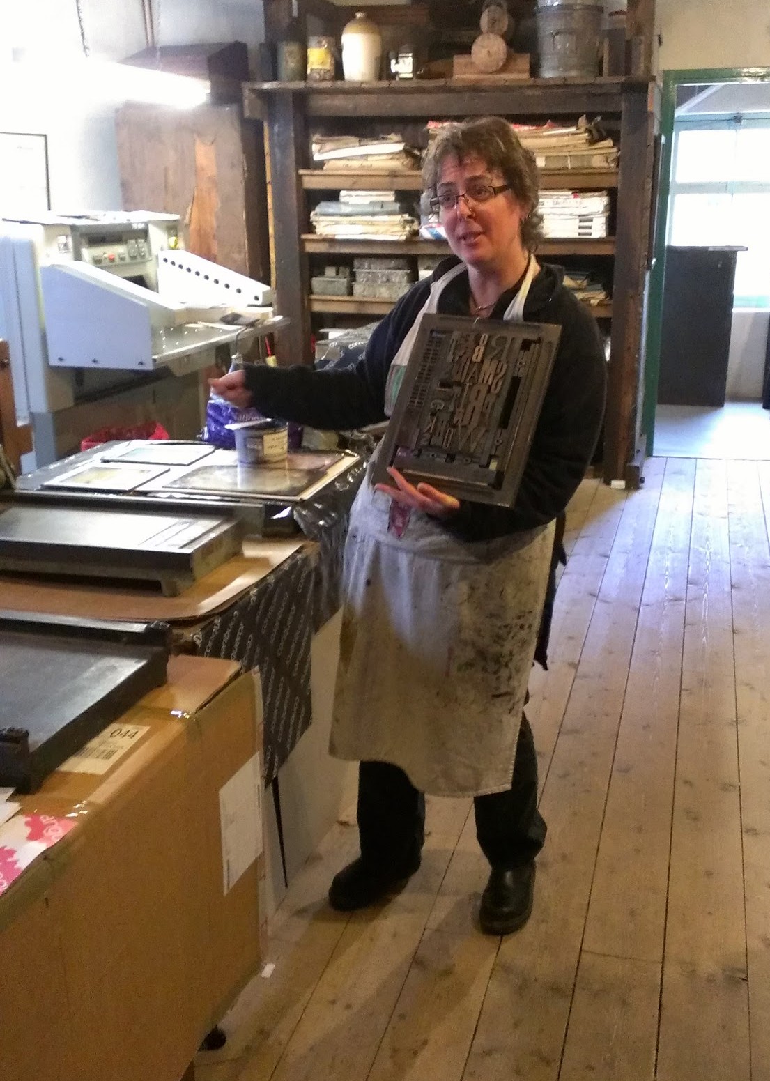
Rather than perfect my wooden type technique, though, I had a different goal in mind. I explained to Gen what I wanted to do and was shown upstairs to the second storey of the workshop. The second floor was again packed with presses and cabinets of type; this time, though, the angled cases set out at eye and waist height held the minuscule lead type used to set books.
The process of setting lead type is a little more involved than for wooden type. First, a ‘composing stick’, or ‘setting stick’, resembling a brass ruler or caliper, is set to the desired line width. Individual sorts — lead blocks carrying embossed letters — are placed upside down and left to right along the composing stick’s ledge until the line is full, or nearly full; any play is eliminated by distributing progressively thinner spaces between the words. Next, if the printed lines are to be separated by some white space, a thin lead strip is placed along the top (or bottom, depending on your point of view) of the finished line, and a new line begun. Once the stick is full, the letters are carefully slid off into a metal ‘chase’, or frame; empty space around the text is filled with furniture and everything is held in place by means of expandable spacers called ‘quoins’. The finished article — furniture, quoins and type bound into a chase — is called the ‘forme’. (Inevitably, your first completed forme will shed letters and spaces willy-nilly onto the workbench as soon as you lift it up. There is an art to spacing lines so that they do not do this.)

Unlike the large roller presses downstairs, this time round I would be using a dainty “Adana”, the quintessential hobbyist printing press, and a British institution from its introduction in the 1920s until the last new example was sold in the ’90s. The Adana is an ingenious device: a single lever drives a pair of rollers across the surface of the type and up over the circular inking plate to receive a fresh coat of ink; after the rollers have passed, the platen bearing the paper is pressed against the type. As the lever is released, the platen is withdrawn from the type and the rollers return to rest at the bottom of the machine. (It’s difficult to describe; this video shows a similar Kelsey press in action.)
My plan called for four or five formes in total, and two separate impressions for each printed piece, each with a different colour of ink. With Gen having demonstrated the subtleties involved in aligning, or ‘registering’, the successive formes required to print each piece, I set to work. The printing itself went remarkably smoothly — so smoothly, in fact, that I almost immediately felt the siren call to purchase a used Adana — though cleaning the stubbornly adhesive ink off the rollers and inking plate was enough to bring me back down to earth. Distributing type back into the correct boxes at the end of the day was another shock to the system, and I suddenly understood at an instinctive level why Ottmar Mergenthaler and Tolbert Lanston had sunk so much of their time and money into their respective automated typesetting devices. A lifetime of distributing used type must have driven even the most patient of hand compositors a little mad.

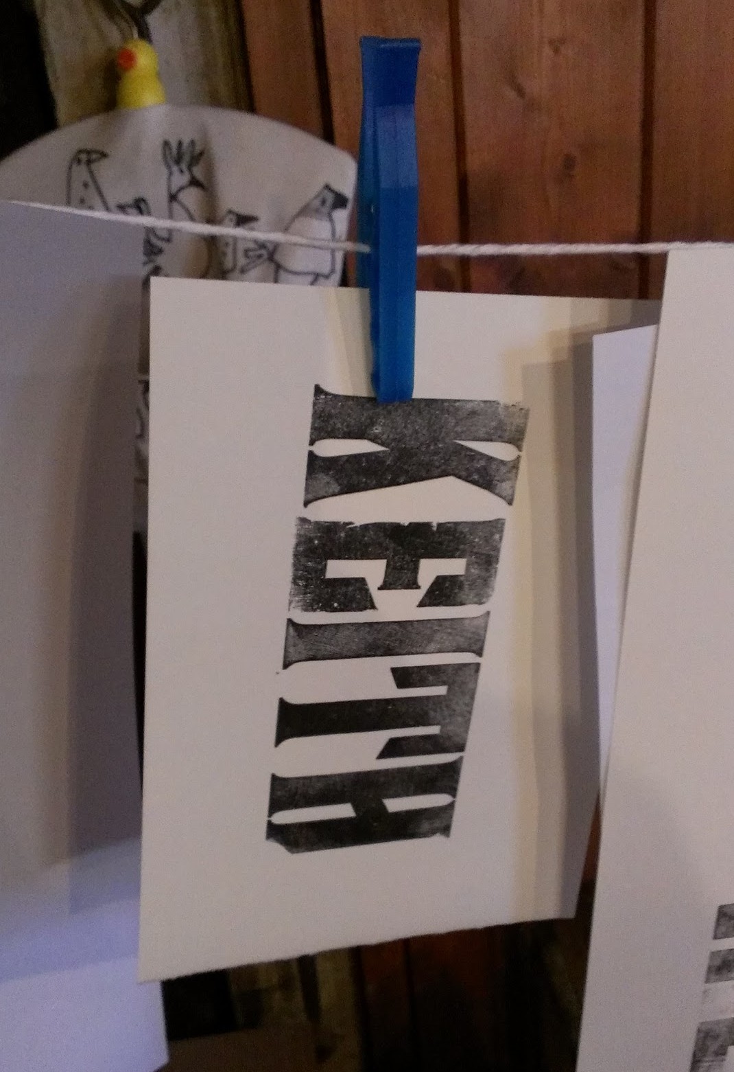
In the end, my 6-hour day resulted in a stack of perhaps fifty two-colour business cards. It seems paltry to type that, but I can’t express how satisfying the process was; Eric Gill may have been a monstrous character in his private life, but his public endorsement of skilled manual work was spot on. Gen and Rachel’s enthusiasm for their job was infectious, and by the end of the day I was thoroughly pleased with my small achievement. If you’ve ever been the slightest bit curious about printing or typopgraphy, you owe it to yourself to give it a try, and Smail’s is the perfect place to start.
Responsibility for all photographs (however inexpert) is mine. See more of them at Google+. Neither the NTS nor Smail’s induced me to write this in any way; I enjoyed myself so much that I thought it worth spreading the word. Do get in touch with them if you fancy trying letterpress printing!
Lastly, if you’ve enjoyed this article, why not buy a copy of The Book? Johannes Gutenberg and his invention (or was it his invention?) play a starring role, along with the many developments in bookmaking and printing that followed. The Book will be published in both the UK and the USA in August 2016.
Comment posted by Dick Margulis on
That’s a well made card, Keith. But I want to say something about the types to people too young to have thought much about them.
Today, a typeface is drawn glyph by glyph on a computer monitor, and the designer can fiddle with side bearings fairly easily. Then the designer may devote some time to a kerning table, to specify minute adjustments in how particular letter pairs fit together. InDesign page layout software even offers the option of measuring the white spaces between glyphs and automatically equalizing them (“optical” kerning). All this is like magic.
Consider, though, the artisans who drew the letters on your card, cut the punches,* punched the copper matrix, and positioned the matrix in the mould. They had to, among them, and after many smoke proofs to check their work, arrive at side bearings on the individual types that would allow you, Keith, to line them up in a composing stick and have the letter spacing look quite wonderful regardless of what characters fall next to one another. This is magic of another kind. And it’s worth pondering for a moment.
* Before about 1900, punches were cut directly on steel billets with gravers and files and such. Afterward, they were cut with a pantograph from a large metal pattern. See https://en.wikipedia.org/wiki/Linn_Boyd_Benton
Comment posted by Keith Houston on
Hi Dick — it does make you think, as you line up the sorts on your composing stick, about the work that went into producing those sorts in the first place. As a software engineer I appreciate the work that must go into making digital typefaces (and the tools behind them), and still my mind boggles at the skill and effort that must have been required back in the cold metal days.
Thank you very much for the comment!
Comment posted by Andrew Areoff on
Thanks for a wonderful article. Love the Adana – it’s my letterpress press of choice. In fact here’s a little video of a little chap using one (my son) https://www.instagram.com/p/BHZL1GXhCce/?taken-by=smelltheink
I’m going to read this article and the previous one about your visit to Robert Smail’s print shop as it’s so full of wonderful words and pictures about our beloved letterpress printing.
Comment posted by Keith Houston on
It was great fun to get to grips with the Adana, and surprisingly easy too. Thanks for the comment!
Comment posted by Liaizon Wakest on
As a long time reader and someone who helps run a letterpress print shop in New Orleans I am glad to see you getting to play with some type. Having spent probably a hundred hours just sorting out the punctuation and trying to figure out what font sets they belong to it really gave me a new sense of appreciation for minute physical details in font design in a way that looking at computer fonts never could (for me at least). If you or your readers ever find yourself in New Orleans feel free to stop by and check out our immense collection of type. Currently the best place to reach us is facebook.com/1023463714384626.
Thanks for your awesome blog (I think this is my first time commenting here but I have read from afar for quite some time).
Comment posted by Keith Houston on
Hi Wakest — good grief! I can’t imagine having to sort out full stops, commas and so on from different metal fonts. Setting and distributing two lines of type was hard enough for one day. In fact, I’m reminded of the old trope in software engineering that a good engineer will write perhaps 10 worthwhile lines of code per day. Is there a similar measure for typesetting, I wonder?
Thanks for the comment, and I’m very glad you’re enjoying the blog!