Funny how time gets away with you in a late-stage pandemic, isn’t it? Here are a few somewhat recent stories of a typographic or emojinal (?) bent that Shady Characters readers may enjoy.
If you recall, the interrobang came into being back in 1962 and was immortalised just a few years later in Richard Isbell’s Americana typeface of 1967. As the first interrobang to take its place in a fully-fledged typeface, Isbell’s “open” version has a reasonable claim to being the canonical form of the character. The holotype of the interrobang, so to speak.
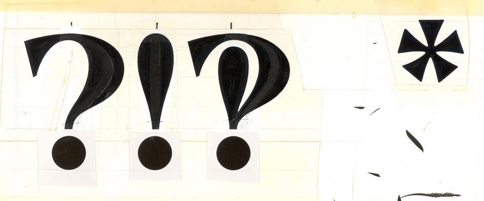
As far as I know, no digital version of Americana includes an interrobang patterned after Isbell’s original design. In fact, other than the hand-drawn example here, decent images of Isbell’s interrobang of any sort have general been hard to come by. Until now, that is: the indispensable Stephen Coles, editorial director and associate curator at the Letterform Archive in San Francisco,* recently tweeted that a clutch of Americana ephemera have been uploaded to the Letterform Archive’s website. You can find the complete collection here, but with the permission of the Letterform Archive I thought I’d highlight one particular example:

As is traditional for type specimens, this one oscillates between the mundane and the absurd. What’s noticeable, though, is how prominently the interrobang features: either Isbell or ATF must have been quite taken by Martin Speckter’s new mark. Quite an achievement for a symbol of punctuation that had only been invented only a few years earlier, even if its Warholian five minutes never quite translated into a durable presence on the printed page.
Elsewhere, the National Law Review reports on “The Case of the [Allegedly] Stolen Ampersand”. Moshik Nadav Typography, a boutique type studio, filed a claim against Banana Republic stating that the clothing company had stolen an ampersand from Nadav’s Paris Pro typeface. That first suit was dismissed for lack of evidence, but Nadav has filed a second on more limited grounds. Head over to the article to judge (ho ho) for yourself, but Nadav looks to have a pretty solid moral case even if the court has found their legal arguments to be less convincing.
Over at the MIT Technology Review, Tom Mullaney writes about the first digital Chinese fonts. I wrote in The Book about China’s invention of movable type and the problems that hampered its wider adoption, and Tom’s article is a neat account of the parallel issues that affected digital Chinese typography. Aficionados of early desktop computing will appreciate the details:
At the advent of computing and word processing in the West, engineers and designers determined that a low-resolution digital font for English could be built upon a 5-by-7 bitmap grid — requiring only five bytes of memory per symbol. Storing all 128 low-resolution characters in the American Standard Code for Information Interchange (ASCII), which includes every letter in the English alphabet, the numerals 0 through 9, and common punctuation symbols, required just 640 bytes of memory — a tiny fraction of, for example, the Apple II’s 64 kilobytes of onboard memory.
But there are tens of thousands of Chinese characters, and a 5-by-7 grid was too small to make them legible. Chinese required a grid of 16 by 16 or larger — i.e., at least 32 bytes of memory (256 bits) per character. Were one to imagine a font containing 70,000 low-resolution Chinese characters, the total memory requirement would exceed two megabytes. Even a font containing only 8,000 of the most common Chinese characters would require approximately 256 kilobytes just to store the bitmaps. That was four times the total memory capacity of most off-the-shelf personal computers in the early 1980s.
And finally: the king is dead, long live the king! Keith Broni of Emojipedia writes that on Twitter at least, FACE WITH TEARS OF JOY (😂) is no longer the most popular emoji. Enter, instead, the even more hysterical LOUDLY CRYING FACE (😭). Keith wonders if the change is down to the Covid-19 pandemic (“Is there simply less to laugh about now?”), which seems like an eminently sensible conclusion in these challenging times. But as ever, the shifting sands of the emoji lexicon mean that the most straightforward explanations are not always the right ones. Nowadays, ‘😭’ is often used to mean “I’m laughing so hard I’m crying” — which is exactly the same ground once staked out by ‘😂’. Emoji users may not be distressed by the pandemic so much as following emoji fashion.
- *
- Stephen can be found at on the web at stephencoles.org and typographica.org, and on Twitter. ↢
Comment posted by Steve Dunham on
I enjoyed this because Americana is one of my favorite typefaces and because of the reference to early desktop computing. Shortly before early desktop computing (around 1982), or at least before it was capable of putting out high-quality type, I worked as a proofreader in a typesetting house (no, not a dream job: a courier brought us work from clients in New York City, we worked all night, and the courier took finished work back in the morning).
Comment posted by Keith Houston on
Hi Steve — thanks for the comment! I’m glad you enjoyed the post. That would have been a phototypesetting house, I take it?