The Speckters lived in a postwar apartment near Gramercy Park in Manhattan. Their collection of printing presses lived in a rented apartment across the hall, a three-thousand-pound Columbian press balanced carefully across the beams under the floor. The couple were steeped in the world of printing: their kitchen hosted what they called the “Four Penny Press”, and their apartment(s) were visited by a parade of typographic celebrities such as Hermann Zapf and Steven Saxe.
They shared a day job, too. Martin was a one-time journalist and, during the war, Penny had worked with the Red Cross, but in 1956 they founded an ad agency named Martin K. Speckter Associates, where they attracted clients such as the Wall Street Journal and Dow Jones. It may have been a time of loosening social mores, but in a 2012 interview Penny insisted that their firm was a stand-up kind of place. Other agencies might have been swept up in the swinging sixties, but Martin K. Speckter Associates was professional to a fault. Even so, in 1962 Martin would push at some boundaries of a different sort.
Since 1959, Speckter had edited Type Talks, a magazine dedicated to typography in advertising. Out for dinner one night early in 1962, and with four pages still to fill in the next issue, he announced a plan to invent a new mark of punctuation—a mark to be publicised, of course, in Type Talks. He called the agency’s preferred art studio, asking “Is there anybody there who can draw?” The answer was yes, so the Speckters dashed to the studio and stayed for hours, thrashing out the appearance of the mark that would become the fabled exclamaquest. Or the interrobang, where “bang” was printer’s slang for an exclamation point. Speckter could not decide on a name.

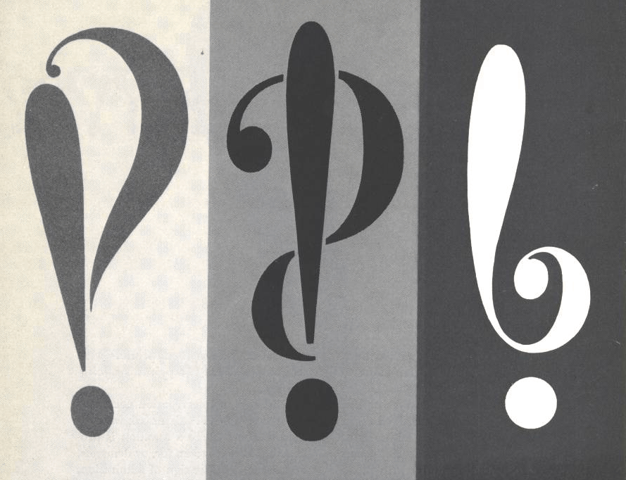
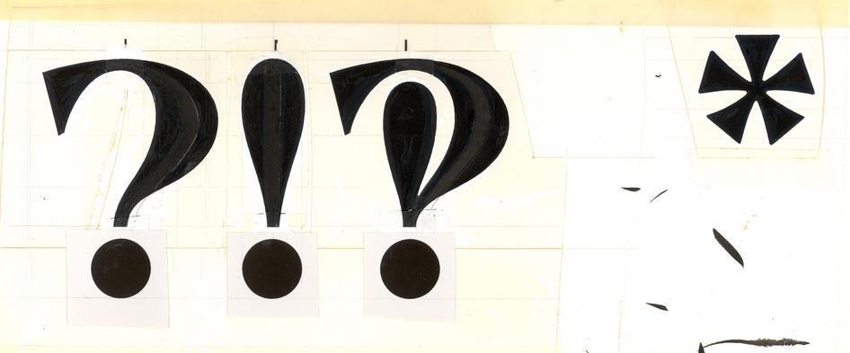
The new mark took a bow in the March-April 1962 issue of Type Talks, accompanied by a clutch of examples showing how it mingled exclamation with interrogation: “How do you do?!” lay at the mundane end of the spectrum; “What the hell?!” at the other. To illustrate the article, Jack Lipton, the Speckters’ art director, drew a suite of prospective designs that mixed and matched exclamation and question marks with varying degrees of harmony.
Even lacking a settled form or name, Speckter’s new mark struck a chord with Type Talks’ readers. In the following issue, he aired suggestions for names from the magazine’s mailbox: “emphaquest”, “exclarogative” and “interrapoint” took Speckter’s original formula and ran with it, while “quex” and “rhet” favoured brevity instead. One reader coined the peerless “consternation mark”, but even that gem could not keep up with events in the wider world. Because in the meantime, the Wall Street Journal, New York Herald Tribune, and other publications had got hold of and reported on Speckter’s proposal for a new punctuation mark, and, uniformly, they preferred his own suggestion of “interrobang”.
And then, for four years, nothing. The interrobang lay unused and unremarked. How could it have been otherwise? It was absent from all stages of the content mill: Writers had no such symbol on their typewriters. Compositors had none in their type cases. Linotype operators had no interrobang matrices in their machines. The few interrobangs that made it to the printed page were either hand-drawn or carefully sculpted out of rubber cement, and neither route was quick or easy.

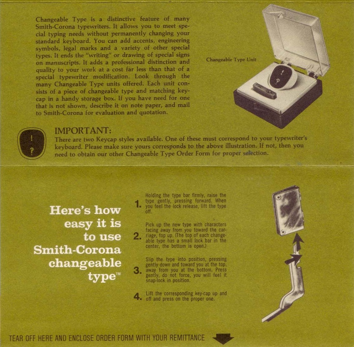
Yet in 1966, Specker’s mark made an abrupt comeback. That was the year that a type designer named Richard Isbell decided—unilaterally, say some; at the Speckters’ bidding, say others—to include the interrobang in a showy serif typeface called Americana. The Americana type specimen went all-in on the new mark, with the “interabang” name-checked and printed on almost every page. Isbell’s publisher, American Type Founders, announced that every one of their new fonts would henceforth come with an interrobang. Two years after Americana, a typewriter company named Remington Rand released a key bearing the new mark for some of their electric typewriters, and a year later a competitor called Smith-Corona followed suit.

Next, the interrobang stepped into the world at large. The proceedings of a philosophy conference at the University of Western Ontario carried one on the cover, while Interrabang, a lurid murder-mystery movie released in Italy in 1969, hung an interrobang necklace around the neck of one of its female stars. Improbably enough, that same year saw the publication of a collection of Lutheran prayers entitled Interrobang, in which author Normal C. Habel described the eponymous mark as “mystery and madness all in one!”
Had the interrobang finally arrived‽
No. It had not. Interest in Speckter’s mark waned rapidly after that second burst of excitement.
Americana would turn out to be the last metal typeface released by American Type Founders, whose movable type business had suffered in competition with typesetting machines such as Linotypes, Monotypes, and newfangled phototypesetters. But those competing machines were no friendlier to the interrobang: each one supported only a limited complement of characters, with little or no room for a novelty such as the interrobang. Americana would be the character’s first and last appearance in metal type.
Elsewhere, Remington Rand and Smith-Corona’s interrobang typewriter keys had failed to raise much enthusiasm from writers. On the rare occasions that the symbol was used in print, it was more often held up as an object for discussion than put to use as a practical punctuation mark.
The reasons for the interrobang’s decline were plain enough. Speckter’s mark was impractical for writers to use, and almost impossible for printers. It was of dubious usefulness, too, splitting the difference between ‘?’ and ‘!’ when in most cases a jury-rigged ‘?!’ worked just as well, if not quite as elegantly. Nor had the interrobang ever been comfortable in its own skin: half a century after its debut, neither Jack Lipton nor any other designer has succeeded in drawing the definitive interrobang. It is hard to call any typographic symbol a success when no-one can agree what it should look like.*
And yet from one particular point of view—perhaps the only one that matters—the interrobang has succeeded wildly.
The Speckters’ time in advertising coincided with an explosion in computing and computers. A host of companies and countries found themselves developing specialised “character sets”, or lists of typographic characters, that suited their particular computational or linguistic needs. When combined, these different character sets could lead to mangled, incomprehensible text: enter a backslash (\) on an American computer, for example, and it would magically transform into a yen sign (¥) when viewed on a Japanese one. Japan has a name for this phenomenon: mojibake, or “character transformation”.
This welter of competing character sets was finally tamed in 1992 by the publication of the Unicode Standard, version 1.0, by a group of engineers from the likes of Apple and Xerox. Calling themselves the Unicode Consortium, they had created one character set to rule them all: Unicode 1.0 contained north of 28,000 characters drawn from the most popular character sets then in use and included a host of additional characters to boot.
But Unicode was not a free-for-all. The consortium warned that it did not entertain “rare, obsolete, idiosyncratic, personal, novel, rarely exchanged or private-use characters”—an admirable stance, although one that has sometimes led to inexplicable exclusions from the standard. Over the years, a number of characters, symbols, and even entire scripts have been left out for one reason or another. (A 2015 article on the subject in Model View Culture magazine, by Aditya Mukerjee, was entitled “I Can Text You A Pile of Poo, But I Can’t Write My Name”.)
Except for reasons that remain unclear, the interrobang, a character that was simultaneously rare, idiosyncratic, personal, novel, and rarely exchanged, managed to sneak into the very first version of Unicode. And, since the consortium almost never removes characters, there it has stayed ever since. This is the reason that I can copy-and-paste† ‘‽’ into a tweet or an email and readers across the world will see the same symbol that I do.
Martin Speckter died in 1988, just a few years shy of the interrobang’s Unicode investiture. Penny lived until 2020, sustained by a daily scotch and soda, and was formidable to the last in her promotion of her husband’s creation. She ran a web site dedicated to the mark‡, gave generously of her time to those interviewers who periodically rediscovered it, and accessorised her immaculate outfits with a gold interrobang lapel pin as she did so.
As for the interrobang, it has achieved a kind of accidental immortality etched in the binary of the Unicode standard. No-one may ever use it again, but it will live on all the same, to be forgotten and rediscovered every decade or two by a new generation of users.
- *
- The interrobangs, like this one (‽), shown here at Shady Characters were drawn by Sindres Bremnes of Norway’s Monokrom type foundry. ↢
- †
- Good luck finding one on a keyboard; the interrobang may live on in Unicode but it has not yet broken into the hallowed QWERTY layout. ↢
- ‡
- Penny’s site is still live at https://www.interrobang-mks.com/. ↢
Comment posted by Steve M. on
‽ Thanks. I just wanted to use it once.
Comment posted by Lee Littlewood on
⸘WTF‽
{or (anxiously) “What The Font?”}
Comment posted by Keith Houston on
Nice! You’ve reminded me that I forgot to ask Monokrom for an inverted interrobang.
Comment posted by Steve Dunham on
Very interesting! So what is the Unicode for an interrobang?! And I should be ashamed to point out typos when I make so many myself (for example, our main doctors are at Mercy Primary Care, but a few days ago I typed Merry Primary Care), but interrobands is, I presume, a typo. A fascinating essay, and merry care to all. ;-)
Comment posted by Keith Houston on
Hi Steve — thanks for catching that typo! Fixed now.
The interrobang is at 203d (https://www.fileformat.info/info/unicode/char/203d/index.htm), and the inverted interrobang is at 2e18 (https://www.fileformat.info/info/unicode/char/2e18/index.htm).