It was 1972 and Sinclair Radionics of Cambridge, England, was riding high. Founded a decade earlier on an excess of pluck and a surfeit of ambition, inventor Clive Sinclair’s company had matured from home-built transistor radios to stylish hi-fi gear. But a visit to the USA had inspired Sinclair to design a new product: the thinnest, lightest pocket calculator the world had ever seen.
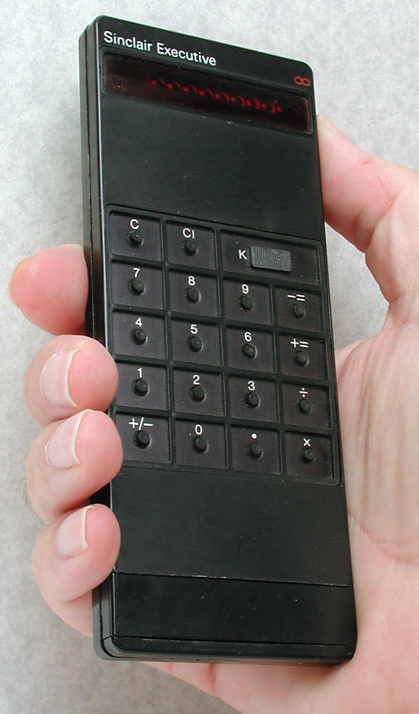
The Sinclair Executive was a huge gamble, and an equally huge hack. The calculator’s elegant silhouette was possible only because its Texas Instruments’ microchip was periodically starved of electrons by a circuit designed at Sinclair Radionics. This meant the calculator could run on tiny coin-shaped cells rather than the bulky cylindrical batteries of its competitors.
Some time later, in Moscow, a Russian diplomat thought he was having a heart attack. He was not: instead, his Sinclair Executive had exploded in his shirt pocket. A defective on/off switch had caused the calculator to grow so hot the batteries burst. An official investigation was begun; an international incident loomed.
Or did it?
The story of the exploding Executive seems to have grown out of a real, although much less dramatic incident. Chris Curry, Sinclair’s friend and one-time employee, explained some years later that the batteries had leaked — not exploded — in an Executive belonging to one Lord Rothschild, a British aristocrat. Curry had been dispatched with a replacement calculator to placate Rothschild, who had once been Sinclair’s banker. Thus, if a Sinclair Executive had ever met its demise in the pocket of a notable personage, it most likely happened in England, not Moscow — yet without much proof either way, there remains the tantalising possibility that there is more to the story.
In time, Clive Sinclair would become famous, and then infamous, for a string of other inventions, eventually to be felled by the disastrous Sinclair C5, an electric trike that placed the rider at car exhaust level and came to halt after 20 miles. Yet among his hits and misses, the Executive stands tall. It was driven by a hack, but an elegant one. It was an alluring electronic device at a time when the very idea of consumer electronics was still in its infancy. And maybe, just maybe, an overtaxed Executive popped its batteries in the pocket of a Russian diplomat who had obtained for himself a token of wealth and influence, and gave him the fright of his life.

