A quick reminder today that I’ll be giving a talk at the British Library on Monday 3rd July (just over a week to go!), and that tickets are now on general release. It’d be great to see some Shady Characters readers there — if you do come along, please don’t hesitate to say hello!
If you’re interested in learning a little more about The Book in advance of the talk, you might want to check out this recent interview I did with Jakub Nowak, available in both the original English and Jakub’s Polish translation. Jakub has previously reviewed The Book, and it was fun to dig into some of the background behind it with him.
A couple of other things while I’m here!
The British Museum holds a copy of Albrecht Dürer’s woodcut print of Triumphal Arch of Emperor Maximilian, one of the largest such prints ever completed. I wrote a little about it in The Book, and so I was intrigued to see that the museum recently restored their copy and documented the process as they did so. There’s an informative video here about it — well worth a watch.
Always nice to ease oneself back into the swing of things with a new mark of punctuation, don’t you think? I was pleased to come across the following announcement a little while ago:
On May 27, at the international design conference TYPO Berlin two new typefaces will be launched that are designed as part of the TilburgsAns project. Both typefaces – TilburgsAnsText and TilburgsAnsIcons – contain a new punctuation mark. This mark is based on the Tilburg dialect word ‘jè’ (which sounds more or less as ‘yeah’) that is used as a confirmation but often expresses some doubt or mild irony. The jè-mark bridges the gap between the exclamation point and the question mark.
And what does this new mark look like? It looks like this:
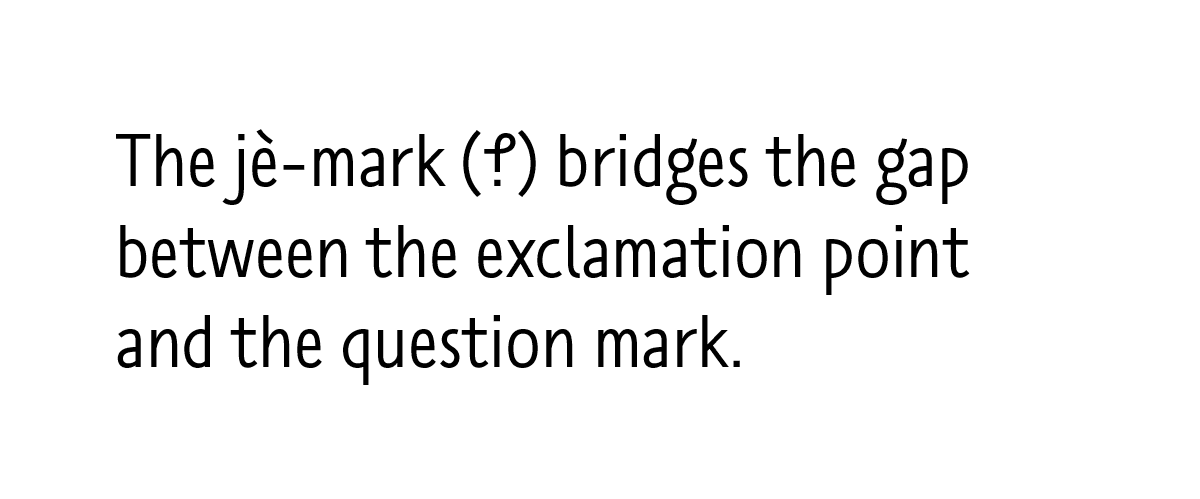
A 36-pt sample of Sander Neijnens’ TilburgsSans, featuring the “jè” mark used to convey irony or doubt. A Dutch interrobang! (Typeface courtesy of Sander Neijnens.)
Let’s backtrack a bit. The TilburgsAns project is the brainchild of Sander Neijnens, a typographer, and Ivo van Leeuwen, a graphic designer, both of whom live in the Dutch town of Tilburg. In 2016 the pair released a typeface called TilburgsAns* inspired by and intended to promote their home town. Their typeface was joined by a set of icons depicting Tilburg landmarks and also by an intriguing new mark of punctuation: the “jè” symbol described above. As Sander explains, it is intended to convey a sort of typographical shrug: somewhere between “oh yeah?” and “really?”.
It’s too early to say how well the jè-mark will fare in comparison to its predecessors, but I was interested to learn more nevertheless. Last week I spoke to Sander Neijnens via email about his new mark of punctuation and about TilburgsAns in general and so, without further ado, here is the genesis of the jè-mark in the words of its creator.
KH: How did the TilburgsAns project get started?
SN: The project started in 2013 when I discovered that I could put pictures into a typeface as ligatures. In typography ligatures are used to replace two separate characters (for instance f and i) by a specially designed, combined character (the fi ligature). It appeared to be possible to construct ligatures of many more than two characters, so complete words can be turned into a ligature (or picture). In fact, ligatures make it possible to bridge the gap between words and images, while images can be linked to the words they represent.
In 2014 I started in cooperation with illustrator Ivo van Leeuwen to design a typeface inspired by our hometown Tilburg in the south of the Netherlands. The typeface is called TilburgsAns, a sans serif that in the meantime also contains ninety icons of specific Tilburg locations, events, persons and dialect words. The first version was released in April 2016 and a new version was recently launched at the TYPO Berlin conference.
Why did you choose to create a “jè” mark? Did you consider any other words from the Tilburg dialect?
Some dialect words that were turned into an icon are dèùf (pigeon), kaajbaand (curbstone), bèngske (bench), knòrrie (canary), lozzie (wristwatch) and kenaol (canal). I also asked Ivo to draw an icon for the word jè, which is an affirmation (like: “yes”) but also expresses doubt (like: “so what”). When he replied that it was not possible to make an icon for this word, I got the idea to turn it into a punctuation mark. I used the letters j and e. The j was rotated 180 degrees and the curl was elongated, so the eye of the e became visible. In fact, it’s also a kind of ligature; this refers to the genesis of the exclamation point, that originated from the Latin word io, a shout of joy.
36-pt icons representing dèùf (pigeon), kaajbaand (curbstone), bèngske (bench), knòrrie (canary), lozzie (wristwatch) and kenaol (canal) from TilburgsAns (Icons by Ivo van Leeuwen.)
KH: Have you seen the “jè” mark being used in Tilburg? Have you had any feedback on it?
SN: The jè mark is incorporated in the latest version of the typeface, so it has just been launched on May 27. We think it can be used as an irony mark. There have been several predecessors like the reversed question mark, the interrobang, the sarcmark and the ironieteken. Neither of them was a real success, but we want to give it another try, because in the past many writers have suggested that they need such a mark. Besides that, the ironic phrase is often used in digital messages. There the jè mark can replace an emoticon or the wink ;-) The mark might also be a help in digital tools for translating text to speech.
What’s the future for the “jè” mark? Do you think it will appear in other typefaces?
As the logic for the design (based on the j and e) is very obvious, the mark can be constructed in any other typeface in a simple way. Furthermore it can easily be written by hand. And the design looks like an intermediate form between the exclamation point and question mark. So, all ingredients for a bright future are present ;-)
Of course, the mark still has a long way to go. First it has to be available in a typeface. That step is already taken, as you can access it by using TilburgsAnsText and typing “jè.” which turns into the ligature, the jè mark.
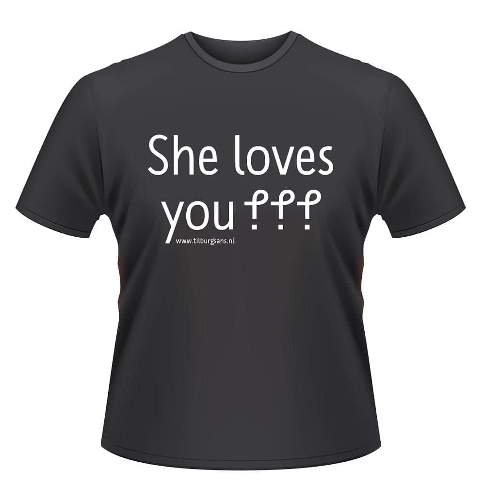
The next step is the application of the mark in texts. Therefor we inform writers, designers and the general public about the birth of this mark; we’ll have to wait if they are actually going to use it. Part of the ‘campaign’ is a T-shirt with the text ‘She loves you jè jè jè’, referring to the Beatles song and expressing that in the realm of love nothing is 100% for sure. [T-shirts are now available to order. See Sander’s comment below for details — ed.]
Step three is the acquisition of a Unicode [code point – ed.].
And step four is a key on the standard keyboard.
The jè-mark in use. (Image courtesy of Sander Neijnens.)
We don’t have plans for designing other new marks. If we can add just one punctuation mark to the toolbox of writers that would be an enormous outcome.
So there you have it: Sander Neijnens’ jè mark, a typographic shrug — “so what?” — or irony mark, made with uncommon care and attention, and just waiting for you to take it up. If you have access to a word processor or other platform that supports ligatures, you can get your own jè by downloading TilburgsAns and typing “jè.”, taking care to include the e-grave and the full stop, to see it magically replaced by Sander’s new mark.
What’s your take? Does the jè-mark stand a chance of making it into the mainstream, or is will it face the same uncertain fate as the other irony marks?
Many thanks to Sander Neijnens for answering my questions — and for designing such a thoughtful take on the irony mark! I’ll be keeping an eye out to see how it gets on.
Also, this is a quick note to say that tickets for my July 3rd talk at the British Library are now on general release. Get them here!
I’m excited to announce that I’ll be giving a talk about books and book history at the British Library’s Knowledge Centre, 96 Euston Road, London, at 7pm on Monday 3rd July. The talk will be about an hour long and there will be plenty of time to ask questions if you so desire. (The bar will be open later, too, until 10pm — I’ll be needing a stiff drink afterwards, I’m sure!)
I’m pleased to say that the first translated edition of The Book is now available: Książka* is published in Poland by Karakter and is available there in all good bookshops. Paweł Lipszyc was the translator.
Thank you to everyone involved in making the Polish edition happen: Laurie Abkemeier and others at DeFiore and Company; Karakter and book/lab in Poland. I think it looks great, and, if you happen to buy a copy, I hope you enjoy it!
*
Props to Sindre Bremnes of Monokrom type foundry, whose Satyr and Faunus typefaces deal so well with all the accented Polish letters here. You can read more about them here. ↢
Congratulations to Scott Pack and Ryan Pullen (@rpullen86), winners of the St Bride ticket giveaway! Their names were picked at random from the set of all entrants who replied to or retweeted the original posts about the competition.* Thank you all for entering!
*
In more detail: I arranged the names of all entrants in a text file, then used random.org to pick two numbers between 1 and the total number of lines in that file. ↢