It’s almost here! As I mentioned before, I’ll be giving a talk at the St Bride Foundation in London on the 23rd of March — just a couple of weeks away now. I’ll be talking about the overlapping histories of writing, printing and books, and signing some books of my own afterwards. Tickets are on sale at £12.50 (£8).
But. But! If you’d like the chance to attend for free, courtesy of the St Bride Foundation, I’m giving away two complimentary tickets to the event. To enter, just do one of the following:
leave a comment on this post, making sure to supply a valid email address so that I can contact you in the event that you win, or
reply to or retweet the tweet announcing this contest, making sure to follow @shadychars so that I can send you a direct message if you win. (Please don’t create multiple accounts or repeatedly reply to the message — Twitter may ban you as a result. One entry is fine!)
This contest will close at noon GMT on Sunday 19th March 2017, so make sure you enter before then. After that I’ll pick two winners from the list of all unique entrants and make sure their names are on the guest list for the event. (Of course, please enter only if you can make it to London in time for the event.)
I’m happy to announce that I’m going to be taking part in Adelaide Writers’ Week 2017, running from Saturday 4th March to Thursday 9th March.
First, on Monday 6th March I’ll be appearing with Alberto Manguel in “Books & Reading” to discuss writing, reading, and the intersection of the two in the form of the book. Here’s how the festival programme describes it:
There are few things more enjoyable than reading books about books and reading. This session brings together one of the great writers about reading, Alberto Manguel, with one of the great writers about book history, Keith Houston. It will be a celebration of the object that perhaps most defines our lives and can define the way we live, as both an object and an idea.
Gulp.
Then, on Tuesday 7th March, I’ll be chatting with Michael Williams about The Book. We have a full hour to luxuriate in book history, and it promises to be a lot of fun. You can learn more about both events and book tickets at the festival’s website.
It’ll be my first time in Australia for a good number of years (and my first visit to Adelaide itself), and I am very much looking forward to it. Moreover, I’ll be in and around the Adelaide Festival all week — if any Shady Characters readers are planning to be in or near the festival, do drop me a line via the Contact page or Twitter if you’d like to meet up!
As a bonus, an interview I did with Kara Miller of WGBH’s Innovation Hub last year has just been posted online. It was fun to record — it covers some of the same ground I expect to be talking about in Adelaide, and has insight and wit aplenty from Kara herself. Listen to it here!
This article was first published in the Winter 2016 issue of The Author, the journal of the Society of Authors.
Quite honestly, sometimes I’m not sure how I feel about books. Paper books, I mean, like the ones currently clogging my bedside table and piled beside my keyboard. I catch myself sighing whenever I have to reach for the enumerated bulk of the Chicago Manual of Style, or as I hunt through my bookshelves for some half-remembered bit of information. We’ve spent 50 years freeing information from the prison of the paper book, making it ubiquitous, searchable and self-replicating, and so it is easy to wonder: what are physical books good for?
There are the obvious things. Readers of printed books revel in a visual and tactile experience that ebooks can’t match: paper books possess memories of their own, falling open at the page where last the reader lingered, and come alive in scribbled marginal notes and passages marked in fluorescent pen. Authors can be happy that book piracy is significantly lower when dealing with paper than with binary bits, and librarians know that the paper book is a superb archival medium, capable of surviving for centuries and readily repaired, rebound or scanned for digital transmission.
Then there are the weirdly artificial drawbacks with which ebooks encumber themselves: the encrypted ‘walled gardens’ of Amazon, Kobo and Google Play, for instance, have no counterpart in the real world. Your library of Google ebooks may not be accessible on your Kindle, but your hands and eyes are guaranteed to be compatible with paper books bought from any bookshop you care to name.
But none of this is news. Anyone with half an eye on the publishing industry will have heard the book-versus-ebook debate many times over. They will have seen sales figures spun one way or the other and they will have formed their own opinions as to the relative merits of physical books and their electronic cousins. No; to my mind, what sets the paper book apart is that it is not a product of the forced march of what we call innovation but rather one of organic evolution. Almost everything that makes a book look, feel, read, and even smell the way it does is a survival trait honed to a fine point by two millennia of human history.
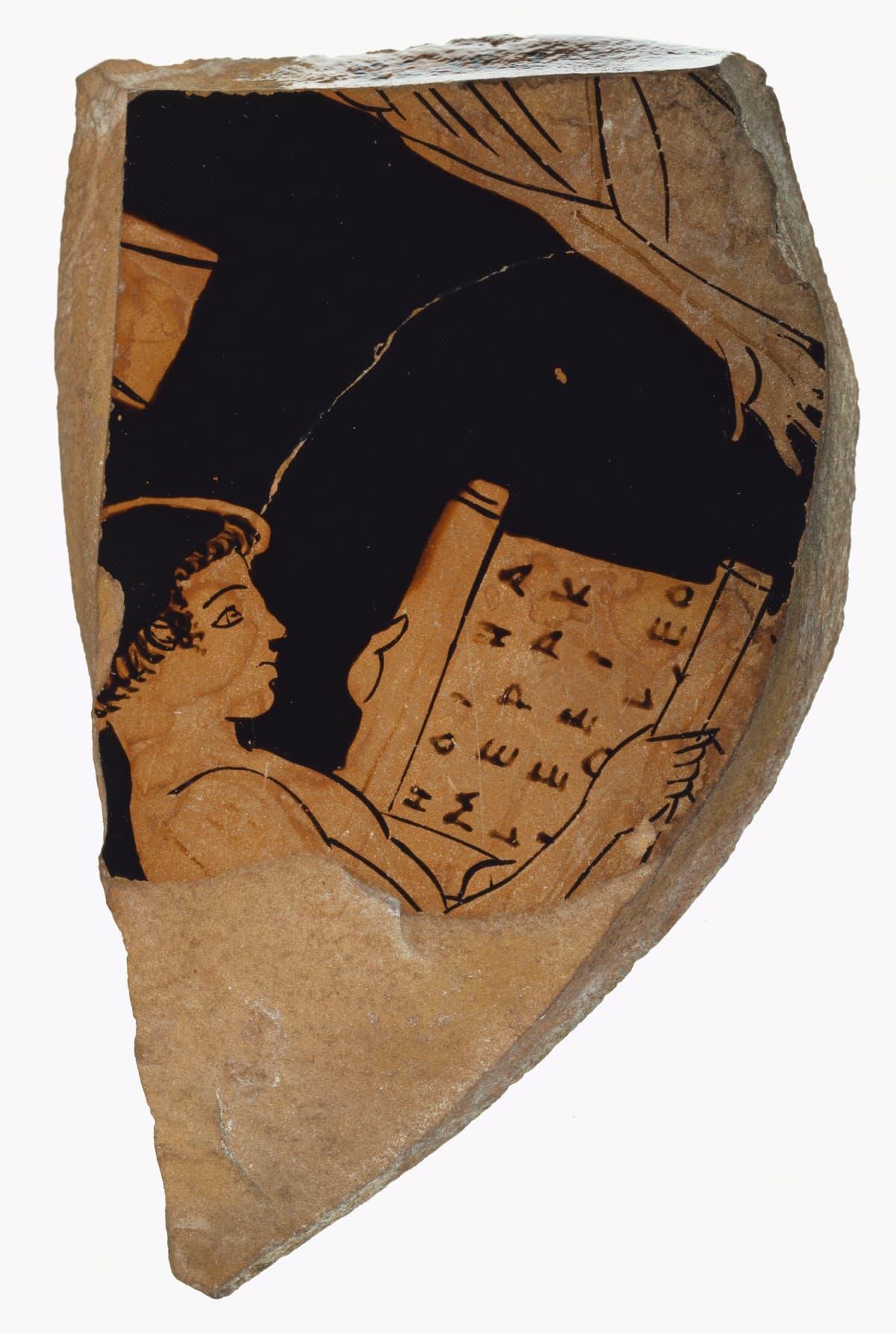
Until the first century or thereabouts, books in the West were made from papyrus sheets pasted together to form scrolls many metres long on which authors and copyists wrote in newspaper-style columns. Scrolls were easy to make and to modify (it was a simple matter to paste in new sheets or to trim off old ones), but they were also fragile and unwieldy. Rolled-up scrolls required special shelves or cases for storage and protection, while in use they gradually degraded, worn away along their exposed bottom edges by the reader’s clothing. And reading a scroll was a chore in itself: the reader had to carefully reel it from one hand into the other – to scroll through it, if you like. To free the reader’s hands for note-taking or wine-drinking, the ingenious Romans wound their scrolls around wooden spindles and read them at desks equipped with pegs behind which the spindles could be wedged.
Of course, we don’t interact with books only when sitting comfortably at a desk, and neither did the Romans. When a Roman-about-town needed to write something down, they reached for a portable wooden writing tablet, or polyptych, covered in beeswax to receive the impression of a sharp stylus. The most common twofold writing tablets, or diptychs, comprised a pair of wooden slabs hinged together with leather thongs; held vertically in the usual fashion, to a modern eye they resemble nothing so much as a laptop computer.
Neither system was perfect. Scrolls were flimsy and bulky at the same time, and tablets were either too small for extended writing or too heavy to be portable. In hindsight, the solution was obvious: chop a scroll into equally-sized pages, stack them on top of one another and crease them along the gutter between adjacent columns. Pierce a few holes along the spine, sandwich the pages between diptych-inspired wooden tablets and tie everything together with some leather thongs, and there you are. The paged book, or codex, is born.
Perhaps all this was obvious at the time as well, because not a word was written about it until around 85 AD, when the poet Martial encouraged readers of his Epigrams to upgrade from scrolls to books as if moving from VHS to DVD:
You who long for my little books to be with you everywhere and want to have companions for a long journey, buy these ones which parchment confines within small pages: give your scroll-cases to the great authors – one hand can hold me.
Here Martial name-checks the next great advance in bookmaking – the arrival of animal-skin parchment as an alternative to fragile, brittle papyrus. Parchment had been invented by a Greek king named Eumenes some centuries earlier (or, more likely, parchment’s actual inventor had bowed and scraped and wisely dedicated the feat to Eumenes), and it had been waiting for its killer app ever since. The book, whose central spine caused papyrus folios to crack and tear along its length, was it.
Ergonomics and economics drove the development of this new medium. Papyrus books were rectangular to minimise the stress on their spines; parchment books were rectangular because the hides of cows, goats and sheep are essentially rectangular too, and parchment was too expensive to waste. Built-in covers made codices robust and double-sided pages made them space-efficient. The ‘random access’ afforded by riffling through a codex’s pages was a world away from the painstaking rolling and unrolling of a scroll. And page numbers, which are present even in the earliest surviving codex fragments, helped readers find their way in a manner that had never been possible within the scroll’s undifferentiated columns.
With the basic shape of the book settled, writers and readers were free to experiment with what lay within its pages. The table of contents arrived in the third century when Christian writers indexed the Gospels to make them easier to navigate. The word space appeared in the eighth century, when Irish monks unfamiliar with the language of the remote Roman Empire started to prise apart unspaced Latin writing. Punctuation, which had fallen by the wayside since its invention in the third century BC, was revived and revised by St Isidore of Seville and other religious writers seeking to clarify their words beyond reasonable doubt.
In time, the nascent bookmaking industry ushered in its own changes. Bookmakers turned from the ‘Coptic’ binding style of the earliest codices, where pages and covers were sewn to one another with a needle and thread, to ‘double-cord’ binding in which substantial cords or thongs formed vertebrae to which the pages and boards were sewn. (The raised bands that run across the spines of old leather hardbacks are there to accommodate the cords beneath.) Parchment was supplanted, grudgingly and gradually, by paper from mills established in Europe by Moorish invaders who had in turn learned their trade from the Chinese. Even the way the book’s text and images were applied to the page was changed out of all recognition: scribes and artists were elbowed aside by the lead soldiers of Johannes Gutenberg’s movable type and the grotesque woodcut blocks of Albrecht Dürer and his contemporaries.
All this is to say that the book has never stood still. The British Library’s 8th-century, £9m St Cuthbert Gospel may be as recognisably a book as a Gutenberg Bible or a Penguin Classic, but the book itself has been nipped and tucked and reinforced and streamlined on an ongoing basis ever since its invention.
And this, fundamentally, is the ebook’s problem. It isn’t the competing welter of walled-garden ecosystems, or that Kindles work only as long as the battery is charged, or that an ebook can never pick up a patina of use in the same way as its paper counterpart. The real problem is that we imprisoned two thousand years’ worth of bookish culture behind glass rectangles – we shoehorned a very old peg into a very new hole and expected everything to work the same way it always had. To borrow the words of designer Frank Chimero, we haven’t yet discovered the grain of the ebook in the same way that we implicitly understand that of the printed book. The ebook’s time will come, I’m sure of that, but lovers of the old fashioned paper book can rest easy – if history is anything to go by, it will be a long time coming.
Many thanks to James McConnachie, editor of The Author, for arranging this article. If you’re interested in reading more about what the future may hold for books and ebooks, my article and others on the same subject can be found in the Winter 2016 issue.
Thanks also to the Getty, whose Open Content Program has made a wealth of images such as those above available for use free of charge. Lastly, the featured image of double-cord bound books is courtesy of Brian Smithson at Flickr.
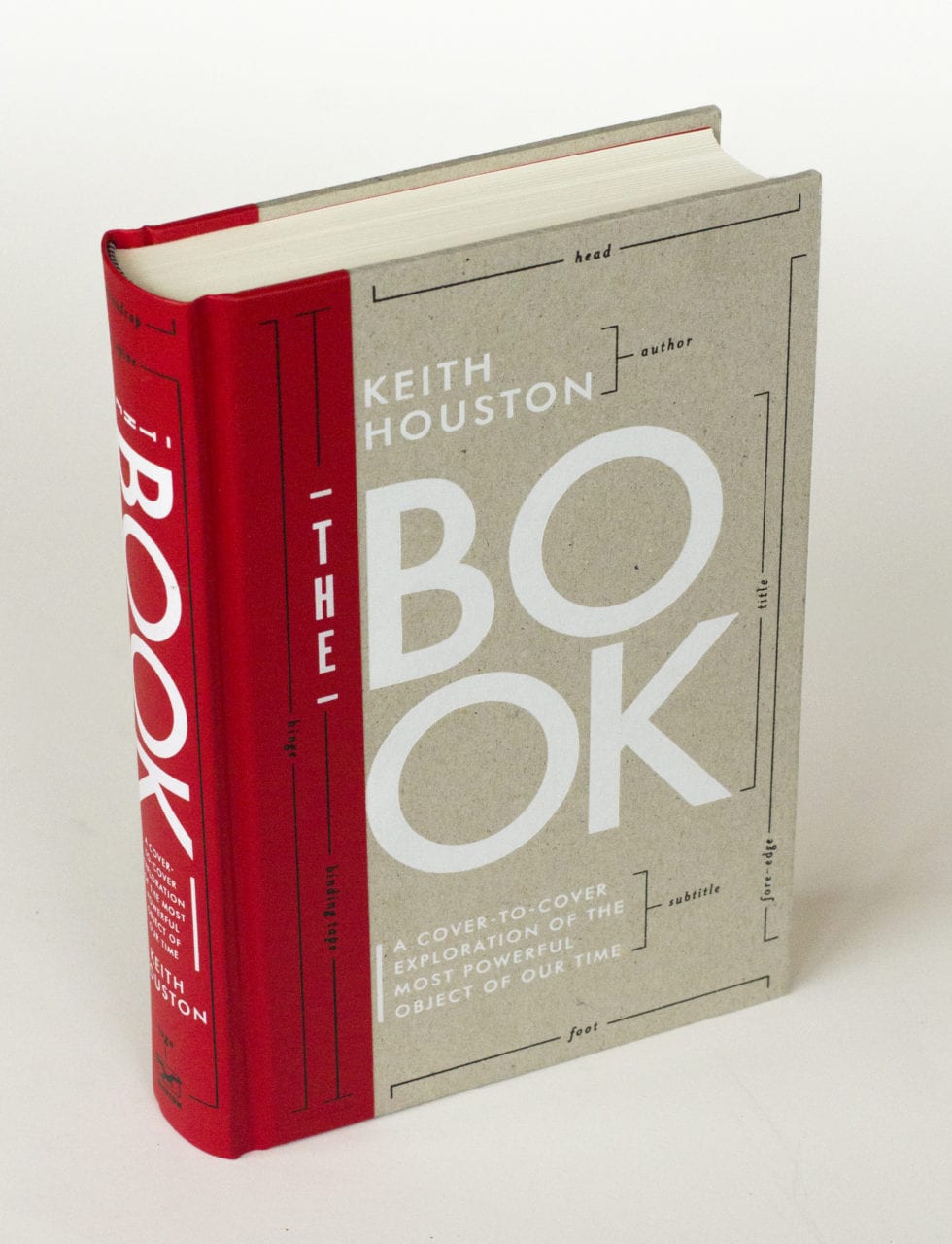
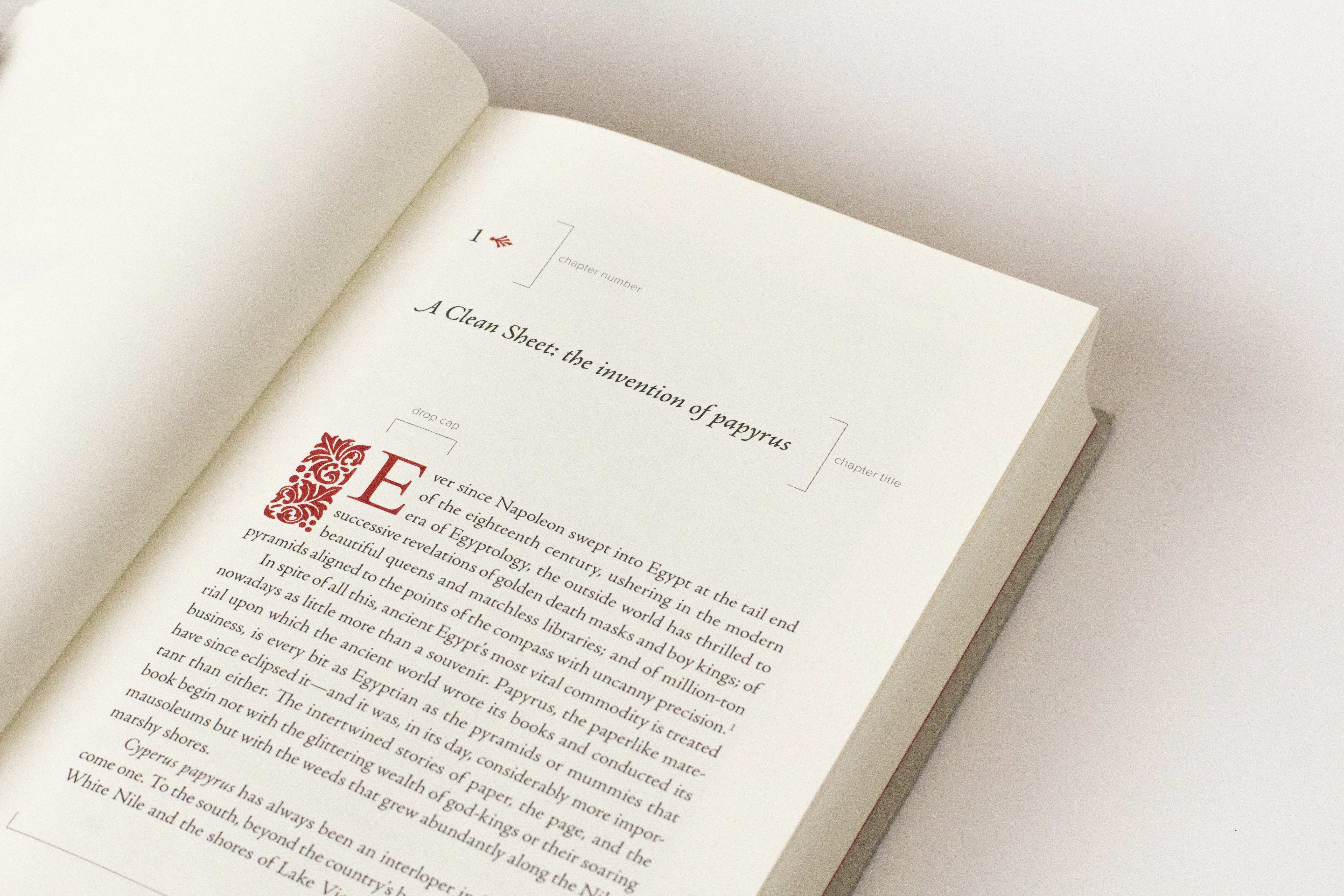
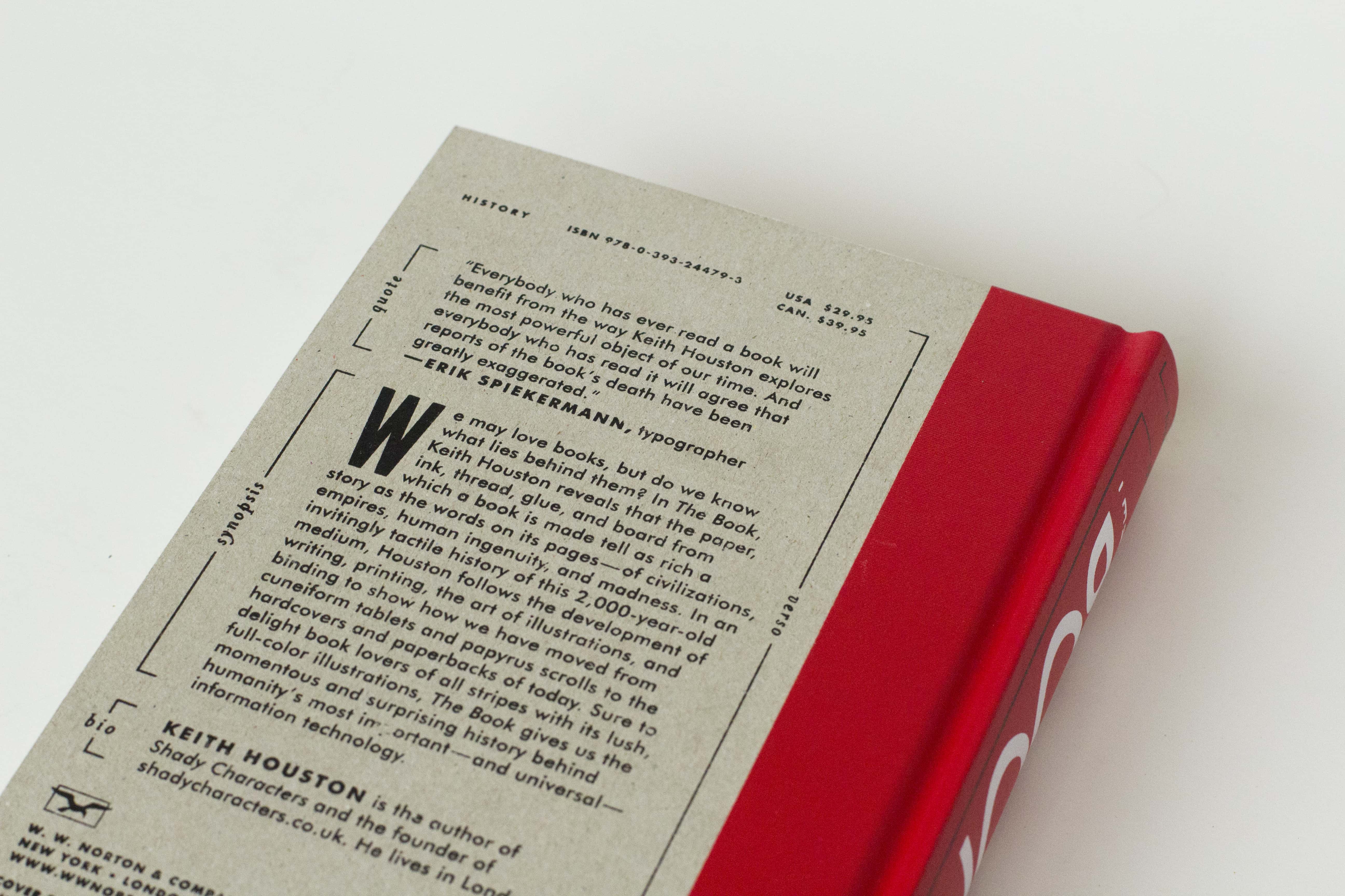
If you enjoyed Shady Characters (or indeed this blog) then I’m sure you’ll find The Book to be of interest, but if you haven’t made your mind up then do have a read of this extract published at Longreads: “Hidebound: The Grisly Invention of Papyrus”. And if you need more encouragement, Blackwell’s in the UK are calling The Book one of their books of the year.
That’s all from me for 2016, and quite a year it has been. Thank you for all the comments, emails and tweets, whether about punctuation, books or The Book — it is always a pleasure to chat with you all, and I appreciate every message. See you all in 2017!
In January 2015, scientists at the European Synchrotron Radiation Facility (ESRF) in Grenoble, France, announced that they had deciphered handwritten text from a series of papyrus scrolls excavated at the Roman town of Herculaneum by passing X-rays through the scrolls’ carbonized remains. Then, in March this year, another secret was revealed. Those same scrolls were discovered to have been written with distinctive metallic ink, once thought to have been invented many hundreds of years later, and which boasted – or rather, whispered of – roots in ancient spycraft.
Since time immemorial Roman scribes had employed a system of hollow reed pens, homemade ink, and papyrus scrolls purchased according to length. The ink in which they dipped their pens was a mixture of water, gum arabic, and soot, just as it had been for the Egyptians and Greeks before them. Gum came from the acacia trees found in Asia Minor to the East; soot, on the other hand, could be scraped off burnt cooking utensils, ground down from cremated elephant bones, or prepared in a purpose-built furnace, depending on the motivation and the means of its maker. It was a simple recipe, and a flawed one: the distinguishing feature of carbon ink was that it could be washed off papyrus scrolls with nothing more than a moistened finger. (Martial, a Roman poet of the first century CE, wrote of sending out his books still wet so that discerning patrons could erase poems not to their liking.)
Sometime during the first century, however, things began to change. As the ESRF researchers discovered, scribes at Herculaneum were using a quite different kind of ink no later than 79 CE, when the eruption of Mount Vesuvius choked the life out of the town – an ink with metallic elements in its make-up that is opaque to X-rays. The days of carbon-based ink were numbered.
Until now, the received wisdom was that metal-based ink had become popular only during the third or fourth century CE, popularized by Christian scribes who copied and re-copied the Gospels and other important religious works. To make metallic ink, nutlike tree growths called galls were dried, crushed and infused in rainwater, wine, or beer, before being mixed with sulfate of iron or copper. The acidic gall liquor reacted with the metal sulfate as soon as the two were brought together to form an insoluble pigment that fixed itself on the page, and scribes learned to breathe into their ink jars to replace the air with unreactive carbon dioxide before stoppering them. For ancient writers, metallic ink was a quantum leap forward, as permanent on papyrus as it was on the new-fangled parchment becoming popular with scribes as far afield as Gaul and Britannia.
But the irony of metallic ink is that it may well have grown out of a need for subterfuge rather than brazen permanence. In the third century BCE, a Greek engineer named Philo wrote of what he called “sympathetic ink” made from tree galls and copper sulfate, but these familiar ingredients were to be brought together after their message had been written, not before. In Philo’s scheme, a would-be spy or illicit lover wrote on papyrus using a colorless infusion of crushed tree galls; on receipt, their correspondent washed that same papyrus with a solution of copper sulfate to reveal its hidden message.
Work to decipher the Herculaneum scrolls is still ongoing, and we don’t yet know whether their singular metallic ink is a descendant of Philo’s recipe or something else entirely. But whatever we learn, our understanding of ancient writing practices has already been turned on its head. Metallic ink was used centuries earlier than previously thought, long before Christian monks and scribes turned their hands to it, in a Rome where citizens prayed to household shrines and where the wrath of Vulcan, god of the volcano, was still a thing to be feared.
Many thanks to Holly Tucker for shepherding the article through the publication process at Wonders & Marvels. Also, thanks to Emmanuel Brun of the European Synchrotron Radiation Facility for the use of his image. Read more about the ongoing work in deciphering the Herculaneum scrolls.