A baby and a pause (and a vote?) for Shady Characters

I am very happy to announce that my wife Leigh and I have just had a baby boy and, as such, I’ll be taking a break from Shady Characters for a while. Think of it as a pilcrow — the end of one paragraph and the start of another!

In the meantime, I thought I’d point you in the direction of an article in the Deseret News in which Chandra Johnson asks rhetorically: “What do Americans lose if bookstores disappear? More than you think”. I chatted to Chandra about the history of the physical book and how it relates to bookshops — after libraries, our other temples to the book. It was a great opportunity to go beyond the historical content of The Book and, I’m not ashamed to say, Chandra gave me some great ideas to pick up on in my subsequent interview with Heleo’s Mandy Godwin. Have a read of both, or either, and feel free to leave a comment below — is the physical bookshop doomed? What lies in its future?*

Secondly, if you happen to be a member of Goodreads, or you wouldn’t mind becoming one, might I interest you in voting for The Book in the History & Biography category of Goodreads’ Choice Awards 2016? The write-in box for other titles appears at the bottom of the page for Goodreads members only.

See you all in the new year!

*
In fact, if you have any suggestions for articles or interesting punctuational links to share, please feel free to email me via the Contact page or leave a comment below
And, er, if you’d like something to read in the interim, why not buy a copy or two of a certain very bookish book

Miscellany № 78: catching up

So: time to catch up! Here are a few links to punctuational goings-on from the past couple of months.


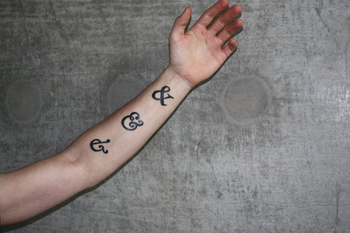
First up, pan-European typefoundry Underware recently took some time to dive into the importance of the pointing hand, or manicule (☞). It’s an old mark, hailing back to the days when the readers of manuscripts and early printed books would draw little pointing hands in the margins to call attention to passages of interest. Though the manicule survived in print, it gradually slid from its previously exalted position, yielding the job of linking footnotes and text to the likes of the asterisk (*) and dagger (†). And yet, in common with the ampersand (&) and the pilcrow (¶), the manicule continues to offer discerning type designers a chance to flex their creative muscles. As Underware’s unnamed writer says in “There you go”,

What many people don’t know, because it’s not easy to spot, is that many type designers enjoy refining many details of their fonts. For example by creating manicules which fit to the style of a font family. A special pointing hand allows extravaganza [sic] typographic subtleties in your book, website, identity or whatever you are making.

What do you say? Is it time to bring the beloved but under-appreciated manicule back into the spotlight?


Next, Cameron Hunt McNabb writes about the evolution of the ellipsis (…) for Slate’s excellent Lexicon Valley blog. In particular, McNabb explains the peculiar medieval practice of “subpuncting”, or adding an ellipsis below an incorrectly copied word:

In medieval manuscripts, we find a mark—sometimes called subpuncting or underdotting—that is used to indicate the omission of a word or phrase, usually when that word or phrase has been copied erroneously. This omission mark involves placing a series of dots under the word that is to be omitted.

Subpuncted words, as McNabb says, were usually left in place — the manuscript equivalent of strikethrough, perhaps, a passive-aggressive jab at the inadequacies of the original copyist. Gradually, however, and in an almost exactly parallel with the rise of print at the expense of manuscripts, subpuncting gave way to the omission of words in favour of ellipses. And yet, McNabb wonders, are the two actually related? The academic spheres of medievalists on the one hand and modern literary scholars do not often overlap and so the nature of the link between subpuncting and the ellipsis remains unclear. Needless to say, Cameron’s article is well worth a read in its entirety!


If the full stop is dying, as has been suggested again and again, it’s taking a hell of a long time to shuffle off this mortal coil. For National Punctuation Day, Katy Steinmetz of Time weighed in with some signs that the patient may be recovering:

“Periods are not dead,” says computational linguist Tyler Schnoebelen, who turned to his own trove of 157,305 text messages to analyze how the final period—a period at the end of a thought or sentence—was being used and shared his initial results exclusively with TIME. “They’re actually doing interesting things.”

As Schnoebelen goes on to explain, those interesting things are not surprising: short text messages are more likely to manage without at least one full stop while longer messages require full stops to help the reader break them into manageable chunks. Where they do occur, those periods mean business:

Texts ending in a period, in Schnoebelen’s analysis, had a disproportionate amount of the words told, feels, feel, felt, feelings, date, sad, seems and talk. By contrast, many of the words that tended to show up in texts that did not end with a period were more casual kinds of speech: lol, u, haha, yup, ok, gonna.

Of course, correlation isn’t causation. Schnoebelen’s work suggests that the full stop is often a participant in sentences intended to convey important sentiments, but he stops short of suggesting that the period itself is the thing that lends them their import. As important as punctuation is, in other words, don’t neglect the words themselves.


Finally, a couple of pieces of self-promotion. First, a few weeks ago I had an enjoyable and wide-ranging chat with Mandy Godwin of Heleo, where we talked about the past, present and future of the book, and in which I used the words “which” and “actually” many times over. You can read the transcript at Heleo — if you do, and if you have any comments, feel free to leave a comment below!

Lastly, I’ll be giving a talk at the St Bride Foundation in March next year. Tickets are on sale now.

Thanks for reading!

The Book: A Cover-to-Cover Exploration at the St Bride Foundation, London, on 23rd March, 2017

It’s some way off yet, but I’m happy to announce that I’ll be giving a talk at the St Bride Foundation here in London on the 23rd of March next year. I’ll be talking about the overlapping histories of writing, printing and books, and signing some books of my own afterwards. Tickets are on sale at £12.50 (£8).

If you live nearby but haven’t been already, the St Bride Foundation is an excellent place to visit. The bookshop will be open as, I’m sure, will some of its fantastic printing exhibits. I look forward to seeing you there in March!


The image featured above is taken from John Clark, The Care of Books  (Cambridge University Press, 1909), fig. 9.

Miscellany № 77: amperbrand

Ampersand tattoo photo by David Hoogland
Hoefler Text ampersands, as modelled by a big ampersand fan. (Image courtesy of David Hoogland on Flickr.)

The ampersand is one of those shady characters that has taken on a life of its own, thriving happily beyond its home in writing and typography. In particular, it exerts an irresistible power over designers, advertisers and others in the business of creating and promoting commercial brands. Fortnum & Mason, for example, recently published a blog post1 explaining “the little-known story of the important symbol sat between our two famous names”.* Crate & Barrel, the American homeware store, once built an advertising campaign around their ampersand;2 AT&T did the same earlier this year.3 As John Brownlee of Fast Co. Design puts it in “Why Designers Love The Ampersand”,

It’s the typographical equivalent of a wedding ring, used to mark permanent partnerships, like Marks & Spencer, Johnson & Johnson, Barnes & Noble, and Ben & Jerry’s.4

An ampersand, in other words, packs considerable significance into its designer-friendly shape. It’s only natural, then, that Washington DC’s &pizza chain of restaurants would appropriate the ampersand for its name and emblem. &pizza, though, have taken their investment in the ampersand a little further than most. Specifically, the company pays for its staff to get ampersand tattoos. As reported by the Washington Post’s Abha Bhattarai 5, more than fifty &pizza employees now have ampersands tattooed somewhere on their bodies, all done courtesy of the chain’s co-founder, Michael Lastoria. As Lastoria explained:

We’re not doing this because we want [employees] to swear their allegiance to us like we’re some insane dictator […] We’re doing it because we listen to our people. They love the symbol, they love the look of it and they love what it stands for.

As I looked into the story a little more, I found that &pizza have since extended their offer of a tattoo to their customers. What I can only hope they call their amperbrand programme began like a loyalty scheme: any customer who spent $1,500 in &pizza restaurants was given the honorary title of “Maverick” and gifted an ampersand tattoo at a Washington tattoo parlour, along with an &pizza- branded jacket and a free photo shoot. (The company later relaxed their not-at-all-insane-or-dictatorial requirement for an ampersand design and let customers choose their own tattoos.)6

Since then, things have evolved yet further. Upon opening a new restaurant in Federal Hill, Baltimore, the first five customers in line were given a free ampersand tattoo and a year’s worth of free pizza.7 Christiana Amarachi Mbakwe of The Baltimore Sun talked to Michael Holt, to one of the fortunate five, to get the inside scoop:

“I wasn’t going to get another tattoo until I heard there was free pizza,” said Holt, a Baltimore native who works in Washington, D.C. and regularly visits &pizza’s branch there. “I thought I was done [with tattoos] forever.”

If the ampersand is the typographical equivalent of a wedding ring, however, &pizza boss Michael Lastoria remains unwilling to put a ring on it. The man who launched a thousand ampersand tattoos (I approximate for dramatic effect) has not joined his customers or employees in getting himself inked. Lastoria has set himself a “secret goal”, he says, after which he promises he will get an ampersand tattoo. What on earth could it be?

1.


2.


3.


4.


5.


6.


7.


*
FYI, Fortnum’s “little-known story” is that the company was once known as Fortnum, Mason & Co. Who knew‽ I am shocked, shocked by this revelation. 

The Book publication round-up

The Book

has been on sale for a few weeks now and so I thought I’d collect some of the articles published in connection with it, both by me and by others.

First, I posted here a series of articles about some of the aspects of bookmaking that I learned about while researching The Book. Here they are:

Keep an eye out here; there may be more in future.

Elsewhere, I contributed an article to I Love Typography entitled “The Prints and the Pauper”. It’s excerpted from a longer chapter on movable type and it tells the story of printing in China — and just how much Gutenberg owes to the Chinese printers that came before him. I also wrote for BBC Culture, discussing the origins of the paged book, and the parallels between the transition from scroll to book in the ancient world and today’s shift from book to ebook. More articles are on the way.

This time round I also did a few interviews. I chatted to Russell Leadbetter of The Herald; newstalk.fm’s Moncrieff show; and Lynn Freeman of RNZ’s Nine to Noon. And if the sound of my voice hasn’t put you off, again, there are more on the way!

Separately, I must say thanks to all the readers who have bought copies of The Book and who have got in touch via the comments or the Contact page. It means a lot to hear that you’re enjoying the book, so thank you very much!