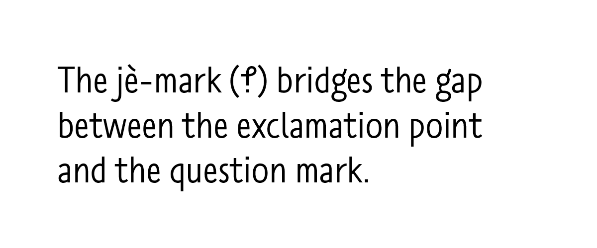
So! The first round of The Book giveaway came to a close yesterday, and I’m pleased to announce that of the 278 entrants the winner was Gary K. McCormick (@WillotheGlen). Congratulations to Gary! His signed copy of The Book will be on its way soon.
Cover of The Book as designed by David High.
If you didn’t win (and statistically speaking, you, um, probably didn’t), don’t fret! This is your chance to win the second of four signed copies I’ll be giving away over the next few weeks. To enter this round of the giveaway, just do one of the following:
leave a comment on this post, making sure to supply a valid email address so that I can contact you in the event that you win, or
reply to or retweet the tweet announcing this contest, making sure to follow @shadychars so that I can send you a direct message if you win. (Please don’t create multiple accounts or repeatedly reply to the message — Twitter may ban you as a result. One entry is fine!)
This second round of the contest will close at noon GMT on Sunday 21st August 2016, so make sure you enter before then. After that I’ll pick one winner from the list of all unique entrants, and I’ll happily post a copy of The Book to them wherever they are in the world.
Good luck!
Update: The second round of the competition is now closed! Thank you for all your comments and tweets. I’ll announce the winner tomorrow, and kick off the next round of the competition!
It’s publication week for The Book here in the UK, and so things are a little busy. For the third part of my “Booking It” series, then, on the arts and crafts that go into bookmaking, I’m cheating a little and republishing a post from November 2012, when I visited Robert Smail’s Printing Works in the Scottish borders. I hope you enjoy it!
So, just before 10am on a damp but clear Saturday morning, I stepped off the bus on Innerleithen’s high street and walked the few hundred metres to the Victorian shop front of R. Smail & Sons Printing Works. Gen Harrison, property manager, and Rachel Mays, senior assistant, greeted the handful of us who had managed to snag places on the second of the two workshops run each year. We were shepherded from the neat, quaint shop to the separate, two-storey workshop building behind, given aprons and warned to keep our hands out of whirring machinery.
Gen Harrison, property manager at Smail’s, holds up a forme of wooden type.
The workshop is a warmly inviting, thoroughly lived-in piece of Victorian architecture. It is poised over a manmade canal, with the small water wheel that powered the works’ presses in their heyday visible through the windows at one gable end. The ground floor was taken up with a variety of hand and powered presses, with cabinets of type and shelves laden with reams of paper crowding the walls. To get us over the inevitable what-do-I-print-and-how-do-I-print-it hump, Gen led us through the basics of printing with the large, wooden type once used to set posters and other display items, and encouraged us to start by printing our own names.
The process is as easy to describe as it is difficult to get right. First, the wooden blocks of type are placed face up on the bed of the press, then the viscous, sticky ink is rolled out and applied to the faces of the letters with a small hand roller. Next, the paper is laid flat over the letters and the press’s cylindrical platen is rolled over and back across the paper. Carefully peel off the paper et voilà: you have a squint, patchy reproduction of your name in a style beloved of the makers of distressed denim clothing. Gen and Rachel helped us through the various tricks to getting things right: even application of ink, the use of magnets and wooden guides (or “furniture”) to keep the type square on the bed of the press, and judicious use of scrap paper placed under the type to level out the uneven surfaces of the letters.
My first attempt at letterpress printing: underwhelming in a fashionable way, I think.
Rather than perfect my wooden type technique, though, I had a different goal in mind. I explained to Gen what I wanted to do and was shown upstairs to the second storey of the workshop. The second floor was again packed with presses and cabinets of type; this time, though, the angled cases set out at eye and waist height held the minuscule lead type used to set books.
The process of setting lead type is a little more involved than for wooden type. First, a ‘composing stick’, or ‘setting stick’, resembling a brass ruler or caliper, is set to the desired line width. Individual sorts — lead blocks carrying embossed letters — are placed upside down and left to right along the composing stick’s ledge until the line is full, or nearly full; any play is eliminated by distributing progressively thinner spaces between the words. Next, if the printed lines are to be separated by some white space, a thin lead strip is placed along the top (or bottom, depending on your point of view) of the finished line, and a new line begun. Once the stick is full, the letters are carefully slid off into a metal ‘chase’, or frame; empty space around the text is filled with furniture and everything is held in place by means of expandable spacers called ‘quoins’. The finished article — furniture, quoins and type bound into a chase — is called the ‘forme’. (Inevitably, your first completed forme will shed letters and spaces willy-nilly onto the workbench as soon as you lift it up. There is an art to spacing lines so that they do not do this.)
A composing stick filled with the first two lines of my printing project. Can you tell what it is yet?
Unlike the large roller presses downstairs, this time round I would be using a dainty “Adana”, the quintessential hobbyist printing press, and a British institution from its introduction in the 1920s until the last new example was sold in the ’90s. The Adana is an ingenious device: a single lever drives a pair of rollers across the surface of the type and up over the circular inking plate to receive a fresh coat of ink; after the rollers have passed, the platen bearing the paper is pressed against the type. As the lever is released, the platen is withdrawn from the type and the rollers return to rest at the bottom of the machine. (It’s difficult to describe; this video shows a similar Kelsey press in action.)
My plan called for four or five formes in total, and two separate impressions for each printed piece, each with a different colour of ink. With Gen having demonstrated the subtleties involved in aligning, or ‘registering’, the successive formes required to print each piece, I set to work. The printing itself went remarkably smoothly — so smoothly, in fact, that I almost immediately felt the siren call to purchase a used Adana — though cleaning the stubbornly adhesive ink off the rollers and inking plate was enough to bring me back down to earth. Distributing type back into the correct boxes at the end of the day was another shock to the system, and I suddenly understood at an instinctive level why Ottmar Mergenthaler and Tolbert Lanston had sunk so much of their time and money into their respective automated typesetting devices. A lifetime of distributing used type must have driven even the most patient of hand compositors a little mad.
The finished article. I also printed examples bearing @-symbols, pilcrows and manicules.
In the end, my 6-hour day resulted in a stack of perhaps fifty two-colour business cards. It seems paltry to type that, but I can’t express how satisfying the process was; Eric Gill may have been a monstrous character in his private life, but his public endorsement of skilled manual work was spot on. Gen and Rachel’s enthusiasm for their job was infectious, and by the end of the day I was thoroughly pleased with my small achievement. If you’ve ever been the slightest bit curious about printing or typopgraphy, you owe it to yourself to give it a try, and Smail’s is the perfect place to start.
Responsibility for all photographs (however inexpert) is mine. See more of them at Google+. Neither the NTS nor Smail’s induced me to write this in any way; I enjoyed myself so much that I thought it worth spreading the word. Do get in touch with them if you fancy trying letterpress printing!
Lastly, if you’ve enjoyed this article, why not buy a copy of The Book? Johannes Gutenberg and his invention (or was it his invention?) play a starring role, along with the many developments in bookmaking and printing that followed. The Book will be published in both the UK and the USA in August 2016.
There are many people to thank for helping make this happen: my agent Laurie Abkemeier; Brendan Curry, Sophie Duvernoy, Nathanial Dennett, Will Scarlett and Anna Oler at W. W. Norton USA; Emily Cary-Elwes, Judith Pamplin et al at W. W. Norton UK; Judith Abbate, David High and Brad Walrod for design and composition; and Rachelle Mandik for copyediting. And of course, my wife Leigh helped out at every stage — she has read The Book cover to cover many times over by now, and it’s all the better for it.
I may have mentioned that I have a new book coming out soon. This is your chance to win the first of four signed copies! To enter the giveaway, just do one of the following:
leave a comment on this post, making sure to supply a valid email address so that I can contact you in the event that you win, or
reply to or retweet the tweet announcing this contest, making sure to follow @shadychars so that I can send you a direct message if you win. (Please don’t create multiple accounts or repeatedly reply to the message — Twitter may ban you as a result. One entry is fine!)
This first round of the contest will close at noon GMT on Sunday 14th August 2016, so make sure you enter before then. After that I’ll pick one winner from the list of all unique entrants, and I’ll happily post a copy of The Book to them wherever they are in the world.
Good luck! And remember, if you don’t win this time round, there are three more chances still to come.
Update: The competition is now closed! Thank you for all your comments and tweets. I’ll announce the winner tomorrow, and kick off the next round of the competition!
So: you’ve made some paper, and now you need to put something on it. Some text would be nice, but what about illustrations? For a thousand years, first in China and later in the West, the best way to do just that was to make a woodcut print — to carve out an image on a wooden block, apply ink, and press it onto the page.
German 15th Century, Christ on the Cross with Pope Pius II, c. 1475, woodcut, Rosenwald Collection 1943.3.476. (Image courtesy of the National Gallery of Art.)
Woodcut was the perfect match for the lead soldiers of movable type. The carven image was embossed on the wood, just as the letters were embossed on the type, and so the two could be locked up together to make a single “forme”, or printing surface, for each page. (Later printing methods, such as copperplate engraving, required text and images to be printed separately.) Moreover, wood blocks could be cut into any shape or size to facilitate more creative page layout — as in the page shown above, where the image of Christ on the cross would have been carved onto a T-shaped block to leave room for a column of text to either side. Perhaps most important of all, wood was a forgiving medium: plentiful, easy to carve, and simple to repair with a dowel or plug in case of a mistake.
That’s the theory, at least. But what about the practice? Back in 2014, in the course of writing The Book, I got the chance to find out when a friend introduced me to Liz K. Miller, a printmaker working at the Lavender Print School in Battersea, London, and who helped me try my hand at making a woodcut print of my own.
When I arrived one day in June of that year, Liz showed me into the bright, white, airy studio where she was helping a class of students prepare for an upcoming exhibition. For me, more accustomed to a mid-1950s library pierced only by a few wan skylights, it was like stepping into the open air. The walls were hung with finished prints and many more dangled from drying racks hung from the roof. Liz presented me with a block of wood about the size of an A5 sheet of paper and asked me to draw out the design I wanted to print.
Now I am not, nor have I ever been, an artist. A compromise was reached: I’d find a design I liked, trace it using a wax crayon, then burnish the tracing onto the wooden block. I flipped through some of the studio’s sample books and chose a simple image of a friendly baleen whale, as you can see below.*
My wood block, with a copied design just visible in yellow crayon. (Image by the author.)
Eat your heart out, Dürer.
A set of Japanese woodblock carving tools. Each one has a different profile; I used the U-shaped one in the centre of the box. (Image by the author.)
The next step was to carve the design into the wood itself using the set of metal-tipped wood-carving tools you can see here. These came from Japan, which, like China, has a robust tradition of woodcut printing. The tool I chose had a U-shaped blade designed to remove wood from the surface of the block when run across it at a shallow angle — a sort of ice-cream scoop for wood.
Liz encouraged me to try carving a few lines on the back of the block. “It’s almost like butter,” she said, and after some experimentation I could start to see what she meant. I might qualify her statement to say that wood is like butter only with tighter tolerances: Get the angle of the tool right and it tills the surface with ease, carving out a springy curl of wood. Too shallow and it skates over the surface of the block; too deep and it catches and beds in. It was a tricky process but rewarding when it worked.
It’s worth nothing that the woodcutter who created the image at the top of the page carved out all the non-printing areas — only the black, printed lines were left raised above the surface — as was typical of most woodcut illustrations of the time. In my case, in the interests of saving some time I carved out only the lines of my design, creating an intaglio, or inset print. This was the result:
The carved wood block, ready for printing. (Image by the author.)
And so, after a surprisingly short amount of time, we were ready to print the image. Liz rolled some oil-based ink onto the surface of the block; I laid a piece of paper on top of it and used a soft pad to press the paper down onto the inked block, and then peeled off the paper. We were finished!
The carved block with ink applied. The ink is a thick, oil-based mixture to stop it seeping into the engraved (intaglio) areas. (Image by the author.)
Our first print was a little uneven but the second, which you can see below, was much better. Liz kept the block and the first print for demonstration purposes (a compliment or a warning to future students? I couldn’t tell) and I proudly brought home the second.
As with my attempts at making paper, I came away from my day at the print school with a considerable amount of respect for the craftspeople who made (and who still make) books in the traditional manner. Woodcut printing today may be more closely associated with art than with bookmaking, but the fact remains that the world of books once leaned on it heavily: for many centuries woodcut was an equal partner of movable type, and books were all the better for it.
The finished print! (Image by the author.)
Many thanks to Liz Miller for guiding me through the process of making my print, for answering all my questions, and for buying me a coffee from the roving barista who took orders from thirsty artists. Liz is no longer at Lavender Print School (she has just completed a three-year Print Fellowship at the Royal Academy Schools), but you can learn more about her work at her website or at her Facebook page. There are more pictures from my day at Lavender in this album at Google Photos.
Lastly, if you’ve enjoyed this article, why not buy a copy of The Book? It examines the invention of woodcut printing, its journey to the West courtesy of Marco Polo and his contemporaries, and much more besides. The Book will be published in both the UK and the USA in August 2016.