Miscellany № 71 — ‘⋮’ redux

Last time round, inspired by Marcin Wichary’s tweet, I wrote a short post about the curious case of the character ‘⋮’, which was present on some of the earliest typewriter keyboards but that mysteriously disappeared from later machines. The comments came in thick and fast, and reader Thomas A. Fine was moved to carry out his own investigation into the life and death of the elusive vertical ellipsis.

Thomas turned up a host of intriguing evidence of the early years of the ‘⋮’, but there’s one reference in particular I thought was too good not to share here. Thomas points to Shaun Usher’s Letters of Note blog, where Shaun writes that none other than Mark Twain bought and used a typewriter in 1874, four years before one of Christopher Latham Sholes’ patents depicted the QWERTY keyboard for the first time. Shaun explains that on composing his first letter with this new-fangled writing machine, Twain’s daughter Susie got to the keyboard first and bashed in the following string of characters:1

BJUYT KIOP N LKJHGFDSA ⋮ QWERTYUIOP:_-98VX5432QW RT

Notable here is the absence of the digits 0 and 1 (to be typed with the uppercase ‘O’ and ‘I’ respectively), along with the lack of punctuation marks other than a hyphen, an underline and a colon — and, right in the middle of the line, a very clear vertical ellipsis. As a ex-compositor, Twain would have been quite at home with uncommon marks such as the pilcrow (¶), double dagger (‡) and manicule (☞) — as per the editors of his collected letters, he used these and other marks in his correspondence — but the ‘⋮’ never appeared again.2 Even if he knew what the mark meant, evidently, he never saw the need to use it. So near, and yet so far! Who would have been better than Mark Twain to enlighten us as to the meaning of the ‘⋮’?

Detail from page 2 of Christopher Latham Sholes' 1878 typewriter patent, showing the '⋮' on the leftmost key of the third row. This was likely similar to the keyboard arrangement present on Mark Twain's 1874 Remington № 1. (Image courtesy of Google Patent Search.)
Detail from page 2 of Christopher Latham Sholes’ 1878 typewriter patent, showing the ‘’ on the leftmost key of the third row. This was likely similar to the keyboard arrangement present on Mark Twain’s 1874 Remington № 1. (Image courtesy of Google Patent Search.)

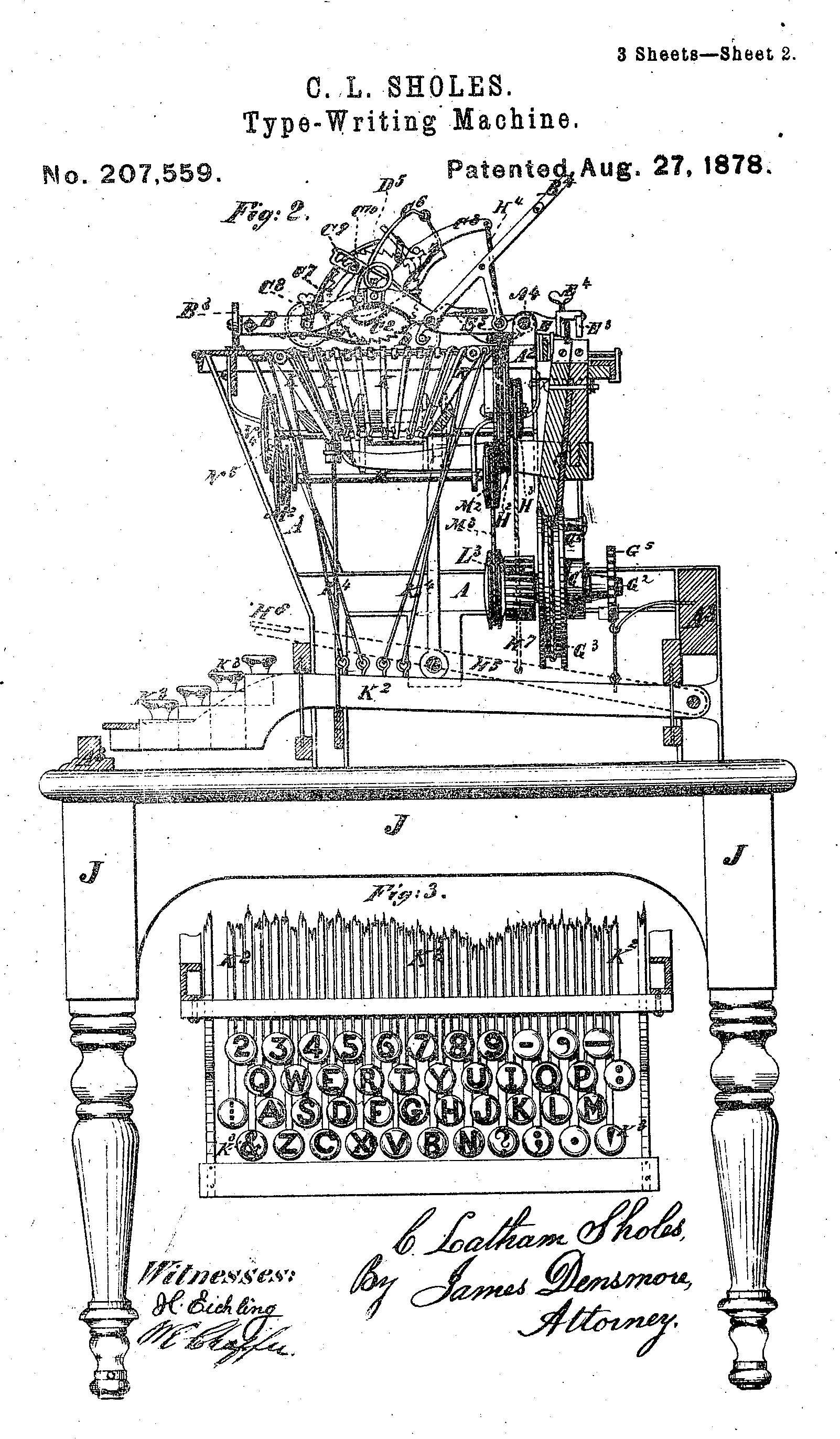
For his part, Thomas concludes that the vertical ellipsis only existed on the very first of Sholes’ commercial typewriters, the so-called Sholes & Glidden, or Remington № 1, and that the character had already disappeared by the time of the 1878 Remington № 2. After all, he says, why type a paragraph character when a flick of the carriage return lever would start a new line? I’ll let Thomas take it from here; his post is a treasure trove of historical appearances for the vertical ellipsis, and it is well worth a look.


Separately, I was happy to see that Michele Buchanan, featured here back in 2014 as the creator of a number of new punctuation marks that included the sarcastic asterisk, the confused question mark (?~) and a doubled right parenthesis (‘))’) for jokes, has published her work in the pages of Communication Design.3 You can find Michele’s paper at Taylor & Francis Online, or you can check out her website at getthepoint.me. Many congratulations to Michele for publishing her paper!


Lastly, I’m sure that many readers will already have heard the sad news of the death of Ray Tomlinson, the inventor of our modern email addressing system and the man who, in essence, rescued the @-symbol from a life of obscurity. I never got the chance to talk to Mr Tomlinson while he was alive, but I was happy to be able to discuss his work here, in the Shady Characters book, and, more recently, with Clare Bates of the BBC for an article on the @-symbol’s remarkable rise to fame.

1.
Clemens, Samuel. “SLC to Orion Clemens, 9 Dec 1874”. Mark Twain Project. Accessed March 13, 2016.


2.
Mark Twain Project. “Guide to Editorial Practice”. Accessed March 13, 2016.


3.
Buchanan, Michele A. “@ Face Value Expanding Our Typographic Repertoire”. Communication Design 3, no. 1 (2015): 27-50. https://doi.org/10.1080/20557132.2015.1057373.


Miscellany № 70 — ‘⋮’, ‘⌨︎’ & ‘¶’

Computers are not typewriters: this is evident. Even so, it’s easy to forget that Christopher Latham Sholes’ mechanical marvel was the wellspring of the QWERTY, QWERTZ, AZERTY and similar keyboards we use to interact with our laptops, tablets and smartphones. Sholes and his invention play supporting roles in the Shady Characters book, too: the typewriter helped popularise the @-symbol even as it savaged the em and en dashes, but there was always one symbol on Sholes’ embryonic QWERTY keyboard that I never quite got to grips with. Take a look at the leftmost key on the third row of Sholes’ keyboard, as shown in his 1878 patent for “Improvement in type-writing machines”.1 What on earth is that? Or rather, what on earth is this: ‘⋮’?

Page 2 of Christopher Latham Sholes' 1878 typewriter patent, showing the mysterious '⋮' on the leftmost key of the third row. (Image courtesy of Google Patent Search.)
Page 2 of Christopher Latham Sholes’ 1878 typewriter patent, showing the mysterious ‘’ on the leftmost key of the third row. (Image courtesy of Google Patent Search.)

A few weeks ago, Marcin Wichary, design lead and typographer at blogging platform Medium, posed the same question on Twitter. One of the first suggestions was that ‘⋮’ must be a shift key — it’s in the right place, more or less — but this feature did not appear until some years later; Sholes was happy to TYPE IN ALL CAPS, like a modern-day internet troll, and it was only after his patents had been acquired by Remington that shift-operated lower case letters appeared.

Next came the idea that it the mystery mark was a vertical ellipsis,2 a rotated version of the standard character (…) that has existed in Unicode since 1993, when it was introduced with version 1.1 of the standard computer character set. As Ross McKillop explained,

[⋮] serves same purpose as … but takes up less space so works on monospaced type3

So far, so reasonable — except, of course, that if the character in question is a vertical ellipsis then it has endured one of the most precipitous falls from grace I’ve yet come across. Every other symbol on Sholes’ original QWERTY keyboard survives in one form or another, and yet the vertical ellipsis, if that is what it was, has effectively disappeared from typographic use. The only similar symbol I’ve ever seen in the wild is the ‘⋮’ used in some Android applications to open a menu or to invoke some secondary action.4 The vertical ellipsis exists, certainly, but I’m pretty sure that it is not the same character that Sholes had in mind.

In the end, Marcin himself found the answer lurking in a paper entitled “On the Prehistory of QWERTY”, written by Koichi Yasuoka and Motoko Yasuoka and published in the journal Zinbun in 2011. It so happens that I mentioned this paper in passing back in 2013, when looking into the layout of the letter keys on the QWERTY keyboard. I learned then that QWERTY’s confusing distribution of alphabetic keys may have been intended to help telegraph operators transcribe the dits and dahs of Morse code, where certain letters were often confused with one another:

[Morse] code rep­res­ents Z as ‘· · · ·’ which is of­ten con­fused with the di­gram SE, more fre­quently-used than Z. Some­times Morse re­ceiv­ers in United States can­not de­term­ine whether Z or SE is ap­plic­able, es­pe­cially in the first let­ter(s) of a word, be­fore they re­ceive fol­low­ing let­ters. Thus S ought to be placed nearby both Z and E on the key­board for Morse re­ceiv­ers to type them quickly (by the same reason C ought to be placed near by IE. But, in fact, C was more of­ten con­fused with S).5

But that is not all that the paper held. Marcin, who was rather more diligent in reading it than I had been, found that Koichi and Motoko also had a theory about our mysterious mark:

’ was added at the left edge of keyboard to indicate “paragraph separator” (“– – – –” in Morse Code of the Western Union Telegraph Company) that was often used when receiving newspaper articles.5

In other words, Sholes’ three-dot mark was the visual representation of the four audible dashes of a Morse code pilcrow: ‘⋮’ = ‘– – – –’ = ‘¶’, if you like.

I’m indebted to Marcin for uncovering this, but I’m also left wondering why Sholes didn’t use the more familiar pilcrow for his Morse code paragraph mark. Perhaps a reader can help shed some light on this — was the vertical ellipsis ever a common paragraph marker in telegraphy or otherwise?

1.


2.


3.


4.
Android Developers. “Action Bar”. Accessed February 28, 2016.


5.
Yasuoka, Koichi, and Motoko Yasuoka. “On the Prehistory of QWERTY”. ZINBUN 42 (March 2011): 161-174.


The Book, revealed!

The Book hardcover. (W. W. Norton, 2016.)

Ladies and gentlemen: The Book: A Cover to Cover Exploration of the Most Powerful Object of Our Time is now available for pre-order! You can order the hardcover in the USA from W. W. Norton, Amazon.com, Indiebound or Powell’s. In the rest of the world, order from Amazon.co.uk, The Book Depository or Waterstones. It will be published in August.

It’s been quite a journey since starting on this second book, and I think that the book itself reflects that: it begins with the clay tablets of the ancient Mesopotamians, takes in the papyrus scroll, the parchment book, paper, printing of all kinds, the Industrial Revolution, photography, lithography and computers, and finishes with the book in your hands. The book (and The Book!) is a product, essentially, of the whole of human history.

Brendan Curry, my editor at Norton, got the band back together again: Judith Abbate provided the sumptuous design (of which more in a future post), which was then expertly typeset by Brad Walrod and copyedited by the eagle-eyed Rachelle Mandik. This is not to forget my agent, Laurie Abkemeier, who was, as always, a great supporter throughout the process. Nor my wife, the long-suffering Dr Leigh Stork, who by now almost certainly knows more than I do about book history.

In lieu of interior shots, for now the typographers and typophiles out there might be interested to know that The Book is set in Adobe Jenson Pro Light, designed by Robert Slimbach between 1995 and 2000 in emulation of type cut in the fifteenth century by the French printer Nicolas Jenson.* Judith has carried over the black-and-red theme from Shady Characters, albeit with the addition of some suitably Venetian printer’s ornaments, and readers of the first book will feel right at home.

I’ll be posting more about The Book in the coming months, but if this has whetted your appetite even a little, why not head over to the retailer of your choice and reserve your copy today?

*
Though the two are not directly related, Judith’s choice of Jenson steered me towards Monokrom’s similarly grand Satyr and Faunus for the recent redesign of the Shady Characters site. 

A spring clean for Shady Characters

As you may have noticed, things are a little different around here. Shady Characters is a little over five years old now, and the original design was starting to fray around the edges: it was not especially readable on mobile devices; PC and Mac users were presented with different fonts; and the underlying code had grown a little stale, leading to ugly citations and unpredictably-sized images.

This new design is my response to all that. Here’s what it entails.


Firstly, all users will now see text set in Sindre Bremnes’ excellent Satyr, with headings set in its “unfaithful companion” Faunus.* Sindre is one of the principals of Norwegian type design studio Monokrom (along with Frode Bo Helland, who helped me greatly in sorting out the minutiae of webfont usage), and he writes of Satyr:1

Curves are hard. Even harder, I think, is making curves and straight lines work well together. And hardest of all is making the transition from line to curve look good. So one day, after a long period of trying to draw type with as few curves as possible, John Downer-style,2 I tried to go the other way, eliminating not the curve but the line. […] But there’s more to Satyr than the lack of straight lines. Although the proportions are vaguely Venetian and the contrast obviously renaissance-influenced, the typeface still can’t be put in any of these coarse categories. The ‘e’ and the ‘a’, most typically, show reversed contrast — the vertical thins seem to change their mind halfway.

In other words, zoom in for a good look! Satyr in particular rewards close examination; Faunus, being designed for larger type, wears its heart on its sleeve.


Aside from the new typefaces, I’ve tweaked the overall design with a view to making things a little more cohesive. The site now scales smoothly from smartphone screens to desktop monitors: font sizes are chosen responsively, images resize and reposition themselves accordingly, and a few other elements rearrange themselves to suit the current screen size. The presentation of references to web pages, newspaper articles, and other problematic article types has been tidied up.


Lastly, I’ve introduced some keyboard shortcuts to make it easier to get around the site. Press ‘j’ to view the next post or ‘k’ to view the previous one. (On list pages, such as the home page, ‘j’ will take you to newer posts and ‘k’ to older posts.) ‘h’ will take you to the home page, ‘/’ to the search box, and ‘c’ to the comments, if available. Try it out, and let me know what you think!


So: here it is, the new version of Shady Characters! There are some other changes under the hood, and not everything will work perfectly at first, of course, but I hope that this is a decent starting point. I encourage you to have a nose around the site to ferret out any visual or functional bugs. Please leave a comment here with your impressions, whether good, bad or indifferent, or drop me a line privately via the Contact page.

Here’s to the next five years!

1.
Bremnes, Sindre. “Designing Satyr”. monokrom.no. Accessed February 14, 2016.


2.
“John Downer”. Typedia. Accessed February 14, 2016.


*
Nina Stössinger assisted with spacing and kerning. 
Shady Characters continues to be powered by WordPress, but the new theme is derived from Automattic’s Underscores starter theme and, for the first time, I’ve automated the creation of the final stylesheet with Sass, Grunt and postcss. None of this should matter to you, the reader, except that it will make maintaining the site a little easier in future.