Unboxing

Hello! (Image by the author.)

Two long-awaited parcels — one from W. W. Norton, the other from Particular Books — arrived this week. With just less than a month to go before publication, I now have some copies of the finished books! They’re both rather amazing.

Above left is Jason Booher’s* cover for W. W. Norton. My shoddy photographic skills don’t really do it justice at all: there’s some very subtle embossing in there that gives the cover design extra depth, and the matte finish is just lovely. I keep wanting to run my hands over it. Also not visible from the photo are the spine, back cover and flaps, all of which carry on the orthographic theme and which look great in their own right.

On the right is Matthew Young’s cover for Particular Books. One pleasant surprise for me was the way in which the front and back covers match up — you don’t have to buy two copies, of course, but they’ll look sharp together if you do! Very nifty. I also love Matthew’s use of what I believe is P22 Johnston Underground, the modernised, licensed version of Edward Johnston’s 1916 London Underground typeface. I’ve always wanted to use that typeface but never quite got it to work the way I imagined it should. Here, though, it is fantastic.

Needless to say, if either of these editions take your fancy then you can pre-order the book today!

*
I earlier (and erroneously) said that Judith Abbate designed this cover. Judith is instead responsible for the excellent internal design of the book. My apologies to Jason! On a serious note, I’m afraid to say that Judith is currently undergoing treatment for cancer of the appendix. Go here if you’d like to help defray the quite staggering medical costs that she and her family are facing. 

Miscellany № 36: the rarity of the shady character

A short but sweet entry today, I’m afraid. Don’t worry, though; with a bit of luck, I should have something rather special for you next week. For now, though, on with the show!


First up is an article on Samuel Arbesman’s Social Dimension blog over at Wired, entitled “The Rarity of the Ampersand: Frequencies of Special Characters”.*

USASCII code chart
USASCII code chart.

Arbesman is an applied mathematician, and he writes about an experiment carried out by Michael Dickens to determine the relative frequencies of characters in a variety of contexts such as prose, casual writing, and programming. Dickens confined himself to the component characters of the now decidedly old-school ASCII code, but the results are instructive nonetheless. There are some familiar faces at the bottom of the list: &, <, %, @, #, ^, `, and ~ bring up the rear for both punctuation characters only and all symbols combined. Perhaps the tilde, percent sign and caret should be in the running for Shady Characters 2!

Continuing with the theme of character frequency analysis, I recently came across a site called Context of Diacritics, whose creator Ondrej Jób describes it as “an analysis of diacritics made to help type designers with refining the character sets of their fonts.” Ondrej and his collaborators have mined Wikipedia articles written in a variety of different languages to derive a list of frequencies for characters with diacritic marks (ä, ř, đ, and so on) and pairs of letters with diacritics (çõ, ół, and so on). And though CoD is ostensibly a tool to help type designers focus on the most widely used combinations of characters and diacritics in their target languages, it’s a visual and typographic treat even for non-type designers like myself. Take a look! What’s your favourite diacritic/letter pair?

*
Arbesman also links to a new article on the Apple command symbol, or . We’ve talked about this before on Shady Characters, of course, but new material on unusual symbols is always welcome and Mike Wehner’s article “Mac 101: The history of the Command key ‘pretzel’” is still worth a read. 

Miscellany № 35: Jay (±-) Z

This week, there is one punctuation-related news story that towers above all others. In the world of musical name changes, Prince’s adoption in 1993 of an unpronounceable glyph called only “Love Symbol #2” must surely retain the crown for sheer outlandishness, but Jay-Z’s reported un-hyphenation has nevertheless set the music press and mainstream media ablaze.12 It all started on the 18th of July when Billboard editor Joe Levy tweeted:

Breaking: Jay Z has dropped the hyphen from his name, according to his label. I am not kidding. (Wish I was.) Copy editors: take note.3

Within days, the story had been picked up by The Atlantic, Pitchfork Media, and many other respectable news outlets, with The Huffington Post running a tongue-in-cheek “Obituary for Jay-Z’s Hyphen”.456 @JayZsHyphen, a parody Twitter account (“Hey @WuTangClan are you guys hiring?”), appeared the very same day Levy broke the news, while Funny or Die ran a spoof Craigslist advert a few days later (“Hardworking SBL [Straight Black Line] seeking immediate, full or part-time employment [see recent photo between the words ‘part’ and ‘time’].”).78

Was it a slow news day? Certainly, the eagerness with which reporters fell on the story seems rather premature in the light of the fact that the rapper and producer had actually dropped the hyphen — or at least tentatively begun to do so — two years previously. Brian Mansfield’s 19th July article for USA Today, entitled “Jay Z’s missing hyphen? It’s been gone for two years”, rather gave the lie to Joe Levy’s excited, day-old tweet.9 Opening with the line, “This is what happens when newspapers cut back on copy editors”, Mansfield went on to explain that Jay-Z had been credited as “Jay Z” on his 2011 collaboration with Kanye West, and that the hyphen is similarly gone from Magna Carta Holy Grail, his current effort.

Less than two weeks on the furore has more or less burned itself out, with only a few laggards such as CNN bringing up the rear with posts that have rather missed their window of opportunity.10 As much as I love the hyphen and its bithorpe siblings, I can’t help but feel rather unmoved by the whole episode. What do you think? Is this a misplaced storm in a teacup, or a genuinely worthwhile news story?


In other news, David Sudweeks continues his excellent series of posts at the FontShop blog with a new treatise on Whitespace and invisible characters. This post is a little more technical than previous entries, focusing on the ins and outs of Adobe’s InDesign software, but it’s still very much worth a read. Over at the Washington Post, Ron Charles looks at the difficulties that David Gilbert’s new novel, & Sons, is causing Amazon’s search facilities.

Thanks for reading!

1.


2.
Prince Vault. “Album: Symbol”. Accessed July 28, 2013.


3.


4.


5.


6.
Duca, Lauren. “An Obituary for Jay-Z’s Hyphen”. The Huffington Post.


7.
Morrissey, Josh. “Hey @WuTangClan Are You Guys Hiring?”. Twitter.


8.


9.


10.


Miscellany № 34: what Ћ?

Those innovators who have designed new typographic symbols make up an eclectic bunch. Interrobang creator Martin K. Speckter was an ad man by trade and a printer by temperament; Bas Jacobs, designer of the ironieteken, and Choz Cunningham, creator of the snark, are type designers; and Doug and Paul Sak of Sarcasm Inc., responsible for the much-maligned SarcMark©, are an accountant and engineer respectively.

To this list — and I never thought I’d write this — we can now add ‘restaurateur’.

The big story this week is the proposal by Paul Mathis, an Australian restaurant owner, to use the symbol ‘Ћ’ as an abbreviation for the word ‘the’. As reported on the website of Australian newspaper The Age,

“The word ‘and’ is only the fifth-most used word in English and it has its own symbol – the ampersand,” says Mathis. “Isn’t it time we accorded the same respect to ‘the’?” […] He has developed the typography – effectively an upper-case “T” and a lower-case “h” bunched together so they share the upright stem – and an app that puts it in everyone’s hand by allowing users to download an entirely new electronic keyboard complete not just with his symbol — which he pronounces “th” — but also a row of keys containing the 10 or 15 (depending on the version) most frequently typed words in English.1

Mathis’ invention (although more on that slippery term later) has made quite a splash, reminiscent of the ripples caused by the SarcMark back in 2010, with many national newspapers and prominent websites picking up the story.2345 Like the Saks, Mathis has covered all his bases: the ‘Ћ’ has its own website (thethe.co), a Twitter account (@thefortweeting) and a promotional YouTube video. Most interesting of all, though, is the suite of Android keyboard apps — developed, Mathis says, at a personal cost of around AUD$38,0002 — with which adventurous users may type the ‘Ћ’ with the greatest of ease.

To my mind, however, the ‘Ћ’ is not without its problems.

Let’s start with a pet peeve. The ampersand (&), to which Mathis compares the ‘Ћ’,2 is derived from a complete word: it is a ligature, albeit a highly stylised one, of the word et. It literally means ‘and’, embodying the word in its entirety. ‘Ћ’ on the other hand, is a ligature of the letters T and h — the e in ‘the’ is left out in the cold. When, as The Age reveals, Mathis pronounces his symbol as “th”,1 he gives voice to this fundamental problem: as often as I scan the symbol ‘Ћ’, my brain persists in rendering it as a stunted “th” sound.

Secondly, it turns out that ‘Ћ’ is not a new invention. Though Mathis insists that he created the symbol from scratch (Karl Quinn of The Age gives him the benefit of the doubt1), he has had the misfortune of alighting upon a design that is functionally identical to the uppercase Cyrillic letter tshe, used only in Serbian, and which represents the <ch> sound in, for example, “chew”.6 Properly speaking, then, ‘Ћ’ does not even represent a “th” sound. (If there is an upside to this unfortunate coincidence, it is that many computing devices can be made to display a ‘Ћ’ without any special effort. Mathis’ Android keyboards are necessary only to enter the character, not to render it.)

Lastly, en route to his final design of ‘Ћ’, Mathis considered and then rejected an existing character — one that, unlike the Cyrillic letter tshe, has exactly the sound he was looking for. The ‘thorn’, or þ, is an Old English letter representing a “th” sound, and was once commonly paired with a superscript e as an abbreviation for ‘the’ to yield ‘þe’.7 Interviewing Mathis for American college website The Airspace, Blake J. Graham wrote:

[Mathis] looked back to the Old English thorn letter (þ) and its variant þe, which was used to represent “the” during the middle ages. While it seemed a good starting point, the thorn wasn’t the answer for Mathis. “Even in ye olde days these symbols were difficult to interpret and eventually were lost in translation,” he told me. “[It doesn’t] look like ‘The.’8

The irony here is that when Mathis talks about “ye olde days”, he is invoking the ghost of the thorn itself. ‘Ye’, commonly used as an anachronistic form of ‘the’ (“Ye Olde Tea Shoppe” is the canonical example), exists only because the cases of blackletter type that early English printers brought over from the continent lacked the Old English þ. Printers turned to the y, its nearest visual equivalent, and the thorn’s fate was sealed.9 Like the tshe, the thorn is well-supported by modern computers; unlike the tshe, the modern thorn boasts a well-realised form that is visually compatible with the roman alphabet. Might Mathis have dismissed it out of hand?

Despite all this, I have to admire Paul Mathis’ chutzpah in launching a new symbol, especially one that represents a word used so frequently in written English. Will the ‘Ћ’ stick? I can’t see it happening. Will his many Melbourne restaurants see a sudden surge in customer numbers as a result of worldwide coverage of his creation? I imagine so!


In other news this week, Symmetry Magazine tells the backstory behind Scott Fahlman’s creation of the smiley at Carnegie Mellon University back in 1982. I’ve talked about this before on Shady Characters, but read Julianne Wyrick’s article for some great details on the circumstances surrounding Fahlman’s invention.

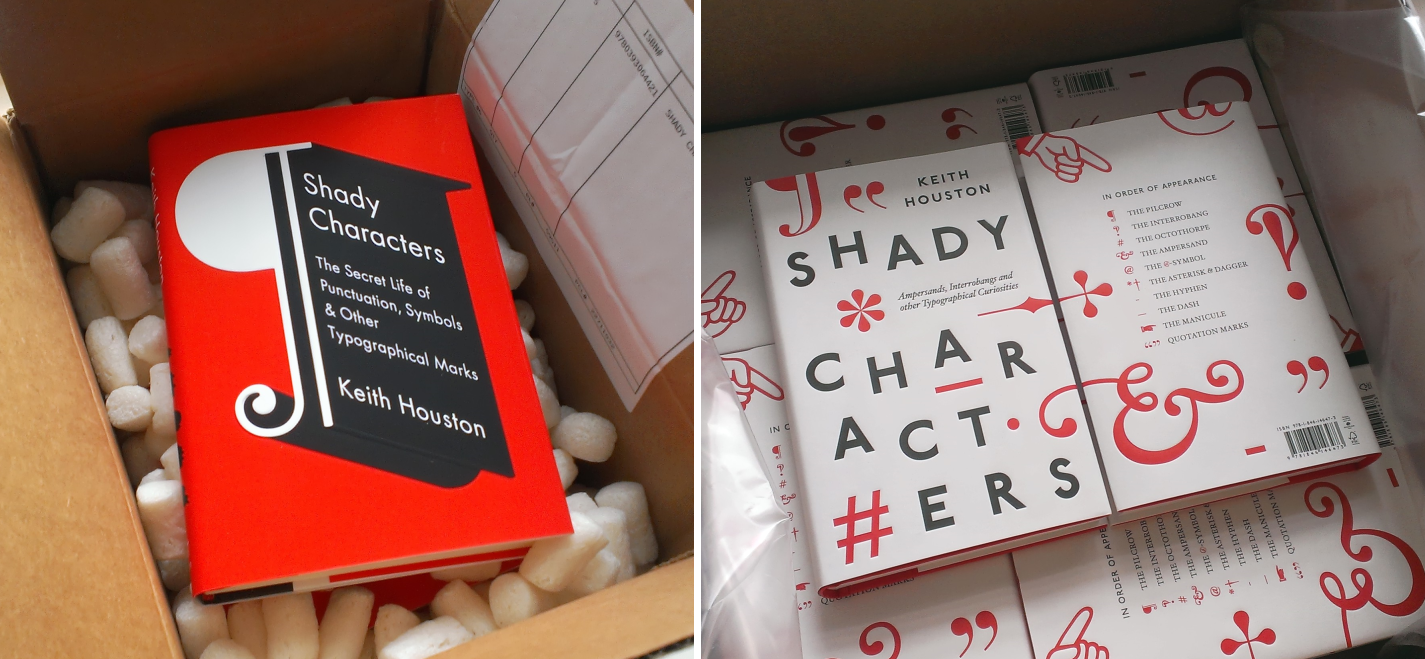
For those who just can’t wait for the hyphen and dash chapters in the Shady Characters book, David Sudweeks’ article at FontShop about the usage of the hyphen, en dash and em dash will whet your appetite.

And lastly, a certain book helps Jimmy Stamp at the Smithsonian Magazine’s Design Decoded blog decipher “The Origin of the Pilcrow, aka the Strange Paragraph Symbol”.

Thanks for reading!

1.


2.


3.
Subramanian, Courtney. “Why The Deserves a Symbol All Its Own”. Time NewsFeed.


4.


5.


6.
Wikipedia. “Tshe”.


7.
Scragg, D. “The Foundation”. In A History of English Spelling, 1-14. Manchester [Eng.]: Manchester University Press, 1974.


8.


9.
“Y”. In Concise Oxford Companion to the English Language. Oxford University Press, 2005.