My last post, where we took a look at Birmingham’s over-punctuated street signs, stirred up quite a bit of discussion. Rich Greenhill suggested that Birmingham’s commas-and-tilde motif could have come from an abbreviated medieval ‘a’ or, perhaps, “ditto” marks. H James Lucas wondered if the paired commas might be a single inverted comma, used by the ironmonger to save typesetting effort; Brian Inglis took the opposite tack and suggested the commas could have been added purely so the manufacturer could invoice for an extra couple of characters. And, on street signs in general, Korhomme pointed out Bern’s colour-coded street signs, imposed by Napoleon’s invading armies. Read about these and other ideas in the comments from last time round.
Two new readers have since been in touch with more examples of elaborately typeset abbreviations, and I couldn’t keep them to myself.
Dr Cathy Gale (@PlayMakeThink on Twitter, or visit her web site at playmakethink.com) sent in some examples of street signs in Margate, a seaside town in the south east of England. The first one shows what I’m going to call a Birmingham-style abbreviation for “Road”, complete with a dash and a pair of commas:
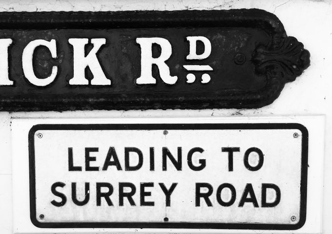
Hold onto your hats, because Dr Gale’s next image has a similar style of abbreviation, only used for the word “Crescent” instead:
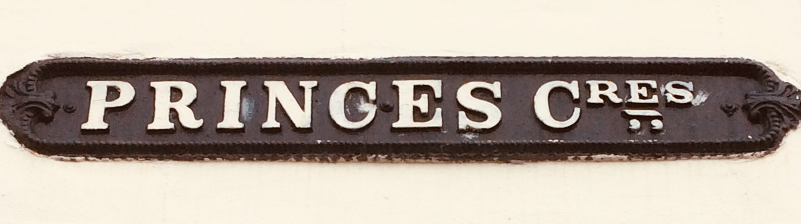
The fact that “Crescent” doesn’t contain an ‘a’ would suggest that this style of abbreviation isn’t derived from an abbreviated medieval ‘a’, but that’s the only potential explanation I think we can rule out.
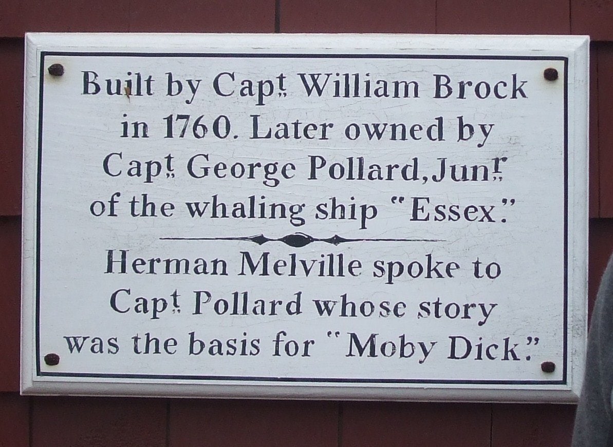
George Pollard (@porges on Twitter, or visit porg.es) sent in some examples of similar abbreviations in different contexts. This first one, a hand-painted plaque in Nantucket, Massachusetts, is dedicated to Captain Ahab’s real-life counterpart, also called George Pollard.
,_Nantucket,_Massachusetts.jpg)
An unexpected intersection of punctuation and Moby Dick — does it get any better than this? And we get four abbreviations for the price of one, even if we make do without the traditional Birmingham dash or tilde.
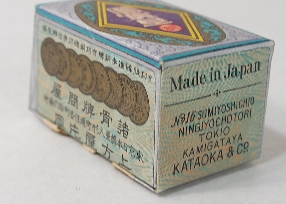
George also pointed out a pair of uses of the abbreviation “Co.”, for “Company”, on two very different playing card decks. First is this Japanese hanafuda card deck box:
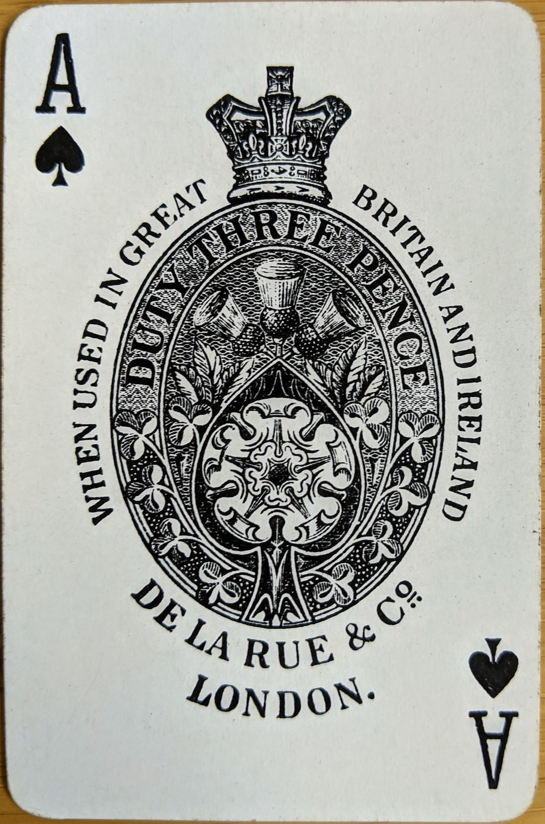
Finally, we have this lovely ace of spades shown on an undated card printed by De La Rue of London. Thomas De La Rue got started in business in 1821, making straw hats; within a decade he had moved on to printing playing cards, and the Co. that now bears his name is best known for the high-tech printing of banknotes.
I must thank Dr Cathy Gale and George Pollard for sharing these images. I’m not sure I’ve learned anything more about why some abbreviations are typeset in the Birmingham style, but I’m glad I’ve had the chance to publish these fantastic pictures. Perhaps one of them has jogged your memory? If so, please leave a comment below!
Comment posted by Geoffrey Allen on
Hi, Keith.
As I mentioned to you briefly over twitter, I recently saw this convention applied in handwritten letters from the latter part of the 19th C. The Newberry Library has an online transcription project that I dabbled in. I tackled several items in the Benjamin Henry Grierson letters, 1868-1890 collection.
While the convention was not consistently followed, I regularly saw dates written such as Aug. 15th, with the “th” superscript, underlined and with two dots (or vertical dashes) below. Grierson commanded the 10th Calvalry, and the same convention was frequently applied to writing out his division’s name.
Other abbreviations where dots were applied under superscript letters occurred often from titles such as Genl. (dot under final l), Sgt.. (two dots under the superscript gt), and Lt.
I quickly looked back at the pages and found a few as reference. Not every example above is found in the small sample I gathered for you, but it should be enough to give the sense. Looking through the letters I’m sure you’ll be able to identify others in the collection. I tried to find example using various hands to illustrate that the practice must have been quite widespread, or at least not the quirk of an individual. I hope they are of interest.
Examples:
Comment posted by Keith Houston on
Hi Geoffrey – thanks for posting those examples! As you say, they would tend to support the idea that the practice was well established by the mid to late 19th century. I wonder how far back it goes?
Comment posted by Paolo on
Do you know the book London Street Signs by Alistair Hall? In one of the pictures on the site there is a “dash and two commas”. I don’t know if it contains any explanation.
Comment posted by Keith Houston on
Hi Paolo — thanks for the pointer! I came across that book as I did some research for these two posts, but without library access I wasn’t able to read it. Something for my books-to-read list!