A couple of months ago, in the midst of writing my emoji series, I took some time out to have a chat with Glenn Fleishman for his new podcast series, the Tiny Typecast. Glenn is an old friend of the blog and is astonishingly well-informed about books, typography and all things related: we talked about books and book history for what felt like a few minutes, but turned out to be the better part of an hour. Glenn is easy to talk to and, if you check out our conversation on Apple Podcasts or at Glenn’s blog, you’ll find that he’s easy to listen to, too. (The jury is still out on yours truly.)
Emoji, part 10: state of the nation
We’ve come a long way, 👶, in this series of posts on emoji, and it’s time to round things up.
We’ve seen how emoji were invented, where they came from, and how they went global. We’ve examined the technical and political infrastructure that underpin the emoji we see on our smartphones and computer screens, and we’ve watched emoji transcend their electronic roots to appear in the news, in the courts, in the movies, and more.
We’ve dug into emoji’s problems with diversity, how the Unicode Consortium have tried to address them via annual updates, and the positive but incomplete steps taken as a result. We asked if emoji are a language, a script, or something else, and we’ve looked both at the proprietary “stickers” that threaten emoji and Unicode’s own attempts to break emoji out of their walled garden.
What, then, is the state of the emoji nation? In the final post in this series, we look at emoji’s journey so far and their prospects for the future.
The Book (책의 책) is now available in Korean!
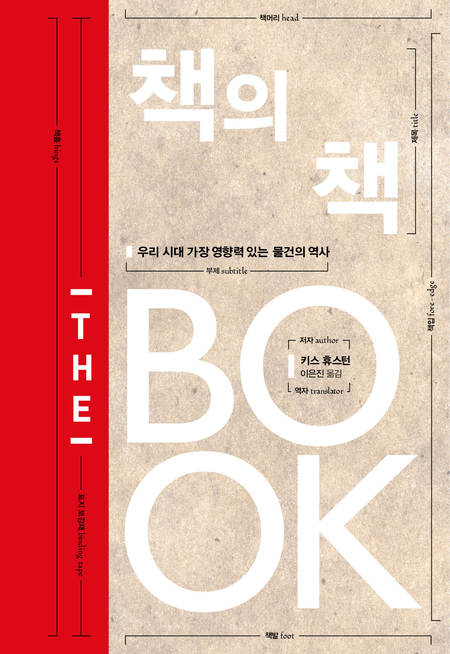
I’m happy to announce that The Book: A Cover-to-Cover Exploration of the Most Powerful Object of Our Time is now available in Korean, courtesy of Gimm-Young Publications. It’s available now, priced at ₩24,800, and you can take a quick tour via Google Books.
And — and! — I somehow forgot to mention that the English edition of The Book is now, and has been for some time, available as an audiobook narrated by Dennis Kleinman. You can find it at Kobo, Audible, audiobookstore.com or wherever else you get your audiobooks.
Lastly, are you looking for a last-minute Christmas present for the bookish person in your life? If you haven’t already bought them a copy, the UK Kindle edition of Shady Characters is currently on sale at the low, low price of £1.99.
If you happen to buy or borrow a copy of any of these editions, please leave a comment below or drop me a line via the contact form to let me know what you think!
Emoji, part 9: going beyond
Given all we’ve seen so far in this series, it becomes natural to wonder: what’s next for emoji? And how do we even begin to answer that question?
We saw in part 7 that emoji are neither a language nor a script. But if we might be permitted for a moment to call them script-like, then, of all of the scripts and script-like things that we use to communicate online, emoji were perhaps the first to be native to the digital world. They were born to inject life into Japan’s teen-friendly poke beru, or pagers; later, they were adopted by Apple, Google, and other companies who have made their money online; and, under the care of the Unicode Consortium, they continue to be tended to by a group of nerds of the highest order. (As a software engineer by trade, I say that with the greatest respect.)
As such, it should come as no surprise that emoji have been, and continue to be, darlings of the tech industry. Emojli, the emoji-only social network, may have folded back in 2015,1 but that same year saw online payment company WorldPay muse that emoji might reasonably replace numbers when it came to PINs, reasoning that a combination of four distinct emoji makes for a significantly more secure password than four distinct digits.2* Also in 2015, Snapchat, an edgy messaging service popular with younger users, added emoji to indicate relationships beween users; a year later, Facebook, a distinctly non-edgy social network, augmented its internet-ancient “like” button (👍) with a palette of five additional “reaction” emoji (❤️, 😆, 😮, 😢 and 😠).4,5
Apple, as befits one of emoji’s earliest adopters in the West, have worked emoji especially hard. In 2017, the newly-launched iPhone X came with what Apple called “animoji” — animated, three-dimensional emoji with the ability to replicate the user’s facial expressions.6 It sounds odd, and, well, it was; within a day of the iPhone X’s unveiling, Devin Coldewey of TechCrunch opined that “Animoji are dumb and I detest them”.7 Dumb or not, Apple have since doubled down on the “weird animated emoji” front, last year launching a “memoji” feature that creates custom, emoji-style stickers based on the user’s facial appearance.8
Emoji, part 8: when is an emoji not an emoji?
As exuberant as emoji can be in the right hands, our palette of emoji remains tightly controlled by the Unicode Consortium. There are, however, other ways to embed colourful graphics in your digital messages, and, in the long run, there is every possiblity that they may elbow emoji out of the way entirely. The future of emoji may not be emoji at all.
Appropriately, given emoji’s invention in Japan, the first cracks in emoji’s monopoly on cutesy inline graphics came out of that same country.
In 2011, in the wake of a tsunami that devastated the north-east coast of Japan’s main island,1 the country’s telecommunication networks were thrown into disarray. Only the internet, designed from its inception to route data packets around broken network links, continued to function reliably — a fact not lost on NHN Japan, an internet company that chose in June of that year to launch a mobile messaging app based not on fragile SMS text messages but rather fault-tolerant mobile data services. It was called Line and it was a runaway success, hitting 50-million users just a year after launch.2
Though Line’s developers had chosen to use the internet for its robustness, by happy coincidence this also meant that they were not confined to text-only messages. Instead, they could send whatever data they liked. This allowed them to connect users in two notable ways: first, Line users could call one another for free, over the caller and callee’s respective mobile data connections; second, users could embed digital images called “stickers” in Line’s SMS-like text messages. These stickers took the form of larger, more detailed versions of existing emoji, along with a slew of additional manga-like characters, that could be sent back and forth either within or in lieu of textual messages.3,4
Line’s stickers were a hit. The app was and is popular in countries whose complex scripts are difficult to enter on smartphones, such as Japan, Thailand, Korea and Taiwan, in part because stickers can convey complex sentiments with a minimum of effort. Moreover, stickers have also turned out to be a formidable revenue stream. In 2013, just two years after its launch, Line made $17 million from sales of downloadable sticker packs;3 two years after that, sticker sales were up to $271 million. This is not to mention that some of Line’s cartoonish sticker personalities, such as “Brown” the bear and a rabbit named Cony, have become so popular that they now have their own lines of merchandise worth tens of millions of dollars in their own right.5 (Even in China, where Line’s apps are blocked by that country’s “Great Firewall”, knicknacks featuring Cony, Brown and company are sought after.6)