The second round of The Book giveaway came to a close yesterday, and I’m pleased to announce that Angela Boothroyd (@StudyingOnline) is the winner. Congratulations to Angela! Her signed copy of The Book will be on its way soon.
Cover of The Book as designed by David High.
To celebrate the publication of the US edition tomorrow, I’m going to do things a little differently this week and give away both of the two remaining copies of the book. To enter this last round of the giveaway, just do one of the following:
leave a comment on this post, making sure to supply a valid email address so that I can contact you in the event that you win, or
reply to or retweet the tweet announcing this contest, making sure to follow @shadychars so that I can send you a direct message if you win. (Please don’t create multiple accounts or repeatedly reply to the message — Twitter may ban you as a result. One entry is fine!)
This last round of the contest will close at noon GMT on Sunday 28th August 2016, so make sure you enter before then. After that I’ll pick two winners from the list of all unique entrants, and I’ll happily post their copies of The Book to them wherever they are in the world.
Good luck! And don’t forget — if you don’t win in this final round of the competition, The Book will be available for purchase in all good bookshops before you know it.
Update: The competition is now closed! I’ll announce the winners soon.
So! The first round of The Book giveaway came to a close yesterday, and I’m pleased to announce that of the 278 entrants the winner was Gary K. McCormick (@WillotheGlen). Congratulations to Gary! His signed copy of The Book will be on its way soon.
Cover of The Book as designed by David High.
If you didn’t win (and statistically speaking, you, um, probably didn’t), don’t fret! This is your chance to win the second of four signed copies I’ll be giving away over the next few weeks. To enter this round of the giveaway, just do one of the following:
leave a comment on this post, making sure to supply a valid email address so that I can contact you in the event that you win, or
reply to or retweet the tweet announcing this contest, making sure to follow @shadychars so that I can send you a direct message if you win. (Please don’t create multiple accounts or repeatedly reply to the message — Twitter may ban you as a result. One entry is fine!)
This second round of the contest will close at noon GMT on Sunday 21st August 2016, so make sure you enter before then. After that I’ll pick one winner from the list of all unique entrants, and I’ll happily post a copy of The Book to them wherever they are in the world.
Good luck!
Update: The second round of the competition is now closed! Thank you for all your comments and tweets. I’ll announce the winner tomorrow, and kick off the next round of the competition!
It’s publication week for The Book here in the UK, and so things are a little busy. For the third part of my “Booking It” series, then, on the arts and crafts that go into bookmaking, I’m cheating a little and republishing a post from November 2012, when I visited Robert Smail’s Printing Works in the Scottish borders. I hope you enjoy it!
So, just before 10am on a damp but clear Saturday morning, I stepped off the bus on Innerleithen’s high street and walked the few hundred metres to the Victorian shop front of R. Smail & Sons Printing Works. Gen Harrison, property manager, and Rachel Mays, senior assistant, greeted the handful of us who had managed to snag places on the second of the two workshops run each year. We were shepherded from the neat, quaint shop to the separate, two-storey workshop building behind, given aprons and warned to keep our hands out of whirring machinery.
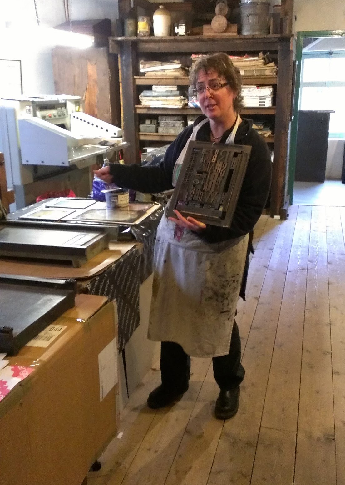
Gen Harrison, property manager at Smail’s, holds up a forme of wooden type.
The workshop is a warmly inviting, thoroughly lived-in piece of Victorian architecture. It is poised over a manmade canal, with the small water wheel that powered the works’ presses in their heyday visible through the windows at one gable end. The ground floor was taken up with a variety of hand and powered presses, with cabinets of type and shelves laden with reams of paper crowding the walls. To get us over the inevitable what-do-I-print-and-how-do-I-print-it hump, Gen led us through the basics of printing with the large, wooden type once used to set posters and other display items, and encouraged us to start by printing our own names.
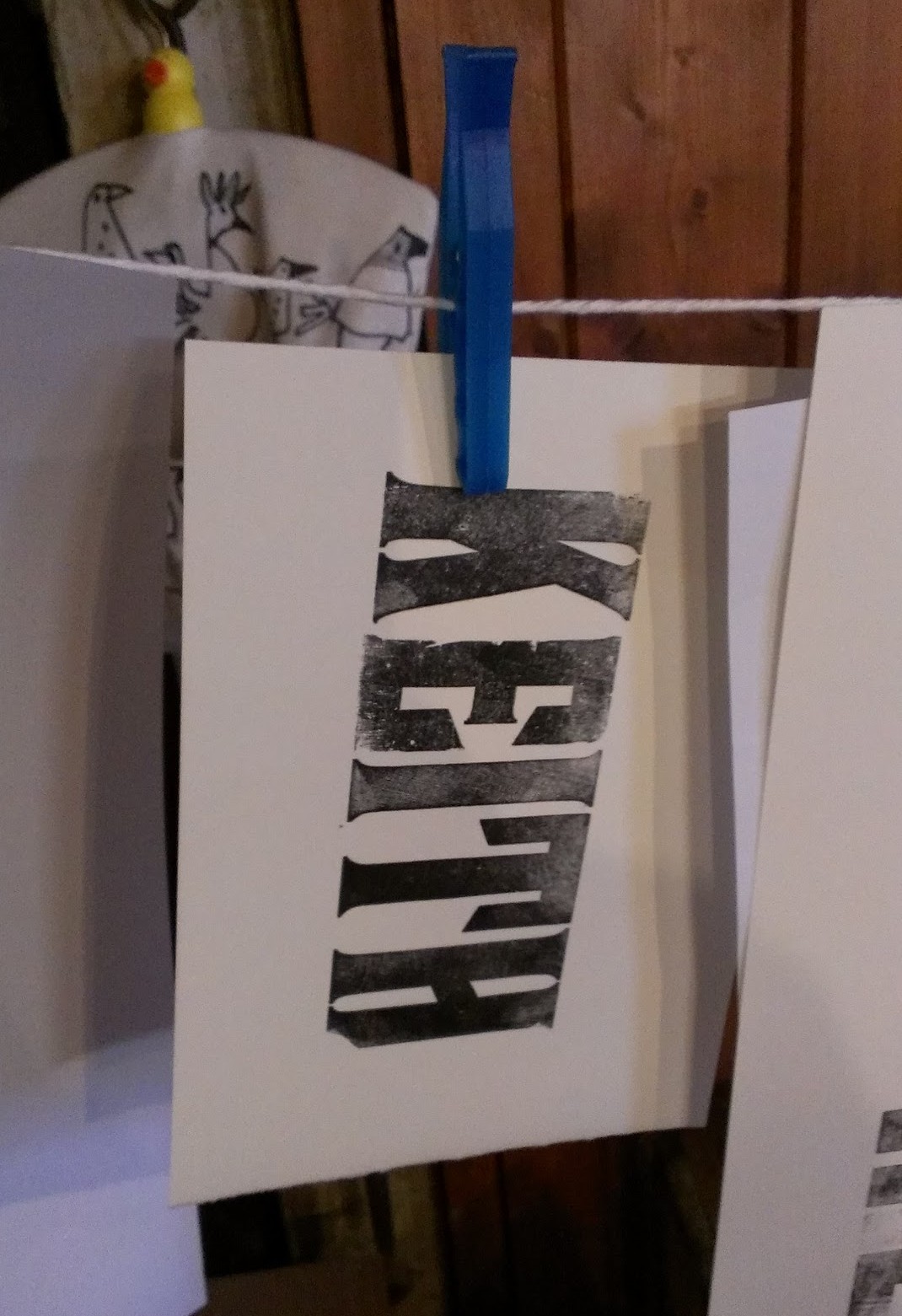
The process is as easy to describe as it is difficult to get right. First, the wooden blocks of type are placed face up on the bed of the press, then the viscous, sticky ink is rolled out and applied to the faces of the letters with a small hand roller. Next, the paper is laid flat over the letters and the press’s cylindrical platen is rolled over and back across the paper. Carefully peel off the paper et voilà: you have a squint, patchy reproduction of your name in a style beloved of the makers of distressed denim clothing. Gen and Rachel helped us through the various tricks to getting things right: even application of ink, the use of magnets and wooden guides (or “furniture”) to keep the type square on the bed of the press, and judicious use of scrap paper placed under the type to level out the uneven surfaces of the letters.
My first attempt at letterpress printing: underwhelming in a fashionable way, I think.
Rather than perfect my wooden type technique, though, I had a different goal in mind. I explained to Gen what I wanted to do and was shown upstairs to the second storey of the workshop. The second floor was again packed with presses and cabinets of type; this time, though, the angled cases set out at eye and waist height held the minuscule lead type used to set books.
The process of setting lead type is a little more involved than for wooden type. First, a ‘composing stick’, or ‘setting stick’, resembling a brass ruler or caliper, is set to the desired line width. Individual sorts — lead blocks carrying embossed letters — are placed upside down and left to right along the composing stick’s ledge until the line is full, or nearly full; any play is eliminated by distributing progressively thinner spaces between the words. Next, if the printed lines are to be separated by some white space, a thin lead strip is placed along the top (or bottom, depending on your point of view) of the finished line, and a new line begun. Once the stick is full, the letters are carefully slid off into a metal ‘chase’, or frame; empty space around the text is filled with furniture and everything is held in place by means of expandable spacers called ‘quoins’. The finished article — furniture, quoins and type bound into a chase — is called the ‘forme’. (Inevitably, your first completed forme will shed letters and spaces willy-nilly onto the workbench as soon as you lift it up. There is an art to spacing lines so that they do not do this.)
A composing stick filled with the first two lines of my printing project. Can you tell what it is yet?
Unlike the large roller presses downstairs, this time round I would be using a dainty “Adana”, the quintessential hobbyist printing press, and a British institution from its introduction in the 1920s until the last new example was sold in the ’90s. The Adana is an ingenious device: a single lever drives a pair of rollers across the surface of the type and up over the circular inking plate to receive a fresh coat of ink; after the rollers have passed, the platen bearing the paper is pressed against the type. As the lever is released, the platen is withdrawn from the type and the rollers return to rest at the bottom of the machine. (It’s difficult to describe; this video shows a similar Kelsey press in action.)
My plan called for four or five formes in total, and two separate impressions for each printed piece, each with a different colour of ink. With Gen having demonstrated the subtleties involved in aligning, or ‘registering’, the successive formes required to print each piece, I set to work. The printing itself went remarkably smoothly — so smoothly, in fact, that I almost immediately felt the siren call to purchase a used Adana — though cleaning the stubbornly adhesive ink off the rollers and inking plate was enough to bring me back down to earth. Distributing type back into the correct boxes at the end of the day was another shock to the system, and I suddenly understood at an instinctive level why Ottmar Mergenthaler and Tolbert Lanston had sunk so much of their time and money into their respective automated typesetting devices. A lifetime of distributing used type must have driven even the most patient of hand compositors a little mad.
The finished article. I also printed examples bearing @-symbols, pilcrows and manicules.
In the end, my 6-hour day resulted in a stack of perhaps fifty two-colour business cards. It seems paltry to type that, but I can’t express how satisfying the process was; Eric Gill may have been a monstrous character in his private life, but his public endorsement of skilled manual work was spot on. Gen and Rachel’s enthusiasm for their job was infectious, and by the end of the day I was thoroughly pleased with my small achievement. If you’ve ever been the slightest bit curious about printing or typopgraphy, you owe it to yourself to give it a try, and Smail’s is the perfect place to start.
Responsibility for all photographs (however inexpert) is mine. See more of them at Google+. Neither the NTS nor Smail’s induced me to write this in any way; I enjoyed myself so much that I thought it worth spreading the word. Do get in touch with them if you fancy trying letterpress printing!
Lastly, if you’ve enjoyed this article, why not buy a copy of The Book? Johannes Gutenberg and his invention (or was it his invention?) play a starring role, along with the many developments in bookmaking and printing that followed. The Book will be published in both the UK and the USA in August 2016.
There are many people to thank for helping make this happen: my agent Laurie Abkemeier; Brendan Curry, Sophie Duvernoy, Nathanial Dennett, Will Scarlett and Anna Oler at W. W. Norton USA; Emily Cary-Elwes, Judith Pamplin et al at W. W. Norton UK; Judith Abbate, David High and Brad Walrod for design and composition; and Rachelle Mandik for copyediting. And of course, my wife Leigh helped out at every stage — she has read The Book cover to cover many times over by now, and it’s all the better for it.
I may have mentioned that I have a new book coming out soon. This is your chance to win the first of four signed copies! To enter the giveaway, just do one of the following:
leave a comment on this post, making sure to supply a valid email address so that I can contact you in the event that you win, or
reply to or retweet the tweet announcing this contest, making sure to follow @shadychars so that I can send you a direct message if you win. (Please don’t create multiple accounts or repeatedly reply to the message — Twitter may ban you as a result. One entry is fine!)
This first round of the contest will close at noon GMT on Sunday 14th August 2016, so make sure you enter before then. After that I’ll pick one winner from the list of all unique entrants, and I’ll happily post a copy of The Book to them wherever they are in the world.
Good luck! And remember, if you don’t win this time round, there are three more chances still to come.
Update: The competition is now closed! Thank you for all your comments and tweets. I’ll announce the winner tomorrow, and kick off the next round of the competition!