There’s no miscellany post this weekend, but by way of compensation I might point you towards tomorrow’s episode of BBC Radio 4’s Word of Mouth programme, to be broadcast at 4pm here in the UK.* In it I’ll be talking with the estimable Michael Rosen about punctuation, ancient Greece, medieval manuscripts, Winston Churchill and more — it was great fun to record the episode, and I hope it’ll be fun to listen to as well.
So: remember to tune in to Radio 4 tomorrow at 4pm, and please let me know what you think in the comments section below or, if you’d prefer, drop me a line via the Contact page. Enjoy!
It’s easy to overlook the importance of empty space as a form of punctuation. Certainly, I’m guilty of giving pride of place to visible marks such as the pilcrow (¶) and interrobang (‽). But this isn’t to ignore the groundbreaking invention of the word space in the medieval period; the disappearance of the pilcrow to create the paragraph indent; or, most recently, the use of variable-length spaces as pauses in Patrick Stewart’s 2015 PhD thesis. Also recently, I was encouraged to look again at the subject of whitespace-as-punctuation by a visit to the Science Museum here in London.
First, though, it’s helpful to recap the 1200-year evolution of empty space as punctuation. Hold onto your hats.
For much of antiquity, texts were written in the traditional style of scriptio continua, or WORDSWITHOUTSPACES, that was favoured by the Greeks and Romans. Eventually, around the eighth century, Celtic monks at the fringes of what had once been the Roman Empire started to add spaces between words to ease the copying and reading of unfamiliar Latin texts.1 Later, with the arrival of printing in Europe in the fifteenth century, an exponential growth in the number of texts to be finished and bound led many printers to omit certain decorative flourishes that had once been added by hand — even as the whitespace dedicated to them continued to feature in printed works. Thus, the pilcrow and other paragraph marks, such as decorative initial caps, disappeared in favour of the now-familiar paragraph indent, as seen in this article.2
And so, by the end of the fifteenth century, the hierarchy of punctuation marks from the paragraph on down was essentially fixed. Paragraphs were separated by a newline followed by an indentation;* sentences were separated by one of a number of visual marks; clauses were separated by points, slashes, and other symbols; and words were separated by simple spaces.
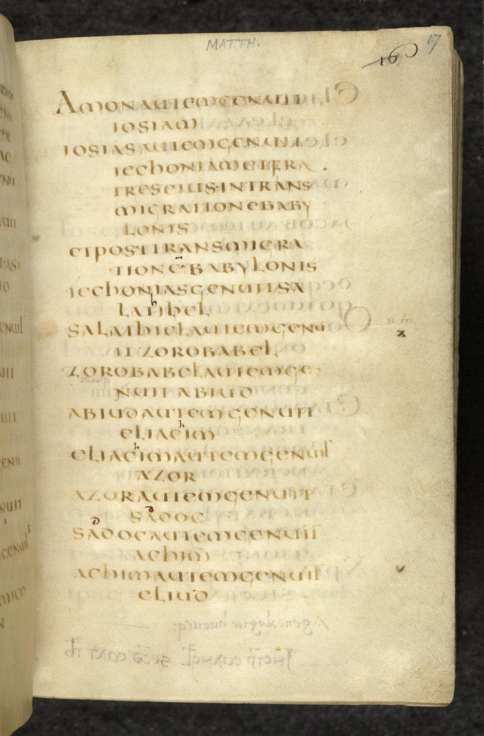
But that isn’t quite all there is to the story. Before the paragraph indent, before even the word space, some writers of the early Christian era experimented with a form of punctuation that they called per cola et commata — “by colons and commas”. Originating with St Jerome in the fourth century, texts arranged per cola et commata placed each sentence and clause on a new line. Where a clause was too long to fit on a single line, it was carried over the next line and indented to the right. 4 Here’s an example, from folio 17 of British Library manuscript Harley 1775, an Italian manuscript of the Four Gospels from the last quarter of the sixth century:
For those trained in the art of rhetoric, a comma was a short clause and a colon a longer one; together a sequence of commata and cola made up a complete periodos, or sentence. The prevailing method of punctuation would have been to add a middle (·), low (.) or high dot (˙) after each comma, colon and periodos respectively,5 but St Jerome, and those who followed his example, used page layout instead of visible marks to punctuate their texts. Given that punctuation began as a way for readers to insert spoken pauses in a written text, St Jerome’s innovative page layout makes a great deal of sense: here is an author inserting visible pauses in his writings to guide his readers in teasing apart their meaning.
All of this brings us to the Science Museum. I was there more or less by accident, killing some time with a friend, when we found ourselves in an exhibition called Churchill’s Scientists, about British scientific advances during WWII. As we wandered through it, I noticed a reproduction of a page from one of Winston Churchill’s speeches, and it looked mightily familiar.
It turns out that Churchill (or, perhaps, a secretary; I’m sure more knowledgeable readers will correct me) had a very particular way of laying out the notes for his speeches. You can see many examples of his typewritten notes at the Churchill Archive, but here are a couple of paragraphs from the closing section of his most famous speech, usually entitled “Their Finest Hour” from its last line, as an example:
If we can stand up to him,
    all Europe may be freed,
	  and the life of the world
	   may move forward into
	     broad and sunlit uplands.

But if we fail,
  then the whole world,
    including the United States,
	  including all that we have known and
	                              cared for,
	   will sink into the abyss of a
	     new Dark Age
		   made more sinister and
		    perhaps more protracted by
			 the lights of perverted
			         Science.
Now isn’t that striking? The notes for “Their Finest Hour” aren’t arranged strictly per cola et commata, for reasons I’ll come to in a moment, but the family resemblance is strong nonetheless. That resemblance becomes even more pronounced when you hear Churchill deliver this part of the speech, as in this British Pathé recording.† What you’ll notice is that when he pauses in his delivery, it is almost always at the end of a line. Only in the final lines of the second sentence above does he deviate noticeably from his per cola et commata-style layout, pausing after “protracted” and “lights”. Everywhere else, essentially, a new line signals a pause in his spoken performance.
Of course, if Churchill was aware of St Jerome’s fourth-century per cola et commata method (he was avowedly ambivalent toward Greek and Latin at school6), he did not follow it slavishly. His line breaks do not always fall where a comma, colon or semicolon might have been expected to appear. He has indented each line a little more than the last, rather than push them all to the left-hand margin, to make it easier to follow his notes as he read aloud from them. And, most obviously, the occasional stray comma has crept in, as if he could not quite bear to abandon conventional punctuation altogether.
Wherever Churchill found inspiration for his note-making technique, however, and whatever you think of the man himself, it’s difficult to argue with the results: his typewritten notes are weirdly lyrical in their layout and his speeches were undeniably effective. Per cola et commata or not, there’s a lot to be said for swapping commas, colons, and semicolons for the architectural precision of a new line of text.
1.
Saenger, Paul. “Silent Reading: Its Impact on Late Medieval Script and Society”. Viator: Medieval and Renaissance Studies, no. 13 (1982): 367-414.
Parkes, M. B. “Antiquity: Aids for Inexperienced Readers and the Prehistory of Punctuation”. In Pause and Effect: Punctuation in the West, 9-19. University of California Press, 1993.
Writing in Print magazine, Jason Pamental hypothesises that the paragraph indent was joined by the blank line — another example of whitespace as punctuation — because of simple laziness. It’s easier, he writes, to hit the return key twice than it is to hit return a single time and then insert a tab or em quad at the start of the next line.3↢
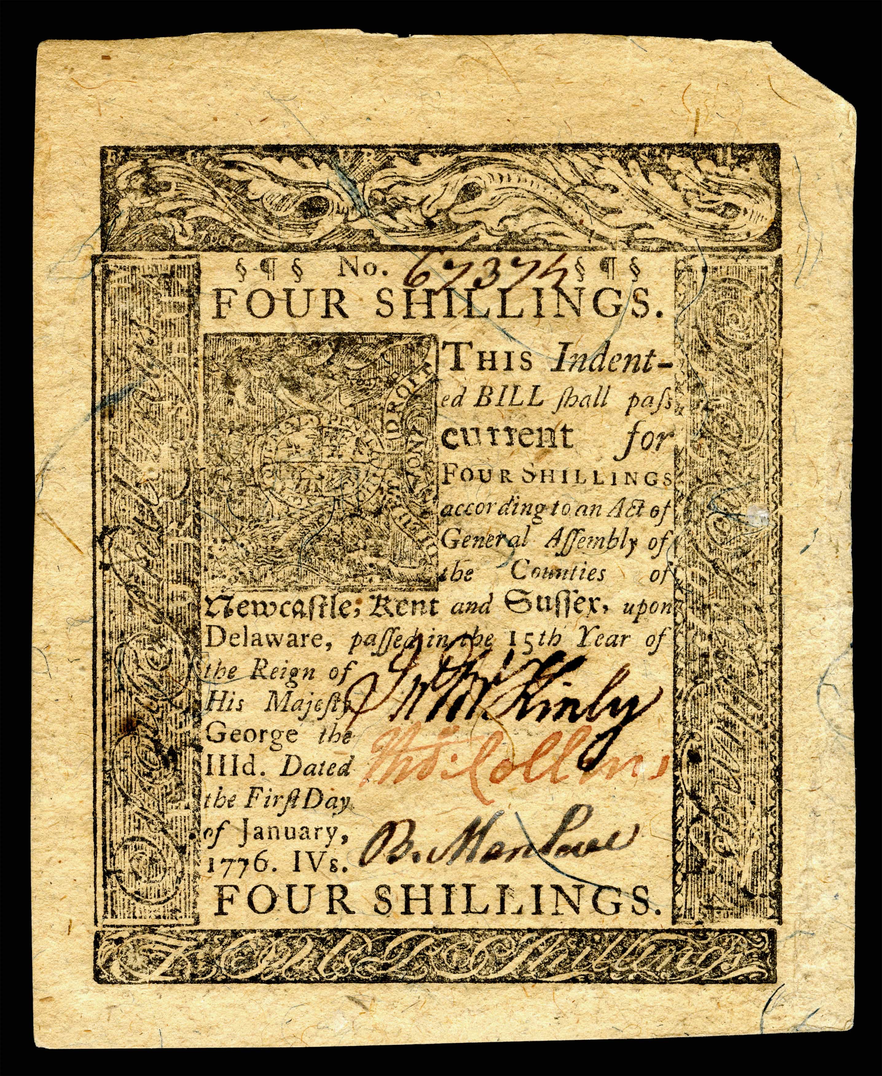
It’s January, 1776. You’re a printer in Delaware, one of thirteen restive American colonies chafing against British rule. The Continental Congress, the colonies’ nascent collective government, has recently passed an act creating its own currency and you’ve been tasked with creating Delaware’s issue of banknotes.1 This is your response:
Bearing the incongruous declaration that the Delaware pound was created “in the 15th Year of the Reign of His Majesty George the IIId”, this 4-shilling note is one of a plethora of “Continental” banknotes issued from 1775 onwards to bankroll the American Revolution. Today, we’d call these Continental notes a fiat currency — that is, a monetary system whose value is managed by a central bank, rather than being vested in a precious commodity such as silver or gold — but Revolutionary-era America was not quite ready for this financial innovation. The colonial governments declared that their Continental dollars (or Continental pounds, as Delaware called them) were backed by future tax revenues, but a jittery populace was unconvinced and the value of paper notes, relative to hard currency such as Spanish silver dollars, dropped five hundredfold in only six years.2 Nor was this the only problem undermining the new currency.
Let’s take a look again at the note above. It may lack the “To Counterfeit, is DEATH” slogan printed on some other Continental notes,3 but that doesn’t mean it would have presented much of a challenge for a skilled counterfeiter.4 Forgers had access to much of the same technology used to produce the notes, such as movable type and copperplate engraving, and that made paper money an easy target. The security measures available to the institutions that issued banknotes were limited to such things as hand-cut type ornaments and detailed engravings, all of which made copying a note a time-consuming process. Some states reissued notes on a yearly basis, with each year’s design distinct from the last, in an effort to stay ahead of the forgers. As long as the time it took to copy a note made it uneconomical for a counterfeiter to do so, that denomination was safe; the instant it had been copied, it was dead in the water.5
Now, our Delaware printer was not exactly a security expert. The engraved panels surrounding the note’s central text might have kept a forger at bay for some time, but the text itself is woefully undistinguished. Up at the top is a sort of cargo-cult attempt at using type ornaments to discourage copying: two section signs and a pilcrow (§ ¶ §) stand sentry at either side of the banknote’s handwritten serial number. Not the most unusual characters, nor the most difficult to copy.
All this spelled disaster for the Continental currency. Unmoored from a silver or gold standard and woefully easy to copy, by 1781 Continental banknotes were barely worth the paper they were printed on. They were, in the parlance of the day, “not worth a Continental”.4 It was not until 1792, when the first U.S. Mint was established in Philadelphia to produce gold, silver and copper coins, that the States’ common currency began to settle on an even keel — and the glorious Continental banknote, earnest, inadequate pilcrows and all, was no more.6
Publication of The Book is still a few months away (if you haven’t circled August 23 on your calendar with a fat red marker pen, I urge you to do so right now), but I thought it might be nice to take a closer look at the book itself, both inside and out.
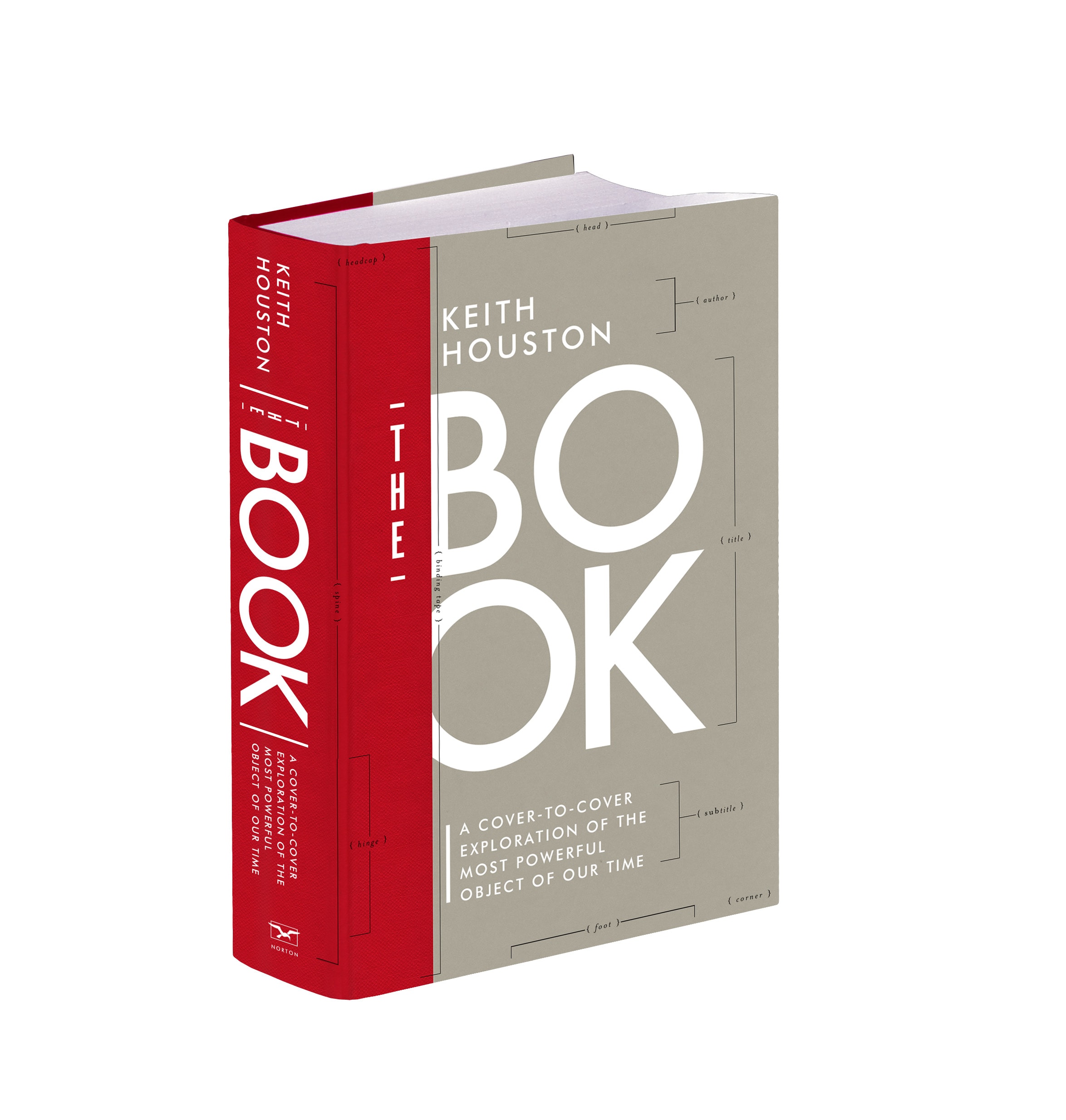
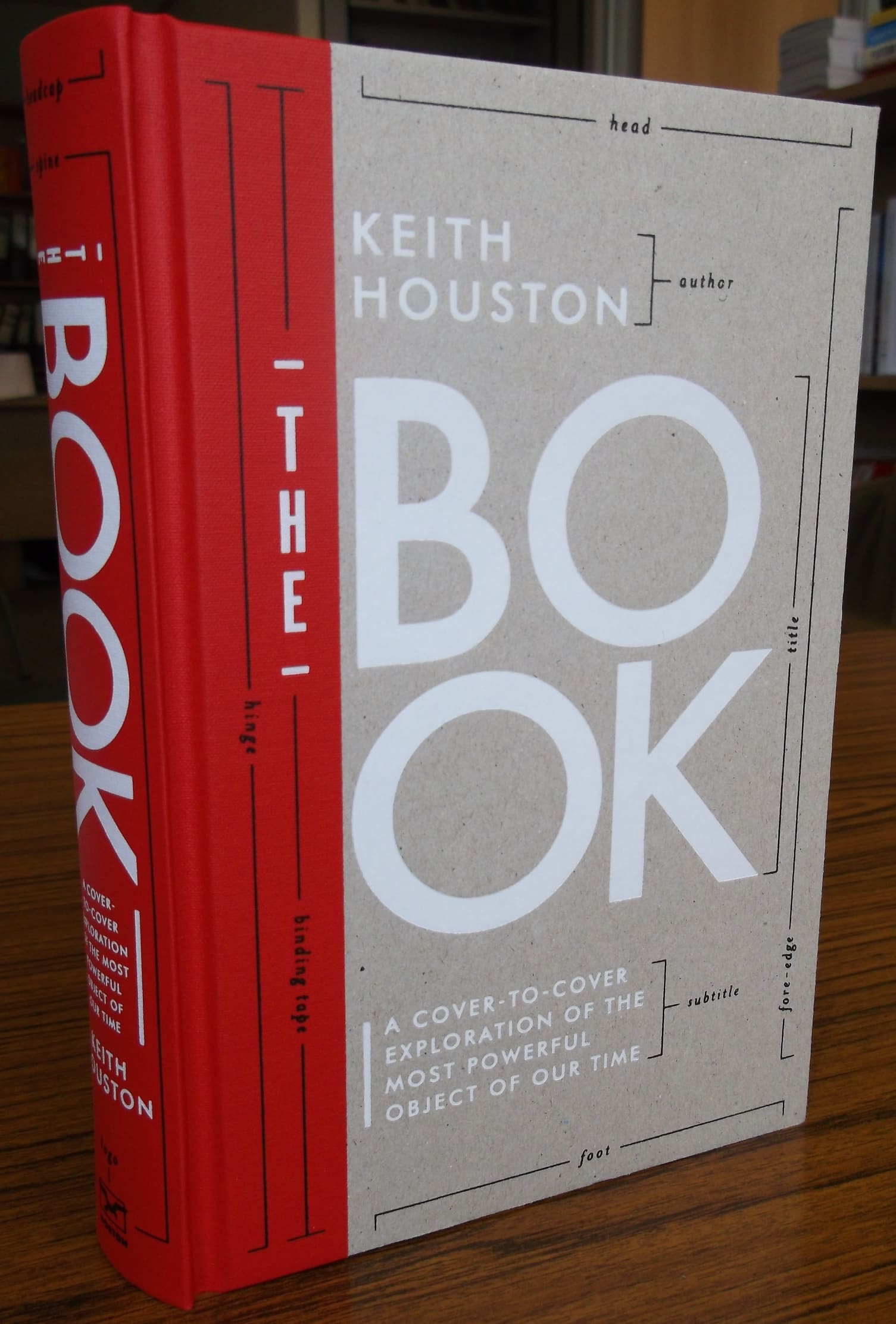
David High’s cover for The Book: A Cover-to-Cover Exploration of the Most Powerful Object of Our Time. (W. W. Norton, August 2016.)
First, David High’s cover.* The image above is a rendering rather than the real thing, but the finished article should be quite something. Unlike Shady Characters, there’s no jacket here: the boards and binding tape (handily identified by one of the many explanatory captions set in Zuzana Licko’s Mrs Eaves) are deliberately exposed to reveal how the book is put together. The title, subtitle, publisher’s mark and other accompanying text are stamped onto the cover, rather than printed, in a neat echo of traditional metal-on-leather techniques. That title, incidentally, is set in Paul Renner’s evergreen Futura, as it was on the American hardback edition of Shady Characters; bonus points go to anyone who can identify the typeface used for the vertically-aligned “THE” next to the word “BOOK”.
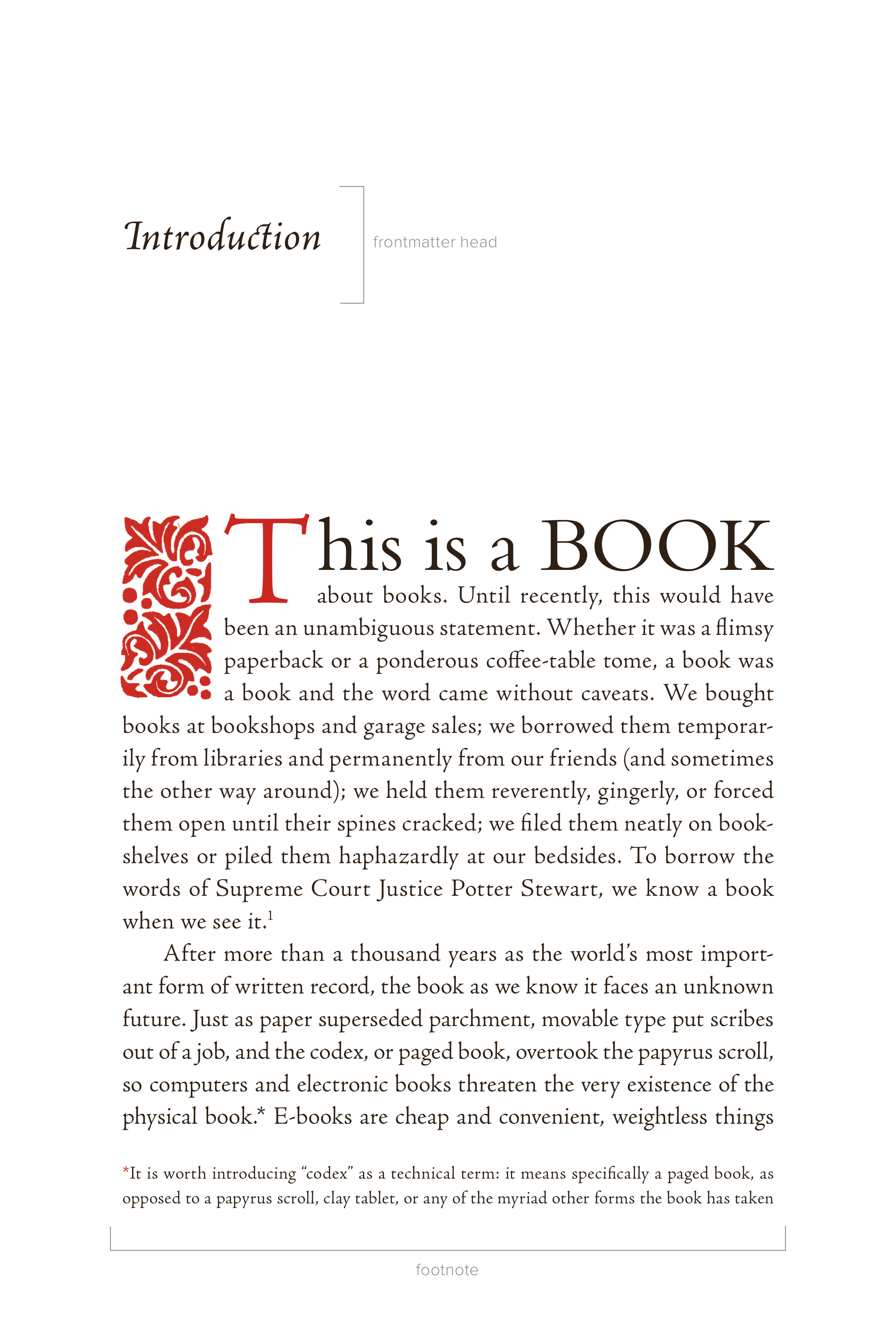
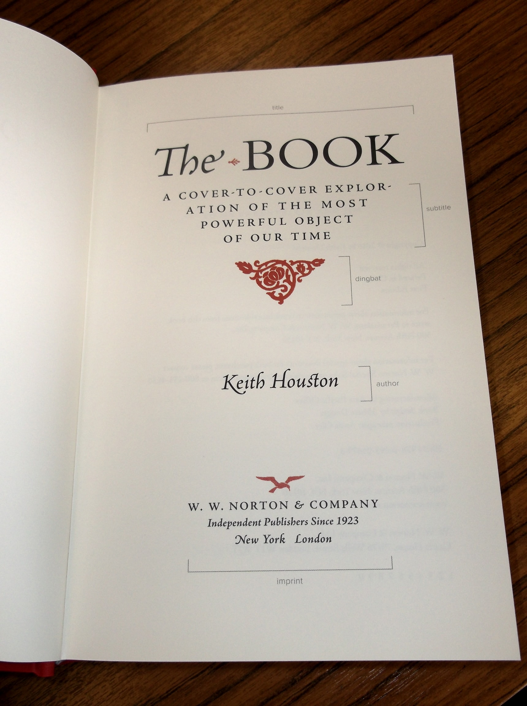
Judith Abbate’s design for the interior of The Book, as composited by Brad Walrod.
Next is Judith Abbate’s splendid interior design, as composited by Brad Walrod. The first page of the introduction gives you a feel for just how rich the text is: it’s set in Robert Slimbach’s Adobe Jenson Pro Light, a modern revival of the work of French printer Nicolas Jenson, and is printed in the same black-and-red colour scheme used for Shady Characters.
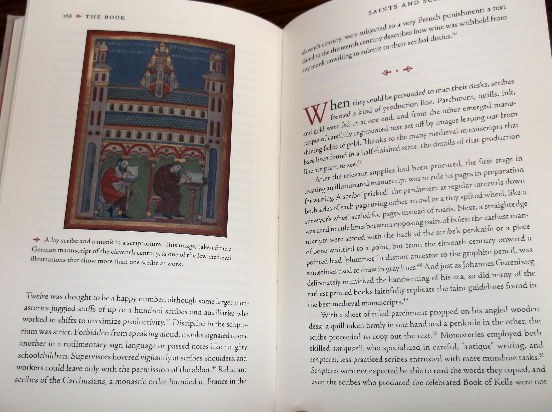
There is much more to it than that, of course: the seventy-odd images that accompany the text, of which I hope to show you more later, will be printed in full colour; the book will be sewn rather than glued, which should make it a more pleasurable read and a hell of a lot more relevant to its content; and it even comes complete with some cut-out-and-keep templates for teaching yourself the ins and outs of different folding schemes. That said, if you like what you see here, you can order The Book in the USA from W. W. Norton, Amazon.com, Indiebound or Powell’s. In the rest of the world, order from Amazon.co.uk, The Book Depository or Waterstones.
Update: in a happy coincidence, the first printed copies of The Book arrived today at the W. W. Norton’s London office — here are a few shots of the finished book!
Cover of The Book.Title page of The Book.Page spread from The Book.
*
David can usually be found at highdzn.com, but his site is currently unavailable. ↢
At the heart of Shady Characters’ recent redesign are the text and display typefaces of Satyr and Faunus, both designed by Sindre Bremnes of Norway’s Monokrom type studio. Shady Characters, of course, is all about unusual marks of punctuation, and I was glad to see that both typefaces came complete with a handy selection of special characters. Even so, there were a few marks missing: the interrobang for one; the numero symbol I use in many post titles for another. As I chatted to Frode Helland of Monokrom about the minutiae of web fonts, though, he suggested that he and Sindre might be able to add some new characters to help Shady Characters live up to its name.
Yes, Frode! A thousand times yes.
After years of writing about how difficult it is to promote lesser-known marks of punctuation without type designers’ backing, this was the first time I’d ever heard a type designer actively encourage the addition of new marks to their typefaces. A couple of weeks ago, then, Frode sent over revised versions of the font files with the following glorious new additions.
Roman and italic custom symbols from Monokrom’s Satyr typeface, as designed by Sindre Bremnes. The marks here have been rendered at 48 points in size and enlarged from there. From left to right, with roman above and italic below, the new marks are: numero, percontation mark, interrobang, barred “lb”, Tironian et, capitulum and ironiteken.
From left to right, the new marks are as follows:
numero sign (№)
The numero sign is a simple contraction of the Latin word numero to mean “number”. Needless to say, it is not a common mark except among typographic completists (your correspondent included) who like to set text as neatly as possible.
reversed question mark (⸮)
The reversed question mark was used for a short time during the late sixteenth and early seventeenth centuries as a rhetorical or ironic question mark, when it was called the “percontation mark”.
interrobang (‽)
We hardly need introduce the interrobang, do we‽ The interrobang is perhaps the quintessential modern shady character, invented in 1962 to punctuate surprised or rhetorical questions. It’s one of the few truly novel modern punctuation marks to have carved out a spot in Unicode, the standard computer character set, and I think Martin Speckter, the interrobang’s inventor, would have been over the moon to see a new version up in lights. (I know his wife Penny will be too.)
L B bar symbol (℔)
The baldly-named l b bar symbol is rather an oddball. It represents the familiar “lb” abbreviation for “pounds in weight”, derived from the Roman term libra pondo, but it comes accessorised with a bar to indicate that the two characters form an indivisible whole, in the style of medieval scribal practice. Isaac Newton was a fan, as were many of his contemporaries, but today the ‘℔’ is a rare sight indeed.
The so-called capitulum is the prototypical form of the better-known pilcrow, or ‘¶’. The tailless form of the mark shown here is derived from the very earliest pilcrows, where the letter ‘C’ for capitulum, or “little head”, was used to introduce the “head” of a new section or argument.
ironieteken ()
Last but not least is the ironieteken, another very new mark. Like the interrobang and the percontation mark, the ironieteken signals an ironic tone of voice; unlike them, it punctuates statements rather than questions. It was created back in 2007 by Bas Jacobs of Underware,* a Dutch type design studio, and I am excessively happy to have been involved, however incidentally, in promoting it. It is, I think, one of the most elegant of all new marks of punctuation, and one that deserves to have a much wider audience.
Some of these marks will already be visible in existing posts here at Shady Characters; others will appear in future.
I was eager to learn more about Sindre’s approach to adding new marks to an existing typeface and so, when we chatted over the phone a couple of weeks back, I asked him about Satyr, interrobangs, and everything in between.
Unexpectedly, Sindre started off by explaining that Satyr was inspired by ancient Viking boatbuilding. Along Norway’s western coast, wooden boats are still patterned after the forms and traditions of old Viking vessels, and the shape they take is very much dependent on their material: much like the Bézier curves from which digital typefaces are made, wood bends, but only so far. (Sindre told me, in fact, that his first exposure to Bézier curves came when he drew up blueprints of boats like this, long before he took up type design.)
Separately, Sindre is both a musician and a member of a musical family: he plays the viol (a fretted relative of the cello) and other similar instruments, while his father is a luthier who makes baroque and renaissance instruments such as lutes and viols — all of which are conspicuous for their curved and recurved forms. All this led Sindre to approach Satyr as a challenge: to design a typeface without a straight line in sight. If you zoom in to these letters or take a look at the image above, you’ll see that he has done just that without compromising the legibility of the resulting letterforms.
I asked Sindre how he went about adding the new marks to a typeface that is now some years old, and whether any of them offered particular problems. His answer surprised me, which just goes to show how little I know about type design: the reversed question mark, he said, was by far the hardest. Can’t you flip the normal question mark, I asked him? No, he said, and with good reason.
The thing is, Sindre explained, Satyr is designed according to a system: it has an overarching philosophy, if that’s the right word, in that it eschews straight lines in favour of curves, and Sindre’s realisation of that idea means that it favours certain curves and forms over others. Moreover, its serifs and strokes are laid out by an imaginary writer wielding a broad-nibbed pen: the pen is held at a particular angle so that each letter’s lines flow from thick to thin and back again in a predictable way. And finally, at the most fundamental level, each letter or mark has to conform to the familiar shapes hammered out over the centuries by a ghostly army of scribes gone by, the originators of our alphabet and its attendant symbols. Each of Satyr’s letters and marks of punctuation has to live within this system and to adhere to it as best it can.
The sticking point with the reversed question mark is that it is 180 degrees out of phase with those existing marks and letters. Like us, our scribal ancestors wrote, by and large, from left to right with pens held in their right hands. There is an underlying directionality to all our writing and text, whether we notice it or nor. Unfortunately, ‘⸮’ just does not fit in with ‘?’, or indeed with the general left-to-right bias of our alphabetic symbols. For this reason, Sindre said, he had to design Satyr’s ‘⸮’ from scratch in order to work out how it should conform to all these design constraints.
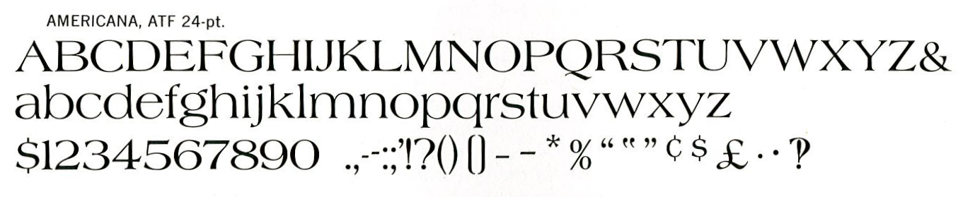
In second place, Sindre said, was the interrobang. When Martin Speckter proposed a new symbol back in 1962, he asked his art director, Jack Lipton, to draw up a variety of suggested forms for the “interrobang” (you can see them here), and a number of Speckter’s colleagues within the advertising world contributed their own ideas too. What we might call the “classical” form of the interrobang, however, is the one seen below at bottom right in Richard Isbell’s Americana typeface of 1966.
Specimen of Americana, by Richard Isbell, taken from American Typefaces of the Twentieth Century (1993), by Mac McGrew. An interrobang is visible at the bottom right. (Permission to reproduce image granted by Oak Knoll Press.)
The problem with Isbell’s interrobang is evident: it’s not easy to coerce a question and exclamation mark into sharing the same airspace without either clumsily overlaying them or forcing one to give way to the other.† Isbell took the second path, as can be seen in the slightly stunted vertical stroke of his interrobang, but Sindre went a third way, letting both marks coexist peacefully alongside one another while still sharing a single terminal dot, thus: ‘‽’. It reminds me of Christian Schwartz’s tripartite interrobang, as drawn for his Amplitude typeface, which, for my money, is one of the best interpretations so far. The interrobang may not have found its Platonic form just yet, but Christian and Sindre are showing it the way.
I must thank both Frode Helland and Sindre Bremnes for their help in getting Shady Characters up and running with its new typefaces, and doubly so for the trouble they went to in designing and integrating the new characters we’ve seen above. If you’re interested in these characters in particular, Frode tells me that they will be making their way into the standard version of Satyr in the near future; alternatively, if you like the look of any of Monokrom’s other typefaces, I cannot recommend them highly enough.
So now, over to you: Which is your favourite character here? What others would you like to see in the futures? As ever, you can leave a comment here or, if you’d prefer, you can drop me a line via the Contact page. Fire away!
*
Bas was of great help to me when researching the various irony and sarcasm marks that have been created over the years. I should thank him again for all his help! ↢

-Delaware-1_Jan_1776_OBV.jpg)