Readers! Have you ever wanted a better name for “marks of punctuation”? No, me neither. And yet that is exactly what drove James Brown (no, not that one) to produce the page shown here in his rambling, esoteric An English Syntithology: In Three Books, Developing the Constructive Principles of the English Language of 1845.1
Brown, as I found out after following a link from the niche but always interesting Coffee & Donatus (tagline: “Early grammars and related matters of art and design”), was a nineteenth century grammarian from Philadelphia with a passion for cataloguing and codifying the rules of English language. His “Syntithology” was an attempt to retrofit a logical structure onto the evolutionary messiness of English grammar, and he gave it an appropriately lofty-sounding title: the Greek syn- stood for “with” or “together”; tith- was derived from tithemi, “to put”; and -ology came from logos, a “doctrine” or “principle”. He summarised his book as “the principles on which the elements are formed into the compound” — how letters form words, words makes sentences, and sentences paragraphs.*
When it came to punctuation, though Brown was happy to call the hyphen, comma and company by their conventional names (I suspect it helped that most such marks had comfortingly classical designations) he could not quite bring himself to leave the subject alone. Punctuation as a whole, he declared, was to be recast as the practice of “gnom-o-nology”.
Gnomonology. For realsies, as the kids might say.
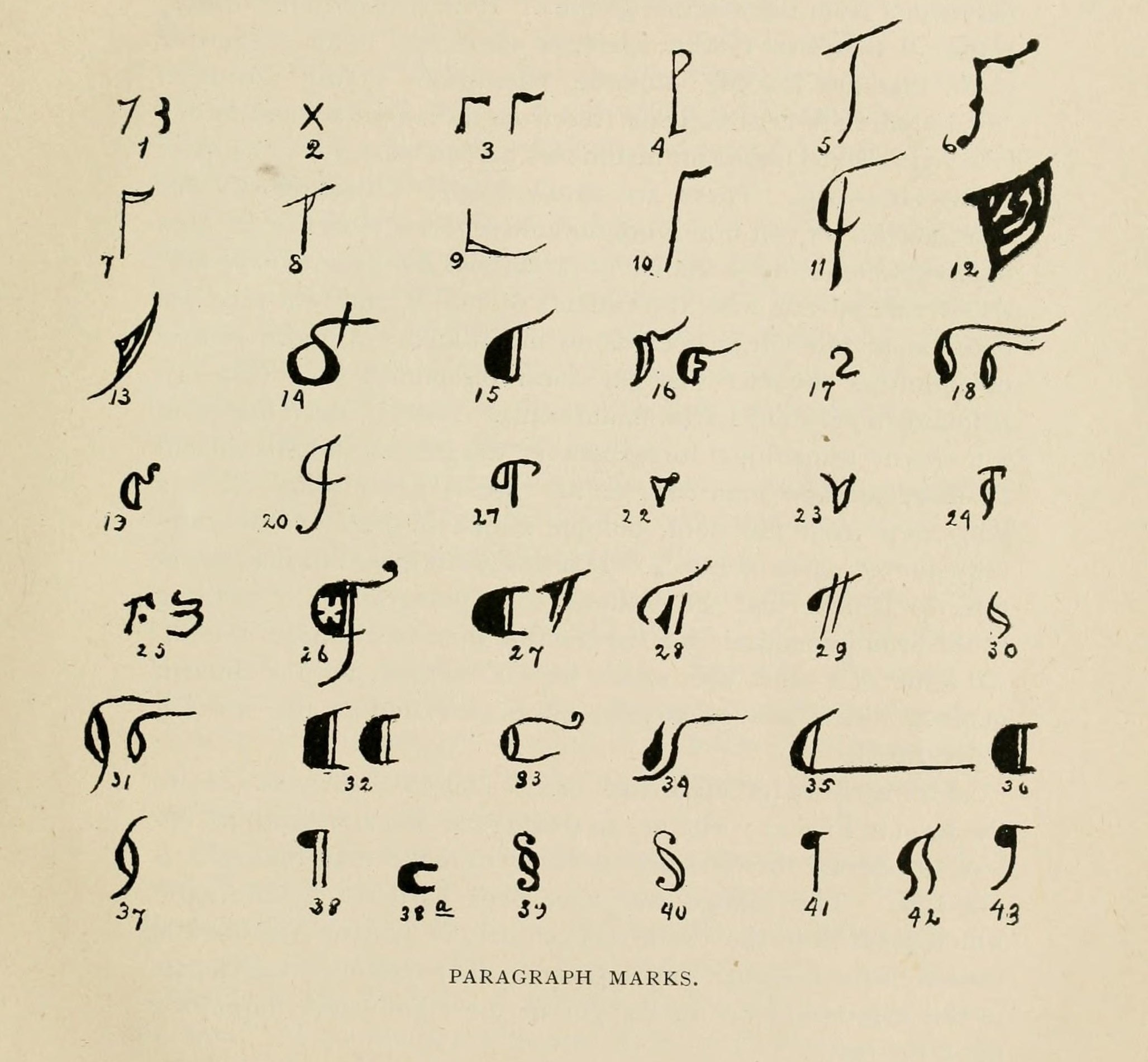
In his chapter on the subject, Brown explained that the Greek word gnomon (“one that knows or examines”) is used to refer the pin or rod of a sundial, the part whose shadow falls upon the dial to tell an observer what time of day it is. For Brown, marks of punctuation were knowing gnomons too — “index marks”, as he described them, that pointed out something of interest in the surrounding words just like a shadow on a dial, and his new terminology was loaded with coincidence.2 The word “punctuation” comes from the Latin punctus, or “point”, for the dots of ink with which early readers marked up their unpunctuated books, though it is not a stretch to imagine these “points” as pointers in a more literal sense. And the manicule, or pointing hand (☞), a mark whose purpose was to highlight interest passages in a text, is also called the index, as Brown showed in his chart.
This drastic re-branding did not take hold. The only other reference I’ve been able to find to Brown’s concept of “gnomonology” is in an 1862 book entitled An analytical, illustrative, and constructive grammar of the English language, written by an English teacher named Brantley York some fifteen years after Brown’s Syntithology, and which lacks Brown’s missionary zeal.3 Today we punctuate our writing rather than gnomonise it, and, in hindsight, I’m just a little bit sad about that.
In tenuously related news, a colleague forwarded me a link to an article penned by the BBC’s anonymous Vocabularist that looks at the names of punctuation marks through the ages. It’s a diverting little read. Gary Nunn’s recent Guardian article “If punctuation marks were people”, errs on the fictional side. As he writes with regard to the interrobang, for example,
- The interrobang is that inappropriate over-sharer we all know
- They ask you at work if you got laid at the weekend‽ Or if you’re hungover again today‽
Thank you to all the readers who send in links — if you have a punctuation-related story you’d like to see here, drop me a line!
- 1.
-
Brown, James. An English Syntithology in Three Books, Developing the Constructive Principles of the English Language, by Appropriate Polymorph Terms, Used in This Science Only, and Each Having But One Meaning. Philadelphia: H. Grubb, 1847.
- 2.
-
OED Online. “Gnomon”.
- 3.
-
York, Brantley. An Analytical, Illustrative, and Constructive Grammar of the English Language. Raleigh: Pomeroy, 1862.
- *
- Even if the latter practice is somewhat in decline. ↢