Another day, another edition of Shady Characters! The handsome book on the right is the Chinese complex characters (also called traditional characters) edition, courtesy of Taiwan’s Rye Field Publications. The cover design is by Chang Lien Hung, aka elf-19, and I can promise you that it is far better looking in real life than my terrible photo makes it out to be. It is available now for ¥360. I’d love to hear what Chinese-literate readers might think of it — if you lay your hands on a copy, please leave a comment below or drop me a line via the contact form!
In unrelated but still exciting news, Oxford University Press recently named “hashtag” as children’s word of the year. Twitter says that it does not allow users under the age of 13, but it turns out that children, in Britain at least, are using hashtags in everyday language as a kind of intensifier or keyword marker. As The Guardian’s Mark Brown explains, “A child might write: ‘This is a wonderful day, #sunny,’ for example, or: ‘I have the best family, #fantasticfamily’.” This is the hash mark as a sort of front-loaded exclamation mark, perhaps, or an alternative to cumbersome parentheses.
Apropos of this, I was lucky enough to be asked to film a short video about the octothorpe for CBBC’s Newsround, a news programme for 6–12 year-olds, so I fired up my webcam and talked into it for a couple of minutes with only a moderate amount of self-consciousness. You can see the full item here. I must thank Newsround’s Ricky Boleto for giving me the chance to take part — Newsround has been on the air since 1972, and it was a pleasure to be able to contribute to a programme that I remember well from my own childhood!
Just the one punctuation-related link this week: Shady Characters is upping sticks and moving to London this coming week, and blogging time is scarce!
So: to Canada, where the National Post recently reported on a PhD thesis that contains no conventional punctuation.1 Submitted to the University of British Columbia by architect Patrick Stewart, a member of the Nisga’a First Nation, each of the chapters of Stewart’s dissertation opens with a summary written in standard academic English but the bulk of the work is presented without uppercase letters, full stops or commas. Stewart holds a select few marks in reserve for more troublesome concepts — a forward slash “connects words of similar meaning / emphasis”; an ellipsis “indicates a continuity of thought”; and the question mark survives intact — but, on the whole, his thesis is, as he describes it, “one long, run-on sentence, from cover to cover”.
Here’s an example, taken from Stewart’s own explanation of his unconventional approach:
in my defense my style of writing is not laziness or lack of knowledge of proper usage of the english language it is a form of grammatical resistance as a deconstructionist in the manner of many writers especially american poet ee cummings he graduated with a master degree in english from harvard university and they called him experimental and innovative not words likely to be used to describe an indigenous writer who breaks all the rules of writing (the behavioural ethics board at the university of british columbia suggested that i hire an editor as it appeared that i did not know the english language) times though they are changing2
The most striking aspect of the text — at least at first glance — is its deliberately architectural layout. Indents and white space are liberally employed to shape the text, narrowing it where the reader’s focus is demanded, broadening it for a more expansive feel, and l e t t e r s p a c i n g words for emphasis. And though Stewart quotes Peter Cole, another indigenous writer, to the effect that “the idea of paragraph [sic] is meaningless”,3 for me the paragraph is very much in evidence in Stewart’s writing. If anything, I’d suggest that he has taken the idea of the paragraph and broadened it, augmenting the familiar single-level paragraph with super- and sub-paragraphs that depend on their level of indentation and placement on the page.
After I had read a few pages, however, I stopped noticing the shape of the text and started to appreciate how it was punctuated. This, I think, is where the National Post gets it wrong: there may be very few marks of punctuation in Dr Stewart’s thesis, but it is rich with punctuation in its most elemental form. Created by Aristophanes of Byzantium, librarian at Alexandria in the third century, the very first marks of punctuation — his ‘middle’ (‘·’), ‘under’ (‘.’) and ‘final’ (‘˙’) dots — marked pauses of increasing duration to help readers perform a text aloud, and Dr Stewart spaces out his clauses to varying degrees to exactly the same effect. As he explains: “writing this dissertation […] reinforced my culture by reinforcing my writing as spoken word part of an oral tradition that has existed since time immemorial”.
For my money, Dr Stewart’s approach has worked surprisingly well. As I read his thesis, I found myself mentally replaying his words, trying to decide how I would read them aloud and, in doing so, divining the logical structure of the text as I went. This is not lack of punctuation but rather an alternative means of punctuation and a thought-provoking one at that.
A tip of the hat to Mark Liberman at the ever-informative Language Log blog for sharing this story.
At the Royal Observatory of Edinburgh on the city’s Blackford Hill, in the depths of its oldest building, is a locked, climate-controlled room. That room is a library, and it houses the world’s most important collection of antiquarian books on astronomy.
I’ve been working up at the observatory* for the past few months and, recently, I was lucky enough to be given a guided tour of this priceless collection of scientific books. Here, then, are a few of the highlights of that tour — chosen by dint of the notability of their punctuation, of course — that take in medieval manuscripts through to Renaissance printed books. I hope you enjoy perusing them as much as I did!
This handwritten book, a Latin translation of an Arabic treatise on optics written around 1000, shows the pilcrow in two different roles. First, and most obvious, each note is introduced by a tall, snake-like pilcrow; second, in the text itself, paragraphs are separated by a two dots and a gallows-shaped pilcrow, like this: ‘•Γ•’.
What is perhaps most striking about this page is the material it is made from: look carefully and you will be able to discern a dimpling, or grain, in its surface, a sign that it is made from animal skin parchment. The skin has been scraped so thin that it is almost translucent — this is “vellum”, properly speaking, or fine calfskin parchment — and the writing on the reverse of the leaf is clearly visible. In some cases, in fact, oiled parchment was used for window panes, letting light in even as it kept out the draughts.
This late thirteenth-century manuscript, on the subject of what we would now call “mechanics”, is a great example of the scribe’s craft. Again, it is made of vellum; initial letters are picked out in contrasting red and black ink; the introductory paragraph in each section is enlarged to draw the eye; and the margins are littered with diagrams related to the text. Hidden among the text are a number of Tironian ets (⁊), early Roman “and”-signs shaped like barred, Germanic 7s.
Nicholas Copernicus [1473-1543]: De Revolutionibus Orbium Coelestium (1st. edition) (Nuremberg, 1543). ‘On the revolution of the heavenly bodies’. (Image courtesy of the Crawford Collection at the Royal Observatory of Edinburgh.)
This is a lovely, lovely printed book. A first edition copy of Nicholas Copernicus’s influential De Revolutionibus Orbium Coelestium, or “On the revolution of the heavenly bodies”, it is remarkably well-preserved for a four-hundred-and-seventy-year-old book. Running heads, chapter numbers,† chapter titles, justified text and line-end hyphens (looking like mathematical equals signs) are all present and correct, and the typeface is almost startlingly readable. And the ampersands! The page is liberally sprinkled with them, and they are fine specimens indeed.
This page, taken from Johannes Kepler’s 1619 Harmonice mundi, or ‘Harmony of the world’, shows the asterisk at work as a reference mark, linking the main text to a marginal note. Notes linked to the text by symbols like this first appeared as early as the twelfth century, though Kepler’s book is somewhat behind the times: the first footnote proper, where the note lay at the bottom of the page rather than in the margin, had appeared some fifty years earlier.
In this work, Kepler used ratios derived from the movements of the planets to construct musical scores (as shown here), and proposed his third law of planetary motion, which related the period of a planet’s orbit to its distance from the sun.
Many thanks to Rob Tweedie for arranging our visit to the Crawford Collection, and to Karen Moran for her engaging and informative tour. You can read more about the Crawford Collection and some of its most important books in this document hosted at the Royal Observatory’s web site.
Things are busy here at Shady Characters and I’m afraid there’s no time for a proper entry this weekend. What I can offer you instead is the brief history of the # and the @ that I put together recently for the Penguin Books blog — have a read, and feel free to drop by afterwards with any comments you might have!
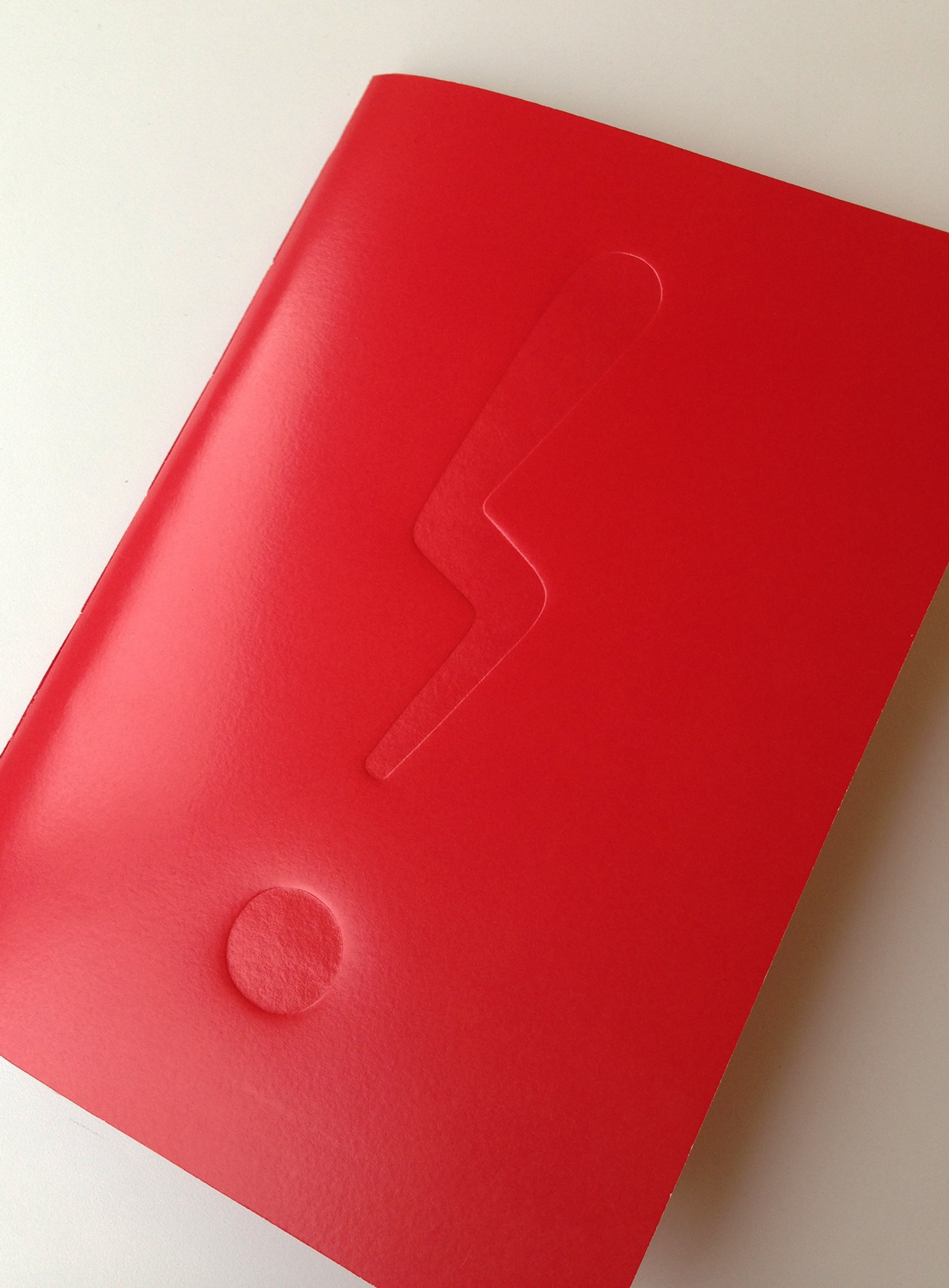
Kim Anderson’s Unpunctuated seeking, a book about irony’s search for a worthy typographic partner. (Image courtesy of Kim Anderson.)
You all know the handsome fellow that adorns the cover of this book, don’t you? This is the ironieteken, the brainchild of type designer Bas Jacobs, and it is used to terminate an ironic statement.1 Specifically, it is intended to punctuate verbal irony, where a speaker or writer says one thing but means another. It is, to my mind, the most visually convincing irony mark to date — but for the purposes of today’s short post, it is merely one of the many suitors who have tried and failed to win irony’s hand in marriage.
After posting last year about the quasiquote (still one of my favourite finds!), a New Zealand reader named Kim Anderson got in touch to tell me about a typographic design project she was about to embark upon. And though the subject of her project has since morphed from the quasiquote to the irony mark, it is my pleasure to share it with you now that it is finished. As Kim describes it:
For centuries a quiet but persistent debate has raged over whether irony should be punctuated. Many have put forward their suggestions for an irony mark (all with varying degrees of seriousness), but so far none have lasted the test of time.
Fascinated by this topic, I styled the search for an irony mark into irony’s search for a punctuation soulmate — its perfect match. While many obstacles stand in irony’s way to find true punctuated love, it perseveres right into the digital age.
Kim took to heart the idea that irony has been seeking a typographic partner since, oh, the time of the Great Fire of London, and produced a book chronicling its quest to find the right irony mark through posting in a lonely hearts column. The ironieteken you see above is the cover star of the resultant book, titled Unpunctuated seeking and written, designed, printed and bound by Kim herself. For all that I scroll through the images of it at Kim’s online portfolio, I’m still captivated by that bright red of that debossed ironieteken. The world at large may have disdained their union, but I think irony and the ironieteken are made for each other.
I must thank Kim for keeping me up to date with her project — it looks fantastic, and, as someone who has just finished crudely stitching together a home-made photo album as a wedding anniversary gift for my wife, I am entirely in awe of the skill evident in Kim’s production of the finished article. If you’re interested in Kim’s work, follow her on Twitter or see more of her portfolio at Behance.
Apologies for the truncated post; the manuscript for The Book has just arrived back from W. W. Norton and I am rather giddily leafing through Brendan Curry’s edits in preparation for responding to them. Trust me when I tell you that it will be a much better book for his attentions!
![Pilcrows in Alhazen [965-1040]: De aspectibus. (c. 1250)](http://shadycharacters.co.uk/wp/wp-content/uploads/2015/05/IMG_20150507_140715950-e1431290839830.jpg)
![Jordanus Nemorarius [1225-1260]: De ratione ponderum. (c. 1290). (Image courtesy of the Crawford Collection at the Royal Observatory of Edinburgh.)](http://shadycharacters.co.uk/wp/wp-content/uploads/2015/05/IMG_20150507_140151484-e1431291557658.jpg)
![Nicholas Copernicus [1473-1543]: De Revolutionibus Orbium Coelestium (1st. edition) (Nuremberg, 1543). ‘On the revolution of the heavenly bodies’.](http://shadycharacters.co.uk/wp/wp-content/uploads/2015/05/IMG_20150507_140459173-e1431347034707.jpg)
![Footnotes in Johannes Kepler [1571-1630]: Harmonice mundi. (Linz, 1619) ‘Harmony of the world’](http://shadycharacters.co.uk/wp/wp-content/uploads/2015/05/IMG_20150507_140636705_HDR-e1431289422718.jpg)