I wrote an article for the Huffington Post
, and yes, I gave it a clickbait headline. Enjoy!
I wrote an article for the Huffington Post
, and yes, I gave it a clickbait headline. Enjoy!

It barely seems a year since the Shady Characters hardback was launched. That’s because it was only a year ago, and yet here we are: the paperback is published today in the USA!
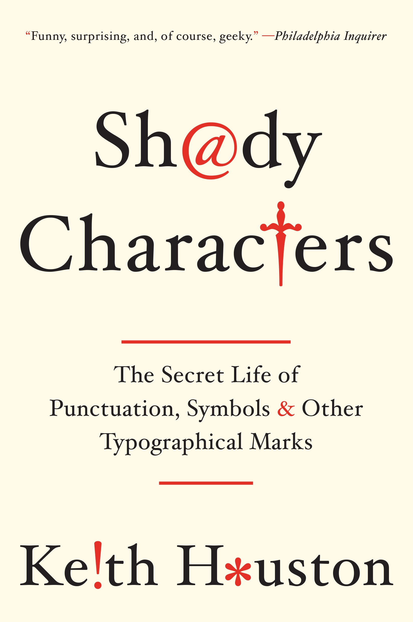
Jarrod Taylor designed the excellent new cover; Mark Forsyth, Eric Johnson, Zoran Minderovic, Tim Nau, Jeff Norman, Bill Pollack, Patrick Reagh, Jeff Shay, and Liz B. Veronis all helped weed out the errata that slipped through the net in the hardback edition. Thank you all!
So, if you’re in the market for a Shady Characters paperback, you can order yours now from Amazon.com, Barnes & Noble, Indiebound or Powell’s. (Dare I say that it would make the perfect Christmas gift for your favourite punctuation, typography, or history buff?) If e-books are more your thing, you can get Shady Characters for your Nook at Barnes & Noble; for your iPhone or iPad at iTunes; for your Kindle at Amazon (USA) or Amazon (UK); and in ePub format at Waterstones (UK).
Or rather, two winners. Congratulations to commenter Lyla and Twitter user @donserifa! Theirs names were picked at random from the set of all commenters on the original competition post, plus all those who replied to, retweeted, or marked as favourite the tweet announcing the contest.* Their copies of the paperback edition of Shady Characters will be on their way very soon.
There were 212 entries this time round — thank you for all the fantastic tweets and comments! Commiserations to those of you who did not win, but rest assured there will be another competition on the way in the new year!
Here’s your chance to win a copy of the new, all-singing, all-dancing paperback edition of Shady Characters. I have two copies to give away, and I’ll happily post them to the two winners wherever they are in the world. To enter the competition, just do one of the following:
I’ll make a list of all unique commenters and tweeters in two weeks’ time and pick two names at random as the winners. The contest will close at noon GMT on Sunday 19th October 2014, so make sure you enter before then. Good luck!
Update: the competition is now closed. Thanks to all who entered!
I had an enjoyable chat last night with Katy Steinmetz of Time.com about this yearly festival of punctuation (you can read her article on the subject here), but of arguably even greater importance is that the Shady Characters book is exactly one year old today! Happy birthday to it! (Or to me. How does that work, exactly?) Also, what better day than today, then, to reveal the cover of the forthcoming paperback edition?
The paperback will be published on October 20th — just in time for Christmas, I might add — and you can pre-order your copy in the US from Amazon.com, Barnes & Noble, Indiebound or Powell’s. And of course, Shady Characters is still available in electronic form from the Apple iBookstore.
Happy National Punctuation Day!