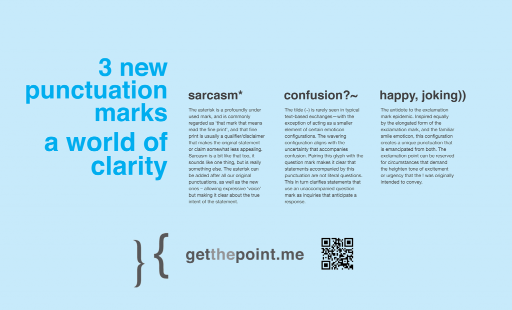
Hot on the heels of the Sartalics’ resurrection, and barely a decade on from the Great Sarcasm Mark Bonanza of the Noughties (I’m hoping that this sobriquet catches on), another new sarcasm mark has swum into view. It has brought friends.

I received this tweet a few weeks ago. To cut a short story shorter, it pointed the way to a website titled “get the point” proposing a set of three new punctuation marks, a sarcasm mark among them. As the site explains:
Communicating with clarity is the challenge imposed with text-based forms of dialogs, and this becomes more and more important as a greater number of our personal and professional exchanges are transacted via text-based methods of delivery.
Adding a few new punctuation marks to our written communications could help correct this situation. That’s what this is all about. [emphasis in original text]
Unlike previous efforts that might have been purely hypothetical, needed special downloads and installations, wanted to you to PAY, or required you to remember special key sequences — we can use marks that are right there, right in front of us, right now. They are clearly visible on any standard North American keyboard, and a quick tap away on tablet and mobile devices.
A laudable set of goals. What’s more, the site backs this all up with cold, hard data gathered from high school students in Winnipeg, Manitoba, that shows that happiness, humour, excitement and sarcasm were regularly misinterpreted in written communication. (You can contribute your own experiences if you’d like to add to the dataset.) To combat this lack of clarity, “get the point” proposes three new marks: an asterisk (*) for sarcasm, a question-mark-plus-tilde (?~) for confusion, and a double closing parenthesis (‘))’) for a happy or joking tone.
I can see the reasoning behind each of these: an asterisk as a footnote marker has always suggested a second or hidden meaning; the tilde is a mathematical symbol denoting an approximation; and the double parenthesis is inspired by the plain old smiley face. More intriguing is the suggestion that these marks can be combined to yield new, composite meanings, as the site demonstrates:
Well, that will be great.* (droll, deadpan)
That’s just what I need!* (agitated)
You must be so excited))* (shared joke)
Could he be more helpful?* (sarcasm rolled into a rhetorical question)
I have no idea?~* (feigned confusion)
Hmm. I was on board until the third example. To me, the individual marks work better than the combined versions: the asterisk in particular I like; the tilde is reasonably defensible; and the smiley/double parenthesis is easily interpreted even if it feels a little redundant in the face of actual smileys.
I’ve tried to get in touch with the author of this new adventure in punctuation but they seem to be keeping a low profile. If you’re the person responsible for the site, please let me know via the contact form! Better yet, leave a comment below so that Shady Characters’ astute readership can weigh in on your creations. I for one would love to learn more about the project and its goals.
All this talk of sarcasm marks reminded me of a comment left by one Catherine Barber regarding the use of ‘(!)’ as a sarcasm mark in televisual subtitles. I’d read about this before, and some digging revealed that it is perhaps the closest thing to an officially-sanctioned sarcasm mark that currently exists. This document, from the UK broadcasting standards watchdog Ofcom, says that ‘(!)’ should be used for sarcasm and ‘(?)’ for irony. As the “Guidance on Standards for Subtitling” explains,
Where tone of voice is particularly critical to meaning, and facial expression and body language are inadequate to convey the tone, the use of ‘(!)’ and ‘(?)’ immediately following speech can indicate sarcasm and irony as shown below:
No, no. You’re not late (!)
The more I think about it, the more I think I must have seen these constructions in use in Wallander, The Bridge, or another of BBC4’s imported (and subtitled) dramas. There’s a certain seductive simplicity about them, and the fact that I didn’t notice their use at the time makes me wonder if they aren’t the answer to our collective yearning for sarcasm and irony marks.
What do you think? Have you seen these marks in use? Do they fit the bill?

