Hand & Eye Letterpress occupies one of the arches under a Victorian railway viaduct in Pinchin Street, London, just a few blocks east of the gleaming City of London. A cobbled road runs between the viaduct and the brick-built council flats opposite. With the London skyline hidden by trees and buildings, you could just as easily be in Newcastle or Nottingham, but despite its unremarkable surroundings, Hand & Eye is that rarest of things: a working, commercial letterpress printing shop. I arrived on a mild October day last year to find Nick Gill, H&E’s resident Monotype operator, sitting outside with a cup of tea. He pointed me inside to find proprietor Phil Abel, with whom I had an appointment. I was there to learn about the press’s most unusual — and, by some measures, most important — device.
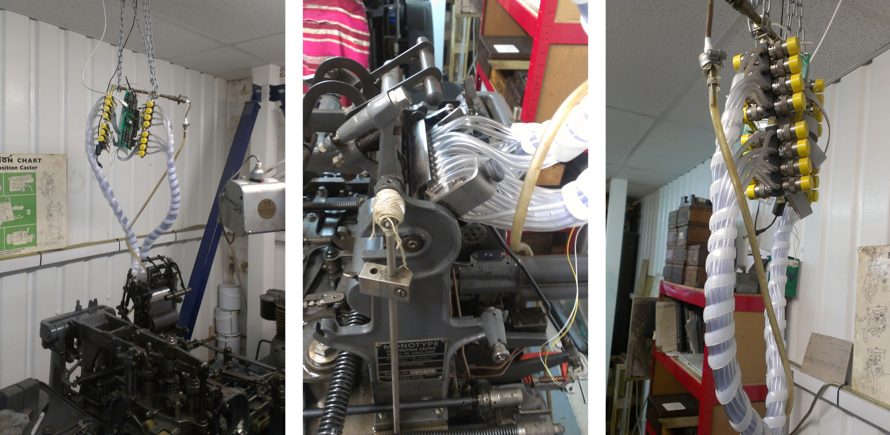
Handing me a mug of tea (in a Pantone mug, naturally. I’m afraid the colour code eludes me), Phil led the way between cases of metal and wood type, bales of paper, and presses of various vintage and type. Right at the back of the shop, looking for all the world like a prop from Doctor Who, was the object of my visit: the press’s computer-driven Monotype caster. Above the familiar ironwork of the caster, an assemblage of transparent air tubes, electronically-driven valves and an exposed circuit board hung from a chain disappearing into the suspended ceiling. Accompanied by the occasional rumble of a DLR train passing on the more modern viaduct just behind the premises, Phil talked me through the system and how it worked.
First, though, a quick recap of what a standard Monotype system is and what it does. These bipartite cast-iron contraptions were first designed and manufactured in the late nineteenth century; somewhat incredibly, now, as then, they represent the state of the art in hot metal typesetting.1 Driven by compressed air and electricity (and, in some cases, noxious coal gas2), Monotypes and machines like them automated the tedious process of type composition* — that is, the laborious, character-by-character arrangement of words, spaces, sentences and paragraphs to form a printed page.3 Monotype divided the composer’s work into two parts: text entry via a clacking, air-driven keyboard that spat out punched paper tape, and casting of that text with a separate, floor-standing caster unit that converted the letters, characters and spaces encoded upon the punched tape into gleaming lead type.
As Phil explained, there are a number of problems with this approach. Monotype casters are complex, finicky devices, and keyboards barely less so. And though it’s possible to correct keying mistakes by patching the paper tape emitted by the keyboard, it is time-consuming and — that word again — finicky to do so. When Hand & Eye had the opportunity to buy a Monotype caster, then, Phil opted to forgo a traditional Monotype keyboard in favour of a computer-driven system that could control the caster directly. Shackled to a mechanical keyboard, a Monotype caster is a decidedly obsolescent beast, but hooked up to a computer it becomes a speedy, flexible, hot metal typesetting device — and one without any real rivals.
Though there are a number of computer-based solutions available,† Phil chose the system offered by one Bill Welliver, a dyed-in-the-wool Monotype enthusiast (a Monomaniac, perhaps?) from Pennsylvania. (I later interviewed Bill in person, and it was a fascinating conversation; for now, though, suffice it to say that Bill told me he earns no money from his Monotype installations — everything he does is charged at cost price — and he keeps up his invaluable hobby purely for enjoyment’s sake. Bill’s enthusiasm, and that of others like him, is key to maintaining the relevance of Monotype casters.)
Using Bill’s system, as Phil demonstrated, text is marked up using HTML-style tags to select <b>bold type</b>, <i>italic type</i>, <sc>small caps</sc>, and so on. Other, more esoteric features are available: the pump that supplies molten type metal can be turned off or on at will, justification settings can be adjusted on the fly, and more: all of the tricks or workarounds developed over the decades by Monotype keyboardists (and some new ones besides) are available at the press of a key.5 Once a document has been marked up, it is possible to generate a PDF preview of it: Bill has not only worked out how to drive a caster from a computer, he has built a complete software simulation of the caster itself. This is no mean feat.
When the document is ready, it is sent to the caster via the cybernetic cluster of electronics, valves, and tubes wired up to the caster’s tape reader. Casters are themselves remarkably computer-like in operation: where a CPU processes instructions with each tick of an internal clock (albeit one that ticks billions of times per second), so a Monotype caster is driven by the revolutions of a central shaft, with 2-3 revolutions required to select, cast and eject a single character. The computer control system monitors the speed of this shaft via a magnetic sensor and uses this to moderate its blasts of air, simulating the advance of a paper tape through the reader with each revolution of the drive shaft.
Conceptually, it’s a simple system. In practice, Bill told me later, it has been anything but simple to make it work. Nick, the Monotype’s keeper at Hand & Eye, confirmed that the system is occasionally temperamental, though he makes the point that casters themselves are temperamental at the best of times.‡ Nevertheless, this ungainly hybrid device is integral to Hand & Eye’s operations: without Bill Welliver’s computer interface, Phil told me, there would be no business case for running the caster. Nick, who I interviewed as he melted spent type over a gas burner and poured it into ingot moulds for reuse, was more forthright: “Without it, we couldn’t stay in business.”
Many thanks to Phil Abel and Nick Gill at Hand & Eye Letterpress for answering my questions and for humouring me in my ignorance of Monotype casters and keyboards. Also, I must thank Bill Welliver for meeting me at the British Library for a chat. If I ever manage to wrestle my schedule back into order, I may even get round to writing up that chat here!
- 1.
-
Barlow, Geoff, and Simon Eccles. “Single-Character Composition – Monotype”. In Typesetting and Composition, 38-40. Blueprint, 1992.
- 2.
-
“Annual Report. 22 (1914 - 1915)”. State of Illinois, n.d.
- 3.
-
Speckter, Martin K. “The Neglected Tool”. In Disquisition on the Composing Stick, 1-24. New York: Typophiles, 1971.
- 4.
-
McIntosh, Harry. “Personal Interview”. Keith Houston, April 11, 2012.
- 5.
-
Welliver, H. William. “Monotype Computer Interface”. electronic.alchemy.