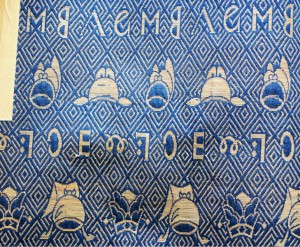
A few weeks back, reader Paul Tanimura left a comment asking for help in identifying the symbols shown in this image. It’s a piece of embroidered brocade fabric that has been used to wrap a document describing a Japanese family tree, and though it bears (to my eyes at least) some distinctly manga-esque animal figures the family claims that it hasn’t been touched since the last entry was made in 1782. Paul writes:
This is […] an inquiry to solicit the wisdom of [Shady Characters] readers for deciphering the ‘shady characters’ woven into a golden brocade, believed to be produced in the 17th century China by a Christian missionary and subsequently exported to Japan before Christianity was forbidden. […] There are two character strings, each composed of four characters, possibly in reference to Jesus and Mary.
There’s much more detail at Paul’s website, including his own speculations on the two rows of text:
The top row starts with the letter M and followed by a mirror-image B. The third letter looks like Greek lambda or A without the horizontal bar. The fourth letter appears to be an ampersand made of a lower-case e and t, current letter &. If the third letter is A, the letters A and M combined could mean Auspice Maria, a familiar combination in the Catholic Church for the Virgin Mary. The mirror-image B may be another ampersand with upper-case E and T. Then the first line could be deciphered as M ET A et [and so on], perhaps meaning ‘as well as Virgin Mary’.
The second line looks very strange, but the first letter which looks like a spring might be a deformed ω(omega) scribed by somebody unfamiliar with Greek script. Then the third letter which looks like a mirror-image C could be α(alpha), implying a reference to the Book of Revelation. The second letter is enigmatic but appears to be a letter I with a banner with two dots, maybe symbolic of the sun and the moon. The fourth letter looks a straight forward E. Then the middle line could be deciphered as Iα(alpha) Eω(omega) [and so on]. IE are the first two letters of the Latin spelling IESUS for Jesus. Thus the whole line could mean the Holy Name of Jesus.
It isn’t punctuation-related, I grant you, but it is an interesting problem. The letter-like characters are unfamiliar to me, but have any Shady Characters readers come across anything like this before? Leave your thoughts and insights in the comments below!
What is The Book about? A few months ago, as we wrestled with the proposal for the new book, Laurie Abkemeier sent me this quotation from the New York Times, and it sums up precisely what I want to address:
When I read a physical book, I remember the text and the book—its shape, jacket, heft and typography. When I read an e-book, I remember the text alone. The bookness of the book simply disappears, or rather it never really existed.
Books, for the most part, become famous — or infamous — for their content. Whether banned and burned or feted and cherished, we remember those books that speak most eloquently or most vehemently to us, that stir up our emotions or impart new knowledge.
But what about the fabric of the book itself? The paper, ink, thread, glue, and board from which the average book is made tell just as rich a story as the words on its pages. Ancient Egyptian papyrus, famed as a material for both bookrolls and boat-building (the Nile’s crocodiles did not like the taste), gave way to parchment sheets that early Christians bound into compact, concealable books, all the better to hide them from prying Roman eyes. William Blake’s unique copperplate etching method, revealed to him in a vision of his dead brother, was just one more step in the journey from illuminated manuscripts to the peerless engravings in John James Audubon’s Birds of America.
From papyrus scrolls to dime novels, and on the eve of what many have proclaimed as the end of the printed book as we know it, The Book will explore the long and surprising history of this most important of information technologies.
To complement The Book, I’ve also been working on a new website. Rest assured that ShadyCharacters.co.uk will be carrying on as usual; KeithHouston.co.uk, the new site, will be to The Book as ShadyCharacters.co.uk is to Shady Characters, and I hope that readers of both sites will feel equally at home in either.
Please don’t hesitate to get in touch if you have any questions!
Publication and its attendant excitements have taken up much of the past month, and I have a stack of punctuation-related matters to catch up with. Without further ado, let’s get on with the show!
Readers of Shady Characters (whether in book or blog form) will recall that the octothorpe (#) came by its rather esoteric name courtesy of the creation, in the 1950s, of the push-button telephone keypad. The engineers of Bell Labs had designed a 4 x 4 grid of buttons where each row and column was assigned a unique audible frequency; when pressed, a button produced a tone composed of the frequencies corresponding to its location on the grid. Early production handsets had only ten buttons — the digits 0–9, arranged in the familiar inverse-calculator layout — while later versions added ‘*’ and ‘#’ buttons to yield a neat 3 x 4 grid. (Military and other speciality handsets used all four columns.) The story, as told by two separate Bell Labs employees, goes that there was no unambiguous name for the ‘#’ and so, for the purposes of training and documentation, it was necessary to invent one: “octothorpe” was the result, and its place on the soon-to-be ubiquitous telephone keypad assured its survival into the future.
Upon watching a recent video on the subject, however, I found myself drawn back to the design of the keypad itself. As I discovered when first researching this topic, its grid-like arrangement was no accident. Early investigations found that call routing equipment was easily confused by human voices, and so composite tones of two or more frequencies were required. Pairs were found to be sufficient, though they worked best when each pair comprised frequencies chosen from mutually exclusive high- and low frequency groups. In the resulting grid layout, rows got the low tones and columns the highs.1
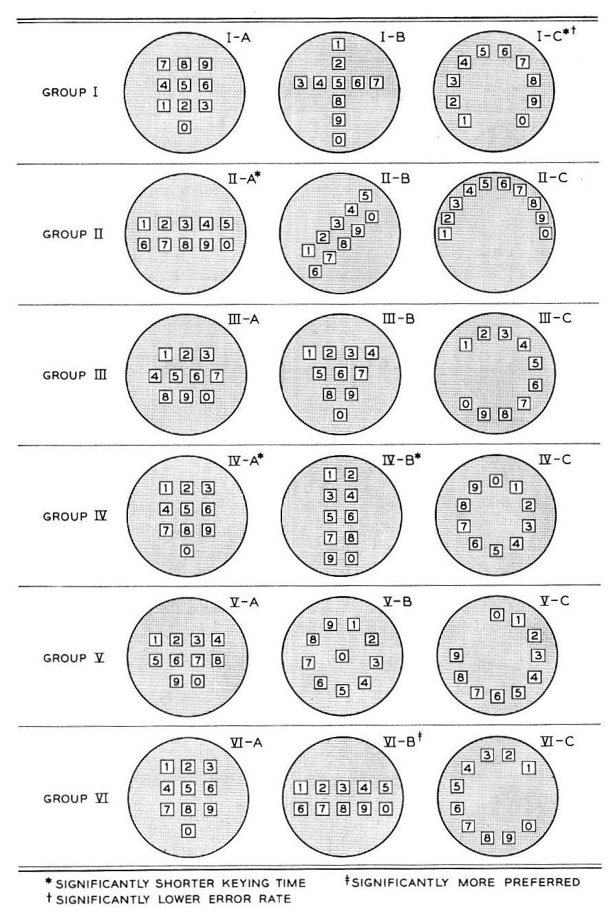
With that in mind, then, take a look at this rogues’ gallery:
Proposed telephone keypad layouts, as described by R. L. Deininger in Human Factors Engineering Studies of the Design and Use of Pushbutton Telephone Sets.
These are the seventeen candidate keypads that Bell considered in the years leading up to the unveiling of their new Touch-Tone handsets. Taken from a 1960 paper named Human Factors Engineering Studies of the Design and Use of Pushbutton Telephone Sets, written by one R. L. Deininger, these layouts were tested for speed, accuracy and preference by test cohorts composed of randomly selected Bell Labs employees.2
Five layouts were chosen as being especially promising in terms of speed, accuracy, and preference among the test cohorts: IV-A (“three-by-three plus one”); II-A (two horizontal rows); IV-B (two vertical columns); VI-C (“telephone”), and I-C (“speedometer”). Of these, the grid-like “three-by-three plus one” layout was selected for further study by dint of possessing “certain engineering advantages”; though Deininger does not spell it out, those advantages must surely have boiled down to simplicity with which its buttons could be made to actuate the oscillators that generated their characteristic tones.
What I find intriguing about all this is that the ‘*’ and ‘#’, the auxiliary keys that we now take for granted on our telephone keypads, are utterly absent from this otherwise comprehensive experiment. Where would they have ended up if, say, the “speedometer” or “telephone” layout had been selected? Would the number keys now be found orbiting the “little star” of the asterisk, held in place by the gravity of the pound sign? Or would they have been relegated to the bottom of the telephone like an especially terse, cryptic footnote?
For more on this story, head over to the Numberphile YouTube channel for their illuminating video on Bell Labs’ work on telephone keypad layouts. As a bonus, listen out for a particularly entertaining anecdote about how the head of their Human Factors department settled on the minimum acceptable length of telephone cords. It’s well worth watching!
In other (and slightly belated) news, last month Peter Robinson wrote an opinion piece for The Guardian on the interrobang, describing it as “the ultimate symbol to express excitement and outrage in our shockaholic era.” I’m reminded of Remington Rand’s description of the mark as they prepared to make it available on their typewriters back in 1968:
[…] Interrobang is already receiving favorable comments from typographers who are said to commend it for its ability to express the incredibility of modern life.3
If the “incredibility” of our “shockaholic” era continues to increase apace, soon there will be no punctuation capable of expressing it. Joking aside (or not), Robinson does come up with the best use of the interrobang since the WSJ’s “Who forgot to put gas in the car‽”,4 writing: “Elsewhere, ‘I Can’t Believe It’s Not Butter!’ could rebrand as, simply, ‘Butter‽’ ”
In a happy coincidence, Conrad Altmann, a long-time friend of this blog, has posted a stylish new interrobang T-shirt for your consideration on Cotton Bureau. If you’d like to help Conrad see his shirt printed, head over there to reserve one for yourself.
Thanks for reading!
1.
Schenker, L. “Pushbutton Calling With a Two-Group Voice Frequency Code”. The Bell System Technical Journal, January 1960, 235-255.
As I mentioned recently, I handed out copies of the Shady Characters quiz at the book launch party here in Edinburgh. I promised the attendees that one winner would receive a copy of the US edition of the book, and I’ve finally got round to tallying up the scores. Tom Pilcher and Chris Mackinnon both scored top marks, but random.org, my go-to source for numerical chaos, has selected Tom as the winner. Congratulations to Tom, commiserations to Chris, and thanks again to all who came to the launch and took part in the competition!
has been on sale for over a week, and now that the furore has died down a little I thought I’d collect links to all the articles I wrote in support of the book. Some of these have already been featured here; others were posted on Twitter, Facebook and so on, and a few more are new. Without further ado, then, and in no particular order, here you are:
And finally, I was interviewed for both The Atlantic Wire and the local newspaper for my home town, the East Fife Mail. I wonder, can anyone else say that?