…that there’s still time to enter the competition to win one of two copies of the UK edition of Shady Characters. Go here to enter, and good luck!
Update: the competition is now closed. Thanks to all who entered!
…that there’s still time to enter the competition to win one of two copies of the UK edition of Shady Characters. Go here to enter, and good luck!
Update: the competition is now closed. Thanks to all who entered!
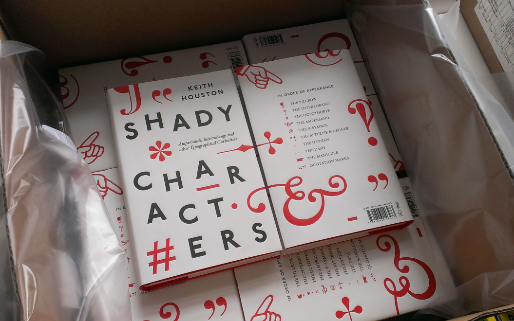
If you missed the chance to enter Goodreads’ giveaway of the American edition of Shady Characters, now’s your chance to win a copy of the UK edition, complete with Matthew Young’s clever wrap-around jacket. I have two copies to give away, and I’ll happily post them to the two winners wherever they are in the world. To enter the competition, just do one of the following:
I’ll make a list of all unique commenters and tweeters in two weeks’ time and pick two names at random as the winners. The contest will close at noon GMT on Sunday 29th September 2013, so make sure you enter before then. Good luck!
Update: the competition is now closed. Thanks to all who entered!
This is a very quick note to say that I’ve added some new details to the Contact page. Also, I learned today that the contact form on that page has been misbehaving; certain messages were lost before they reached my inbox. If you’ve tried to send me a message but did not receive a reply, please accept my apologies! From now on, all messages should reach me in short order — and if not, please drop me a line on Facebook, Twitter or Google+.
I wrote a guest post for The New Yorker’s Page-Turner blog. Read it here!

I must apologise for the radio silence this past weekend; my wife and I were visiting Düsseldorf in Germany for a few days of archaeological sightseeing, museum going, and tasting of regional beers. One thing caught my eye as soon as we arrived, as you can see above: the city’s new logo, designed by advertising agency BBDO, could be seen from the airport to the Altstadt. The Local reports that BBDO head Frank Loetze said: “We wanted an over-arching symbol which exudes the feeling of living in the city — the grinning D is concise and appealing. And we decided on red and white as they are the colours of the city.”1
Though it isn’t explicitly mentioned, I feel certain that BBDO must have been inspired by the umlaut over Düsseldorf’s ‘u’. Certainly, at a time when some German businesses are abandoning their umlauts for the sake of clarity in international business dealings,2 Düsseldorf’s new logo positively celebrates it, and the sans-serif Ü in :DÜSSELDORF is as cheery as the :D with which it starts.
In other news, I somehow managed to miss Tom Humberstone’s punctuation support group comic strip in the New Statesman when it was first published back in July. Very remiss of me, but here it is nevertheless. Better late than never!
Nick Sherman is on the hunt for a monospaced typeface that contains a manicule, or “monocule”, as he has it. Can you help?
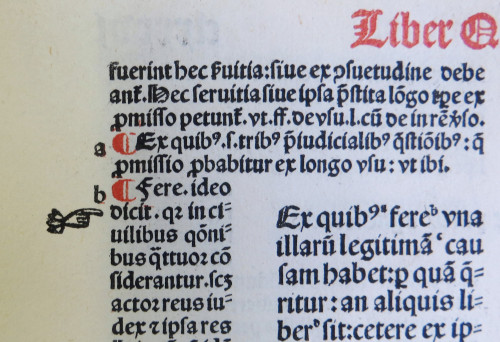
Also on the subject of the manicule (and arriving late to the party yet again) I recently came across an excellent post on the subject of the manicule from Cardiff University Library’s Special Collections and Archives. In it Ken Gibb presents a bevy of manicules to ogle, including the lovely printed example shown here. Take a look!
That’s all for this week. Thanks for reading!