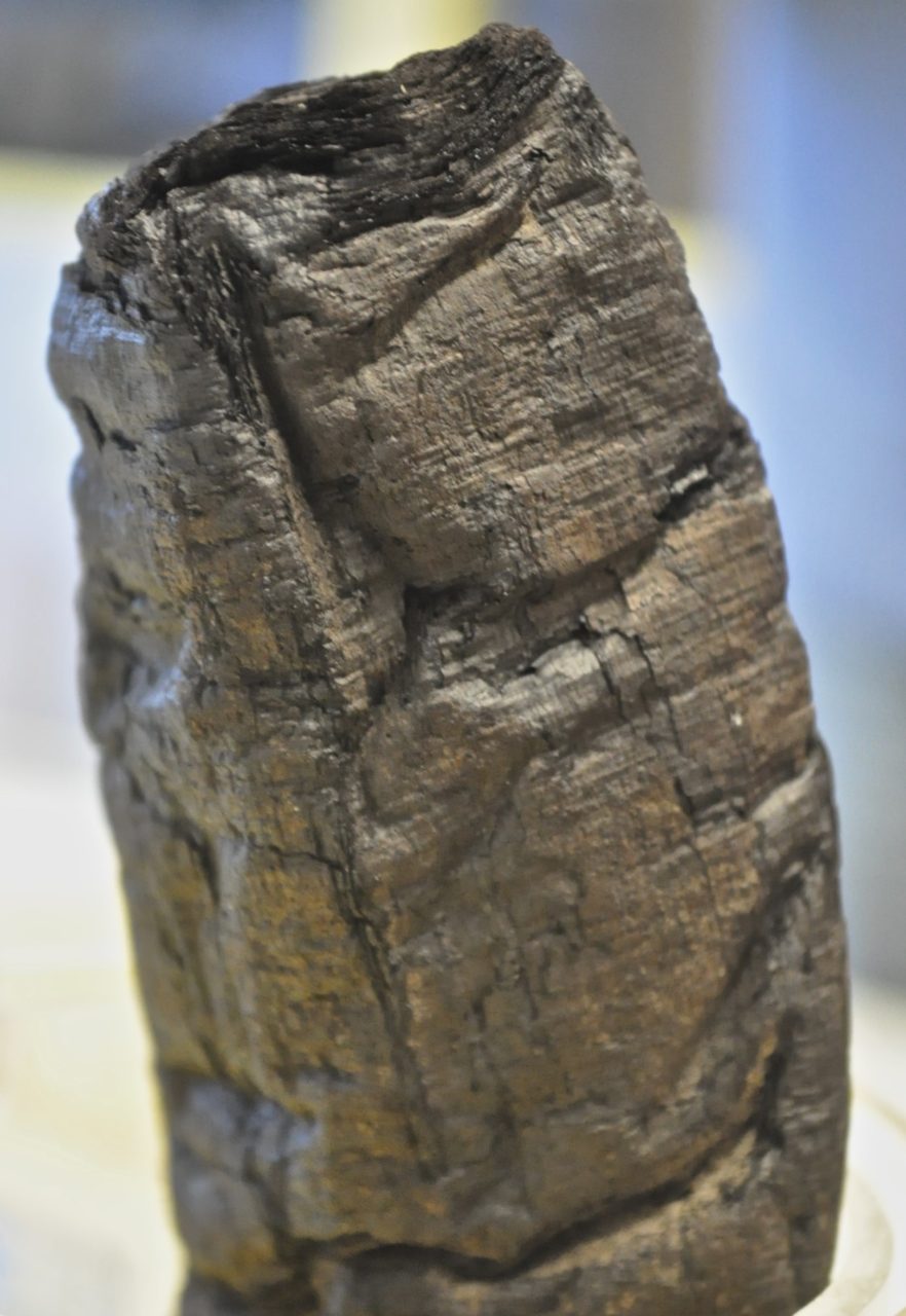
Miscellany № 74: zombies always make a hash of things

You remember the octothorpe, don’t you? This plucky little mark evolved from the Roman abbreviation lb for libra pondo, or pound weight, and into the barred medieval ‘℔’ before settling into its modern form of ‘#’. Along the way it picked up a cacophony of mostly reasonable nicknames: pound sign; number sign; hash sign; hex; grid; crunch; pig pen; square; tic-tac-toe.1,2 Sometime during the 1960s, however, it acquired another name — ‘octothorpe’ — that is unreasonable by design. The roots of that name lie in the hallowed corridors of Bell Labs, but today we’re interested in one of the false etymologies that cling to it like a bad smell:

In car­to­graphy, it is a tra­di­tional sym­bol for vil­lage: eight fields around a cent­ral square. That is the source of its name. Oc­to­thorp means eight fields.3

That’s how Robert Bring­hurst, eminent author of The Ele­ments of Ty­po­graphic Style, put it in the 2008 edition of his reference book. It is, unfortunately, an etymology without merit. The suf­fix thorp(e) is an Old Eng­lish word for vil­lage,4 still used in Brit­ish place names such as Scun­thorpe,* but octo is Greek; not a combination that readily occurs in the natural way of things.

It was this pleasing but erroneous explanation that caught the attention of poet Tom Comitta and artist George Pfau. I say “artist”, but George has a claim to being one of the world’s few professional zombie enthusiasts: he is a prolific producer of zombie-inspired art and has been interviewed about his fascination with the walking dead by FastCo.Exist,6 Motherboard7, and others. Together, George and Tom have synthesised zombies and octothorpes into a series of artworks called Eight Fields Surrounding a Village (Or a History of the Hashtag), of which you can see a part here:

Detail from "Eight Fields Surrounding a Village" by Tom Comitta and George Pfau. (Image courtesy of the artists.)
Detail from Eight Fields Surrounding a Village (Or a History of the Hashtag) by Tom Comitta and George Pfau. (Image courtesy of the artists.)

I see what you did there.

Tom explained to me via email how the pair were inspired by the description and shape of the ‘#’ as an isolated village surrounded by fields:

George and I made a sequential visual poem called “Eight Fields Surrounding a Village,” turning this visual metaphor into a visual narrative of zombies swarming a village. In much of our work, we bring together my practice of visual poetry with George’s practice of exploring and inverting society’s use of “zombie.” When we discovered the history of the octothorpe as you described it, we couldn’t help but see the almost cliché story of a rural zombie takeover. If you look closely at each panel from left to right, you’ll see a sequential narrative that goes from #peace to #zombieapocalypse.

And so you will! The image above is just one panel of four; the #zombieplague is taking hold but is not yet pathological. You can see the complete work, along with more of George and Tom’s zombie-related art, at Cold Front magazine.

Many thanks to Tom and George for getting in touch!

1.
Fulford, Robert. “How Twitter Saved the Octothorpe”. National Post.


2.
“Green Book”. In. International Telecommunication Union, 1973.


3.
Bringhurst, Robert. “Octothorpe”. In The Elements of Typographic Style : Version 3.2, 314+. Hartley and Marks, Publishers, 2008.


4.
“Thorp”. Oxford University Press, May 2011.


5.
Sheerin, Jude. “How Spam Filters Dictated Canadian magazine’s Fate”. BBC News.


6.


7.


*
Tangentially, the town of Scunthorpe is the originator of the so-called Scunthorpe problem.5 
If this isn’t your cup of tea, you might be interested in Tom and George’s iOS app BlabberLab, in which dismembered body parts — another zombie trope — are combined with letters to make, as Tom puts it, “a set of 400+ grotesque rebuses, which folks can now use to make colorful visual poems, encrypted messages and collages.” You can download the app for free from iTunes

Shady Characters at the BBC: Word of Mouth, 24th May

There’s no miscellany post this weekend, but by way of compensation I might point you towards tomorrow’s episode of BBC Radio 4’s Word of Mouth programme, to be broadcast at 4pm here in the UK.* In it I’ll be talking with the estimable Michael Rosen about punctuation, ancient Greece, medieval manuscripts, Winston Churchill and more — it was great fun to record the episode, and I hope it’ll be fun to listen to as well.

So: remember to tune in to Radio 4 tomorrow at 4pm, and please let me know what you think in the comments section below or, if you’d prefer, drop me a line via the Contact page. Enjoy!


Update: The programme is now available to stream and download.

*
It should be available to stream elsewhere in the world too, shortly after the broadcast itself. 

Miscellany № 73: per Churchill et commata

It’s easy to overlook the importance of empty space as a form of punctuation. Certainly, I’m guilty of giving pride of place to visible marks such as the pilcrow (¶) and interrobang (‽). But this isn’t to ignore the groundbreaking invention of the word space in the medieval period; the disappearance of the pilcrow to create the paragraph indent; or, most recently, the use of variable-length spaces as pauses in Patrick Stewart’s 2015 PhD thesis. Also recently, I was encouraged to look again at the subject of whitespace-as-punctuation by a visit to the Science Museum here in London.

First, though, it’s helpful to recap the 1200-year evolution of empty space as punctuation. Hold onto your hats.


For much of antiquity, texts were written in the traditional style of scriptio continua, or WORDSWITHOUTSPACES, that was favoured by the Greeks and Romans. Eventually, around the eighth century, Celtic monks at the fringes of what had once been the Roman Empire started to add spaces between words to ease the copying and reading of unfamiliar Latin texts.1 Later, with the arrival of printing in Europe in the fifteenth century, an exponential growth in the number of texts to be finished and bound led many printers to omit certain decorative flourishes that had once been added by hand — even as the whitespace dedicated to them continued to feature in printed works. Thus, the pilcrow and other paragraph marks, such as decorative initial caps, disappeared in favour of the now-familiar paragraph indent, as seen in this article.2

And so, by the end of the fifteenth century, the hierarchy of punctuation marks from the paragraph on down was essentially fixed. Paragraphs were separated by a newline followed by an indentation;* sentences were separated by one of a number of visual marks; clauses were separated by points, slashes, and other symbols; and words were separated by simple spaces.

But that isn’t quite all there is to the story. Before the paragraph indent, before even the word space, some writers of the early Christian era experimented with a form of punctuation that they called per cola et commata — “by colons and commas”. Originating with St Jerome in the fourth century, texts arranged per cola et commata placed each sentence and clause on a new line. Where a clause was too long to fit on a single line, it was carried over the next line and indented to the right. 4 Here’s an example, from folio 17 of British Library manuscript Harley 1775, an Italian manuscript of the Four Gospels from the last quarter of the sixth century:

BL Harley 1775, f.17
Text punctuated per cola et commata on folio 17 of British Library manuscript BL Harley 1775. (Public domain image courtesy of the British Library.)

For those trained in the art of rhetoric, a comma was a short clause and a colon a longer one; together a sequence of commata and cola made up a complete periodos, or sentence. The prevailing method of punctuation would have been to add a middle (·), low (.) or high dot (˙) after each comma, colon and periodos respectively,5 but St Jerome, and those who followed his example, used page layout instead of visible marks to punctuate their texts. Given that punctuation began as a way for readers to insert spoken pauses in a written text, St Jerome’s innovative page layout makes a great deal of sense: here is an author inserting visible pauses in his writings to guide his readers in teasing apart their meaning.


All of this brings us to the Science Museum. I was there more or less by accident, killing some time with a friend, when we found ourselves in an exhibition called Churchill’s Scientists, about British scientific advances during WWII. As we wandered through it, I noticed a reproduction of a page from one of Winston Churchill’s speeches, and it looked mightily familiar.

It turns out that Churchill (or, perhaps, a secretary; I’m sure more knowledgeable readers will correct me) had a very particular way of laying out the notes for his speeches. You can see many examples of his typewritten notes at the Churchill Archive, but here are a couple of paragraphs from the closing section of his most famous speech, usually entitled “Their Finest Hour” from its last line, as an example:

If we can stand up to him,
    all Europe may be freed,
	  and the life of the world 
	   may move forward into 
	     broad and sunlit uplands.

But if we fail,
  then the whole world, 
    including the United States,
	  including all that we have known and 
	                              cared for,
	   will sink into the abyss of a 
	     new Dark Age
		   made more sinister and 
		    perhaps more protracted by 
			 the lights of perverted 
			         Science.

Now isn’t that striking? The notes for “Their Finest Hour” aren’t arranged strictly per cola et commata, for reasons I’ll come to in a moment, but the family resemblance is strong nonetheless. That resemblance becomes even more pronounced when you hear Churchill deliver this part of the speech, as in this British Pathé recording. What you’ll notice is that when he pauses in his delivery, it is almost always at the end of a line. Only in the final lines of the second sentence above does he deviate noticeably from his per cola et commata-style layout, pausing after “protracted” and “lights”. Everywhere else, essentially, a new line signals a pause in his spoken performance.

Of course, if Churchill was aware of St Jerome’s fourth-century per cola et commata method (he was avowedly ambivalent toward Greek and Latin at school6), he did not follow it slavishly. His line breaks do not always fall where a comma, colon or semicolon might have been expected to appear. He has indented each line a little more than the last, rather than push them all to the left-hand margin, to make it easier to follow his notes as he read aloud from them. And, most obviously, the occasional stray comma has crept in, as if he could not quite bear to abandon conventional punctuation altogether.

Wherever Churchill found inspiration for his note-making technique, however, and whatever you think of the man himself, it’s difficult to argue with the results: his typewritten notes are weirdly lyrical in their layout and his speeches were undeniably effective. Per cola et commata or not, there’s a lot to be said for swapping commas, colons, and semicolons for the architectural precision of a new line of text.

1.
Saenger, Paul. “Silent Reading: Its Impact on Late Medieval Script and Society”. Viator: Medieval and Renaissance Studies, no. 13 (1982): 367-414.


2.
Haslam, Andrew. “Articulating Meaning: Paragraphs”. In Book Design, 73-74. Laurence King, 2006.


3.
Pamental, Jason. “The Life of ¶: The History of the Paragraph”. Print, no. Fall (2015).


4.
Parkes, M. B. “Antiquity: Aids for Inexperienced Readers and the Prehistory of Punctuation”. In Pause and Effect: Punctuation in the West, 9-19. University of California Press, 1993.


5.
Kemp, J Alan. “The Tekhne Grammatike of Dionysius Thrax: Translated into English”. Historiographia Linguistica 13, no. 2/3 (1986): 343-363.


6.
Churchill, Winston. “Harrow”. In A Roving Commission : My Early Life, 17. New York: Charles Scribner’s Sons, 1930.


*
Writing in Print magazine, Jason Pamental hypothesises that the paragraph indent was joined by the blank line — another example of whitespace as punctuation — because of simple laziness. It’s easier, he writes, to hit the return key twice than it is to hit return a single time and then insert a tab or em quad at the start of the next line.3 
The text above is modified slightly from Churchill’s original notes in order to match the speech as he delivered it. You can also read the “substantially verbatim” speech as it was transcribed by Hansard, the official parliamentary record, which differs again. 

Miscellany № 72: sections and shillings

It’s January, 1776. You’re a printer in Delaware, one of thirteen restive American colonies chafing against British rule. The Continental Congress, the colonies’ nascent collective government, has recently passed an act creating its own currency and you’ve been tasked with creating Delaware’s issue of banknotes.1 This is your response:

4-shilling banknote issued in 1776 by Delaware Colony
4-shilling banknote issued in 1776 by Delaware Colony. (Image courtesy of National Numismatic Collection at the Smithsonian Institution.)

Bearing the incongruous declaration that the Delaware pound was created “in the 15th Year of the Reign of His Majesty George the IIId”, this 4-shilling note is one of a plethora of “Continental” banknotes issued from 1775 onwards to bankroll the American Revolution. Today, we’d call these Continental notes a fiat currency — that is, a monetary system whose value is managed by a central bank, rather than being vested in a precious commodity such as silver or gold — but Revolutionary-era America was not quite ready for this financial innovation. The colonial governments declared that their Continental dollars (or Continental pounds, as Delaware called them) were backed by future tax revenues, but a jittery populace was unconvinced and the value of paper notes, relative to hard currency such as Spanish silver dollars, dropped five hundredfold in only six years.2 Nor was this the only problem undermining the new currency.

Let’s take a look again at the note above. It may lack the “To Counterfeit, is DEATH” slogan printed on some other Continental notes,3 but that doesn’t mean it would have presented much of a challenge for a skilled counterfeiter.4 Forgers had access to much of the same technology used to produce the notes, such as movable type and copperplate engraving, and that made paper money an easy target. The security measures available to the institutions that issued banknotes were limited to such things as hand-cut type ornaments and detailed engravings, all of which made copying a note a time-consuming process. Some states reissued notes on a yearly basis, with each year’s design distinct from the last, in an effort to stay ahead of the forgers. As long as the time it took to copy a note made it uneconomical for a counterfeiter to do so, that denomination was safe; the instant it had been copied, it was dead in the water.5

Now, our Delaware printer was not exactly a security expert. The engraved panels surrounding the note’s central text might have kept a forger at bay for some time, but the text itself is woefully undistinguished. Up at the top is a sort of cargo-cult attempt at using type ornaments to discourage copying: two section signs and a pilcrow (§ ¶ §) stand sentry at either side of the banknote’s handwritten serial number. Not the most unusual characters, nor the most difficult to copy.

All this spelled disaster for the Continental currency. Unmoored from a silver or gold standard and woefully easy to copy, by 1781 Continental banknotes were barely worth the paper they were printed on. They were, in the parlance of the day, “not worth a Continental”.4 It was not until 1792, when the first U.S. Mint was established in Philadelphia to produce gold, silver and copper coins, that the States’ common currency began to settle on an even keel — and the glorious Continental banknote, earnest, inadequate pilcrows and all, was no more.6


Many thanks to Jason Black, who tweets at @p2p_editor, for his original tweet about all this. Also, you can see many more fascinating images of Continental banknotes at Eric Grundhauser’s article at Atlas Obscura, “The Ornate Charm of American Currency from the 1700s”.

1.
U.S. Department of State Office of the Historian. “Continental Congress, 1774–1781”. Accessed April 23, 2016.


2.
McLeod, Frank Fenwick. “The History of Fiat Money and Currency Inflation in New England from 1620 to 1789”. The Annals of the American Academy of Political and Social Science 12 (1898): 57-77.


3.


4.


5.
Lynch, Jack. “The Golden Age of Counterfeiting”. Colonial Willamsburg.


6.
Federal Reserve Bank of Philadelphia. “Money in Colonial Times”. Accessed April 23, 2016.


More on The Book

Publication of The Book is still a few months away (if you haven’t circled August 23 on your calendar with a fat red marker pen, I urge you to do so right now), but I thought it might be nice to take a closer look at the book itself, both inside and out.

David High's cover for The Book: A Cover-to-Cover Ex­plor­a­tion of the Most Power­ful Ob­ject of Our Time. (W. W. Norton, August 2016.)
David High’s cover for The Book: A Cover-to-Cover Ex­plor­a­tion of the Most Power­ful Ob­ject of Our Time. (W. W. Norton, August 2016.)

First, David High’s cover.* The image above is a rendering rather than the real thing, but the finished article should be quite something. Unlike Shady Characters, there’s no jacket here: the boards and binding tape (handily identified by one of the many explanatory captions set in Zuzana Licko’s Mrs Eaves) are deliberately exposed to reveal how the book is put together. The title, subtitle, publisher’s mark and other accompanying text are stamped onto the cover, rather than printed, in a neat echo of traditional metal-on-leather techniques. That title, incidentally, is set in Paul Renner’s evergreen Futura, as it was on the American hardback edition of Shady Characters; bonus points go to anyone who can identify the typeface used for the vertically-aligned “THE” next to the word “BOOK”.

Judith Abbate's design for the interior of The Book, as composited by Brad Walrod.
Judith Abbate’s design for the interior of The Book, as composited by Brad Walrod.

Next is Judith Abbate’s splendid interior design, as composited by Brad Walrod. The first page of the introduction gives you a feel for just how rich the text is: it’s set in Robert Slimbach’s Adobe Jenson Pro Light, a modern revival of the work of French printer Nicolas Jenson, and is printed in the same black-and-red colour scheme used for Shady Characters.

There is much more to it than that, of course: the seventy-odd images that accompany the text, of which I hope to show you more later, will be printed in full colour; the book will be sewn rather than glued, which should make it a more pleasurable read and a hell of a lot more relevant to its content; and it even comes complete with some cut-out-and-keep templates for teaching yourself the ins and outs of different folding schemes. That said, if you like what you see here, you can order The Book in the USA from W. W. Norton, Amazon.com, Indiebound or Powell’s. In the rest of the world, order from Amazon.co.uk, The Book Depository or Waterstones.


Update: in a happy coincidence, the first printed copies of The Book arrived today at the W. W. Norton’s London office — here are a few shots of the finished book!

Cover of The Book
Cover of The Book.
Title page of The Book
Title page of The Book.
Page spread from The Book
Page spread from The Book.
*
David can usually be found at highdzn.com, but his site is currently unavailable.