Welcome to the 2025 Shady Characters advent calendar! I’ll be counting down to Christmas by way of ten of the most interesting, controversial, and downright odd emoji to have appeared on our screens. Enjoy, and come back every other day or so for a new entry!
In most ways, the HAMBURGER emoji is quite boring. It’s been around since emoji’s Japanese heyday, when it appeared on phones from all of Japan’s big cellphone networks, and it was one of the first emoji to be adopted for use in the wider world.1 Early documents show that ‘🍔’ was intended to represent both hamburgers specifically (ハンバーガー, or hanbaagaa) and fast food in general (ファーストフード, or fuaasutofuudo)2 — although its modest place in the emoji rankings, coming in at only 355th most popular in 2021,3 suggests that neither sense is particularly compelling. To put it another way, and to see emoji’s very long tail in action, HAMBURGER is used 677 times less often than ‘😂’, the most common emoji.
Why, then, am I writing about ‘🍔’? Well, for two reasons.
First is because HAMBURGER provides an object lesson in how emoji are not really standardised, at least not in the way you might expect. Back in 2017, when Google refreshed the visual appearance of all its emoji, the slice of cheese on the ‘🍔’ somehow migrated from its rightful position atop the burger to under it,4 prompting not a little online surprise.5 Google CEO Sundar Pichai, who, it should be noted, earned $200,000,000 that same year,6 publicly promised to fix the position of the cheese on a pixelated hamburger:
Will drop everything else we are doing and address on Monday:) if folks can agree on the correct way to do this!
And indeed, Pichai was as good as his word. The cheese was soon restored.7
That “burgergate” had come about at all was because neither Google nor anyone else truly controls what emoji look like. The Unicode Consortium, which gives each emoji its unique name and number, provides examples of how each one should be designed, but it has no way to enforce those suggestions. This is why Facebook’s emoji can look subtly different to Microsoft’s, and Microsoft’s to Snapchat’s, and so on. And furthermore, this is why Google, the first big Western company to embrace emoji, can put the cheese in the wrong place in the ‘🍔’.
The second reason to take note of the burger emoji is because its mid-table position in the emoji hierarchy has a practical significance. The set of emoji we can use on our phones and computers isn’t fixed. The same Unicode Consortium which manages the emoji lexicon invites proposals for new symbols, and each year, a lucky few are given the official seal of approval. One of the criteria for deciding which new emoji to approve is their expected level of usage — and that is where HAMBURGER comes in. Although its popularity is little more than a rounding error when compared to the most common emoji, ‘🍔’ sits roughly at the midpoint, or median, of emoji popularity: about half of all emoji are more popular, and about half are less popular.8 HAMBURGER is a helpful, beefy barometer for how popular an emoji needs to be before Unicode’s emoji subcommittee will take it into consideration.
The humble ‘🍔’ has a lot to teach us about how emoji work.
Welcome to the 2025 Shady Characters advent calendar! I’ll be counting down to Christmas by way of ten of the most interesting, controversial, and downright odd emoji to have appeared on our screens. Enjoy, and come back every other day or so for a new entry!
You would be forgiven for wondering what, exactly, this emoji (♨️) is meant to represent. Well, if the title has not already given the game away, I will tell you: this is the HOT SPRINGS emoji,1 and in emoji terms at least, it is positively antediluvian. Not only that, but ‘♨️’ gives us a peek behind the Unicode curtain — Unicode being the consortium, and the eponymous standard, which define how computing devices encode text.
The emoji that Unicode first added to their computerised character set in 2010 came from a variety of sources. Chief among them were Japan’s big three mobile phone networks: NTT, KDDI and Softbank.2 But pipping emoji into Unicode was a different collection of Japanese symbols. ARIB, the industry body for Japan’s TV and radio networks,3 had its own lexicon of symbols for TV news programmes, weather reports and more, and among those symbols was this one, ‘♨︎’, standing for the onsen, or hot springs, on which Japan’s traditional bath houses were built.4
Unicode is not a democracy, exactly, but the consortium accepts suggestions from other organisations and even members of the public on which characters should be added to its set. In 2007, then, a Michel Suignard had proposed to add ARIB’s symbols, including ‘♨’, to better support Japanese users.5 But Unicode already had an onsen symbol. In fact, it had had one since Unicode version 1.0, published way back in October 1991.6
Now, it’s not entirely clear to me why this should be the case. Unicode 1.0 was Frankensteined together from a number of earlier character sets, including two from Japan, but neither one of them contained an onsen character.7,8 ‘♨︎’ was a common cartographic symbol at the time,9 which may have been enough for Unicode to give it the nod, but that is pure supposition on my part. Not every character’s journey into the Unicode standard is documented, and the onsen symbol is every bit as mysterious as the interrobang (‽) in this respect.
So, to recapitulate: in 1991, for reasons unknown, a certain Japanese cartographic symbol (♨︎) made the cut for the initial version of Unicode standard. Its utility was reaffirmed in 2007 by its presence in a collection of Japanese broadcasting symbols also to be added to the standard.
Then, in 2010, came emoji. And it turned out that not only was ‘♨’ used on maps and on TV, but also that all three of Japan’s big cellphone carriers had a HOT SPRINGS emoji in their respective sets.2 End of story, right? Our onsen symbol has reached its final form.
Well, not quite. When Unicode added a host of emoji in 2010 it was obvious that they would have to be drawn in colour — but what of those, such as ‘♨︎’ which already existed as black-and-white symbols? We’re accustomed, these days, to emoji’s colourful appearance, but in the late 2000s, when emoji were still taking tentative steps out of Japan and into the rest of the world, text was very much a monochrome prospect. The Unicode Consortium didn’t quite know how to handle the problem, writing that:
Because many characters in the core emoji sets [overlap] with Unicode characters that originally came from other sources, there is no way […] to tell whether a character should be presented using an “emoji” style; that decision depends on context.10
You’re on your own, in other words. For a handful of years, these problematic characters were left up to those companies and organisations which translated Unicode’s abstract numeric “code points”* into concrete glyphs — the Googles, Apples, and Facebooks of the world, not to mention sundry type designers. In the confusion, some symbols were rendered as colourful emoji and others as sober monochrome icons.11
Finally, late in 2011, the consortium made some behind-the-scenes technical adjustments to allow certain characters to be rendered either in black and white or in colour;12 ‘♨︎’ and ‘♨️’ were given their own distinct appearances, and the onsen emoji was born.
I hope this has given you some insight into how emoji made their way onto our smartphones and computers, and how fraught their journey has been — and yet it’s worth noting that even tracing the evolution of the ‘♨️’ in some detail barely scratches the surface of that process. Whenever you type a ‘❤️’ or a ‘😭’, spare a thought for the programmers, language experts, and type designers who made it possible.
Welcome to the 2025 Shady Characters advent calendar! I’ll be counting down to Christmas by way of ten of the most interesting, controversial, and downright odd emoji to have appeared on our screens. Enjoy, and come back every other day or so for a new entry!
You know this guy, right? FACE WITH TEARS OF JOY, also known as the “cry-laugh” emoji, has been the most commonly-used emoji in the world for much of its existence. Barring a brief fall from grace during the Covid-19 pandemic in favour of ‘😭’ (and let’s face it, we didn’t have quite as much to be joyful about back them),1,2 ‘😂’ has been a constant companion in the new world of emoji.
‘😂’ made its formal debut in 2010, when, along with hundreds of other Japanese emoji, it was added to a standards document, called Unicode, which governs the characters our computers and smartphones can exchange.3 Google and Apple had shipped non-standard, bootleg emoji a couple of years earlier,4,5 but 2010 marked the point at which emoji could, and did, go global.
FACE WITH TEARS OF JOY was one of emoji’s early winners. In 2014, Mona Chalabi of 538 noted that on Twitter, only ‘♥️’ was used more frequently,6 and, by the following year, ‘😂’ was arguably the most popular emoji in the world.7 It was so common, in fact, that Oxford Dictionaries felt able to name it as word of the year.8
Then the backlash began. ‘😂’ had always been a very demonstrative emoji, as Amy O’Connor noted for The Daily Edge in 2015, but was it perhaps too dramatic? O’Connor called FACE WITH TEARS OF JOY “basic as hell”, and lamented that its use was almost always unwarranted.9 Whether O’Connor was right or wrong, something had broken the thread which connected this particular emoji’s meaning to its appearance. Slowly, inexorably, ‘😂’ came to embody not a joyful or empathetic reaction but rather a mirthless laugh of derision.* Abi Wilkinson, writing for the Guardian in 2016, branded it “mocking and cruel”.10 In 2021, CNN would tell us “Sorry, millennials. The 😂 emoji isn’t cool anymore”,11 and Vice would call it “the most divisive emoji in history” with only a pinch of exaggeration.2
And yet! For all the brickbats, FACE WITH TEARS OF JOY is still very popular. Quantifying exactly how popular is tricky to do, as we’ll see in a future advent calendar entry, but I am comfortable in stating that as of December 2025 it is almost certainly within the top five emoji worldwide. How can this be? How can such an overexposed emoji of debatable sincerity stay at the top of the heap? The answer, I suspect, lies in a combination of ignorance and malice. Some people like it because they see it as positive; others like it because they see it as negative. There’s a lesson here to be learned, I’m sure.
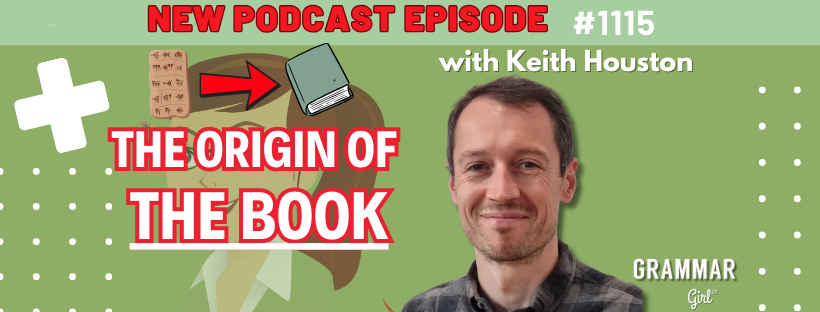
I’ve been internet acquaintances with Mignon Fogarty, also known as Grammar Girl, for many years now. (We share a literary agent, in fact, which is perhaps the most New Yorker–coded thing I’ve ever typed.)
As such, I was more than happy to talk to Mignon about Face with Tears of Joy for her always fascinating podcast. That episode has been out for a couple of months now (you can find it here, on YouTube, or wherever else you get your podcasts), but we also recorded a bonus episode about the hoary subject of books and book history. I am happy to report that that second episode has now been published to YouTube and all of the usual places, so head over there to watch and listen. (And also to marvel at my webcam, which insisted on focusing on the bookshelves behind me rather than on my face. It has a sense of irony, at least.)
There is a new AI controversy in town: chatbots are ruining the em dash.
Over the past year or so, a number of people have decided that texts created by generative AI applications contain more em dashes than might otherwise be expected. The complainants come from LinkedIn,1 Reddit,2 Instagram,3 and beyond. There’s even a thread on a forum operated by OpenAI itself,4 the company which owns ChatGPT, whose participants bemoans the bot’s excessive and apparently unstoppable use of em dashes.
What, though, is an em dash? The Shady Characters book has a chapter dedicated to dashes, but for now it’s enough to know that the em dash is one of a family of dashes used for different typographical purposes.
The hyphen (-) is the shortest dash, and is often used to join compound terms. Note the lack of spaces: “Moby-Dick.”*
The en dash (–), which is slightly longer, is used to join ranges of numbers (1–10) or dates (2010–2025), and, mostly in British English, to mark a break or parenthesis in a sentence – and in this mode, it normally has a space on each side. The en dash is also sometimes used to hyphenate compounds which themselves contain compound terms. For the keen-eyed, there’s an example elsewhere in this post.
The em dash (—) is the longest of the conventional dashes. It is named for the em, a typographic unit of size, which was once held to be the same width as an ‘M’ from its parent typeface, but which is now synonymous with the size of the typeface itself. A 16-point font will have a 16-point em, and its em dash will be 16 points long. (An en, incidentally, is half the width of an em.) The em dash is used by some novelists to introduce a change in speaker when recounting direct speech, although the practice varies from writer to writer and from country to country. Here’s a contrived example (contrived, that is, because Melville used quotation marks in Moby Dick):
— Masthead, there! Look sharp, all of ye! There are whales hereabouts! If ye see a white one, split your lungs for him!
— What do you think of that now, Flask? ain’t there a small drop of something queer about that, eh? A white whale—did ye mark that, man?5
More commonly than this, however, the em dash is used in American English for the same purposes as the en dash in British English—that is, to set off a parenthetical clause or to mark a break in a sentence. In this role, it’s normally used without spaces.† And this, finally, is the mark to which large language models are alleged to have laid claim.
Back to the flap at hand. The complaint is that many of the LLM-driven chat services that currently occupy the public consciousness‡ use em dashes so frequently that they have become a hallmark of AI-generated text. A viral clip from a podcast called LuxeGen (you can watch it here),3 in which the hosts discuss a rebrand of a clothing label called Pretty Little Thing, gave the phenomenon a name: the “ChatGPT hyphen”.
The odd thing from my perspective is that documentary evidence of the ChatGPT hyphen is quite thin on the ground. Opinion about the ChatGPT hyphen, on the other hand, is rampant. Quite apart from the blog posts6 and newspapers articles7 recapitulating the issue, a handful of technically-minded em dash–phobics have come up with ways to actively fight back against it, with the two most striking efforts both appearing in May this year.
First came the “am dash”. As you can read at theamdash.com, the idea is that human writers should not use em dashes at all, but instead the “am dash” — a sort of elongated tilde, or a dash with one end turned up and the other turned down — to distinguish themselves from AI chatbots. The brainchild of an Australian ad agency called Cocogun, the am dash is, so the website claims, “unmistakably human, unusable by AI”.8
Putting the am dash into practice is somewhat involved. There’s no standardised number or code that identifies this novel mark of punctuation, so the only way to use it is to install one of two custom fonts (“Areal”, based on Arial, and “Times New Human”, based on Times New Roman) and then, rather than typing an em dash, type in “am-” instead. Areal or Times New Human, as appropriate, will recognise this special invocation and replace it with an am dash. It’s clumsy, but if you have the luxury of choosing your own typeface, it works.
The thing is that any chatbot worth its salt can very easily make the same substitution. I asked Google’s Gemini: “Please write me a sentence illustrating the use of the em dash, but instead of the em dash itself, please use the characters ‘am-’.” This was the response I got:
I wanted to go to the store am-but then I remembered I forgot my wallet.
When I copy-and-pasted this into a word processor using Areal, this was the result:
llustrating the use of the am dash in Microsoft Word. (Image by the author.)
Admittedly, there’s a spurious space before am dash, but I think the point stands. The am dash is more social commentary than a valid antidote to the ChatGPT hyphen.
theamdash.com was followed by noemdash.com. (Ironic, I think, that both URLs could use a hyphen or two to make them easier to parse.) This, in turn, was the product of Lior Grossman, a self-described “serial parallel entrepreneur”, who had, he wrote, “lost it with ChatGPT”:
For probably the 100th time, I patiently asked it (okay, maybe less patiently each time) to STOP using em dashes. I even spelled it out clearly in the instructions: “Do NOT use em dashes (—). Just hyphens!”. What did ChatGPT do? It nonchalantly sprinkled even MORE em dashes, mocking me, as if my instructions were just a friendly suggestion 🤯9
Grossman’s response was to build noemdash.com, a tool which scrubbed texts of em dashes and replace them with spaced hyphens. “Get text that doesn’t suck”, it boasted. And to be fair to it, noemdash.com does what exactly what it promises to do: it removes not only em dashes, but also semicolons, “curly” or “smart” quotes, and also the hidden watermarks added to text by some AI systems.
Unfortunately, both Grossman and Cocogun have missed the point: we should not be picking on the em dash. To anyone with a passing interest in writing or typography, the em dash is not a malign mark: on the contrary, what an em dash most reliably signals is that a writer or a proofreader or a typographer cared about their work.
With the caveat that there are no rules in writing and typography, only conventions, there are many situations where an em or en dash is inarguably the best tool for the job. There are other marks, too, which are, for some definition of correctness, more correct than their lo-fi equivalents. In an ideal world, possessives would come with apostrophes (’) rather than primes (′). Direct speech would live between inverted commas (“ ”) and not double primes (″ ″). Independent clauses would be gracefully united by semicolons rather than hastily epoxied with commas.
If you are writing for publication, then, or in a formal register, or you just want to do the right thing by your words, then you should absolutely be reaching for the em dash and its comrades. There is no shame in this. And if you are evaluating a piece of writing in those same contexts, then by extension the em dash is no more helpful in identifying a chatbot’s ersatz spiel than any of the other, mostly-discredited tricks that have been claimed to be able to do so.10 In this light, the am dash and noemdash.com look almost parodic: theamdash.com asks that you confine yourself to one of only two custom fonts in order to avoid looking like an chatbot, while noemdash.com goes to extraordinary lengths to excise any sign of conscientious punctuation or typesetting from a piece of writing.
Of course, this isn’t to denigrate writing which is, by that same definition of correctness, incorrect. Real life comes for us all! It takes a few extra taps or clicks to find a curved quotation mark, and who has the time for that? The Chicago Manual is right there on the shelf but the kettle is boiling or the kids are crying. Bluesky fails to convert a well-intentioned double-hyphen to an em dash. There are a million reasons why we dash off texts that aren’t quite as refined as they could be.
If I have a conclusion, it is something like this: raging that a chatbot’s words are typeset better than a human’s is futile. LLMs are trained on a huge variety of texts, many of them from a bygone age when publishing anything at all meant having it first edited, then copyedited, then proofread, and finally typeset. If an chatbot is going to learn anything at all from the centuries’ worth of pirated books it has been fed, it will be where to use an em dash. Better, perhaps, would be to look critically at our use of AI in the first place. If you don’t like being outed as a ChatGPT user, maybe the solution isn’t to wreck its typography — it’s to stop using it in the first place.
Weber-Wulff, Debora, Alla Anohina-Naumeca, Sonja Bjelobaba, Tomáš Foltýnek, Jean Guerrero-Dib, Olumide Popoola, Petr Šigut, and Lorna Waddington. “Testing of Detection Tools for AI-Generated Text”. International Journal for Educational Integrity 19, no. 1 (December 2023): 1-39. https://doi.org/10.1007/s40979-023-00146-z.
As you will have seen in this post and in others here at shadycharacters.co.uk, I quite enjoy using spaced em dashes. This is contrary to essentially every style guide. Don’t do it. ↢